
Combined Data
The graph below shows how four of our big metrics for tracking the COVID-19 pandemic are tracking over time. Cases are represented by the blue line and correspond with the left y-axis. All other metrics correspond with the right y-axis. The reason I graph all of these things together is so that we can see the way these things trend together (or differently) over time. If we compare the winter and summer surges, we can see that the cases were much bigger during the winter surge, by 152%. But the weekly hospital admissions peaked at similar levels. Despite the nearly equal hospital peak, the weekly death count peak for the winter surge was 53% higher than the summer peak. This may be explained by the reality that the hospitals have a maximum capacity and we may have reached it both times.

Cases, deaths and ICU admissions all decreased this week. But hospitalizations increased slightly, by 5.3% compared to the week prior. As we look for signs of the vaccine impact, we’ll want to pay attention to both hospitalizations and deaths, since the vaccines are designed to protect against both of those outcomes.
Testing
The PCR test output trend over time can be seen in the graph below, represented by the blue line that corresponds with the left y-axis. The red line represents the test positivity rate over time, and corresponds with the right y-axis. The gray dashed line is the goal line for test positivity.

PCR testing output decreased slightly, by 2.3% compared to the previous week, with 119,294 test results reported. But, hey! Guess what Georgia did for the first time EVER in the pandemic? The weekly PCR positivity rate is below 5%, at 4.8%! This is a neat milestone to achieve, but our work is not yet done. The challenge is keeping the test positivity rate at or below 5% for a sustained period of time. Being below 5% means that the case rate is unlikely to be an undercount and we are unlikely to be missing cases with the current testing output.
For antigen testing, there were 51,834 tests reported through Electronic Laboratory Reporting (ELR) and that was a 5% drop from the previous week. Of the antigen tests reported, 6.6% were positive.

The DPH does not provide data regarding demographic details for cases identified by the antigen test. Keep that in mind as we go through the demographic data in the following sections. You’re only seeing part of the data. Meanwhile, antigen testing identified 33% of the cases this week.
Cases
The number of combined new cases (by date of report) is as follows:
- 24 hours: 653 by PCR + 221 by antigen = 874 (+0.08%)
- 7 days: 6232 by PCR + 3066 by antigen = 9,298 (+0.9%)
- 4 weeks: 27,503 by PCR + 13,564 by antigen = 41,067 (+4.0%)
In the graph below, I show the Georgia cases by date of report for both PCR and antigen cases for each county type. Ignore the big bump around 11Oct - that was a data dump of antigen cases. You can check how your county is classified here. Case rate is highest for the Atlanta suburbs and lowest for rural counties. The statewide case rate is 20% above the pre-surge baseline.

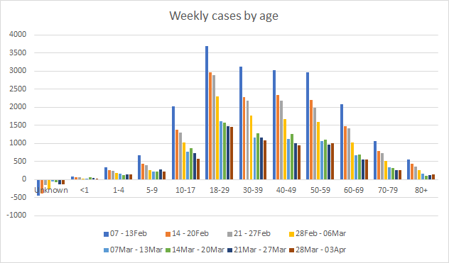
The next graph shows us where this week’s confirmed COVID-19 cases came from in terms of age groups. Small increases were observed in the weekly count for those all above the age of 50. Younger age groups saw decreases.
Hospitalizations
The number of new hospital admissions (by date of report) is as follows:
- 24 hours: 21 new COVID-19 admissions, 5 admissions to the ICU (weekend reporting is typically light)
- 7 days: 596 new COVID-19 admissions, 88 ICU admissions
- 4 weeks: 2297 new COVID-19 admissions, 403 ICU admissions
As noted earlier in the combined data section that looks at weekly numbers, hospital admissions are on the rise compared to the previous week. Let’s look at the demographic details that we have for hospitalizations. Increases were observed this week for children up to 4 years old, 18 - 49 year olds and 60-79 year olds.

The increase in hospital admissions can also be observed for each racial group too, with the exception of Native Hawaiian / Pacific Islanders.

Deaths
The number of new confirmed deaths (by date of report) is as follows. The percentage in parentheses indicates how the increase compares to Georgia’s cumulative total at the start of each window of time.
- 24 hours: 1 confirmed, 1 probable deaths (reporting on Sundays is typically low)
- 7 days: 262 (+1,6%), 24 probable deaths
- 4 weeks: 1151 (+7.4%), 155 probable deaths
The graph below shows how the 7-day death rate per 100,000 residents has trended over time for each county type. The state death rate is 39% above the pre-winter surge baseline. The 7-day death rate is highest for rural counties and lowest for the Atlanta suburbs.

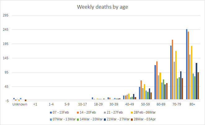
Next, let’s look at where the week’s newly reported deaths came from in terms of age groups. This week, deaths increased for 18 - 39 and 60-69. For those 18 - 39, they only became eligible for vaccines a short time ago.
Apart from the slight increase in hospitalizations, this week showed most metrics were trending downward (a good thing). The state also dropped below 5% weekly PCR test positivity for the first time since the pandemic began. Hopefully the downward trends continue next week. In the meantime, please try to get vaccinated at your earliest opportunity and continue to adhere to public health guidance with respect to masking, social distancing, etc.
References
https://dph.georgia.gov/covid-19-daily-status-report
https://covid-gagio.hub.arcgis.com/
https://beta.healthdata.gov/dataset/COVID-19-Community-Profile-Report/gqxm-d9w9
https://healthdata.gov/dataset/covid-19-reported-patient-impact-and-hospital-capacity-state
Georgia COVID-19 Updates is a free newsletter that depends on reader support. If you wish to subscribe please click the link below. There are free and paid options available.
My Ph.D. is in Medical Microbiology and Immunology. I've worked at places like Creighton University, the Centers for Disease Control & Prevention and Mercer University School of Medicine. All thoughts are my professional opinion and should not be considered medical advice.