Hello readers! On August 10th I submitted an open records request with the Office of General Counsel at the Department of Public Health for the following:
The number of SARS-CoV-2 PCR tests performed and the number of SARS-CoV-2 PCR tests that were positive, respectively, for each of Georgia's 159 counties for each of the most recent 14 days (July 27, 2020 - August 10, 2020).
Today, they responded with the weekly percent positive rate for each county for the weeks of 07/26 - 08/01 and 08/02 - 08/08 and whether they consider that rate to be high, moderate or low.
Some of the public health districts have been providing this information for their constituents which is fantastic. However, considering that the percent positive rate is a critical piece of information for the public to know how well testing is going in their area and how much disease might be being missed, it seemed like something that all 159 counties in Georgia had a right to know.
As a reminder, the World Health Organization advises that a community have a PCR Positive Rate of 5% or less for 14 days to be on track to contain the virus. The higher the percent positive rate, the more disease is likely being missed due to insufficient testing. As you’ll note when you look at the data, this is a metric that moves week to week. A county might have a low rate one week and a high rate the next, or vice versa.
Lastly, the Department of Public Health wanted me to be sure to remind you that these percentages are based on only lab tests reported to DPH, which are required to be reported by electronic laboratory reporting. Therefore, this does not represent all tests performed in Georgia.
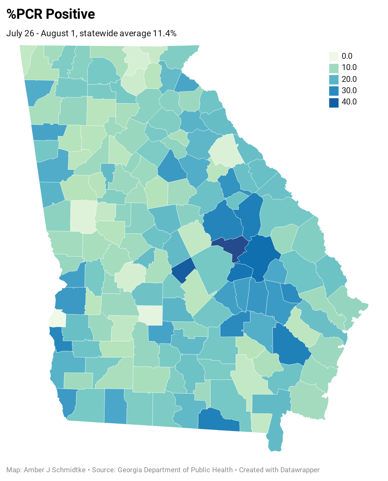
In the maps that follow you will see how the percent positive rate compares across counties. The statewide average is provided below the title of each map along with the week it portrays. First, let’s look at the week of July 26 - August 1. The statewide average is 11.4%. So anything in the top three color tiers is above the statewide average.

And the most recent week, August 2-8th. The statewide average is 10.7%, so anything in the top three color tiers is above the state average.

What is interesting to me, if you map these data as I have here, is that the areas of most intense percent positivity are the ones with the most intense increases in disease in the past two weeks, adjusted for population. It also looks like things are slightly better this most recent week than the week before, if one considers how many of the counties are dark in color.

Because it can be hard to compare the colors in the map to the legends, I’ve also provided the percent positive rate for each county and how DPH classifies that rate (high, moderate, low).

Many thanks to the Department of Public Health for their timely response to my records request. If you would like to subscribe to the Georgia COVID-19 Updates newsletter, please click the link below. Free and paid options are available.


You are a true blessing during this unsettling time.
Is this county report available online anywhere (e.g., DPH, etc.)? Or will you receive and post it regularly for on-going access to updated information? Thanks for providing!!