

Week in Review, 26Apr - 02May
Georgia COVID-19 Updates

Thanks everyone for the well wishes. The surgery lasted 3.5 hours on Friday and I was far more nervous for it than I should have been. I was grateful for a funny but also really compassionate anesthesia team that knocked me out as soon as it was okay to do so because I was spinning up in a way that wouldn’t help anyone. I just wanted to wake up and be done. I will say that I am really, really glad that my husband and I were fully vaccinated prior to this experience. As it was, my husband waited in the car rather than the waiting room because there were still a lot of people who didn’t wear masks appropriately. It really took so much of the worry out of things for me, especially considering where they were operating is the main route of entry for the virus. Having gone through the surgery twice before, I will say that the only ways COVID-19 changed things the day of was (1) my husband wasn’t able to be with me in pre-op or post-op except only briefly to see me off and collect me, (2) the surgeon gave him updates via phone rather than in person, (3) I had to be tested for COVID-19 prior to the surgery.
Combined Data
The graph below shows how four of our big metrics for tracking the COVID-19 pandemic are tracking over time. Cases are represented by the blue line and correspond with the left y-axis. All other metrics correspond with the right y-axis. The reason I graph all of these things together is so that we can see the way these things trend together (or differently) over time.

I have good news this week. Cases, hospital admissions and ICU admissions all decreased this week. Deaths rose by 10% this week, but I suspect this is an artifact of delayed reporting. The overall trend for deaths is continued decline.
Testing
The PCR test output trend over time can be seen in the graph below, represented by the blue line that corresponds with the left y-axis. The red line represents the test positivity rate over time, and corresponds with the right y-axis. The gray dashed line is the goal line for test positivity.

We saw a big jump in PCR testing this week, +17.6%. Test positivity decreased to 4.4% this week.
For antigen testing, the total tests reported rose about 25%, but the positivity rate increased to 6.3%.

The DPH does not provide data regarding demographic details for cases identified by the antigen test. Keep that in mind as we go through the demographic data in the following sections. You’re only seeing part of the data. Meanwhile, antigen testing identified 33% of the cases this week.
Cases
The number of combined new cases (by date of report) is as follows:
- 24 hours: 662 by PCR + 640 by antigen = 1302 (+0.12%)
- 7 days: 6005 by PCR + 3016 by antigen = 9021 (+0.8%)
- 4 weeks: 25,659 by PCR + 12,576 by antigen = 38,235 (+3.6%)
In the graph below, I show the Georgia cases by date of report for both PCR and antigen cases for each county type. Ignore the big bump around 11Oct - that was a data dump of antigen cases. You can check how your county is classified here. Case rate is highest for the Atlanta counties (Fulton and DeKalb) and lowest for rural counties. The statewide case rate is 15% above the post-winter surge low point.

The next graph shows us where this week’s confirmed COVID-19 cases came from in terms of age groups. Remember, this only describes PCR cases. We’re missing age information for the antigen cases (~30% of the week’s cases). In the most recent week, cases increased slightly for 0-4 year olds.

Hospitalizations
The number of new hospital admissions (by date of report) is as follows:
- 24 hours: 30 new COVID-19 admissions, 1 admission to the ICU (weekend reporting is typically light)
- 7 days: 584 new COVID-19 admissions, 104 ICU admissions
- 4 weeks: 2578 new COVID-19 admissions, 439 ICU admissions
Hospital admissions rose for 18-29 year olds this week. But hospitalizations continue to trend upward overall for younger adults (see 30-49) while decreasing for those 70+. The decreases in those 70+ are likely due to the effect of vaccines. It would be terrific to see a similar effect for younger adults once more of them are vaccinated.

But we have conflicting data coming from a new data set provided by the Department of Health and Human Services. They just began providing COVID-19 admissions by age group (confirmed and suspected) each day on Friday. The numbers reported daily from DPH and HHS have never agreed. The new data set helps us to explain some of the disagreement. For example, on 29Apr, DPH indicated that there was a net increase of 130 new COVID-19 admissions. For the same day, HHS reported 147 confirmed COVID-19 admissions, meaning they were test-positive prior to admission. And if you subtract out the pediatric admissions (n=12) and unknown/missing age admissions (n=6) you more or less get to the DPH number. In addition, whereas the DPH dashboard indicates that there was a net increase of 20 newly reported pediatric hospital admissions for COVID-19 during the week of 25Apr - 01May (7 days, see above graph), the HHS data indicate that there were 19 confirmed pediatric admissions for 29-30Apr alone (2 days). So that would suggest that 20 admissions for the week is likely a serious undercount by DPH. In addition, the numbers of children admitted with suspected COVID-19 disease is higher than any other age group, likely because we do not test children nearly enough. So at the time of admission, their test results are still pending. Though, to be fair, the pediatric age group is a 17-year span, whereas most other age groups are 9-year spans. So the fact that these bars look so big for children is partly the result of an artifact of how they’re grouped.
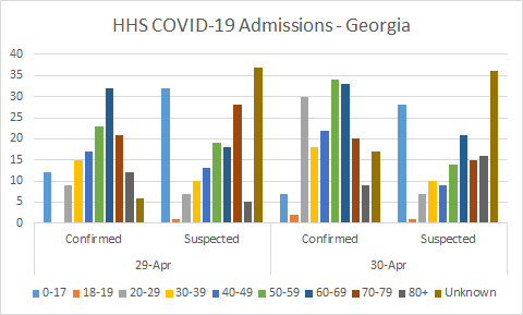
In any case, it would seem that DPH hasn’t been including pediatric admissions in their hospitalization numbers. That’s pretty important considering the debates over reopening schools (especially among communities that eschew masking), or the false narrative that COVID-19 doesn’t impact children. People determine their risk tolerance for their families using these numbers. So it’s really important that they’re as accurate as possible.
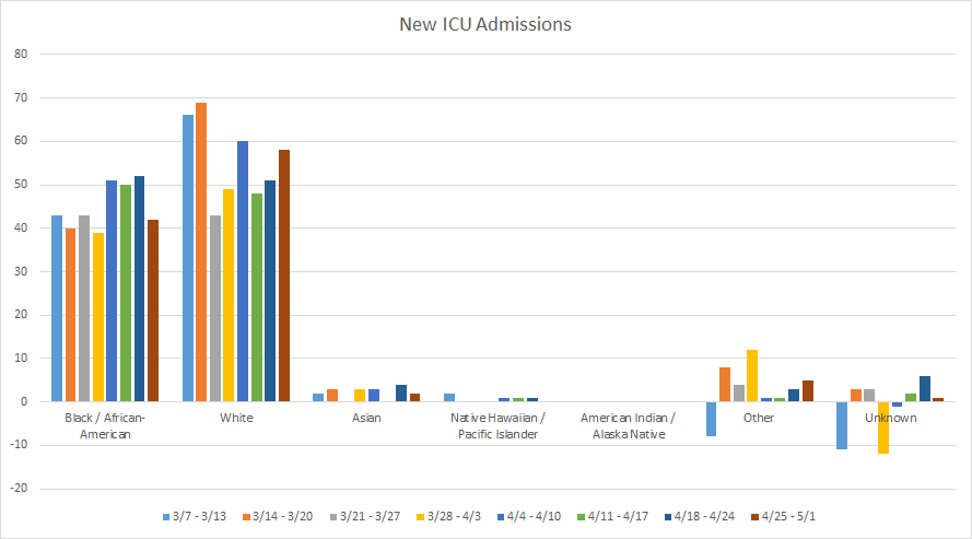
COVID-19 hospital admissions are rising for “other” population that includes the majority of those who identify as Hispanic / Latinx (data not shown). ICU admissions are rising for this same population and for the White population. To date, for every hospital admission due to COVID-19, 16.4% required an ICU stay. For those who went into an ICU for COVID-19, the mortality rate for Georgia has been 41.9%. This virus is not a game.
Deaths
The number of new confirmed deaths (by date of report) is as follows. The percentage in parentheses indicates how the increase compares to Georgia’s cumulative total at the start of each window of time.
- 24 hours: 0 confirmed, 0 probable deaths (weekend reporting is light)
- 7 days: 191 (+1.1%), 46 probable deaths
- 4 weeks: 829 (+4.9%), 171 probable deaths
The graph below shows how the 7-day death rate per 100,000 residents has trended over time for each county type. The state’s death rate is currently 3% below the pre-winter surge baseline. The 7-day death rate is highest for rural counties and lowest for the Atlanta suburb counties.

Next, let’s look at where the week’s newly reported deaths came from in terms of age groups. This week, deaths increased for those 40-49 and 70+. Seeing the deaths among those 70+ is especially sad, given they were among the first people to be prioritized for vaccine eligibility. These are people we likely could have saved, if we had vaccinated them in time. Please work to get vaccinated - not only to protect yourself but the people you encounter.

The increase in deaths this week was observed in both Black/African-American and White populations (data not shown).
To summarize, good trends we saw last week are continuing into this week plus we have more robust testing to identify problems if/when they arise. We want to continue to be cautious, of course, and work to get folks vaccinated as much as possible. I wouldn’t say we are out of the woods yet, because while things are stable they are still high.
References
https://dph.georgia.gov/covid-19-daily-status-report
https://covid-gagio.hub.arcgis.com/
https://covid.cdc.gov/covid-data-tracker/#county-view
https://beta.healthdata.gov/dataset/COVID-19-Reported-Patient-Impact-and-Hospital-Capa/6xf2-c3ie
Georgia COVID-19 Updates is a free newsletter that depends on reader support. If you wish to subscribe please click the link below. There are free and paid options available.
My Ph.D. is in Medical Microbiology and Immunology. I've worked at places like Creighton University, the Centers for Disease Control & Prevention and Mercer University School of Medicine. All thoughts are my professional opinion and should not be considered medical advice.