
This week’s update looks and sounds a lot like last week’s update. Our descent from the winter surge peak has leveled off for the four big indicators.
Combined Data
The graph below shows how four of our big metrics for tracking the COVID-19 pandemic are tracking over time. Cases are represented by the blue line and correspond with the left y-axis. All other metrics correspond with the right y-axis. The reason I graph all of these things together is so that we can see the way these things trend together (or differently) over time.

Cases and ICU admissions decreased this week, by 19% and 22% respectively. But they increased by about the same amount the previous week. So things are about where they were two weeks ago. Deaths increased 25% and this may be an issue of delayed reporting. The death curves usually don’t feature straight lines like cases and hospitalizations. Hospital admissions for the week are about the same as the previous week.
Testing
The PCR test output trend over time can be seen in the graph below, represented by the blue line that corresponds with the left y-axis. The red line represents the test positivity rate over time, and corresponds with the right y-axis. The gray dashed line is the goal line for test positivity.

PCR testing output dropped 13% this week compared to the previous week, with 122,152 test results reported. At the same time, the PCR test positivity rate was about the same as the previous week, at 5.2%. We still have not gone below the 5% goal, but are REALLY close right now. On a weekly basis, Georgia has never dropped below 5%. The state has come very close but then reverses quickly. Let’s hope things are different this time.
For antigen testing, there were 54,620 tests reported through Electronic Laboratory Reporting (ELR) and that was a 6% drop from the previous week. Of the antigen tests reported, 6.3% were positive.

The DPH does not provide data regarding demographic details for cases identified by the antigen test. Keep that in mind as we go through the demographic data in the following sections. You’re only seeing part of the data. Meanwhile, antigen testing identified 32.8% of the cases this week.
Cases
The number of combined new cases (by date of report) is as follows:
- 24 hours: 748 by PCR + 78 by antigen = 826 (+0.08%)
- 7 days: 6466 by PCR + 3152 by antigen = 9,618 (+0.9%)
- 4 weeks: 31,091 by PCR + 17,644 by antigen = 48,735 (+4.8%)
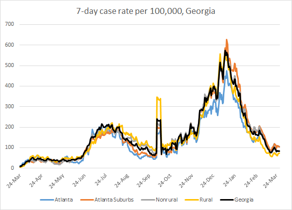
In the graph below, I show the Georgia cases by date of report for both PCR and antigen cases for each county type. Ignore the big bump around 11Oct - that was a data dump of antigen cases. You can check how your county is classified here. Atlanta and the Atlanta suburb counties are nearly identical for 7-day case rate and they are the highest in the state. The case rate for nonrural counties is nearly the same as that for the state, so the gray line is obscured in the graph below. Rural counties currently have the lowest case rate in the state.
The next graph shows us where this week’s confirmed COVID-19 cases came from in terms of age groups. Small increases were observed in the weekly count for those 1 - 9 years old and those 80+. All other age groups saw decreases.

You can see from the graph that the bulk of cases are coming from 18 - 59 year olds. This is why I’m particularly excited about Georgia’s recent expansion of vaccine eligibility to anyone over the age of 16. If your goal is to prevent hospitalizations and deaths, you focus on those 65+. If you want to stop cases, and end the pandemic, you need to target the group driving cases. And that is the group 18 - 59 years of age. The question now is whether the state will fund an education and outreach campaign to encourage younger adults to get vaccinated. So far we haven’t seen that, perhaps because demand exceeded supply. But soon, the opposite will be true and we will have an abundance of supply. We need to see more effort across the state to normalize vaccinations, targeted messaging and incentives if we want to reach herd immunity. If you are trying to get these efforts off the ground on a local level, I was recently shown a neat resource of free, downloadable art that can be used to help make posters, flyers, etc. An example, by Thomas Wimberly, is provided below. If you are holding events in your area and need help getting the word out, please let me know so that I can help.

Hospitalizations
The number of new hospital admissions (by date of report) is as follows:
- 24 hours: 22 new COVID-19 admissions, 8 admissions to the ICU (weekend reporting is typically light)
- 7 days: 566 new COVID-19 admissions, 97 ICU admissions
- 4 weeks: 2459 new COVID-19 admissions, 452 ICU admissions
As noted earlier in the combined data section that looks at weekly numbers, hospital admissions are nearly equal to last week. Let’s look at the demographic details that we have for hospitalizations. Increases were observed this week for 5 - 17 year olds, 40 - 59 year olds and those 80+. The 80+ age group is a bit unexpected, given how aggressively the state has been targeting vaccinations to this age group.

Deaths
The number of new confirmed deaths (by date of report) is as follows. The percentage in parentheses indicates how the increase compares to Georgia’s cumulative total at the start of each window of time.
- 24 hours: 0 confirmed, 0 probable deaths (reporting on Sundays is typically low)
- 7 days: 342 (+2.1%), 54 probable deaths
- 4 weeks: 1419 (+9.4%), 212 probable deaths
The weekly count of deaths was 25% higher than the previous week. The graph below shows how the 7-day death rate per 100,000 residents has trended over time for each county type. The state death rate is 94% above the pre-winter surge baseline. The 7-day death rate is worst for rural counties and best for the Atlanta suburbs.

Next, let’s look at where the 25% increase in deaths came from in terms of age groups. This week, deaths increased for all age groups over the age of 40. Keep in mind, these are based on date of report, not date of death. It appears that a lot of these are deaths that we’re just learning about due to delayed reporting.

Last week, all the big metrics stopped decreasing. This week stands out because the big metrics are still flat and didn’t resume their descent. That means that last week’s data weren’t a fluke of testing or reporting. It’s possible we have bottomed out from the winter surge. Understand that surges aren’t things that happen to us. They are things that happen as a result of our actions. So if you don’t want another surge, don’t engage in behaviors that will make it more likely for one to happen. Only 11% of the Georgia population is fully vaccinated. The state remains in a very vulnerable position, especially when you remember that the more transmissible variants are growing in number in Georgia.
Please work to get vaccinated and encourage those around you to do so also. In the meantime, please continue to be careful about limiting disease transmission. If we can get through Memorial Day without a new surge, I think we’ll be in good shape. But we’re seeing concerning trends for Michigan and the Northeast as the new variants become dominant and we don’t want to happen in Georgia too.
References
https://dph.georgia.gov/covid-19-daily-status-report
https://covid-gagio.hub.arcgis.com/
https://beta.healthdata.gov/dataset/COVID-19-Community-Profile-Report/gqxm-d9w9
https://healthdata.gov/dataset/covid-19-reported-patient-impact-and-hospital-capacity-state
Georgia COVID-19 Updates is a free newsletter that depends on reader support. If you wish to subscribe please click the link below. There are free and paid options available.
My Ph.D. is in Medical Microbiology and Immunology. I've worked at places like Creighton University, the Centers for Disease Control & Prevention and Mercer University School of Medicine. All thoughts are my professional opinion and should not be considered medical advice.