Week in Review, 15-21Mar2021
Georgia COVID-19 Updates

Whereas the previous week in review featured a lot of positive trends for Georgia, this week’s shows some items that remind us that the pandemic is not over and we should not relax our precautions.
Earlier this week, I received my second dose of the Moderna vaccine. My symptoms were largely the same as last time and included insomnia, headache, soreness at the injection site and feeling a little out of it. All were minor and manageable. I just took it easy for a couple days.
If you’re in the Atlanta metro, I know that vaccine appointments have been hard to find. But the Fulton Board of Health has loaded a LOT of appointments at their Mercedes-Benz Stadium site. You can find appointments here including up to 10:00 pm for those who can’t attend during traditional business hours. In Chatham county, they’ve stopped requiring appointments all together at their mass vaccine site. I very much hope that we’re getting to a point where the appointment strategy can just stop. It has been an enormous barrier to access and led to a lot of frustration and confusion. I also hope that in the coming weeks we are going to see a shift from passive vaccination efforts (i.e. expecting the community to come to us) to active vaccination efforts where the vaccine is brought into communities and made widely available.
Combined Data
The graph below shows how four of our big metrics for tracking the COVID-19 pandemic are tracking over time. Cases are represented by the blue line and correspond with the left y-axis. All other metrics correspond with the right y-axis. The reason I graph all of these things together is so that we can see the way these things trend together (or differently) over time.
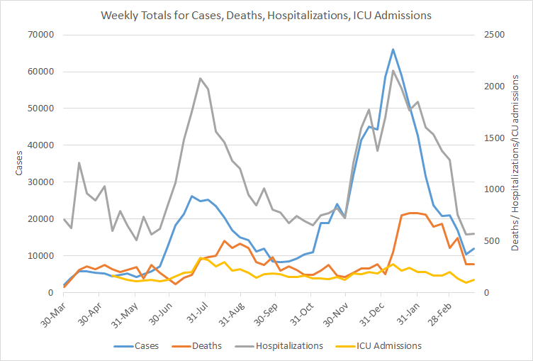
Last week everything decreased. But this week, we’ve seen things level off or increase. Weekly cases reported (PCR + antigen) rose 15%. Hospitalizations and deaths were nearly the same as last week. ICU admissions rose 32% compared to the previous weekly total.
Testing
The PCR test output trend over time can be seen in the graph below, represented by the blue line that corresponds with the left y-axis. The red line represents the test positivity rate over time, and corresponds with the right y-axis. The gray dashed line is the goal line for test positivity.

This week we saw a 6.8% increase in PCR testing output (blue line above). The PCR test positivity rate still hasn’t cracked the 5% threshold but it is really close, 5.1% for the week. Remember, the goal is to be at or below 5% for a sustained period of time. If we can achieve that, it’s a good indication that we are unlikely to be missing cases. When we do drop below 5%, the real challenge is staying below that number. On a weekly basis, Georgia has never dropped below 5%. The state has come very close but then reverses quickly. Let’s hope things are different this time.
For antigen testing, there were 58,025 tests reported through Electronic Laboratory Reporting (ELR) and that was a 4% drop from the previous week. Of the antigen tests reported, 7% were positive.

The DPH does not provide data regarding demographic details for cases identified by the antigen test. Keep that in mind as we go through the demographic data in the following sections. You’re only seeing part of the data. Meanwhile, antigen testing identified 35.4% of the cases this week.
Cases
The number of combined new cases (by date of report) is as follows:
- 24 hours: 890 by PCR + 614 by antigen = 1504 (+0.14%)
- 7 days: 7657 by PCR + 4195 by antigen = 11,852 (+1.1%)
- 4 weeks: 38,329 by PCR + 21,804 by antigen = 60,133 (+6.1%)
In the graph below, I show the Georgia cases by date of report for both PCR and antigen cases for each county type. Ignore the big bump around 11Oct - that was a data dump of antigen cases. You can check how your county is classified here. The 7-day case rate per 100,000 has risen 35% in the past 6 days. At this point, the state case rate is 60.8% higher than the pre-winter surge baseline.

If we look at where these case increases are coming from, we can see from age data that cases are on the rise in 10-17 year olds and adults 30 - 59. Are these families testing for COVID-19 in preparation for Spring Break travel? We’ll have to see what happens here. In the past, our surges began with the 18-29 year group. So this could be travel-related increases (i.e. we’re identifying more asymptomatic cases) and a fluke that goes away, or it could lead to something more. We need more time to know.

Hospitalizations
The number of new hospital admissions (by date of report) is as follows:
- 24 hours: 21 new COVID-19 admissions, 4 admissions to the ICU (weekend reporting is typically light)
- 7 days: 571 new COVID-19 admissions, 124 ICU admissions
- 4 weeks: 3179 new COVID-19 admissions, 554 ICU admissions
The graphic below shows us the Georgia Emergency Management Agency hospital regions. The table on the right tells you how each region is doing with respect to usage of their available ICU beds and how their COVID-19 patient population compares to their overall patient population. These numbers are all based on data from the Georgia GIO COVID-19 data hub.

There are no hospital regions that are using >90% of their ICU beds. Most of the state is in the yellow or green category for COVID-19 patient census, or how much of the total hospitalized population is there for COVID-19 treatment. Only region F is in the orange zone.
The graph below tracks daily COVID-19 hospital admissions with a 7-day moving average represented by the dashed orange line. The 7-day average has dropped down to levels we haven’t seen since before the summer surge began.

But as noted earlier in the combined data section that looks at weekly numbers, hospital admissions are nearly equal to last week, with only an increase of 1.2%. Let’s look at the demographic details that we have for hospitalizations. Increases were observed this week for 30 - 49 and 60 - 69 year olds.

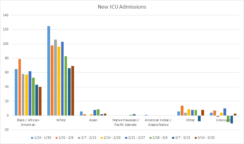
Next, let’s look at ICU admissions because those saw a big increase this week (+32%). In the graph below, we can see that increases were observed this week for White, Asian, and “Other” populations. Note: “other” includes the majority of those who identify as Hispanic.
Deaths
The number of new confirmed deaths (by date of report) is as follows. The percentage in parentheses indicates how the increase compares to Georgia’s cumulative total at the start of each window of time.
- 24 hours: 0 confirmed, 0 probable deaths
- 7 days: 274 (+1.7%), 41 probable deaths
- 4 weeks: 1512 (+10.3%), 274 probable deaths
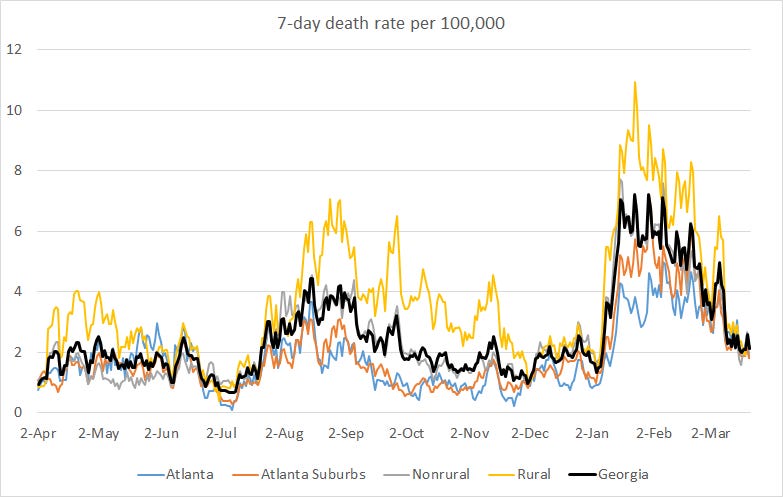
This week the number of confirmed deaths was only one more than the week before. The graph below shows how the 7-day death rate per 100,000 residents has trended over time for each county type. The state death rate is 40% above the pre-winter surge baseline. The 7-day death rate is worst for nonrural counties outside of the Atlanta metro and best for the Atlanta suburbs.
Even though the weekly death total is about the same as last week, we didn’t see flat numbers for each age group. Deaths ticked upward for 40-49 and 60-79 year olds this week.

This week stands out because the big metrics all stopped decreasing. A boost in testing for travel could potentially explain the increase in cases, but that wouldn’t affect the other metrics. It’s unclear what we should make of this yet other than to let us remind ourselves to keep our guard up. If you are traveling for Spring Break, please consider getting a COVID-19 test 4-7 days after you get back, especially if you had high risk exposures. If you were unfortunate enough to pick up the more transmissible variants and bring them home, you and your public health department would prefer to know that sooner rather than later.
In the coming weeks we should see vaccine eligibility open to all adults and teenagers 16+ (for Pfizer only) in Georgia, assuming the Governor’s estimates still hold. We need to do our best to vaccinate as many people as we can. So start talking to your friends and family about their plans to get vaccinated.
That’s it for today. I will be back tomorrow to discuss how the state fits into the national and global context.
References
https://dph.georgia.gov/covid-19-daily-status-report
https://covid-gagio.hub.arcgis.com/
https://beta.healthdata.gov/dataset/COVID-19-Community-Profile-Report/gqxm-d9w9
https://healthdata.gov/dataset/covid-19-reported-patient-impact-and-hospital-capacity-state
Georgia COVID-19 Updates is a free newsletter that depends on reader support. If you wish to subscribe please click the link below. There are free and paid options available.
My Ph.D. is in Medical Microbiology and Immunology. I've worked at places like Creighton University, the Centers for Disease Control & Prevention and Mercer University School of Medicine. All thoughts are my professional opinion and should not be considered medical advice.