
Combined Data
The graph below shows how four of our big metrics for tracking the COVID-19 pandemic are tracking over time. Cases are represented by the blue line and correspond with the left y-axis. All other metrics correspond with the right y-axis. The reason I graph all of these things together is so that we can see the way these things trend together (or differently) over time.

This week we saw all metrics decrease - a very positive development. However, whereas cases have decreased 64% from the peak on 10Jan, hospitalizations have seen a much slower and smaller decrease - 29%. It’s a good reminder that as good as the news might be that cases are declining, there are still a lot of people out there with serious cases of COVID-19 and the burden on hospitals remains significant.
ICU admissions dropped 18.6% and deaths decreased 15.6%.
Testing
This week we a 11% decrease for PCR tests performed. In total, there were 188,785 PCR tests reported. Of those, 10% were positive. The test output trend over time can be seen in the graph below, represented by the blue line that corresponds with the left y-axis. The red line represents the test positivity rate over time, and corresponds with the right y-axis. The gray dashed line is the goal line for test positivity.
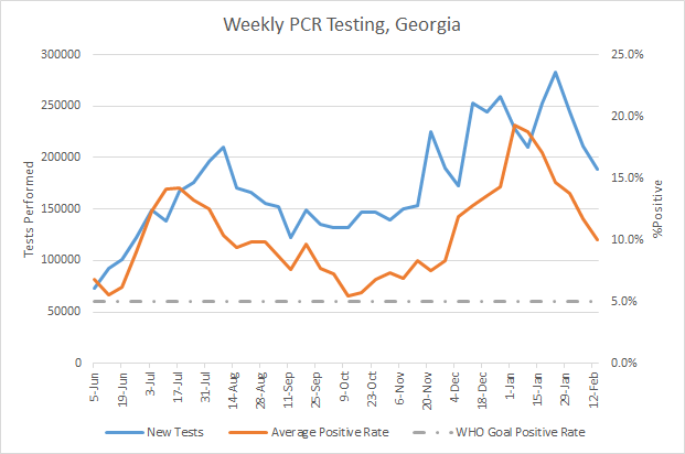
The percent positive rate has decreased, but we still remain far above the 5% goal line. So we are likely missing a lot of cases, but not as badly as during the height of the winter surge. So it’s a little distressing to see test output decrease, rather than remain high - in order to find the cases that are out there, symptomatic or otherwise, and isolate those cases so that they cannot contribute to ongoing disease transmission.
The Georgia Department of Public Health does not provide data regarding the number of antigen tests that have been performed nor how many were positive. Further, they do not provide any demographic details for cases identified by the antigen test. Keep that in mind as we go through the demographic data in the following sections. You’re only seeing part of the data. Meanwhile, antigen testing identified 25% of the cases this week.
Cases
The number of combined new cases (by date of report) is as follows:
- 24 hours: 1709 by PCR + 220 by antigen = 1929 (+0.2%)
- 7 days: 17,801 by PCR + 5,945 by antigen = 23,746 (+2.5%)
- 4 weeks: 110,401 by PCR + 38,341 by antigen = 148,742 (+18.2%)
The new statewide total is 964,737, combining PCR and antigen-test identified cases. Bear in mind that as large as these case totals are, they are likely an under count of our actual case count - it’s a problem that plagues public health for multiple diseases and especially so when a disease has so many asymptomatic cases, as COVID-19 does. But also because we know that our percent positive rate is high. So there are likely a fair amount of cases out there that we are not detecting. In the graph below, I show the Georgia cases by date of report for both PCR and antigen cases for each county type. Ignore the big bump around 11Oct - that was a data dump of antigen cases. You can check how your county is classified here. The state’s case rate is now below the peak of the summer surge, but 211% higher than the pre-winter surge baseline.

The next two graphs show us some of the demographic details of those who are getting sick and testing positive. In each graph, you’re looking at 8-week timelines for each age group side by side.

This week we saw decreases in cases for every age group except those 5-9. However, cases are still quite high. A really good thing we see in this graph is a negative number in the “unknown” category. This is a holding spot for cases that are pending investigation and follow up. When the numbers are large for this category, it suggests that contact tracers are overwhelmed by the number of cases. When the number is small, it suggests they’re coping. When the number is negative as it is this week, it suggests that contact tracers are not only able to cope with the week’s incoming cases, but can work through the backlog that preceded this week. We see a similar trend for cases by race in the graph below.

Cases among Black / African-American, White and Asian populations are nearly the same as last week, but have declined for the other races.
Hospitalizations
The number of combined new hospital admissions (by date of report) is as follows:
- 24 hours: 39 new COVID-19 admissions, 4 admissions to the ICU (weekend reporting is typically light)
- 7 days: 1537 new COVID-19 admissions, 162 ICU admissions
- 4 weeks: 6760 new COVID-19 admissions, 803 ICU admissions
According to the state of Georgia, the number of patients currently hospitalized for COVID-19 is 2931 and we haven’t been below 3000 since 16Dec. According to the US Department of Health and Human Services, they’re tracking that Georgia currently has 3446 patients hospitalized for COVID-19. I have some ideas on why these two numbers are so different: (1) Georgia only reports confirmed admissions, meaning they already have a positive COVID-19 test prior to hospital admission. On the other hand, HHS tracks both confirmed and suspected COVID-19 admissions, meaning that their lab result is pending at the time of admission. (2) I think that Georgia only reports adult COVID-19 patients whereas HHS includes pediatric patients. In fact, there are 49 children currently hospitalized for COVID-19 in Georgia.
The graphic below shows us the Georgia Emergency Management Agency hospital regions. The table on the right tells you how each region is doing with respect to usage of their available ICU beds and how their COVID-19 patient population compares to their overall patient population. These numbers are all based on data from the Georgia GIO COVID-19 data hub.

There’s a LOT of news to celebrate here, even as we still see a lot of red. First of all, take notice that there are only 3 hospital regions using >90% of their ICU beds (regions E, L and N). In addition, if we look at the patient census we now have 6 regions in the light red zone, 2 regions in the orange zone and one in the yellow zone. As recently as 18Jan, all regions were in the dark red zone. Regions H, L and M have reached their pre-surge baseline.
The state says that 83.7% of ICU beds are full whereas HHS says the number is 86.9%. I’ve started to graph both numbers, with the HHS estimate in orange below. The HHS reports that 32.2% of the ICU beds in Georgia are occupied by COVID-19 patients. This is a big improvement compared to the height of the winter surge, when more than half of ICU beds were in use by COVID-19 patients.

As a reminder, hospitalizations are down - yes. But they remain very high. We need to continue to do the long, difficult work of limiting disease transmission to give our healthcare workers the space they need to do their jobs well and to give them time to recover.
Next, let’s look at the demographic details that we have for hospitalizations.

This week hospital admissions were flat for 18-29, 40-49 and 80+. They increased for the “unknown” category, 1-4 and 50-69.
If we look at COVID-19 admissions by race, we see increases for every race category except for American Indian / Alaska Native and the “unknown” category.

In Georgia, the COVID-19 hospitalization rate, on average, is 5.5%. For those who are hospitalized, 16.4% require an ICU bed. While the case fatality rate for confirmed cases and confirmed deaths right now is 1.77%, the fatality rate for people admitted to the ICU for COVID-19 is 40.4%. The ICU mortality rate has increased 7.6% since I started tracking this information, the week of 10Oct.
Deaths
The number of new confirmed deaths (by date of report) is as follows. The percentage in parentheses indicates how the increase compares to Georgia’s cumulative total at the start of each window of time.
- 24 hours: 3 (+0.02%), 18 probable deaths
- 7 days: 638 (+4.8%), 141 probable deaths
- 4 weeks: 2932 (+26.6%), 643 probable deaths
This week the number of confirmed deaths declined 15.6% compared to the previous week. The graph below shows how the 7-day death rate per 100,000 residents has trended over time for each county type. The state death rate is 27.6% above the peak during the summer surge. The death rate is worst for rural counties and best for the Atlanta counties of Fulton and DeKalb. In fact, the death rate in rural counties is 105% higher than the death rate in Atlanta.

Next, let’s look at the demographic data for this week’s deaths. Deaths increased for those in the unknown category and those 18 - 29. Deaths decreased for all other age categories.

That’s it for today. I hope you have a great remainder to your weekend!
References
https://dph.georgia.gov/covid-19-daily-status-report
https://covid-gagio.hub.arcgis.com/
Georgia COVID-19 Updates is a free newsletter that depends on reader support. If you wish to subscribe please click the link below. There are free and paid options available.
My Ph.D. is in Medical Microbiology and Immunology. I've worked at places like Creighton University, the Centers for Disease Control & Prevention and Mercer University School of Medicine. All thoughts are my professional opinion and should not be considered medical advice.