

The Week in Review, 25 - 31Jan2021
Georgia COVID-19 Updates

Combined Data
The graph below shows how four of our big metrics for tracking the COVID-19 pandemic are tracking over time. Cases are represented by the blue line and correspond with the left y-axis. All other metrics correspond with the right y-axis. The reason I graph all of these things together is so that we can see the way these things trend together (or differently) over time.

This week we are continuing to see cases decline for COVID-19, by 16.5%. ICU admissions also decreased this week, by 17.4%. Deaths were exactly the same as last week, 769. But something weird happened with hospital admissions - they went up this week by 4.9%. To be fair, the descent from the peak isn’t always a straight line down. So this small increase might just be an anomaly.
Testing
This week we a 14% decrease for PCR tests performed. In total, there were 243,886 PCR tests reported. Of those, 13.8% were positive. The test output trend over time can be seen in the graph below, represented by the blue line that corresponds with the left y-axis. The red line represents the test positivity rate over time, and corresponds with the right y-axis. The gray dashed line is the goal line for test positivity.

The percent positive rate continues to decrease, but it has slowed its descent this week.
The Georgia Department of Public Health does not provide data regarding the number of antigen tests that have been performed nor how many were positive. Further, they do not provide any demographic details for cases identified by the antigen test. Keep that in mind as we go through the demographic data in the following sections. You’re only seeing part of the data. Meanwhile, antigen testing identified 26% of the cases this week.
Cases
The number of combined new cases (by date of report) is as follows:
- 24 hours: 3000 by PCR + 587 by antigen = 3587 (+0.4%)
- 7 days: 31,335 by PCR + 11,199 by antigen = 42,534 (+4.9%)
- 4 weeks: 162,791 by PCR + 55,754 by antigen = 218,545 (+31.6%)
Some good news is that we haven’t seen a daily case total this low since 27Dec. Some of this is due to weekend effect - with decreased reporting over the weekends. But even the weekends have had high reporting over the past few weeks. The new statewide total is 909,445, combining PCR and antigen-test identified cases. Bear in mind that as large as these case totals are, they are likely an under count of our actual case count - it’s a problem that plagues public health for multiple diseases and especially so when a disease has so many asymptomatic cases, as COVID-19 does. But also because we know that our percent positive rate is high. In the graph below, I show the Georgia cases by date of report for both PCR and antigen cases for each county type. Ignore the big bump around 11Oct - that was a data dump of antigen cases.

You’ll notice that we are well above the previous summer surge, but there’s a decrease from a peak three weeks ago. For now, our 7-day rolling average is 70% higher than the summer peak. So just keep in mind that our work isn’t finished here just because the case rate is declining. When you have this much disease, it’s very easy for momentum to turn and for new surges to begin. We need to continue to be aggressive in limiting disease transmission, going back to at least the pre-winter surge level, and ideally down to the pre-summer surge level if we can. The Atlanta counties (Fulton and DeKalb, blue line) are faring better than other county types in the state. Atlanta suburb counties have the highest 7-day case rate in the state.
I’ve seen some chatter about whether we might be starting to see the impacts of the vaccine on COVID-19 metrics. I would say “no” for at least two reasons. First, while it’s very exciting to see the number of vaccinated individuals rise each day, we aren’t even close to vaccinating a large enough portion of our community to make a huge difference. Second, because of who we are prioritizing for vaccinations (healthcare workers, long term care facility residents and people 65+), I think the place we are most likely to see the earliest impacts of the vaccine is in the hospitalizations and deaths data. But these populations aren’t the main drivers of disease transmission. So I don’t anticipate that we’ll see a big impact on case totals until we’re vaccinating younger adults, and especially those 18-29 years of age. We’ll come back to this idea in the following sections. Trust me, I look forward to celebrating the vaccine’s impact as soon as we start to see it.
The next two graphs show us some of the demographic details of those who are getting sick and testing positive. In each graph, you’re looking at 8-week timelines for each age group side by side.
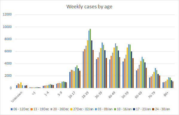
This week we saw decreases in cases for every age group (woohoo!). However, cases are still quite high. Again, younger adults 18 - 59 but especially 18-29 are the largest contributors to our case total. And we aren’t really vaccinating these folks yet unless they’re healthcare workers, first responders or they got lucky when doses were thawed without a recipient. Next, let’s look at how cases are trending based on race.

We saw decreases for Black / African-American, White and Other race categories. However, we see increases for Asian, Native Hawaiian / Pacific Islander and American Indian / Alaska Native populations. It’s reassuring to see the number of weekly cases in the “unknown” category have decreased, but they are still quite high. This is a holding spot for cases that are pending investigation. Seeing this category rise as it has in the past 8 weeks is an indication that the weekly case totals are exceeding the capacity of the contact tracing workforce. That makes it harder to notify, test and isolate the close contacts of known cases. So again, seeing that number come down this week is a good sign.
Hospitalizations
The number of combined new hospital admissions (by date of report) is as follows:
- 24 hours: 105 new COVID-19 admissions, 9 admissions to the ICU (weekend reporting is typically light)
- 7 days: 1852 new COVID-19 admissions, 200 ICU admissions
- 4 weeks: 7754 new COVID-19 admissions, 933 ICU admissions
As indicated above, reporting over the weekend is often less than we see during the week. Today there are 4150 COVID-19 patients currently hospitalized, a decrease of 16% compared to the previous week. In fact, the last time we saw a number this low was 27Dec. This metric has plateaued and decreased over the past three weeks. So it’s another good sign of progress, taken together with other hospital metrics.
As mentioned in the combined data section, we saw an increase in new COVID-19 hospital admissions this week (+4.9%). This is a setback, but hopefully a temporary one.
The graphic below shows us the Georgia Emergency Management Agency hospital regions. The table on the right tells you how each region is doing with respect to usage of their available ICU beds and how their COVID-19 patient population compares to their overall patient population.

Just as we saw last week, there are some good signs here, even though we see so much red in the chart. First, there are zero regions that are maxed out for ICU beds, compared to 3 last week. In addition, there are only 7 regions in the red zone (>90%) compared to 8 last week. Further, we now see two regions are in the green zone (<80%), although region G might be an anomaly (see Friday’s post). Let’s hope this trend continues in the coming week. All hospital regions continue to have a high COVID-19 patient census and all are in the red zone.
Next, let’s look at the demographic details that we have for hospitalizations.

This week we saw increases for many age groups, including those 5-17, 30-39, 50-59 and 70+. Remember how I mentioned that we might expect to see the vaccine’s earliest impacts in hospitalizations and deaths, based on who we were vaccinating? Hospital admissions are flat or increasing for 65+. We most likely aren’t seeing the vaccine’s impact yet.
Deaths
The number of new confirmed deaths (by date of report) is as follows. The percentage in parentheses indicates how the increase compares to Georgia’s cumulative total at the start of each window of time.
- 24 hours: 2 (+0.02%)
- 7 days: 769 (+6.5%)
- 4 weeks: 2677 (+27.1%)
This week the number of deaths was exactly the same as the previous week. The current statewide total of confirmed deaths is 12,570 and of those, 21.3% were reported in the last 4 weeks alone. That means that one out of every five deaths Georgia has recorded since the start of the pandemic was in the past 4 weeks - it’s a lot of death. The graph below shows how the 7-day death rate per 100,000 residents has trended over time for each county type. The state death rate is 52% above the peak during the summer surge. The death rate is worst for rural counties and best for the Atlanta counties of Fulton and DeKalb. In fact, the death rate in rural counties is more than twice as high as the death rate in Atlanta.

Whereas this most recent surge had a relatively short-duration peak for cases and hospitalizations, we seem to be hanging out on this plateau for deaths (statewide) a bit longer. It’s possible that it will take longer to descend from the death peak than the peaks for cases and hospitalizations, especially if the trend we saw last time for rural Georgia continues this time.
Next, let’s look at the demographic data for this week’s deaths. Deaths are on a continued increase for 50-59 year olds over the past four weeks. We also saw an increase in deaths this week for those 10-29 and 80+.
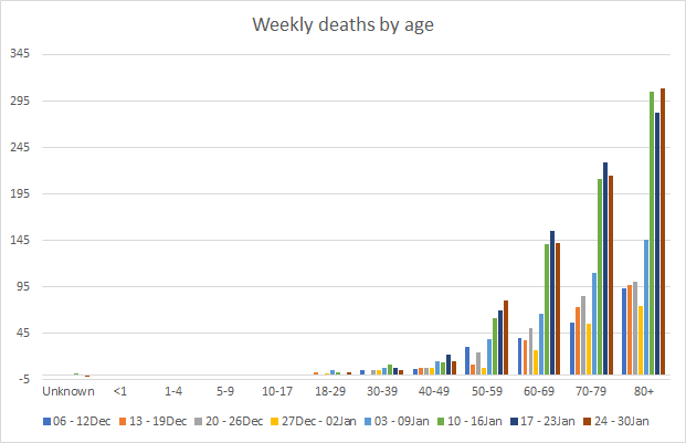
Based on who we’re vaccinating, the place we’re most likely to see the earliest impact of the vaccines is in deaths and especially since those 65+ contribute the majority of the state’s deaths week to week. However, deaths among 65+ remain very high or are even increasing in the past week. In summary, I think it’s too soon for us to be seeing the vaccine’s impacts. However, the more people are vaccinated, the sooner we will see those impacts and those will be lives saved.
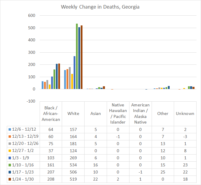
Next, let’s see where this week’s newly reported deaths came from in terms of race. There were zero additional deaths for the “Other” race category this week (this includes the majority of individuals who identify as Hispanic). But there were increases for all other race categories. Some of those increases were small (1-2), some where larger (i.e. 12-13).
That’s it for this week. I’ll be back tomorrow to put the Georgia pandemic in the national and global context.
References
https://dph.georgia.gov/covid-19-daily-status-report
https://covid-gagio.hub.arcgis.com/
Georgia COVID-19 Updates is a free newsletter that depends on reader support. If you wish to subscribe please click the link below. There are free and paid options available.
My Ph.D. is in Medical Microbiology and Immunology. I've worked at places like Creighton University, the Centers for Disease Control & Prevention and Mercer University School of Medicine. All thoughts are my professional opinion and should not be considered medical advice.