

The Week in Review, 16-22Nov2020
Georgia COVID-19 Updates

I was secretly hoping that today’s scheduled maintenance for the DPH Daily Situation Report was cover for an update to the data visualizations, to include antigen case data. Alas, it truly was system maintenance. Using the DPH daily situation report graphs and maps, we remain blind to ~27% of the data (that number will make sense as you progress through today’s report).
Combined Data
Let’s begin with a look at how our three biggest indicators for the pandemic are trending. Cases are shown in the blue line and correspond to the left y-axis. Hospital admissions and deaths (gray and red lines, respectively) correspond to the right y-axis. This week we saw another large increase in the number of cases (identified by PCR + Antigen test) and a smaller increase in hospital admissions. Deaths declined and that’s good news for now.
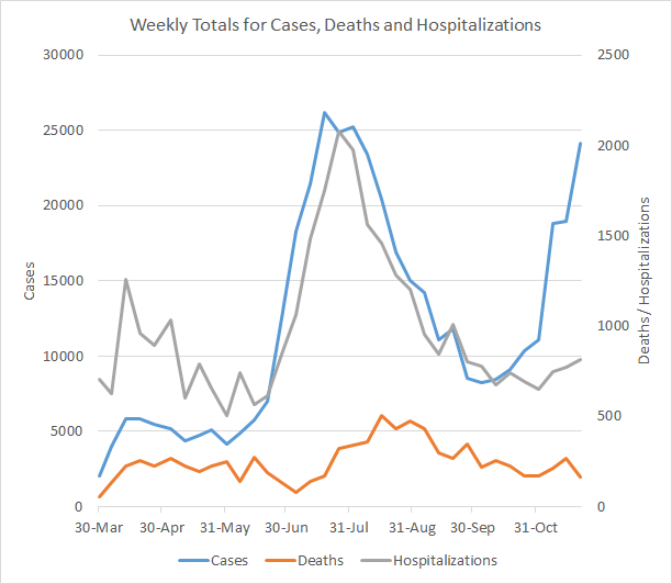
In the past, we’ve seen hospital admissions rise following a surge in cases. So far, the increase in hospital admissions is small compared to the surge in cases. Deaths are declining for now, but last time they began to trend up about 3 weeks after the case surge began.
Testing
This week we saw the greatest PCR test output that Georgia has ever recorded in a week’s time, with 225,494 PCR tests reported. There were 72,168 more tests this week than the week before (an increase of 47%). I suspect some of this is driven by people wanting to get tested before Thanksgiving travel and gatherings, but we don’t get any insight on that from the data that are available through the Department of Public Health. Of the tests reported this week, 7.5% were positive.

So while the tests performed increased 47%, the percent positive rate only declined by 10%. So there’s a lot of disease out there. Keep in mind, the DPH does not provide data on the number of antigen tests performed each day or each week and as a consequence we do not have any insight on how many of them are positive. Meanwhile, 27.7% of this week’s newly reported cases were identified by the antigen test, which is roughly equal to the previous week’s proportion of cases. As a reminder, the data visualizations on the DPH daily status report only include PCR-identified cases. What that means is that although things look bad even when you’re only considering PCR data, things are even worse if you add in the antigen cases.
Cases
The number of combined new cases (by date of report) is as follows:
- 24 hours: 1976 by PCR + 352 by antigen = 2328 (+0.5%)
- 7 days: 17,462 by PCR + 6,681 by antigen = 24,143 (+5.7%)
- 4 weeks: 98,209 (+28.0%)
The new statewide total is 449,132, combining PCR and antigen-test identified cases. Bear in mind that these case totals are likely an under count of our actual case count - it’s a problem that plagues public health for multiple diseases and especially so when a disease has so many asymptomatic cases, as COVID-19 does. We are seeing an acceleration of cases this week, with the 7 day and 4 week increase greater than the week before. Of all the cases that Georgia has recorded to date, 22% were recorded in the past 4 weeks. So even though we’ve been living through this pandemic since March (8 months), one fifth of the pandemic has happened in the last month.
The graph below shows how each week’s cases have been distributed by age according to PCR-based testing alone. Each bar represents a separate week. This kind of graph lets us look at timelines for each age group at the same time. Note, the Department of Public Health does not yet include antigen-identified cases in their demographics data table or graph. This week, antigen-identified cases made up 27.7% of the week’s newly reported cases. So there is a lot of data we aren’t seeing. But the graph below shows what we *do* know, based on PCR-based testing. The red bar is the most recent week and, again, this is just PCR-based data.
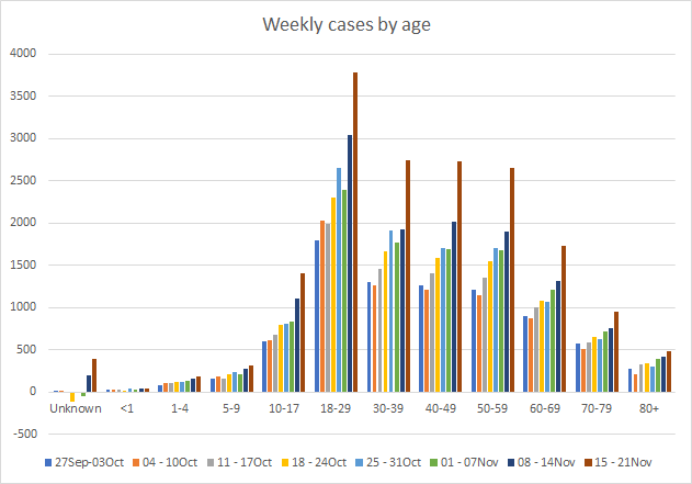
Cases are skyrocketing for young adults aged 18-29. They’ve increased 111% since the last week of September. So I would be very cautious about welcoming your college students home for the Thanksgiving break and end of the semester. Follow the most recent CDC guidance, functioning as though the college student coming home is not part of your existing household for the first 14 days. This will be super weird and uncomfortable. But it’s not forever, so hang in there. We also see concerning increases among 30-59 too. Thankfully, the case increase is relatively small for those >70 but they are still trending up and that is cause for concern. The cases among 10-17 year old children have increased 70% in the past two weeks. But another thing that makes me nervous is that we are seeing increases in the past two weeks in the number of cases in the “unknown” category. This is a holding area while cases are pending investigation by contact tracers. So when this category increases, it might suggest that contact tracers are getting overwhelmed by the influx of new cases.
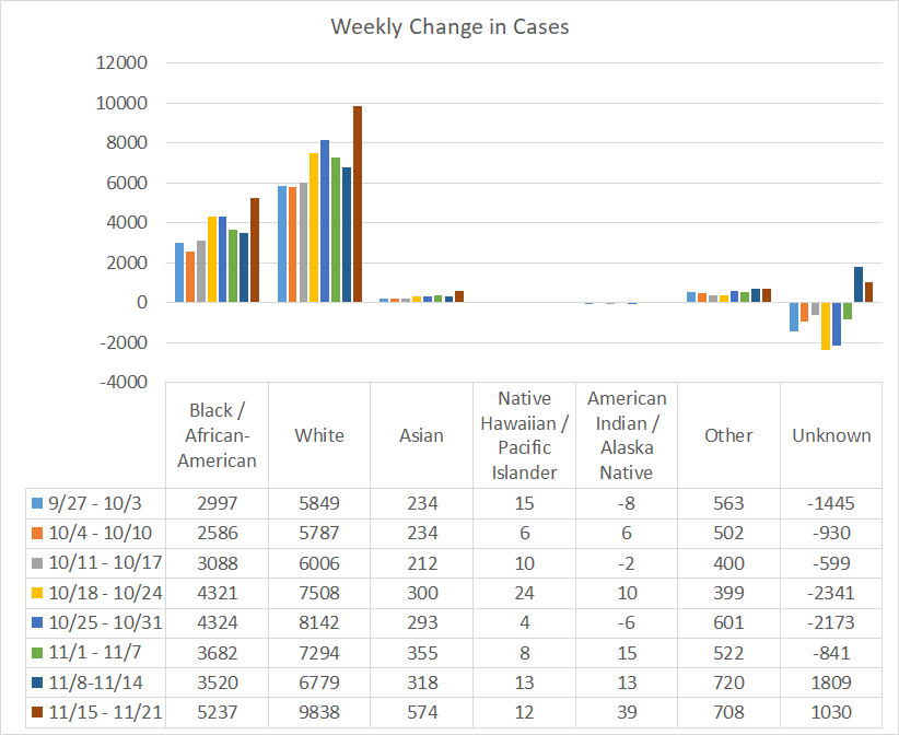
If we look at a similar graph below that shows the timeline for different races, we can see the same anomaly in the “unknown” category, although not to the same degree. The races that saw increases compared to the previous week were Black / African-American, White, Asian and American Indian / Alaska Native. Again, this graph is based on PCR-identified cases only. Antigen test-identified cases are not included in these race totals provided by DPH.
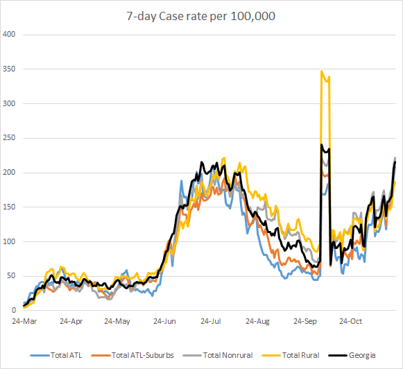
This next graph is going to look different than the graph provided by DPH because I’m factoring in the antigen test-identified cases. Ignore the weird peak around 06Oct. That’s when DPH first started providing antigen test-identified cases, dumping all of the cumulative cases to date. Pay attention to the trends that happened after. The statewide average (black line) is trending up sharply. In fact, the case rates per 100,000 people are increasing across all county types. The case rate for the state is back to where we were at the height of the summer surge. Going forward, I expect we will be setting new records daily until we decide to put our community’s needs ahead of our own and flatten this curve.
In fact, by only looking at the PCR-identified cases, the DPH website is giving a rosier outlook than reality might indicate for all of their graphs and maps and with each passing day, their maps and graphs carry less and less meaning or value. It doesn’t make sense that the DPH can herald the arrival of 207,000 antigen tests saying, “Having these rapid tests available will help us quickly identify people who are sick, isolate them, and prevent further spread of COVID-19 among families, close contacts and entire communities,” and then ignore the cases that those tests identify. Not including the antigen tests in the data visualizations and demographic data makes it difficult for Georgians to see where the pandemic is most intense. Considering how many governmental and civic organizations depend on the DPH numbers for decision making, it is absolutely vital that the website provide the antigen data for every graph, map and table. In addition, the CDC now includes antigen cases in their total case count for Georgia. So if the antigen cases are trustworthy enough for the CDC, they probably should be for the state of Georgia too.
To give a more realistic estimate of disease trends, I’ve mapped 14-day case rate per 100,000 for each Georgia county below, using both PCR and Antigen test-identified cases. The left side shows the data as of last Sunday. The map on the right shows the data as of today. I recommend clicking on the map to see the live image for the current week where you can click or hover over a particular county of interest to get their value. The color for 200 cases per 100,000 (a threshold set by some school districts for when to pivot to virtual learning) is right at the transition from a salmon color to magenta. You’ll notice that many Georgia counties are at or above that threshold.

Hospitalizations
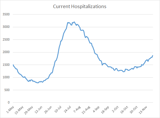
There were 816 Georgians newly admitted to the hospital for COVID-19 this week (+5.6% compared to last week) and 148 were admitted to the ICU (+13.8%). The number of patients currently hospitalized (shown below) has been trending up but hasn’t risen sharply yet like we saw during the summer surge. Hopefully that history doesn’t repeat here. Last week on Sunday there were 1634 currently hospitalized and that number was 10% higher than the previous week. Today the number of patients currently hospitalized is 1871 and that number is 14.5% higher than where we were a week ago. So we are seeing an increase and it is an even sharper increase than the week before.
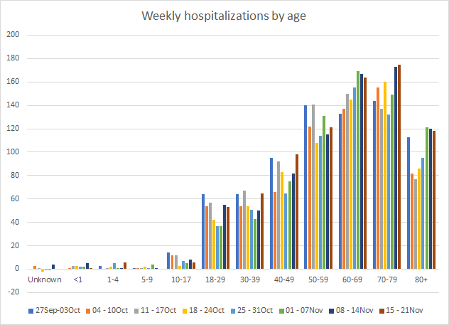
If we look at how hospitalizations have varied over time with age, we can see that this most recent week featured both increases and decreases in hospitalizations for many age groups. Hospital admissions increased for age groups 1-4, 30-59 and 70-79. Hospital admissions remain high for those 18-29, 60-69 and 80+. Again, this only considers hospitalizations among cases identified through PCR. DPH does not provide demographic data for antigen-identified cases at this time. One could argue that hospitalized patients are more likely to receive a PCR test than an antigen one, so it’s hard to say what impact *not* including the antigen case data here has. It really would be best just to have the most complete data that DPH has.
As of Saturday, there had been 6366 ICU admissions, or 18.7% of all COVID-19 hospital admissions. Of those ICU admissions, 2472 have died. So the mortality rate for COVID-19 illness that requires an ICU is 38.8%.
For our healthcare workers, there were 769 newly reported cases (+10.5%), 38 hospital admissions (+65%) and 2 newly reported deaths this week. All of these are large increases over the previous week. A reminder, our healthcare workforce is not an unlimited or renewable resource. Please limit your exposures to honor the risk that our healthcare workers are taking to care for the ill right now. Last spring, we saw people showing their support for healthcare workers by flashing their car lights and honking their horns in the hospital parking lot. Lately, the attitude seems to be that they should suck it up and deal. The Atlantic’s Ed Yong wrote a terrific essay, describing what it’s like to be a healthcare worker right now. I’d encourage you to read it.
Deaths
The number of new confirmed deaths (by date of report) is as follows. The percentage in parentheses indicates how the increase compares to Georgia’s cumulative total at the start of each window of time.
- 24 hours: 3 (+0.03%)
- 7 days: 165 (+1.9%)
- 4 weeks: 818 (+10.5%)
This week the number of deaths was a decrease of 103 compared to the week before (268 deaths). The current statewide total is 8627 and of those, 9.5% were reported in the last 4 weeks alone. The case fatality rate is 2.13% if PCR-based cases alone are considered. If the antigen test cases are also considered, then the case fatality rate is 2.05%. The case fatality rate has been falling for the past four weeks with the increase in cases to dilute the deaths. During the summer surge, eventually deaths increased too and the case fatality rose again as a result. We’ll have to see what happens with this surge.
As for cases and hospitalizations, here is a graph of deaths by age over time. As you get to the next age group, the timeline starts over. A reminder, this graph is built using data for deaths among PCR-identified cases only.
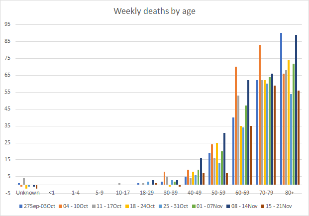
This week we saw decreases in deaths for every age group. Deaths are a lagging indicator compared to cases, usually by about 3 weeks.
Below you will find the updated 7-day death rate per 100,000 graph, showing how deaths have varied across county types. The statewide death rate is 35% lessthan where we were last Sunday. The rural death rate remains 62% higher than the state average. You can check to see how your county is classified by reviewing the table in this post.

References
https://dph.georgia.gov/covid-19-daily-status-report
https://covid-gagio.hub.arcgis.com/
https://amberschmidtkephd.substack.com/p/pcr-percent-positive-rate-by-county
https://www.theatlantic.com/health/archive/2020/11/americas-best-prepared-hospital-nearly-overwhelmed/617156/
https://www.cdc.gov/coronavirus/2019-ncov/daily-life-coping/holidays.html
Georgia COVID-19 Updates is a free newsletter that depends on reader support. If you wish to subscribe please click the link below. There are free and paid options available.
My Ph.D. is in Medical Microbiology and Immunology. I've worked at places like Creighton University, the Centers for Disease Control & Prevention and Mercer University School of Medicine. All thoughts are my professional opinion and should not be considered medical advice.