The Week in Review, 08-15Nov
Georgia COVID-19 Updates

Good afternoon! The question I’m asked most often by reporters is “how is Georgia doing this week?” To summarize where we are right now, I would say not where we want to be - cases, hospitalizations and deaths are all increasing. There might be indications that our contact tracing workforce is being overwhelmed. Our case rate is only 22% less than where we were at the height of the summer surge. And all of this is our situation before the winter holidays and before influenza season really gets going - two things that will likely exacerbate the pandemic for Georgia. That’s another reminder to go and get your flu shot if you haven’t already done so.
Combined Data
Let’s begin with looking at how cases, hospitalizations and deaths have changed weekly over time. The left y-axis for the graph below corresponds to cases (blue line). The right y-axis corresponds to the gray and orange lines (hospitalizations and deaths, respectively).

The combined case total for this week is roughly equal to last week. The previous week’s case total was probably an overcount because at that time we were still getting antigen case dumps on Mondays. Now we get antigen case data every day, so the data will hopefully be more consistently provided going forward. Hospital admissions increased this week (773 compared to 748 the previous week) and deaths also increased (268 compared to 213 the previous week).
Testing
This week we saw a modest increase in PCR test output with a total of 153,326 tests reported (+2.3% compared to last week). The positive rate for all of the PCR test results reported this week through electronic laboratory reporting (ELR) was 8.3%. Looking back to early October, our positive rate has increased 51% in just a month. During that same time, testing output increased only 15.8%. So the disinformation that we are seeing more cases because we are doing more testing is simply not supported by the data coming from Georgia.

It’s important to remember that we do not receive any data regarding total tests performed nor positive rate for antigen tests. This week, there were 5057 newly reported cases that were identified using antigen tests, of the 18,928 of total cases for the week. In other words, this week the antigen test identified 27% of this week’s reported cases.
Cases
The number of combined new cases (by date of report) is as follows:
- 24 hours: 1952 by PCR + 132 by antigen = 2084 (+0.5%)
- 7 days: 13,871 by PCR + 5057 by antigen = 18,928 (+4.7%)
- 4 weeks: 84,431 (+24.8%)
The new statewide total is 424,989, combining PCR and antigen-test identified cases. Bear in mind that these case totals are likely an under count of our actual case count - it’s a problem that plagues public health for multiple diseases and especially so when a disease has so many asymptomatic cases, as COVID-19 does.
The graph below shows how each week’s cases have been distributed by age according to PCR-based testing alone. Each bar represents a separate week. This kind of graph lets us look at timelines for each age group at the same time. Note, the Department of Public Health does not yet include antigen-identified cases in their demographics data table or graph. This week, antigen-identified cases made up 27% of the week’s newly reported cases. So there is a lot of data we aren’t seeing. But the graph below shows what we *do* know, based on PCR-based testing. The red bar is the most recent week and, again, this is just PCR-based data.
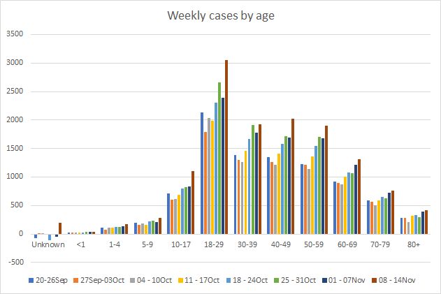
This week, we see increases for every age group and the increase is most dramatic over the past 8 weeks for 18-29 year olds where cases have increased 42%. A reminder, this is how the summer surge began too - with dramatic increases in the 18-29 year olds that gradually spread to the older and more medically vulnerable. There’s also a big jump just this week for children aged 10-17, increasing 33%. It’s interesting that the biggest increases were seen among those 10 - 29. We’re about two weeks past Halloween at this point. So could Halloween parties and other indoor celebrations be contributing to this big spike? It’s possible, but there were a lot of things that were contributing to disease about two weeks ago, including Halloween, Homecoming, the election (more for the 18-29 year olds), and just general pandemic fatigue. I think it will be hard to identify a single factor that contributed more than the others. But the timing is curious. I also want you to note the increase this week in the unknown category. For the past 8 weeks, there have been few big increases in this category - in fact, most weeks we’ve seen that contact tracers are clearing the backlog. I’m wondering if the reason we’re seeing a larger than typical increase this week is a sign that our contact tracers are beginning to become overwhelmed with cases - something that doesn’t bode well for the coming weeks to months.
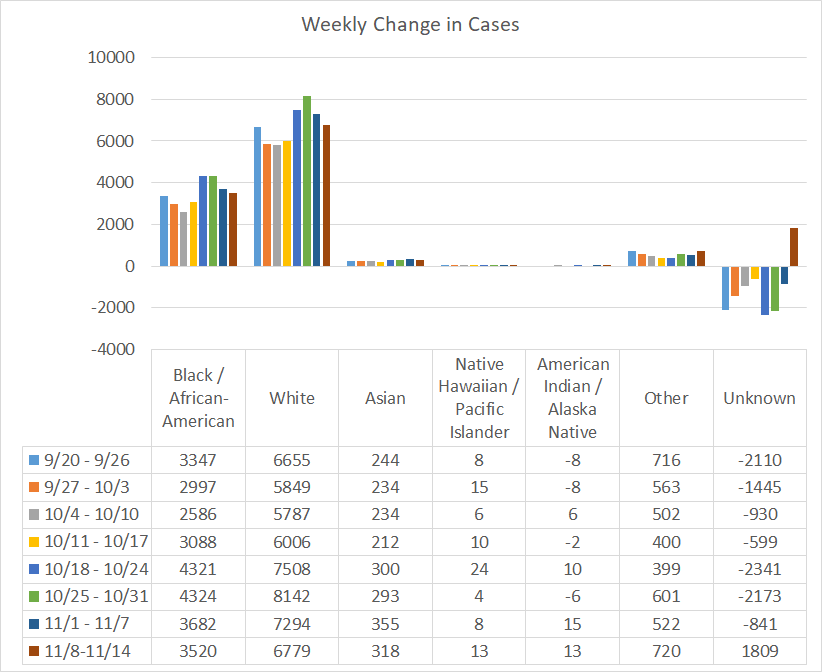
If we look at a similar graph below that shows the timeline for different races, we can see the same anomaly in the “unknown” category. The races that saw increases compared to the previous week were Native Hawaiian / Pacific Islander, and “Other” which includes the majority of those who identify as Hispanic or Latinx. Again, this graph is based on PCR-identified cases only. Antigen test-identified cases are not included in these race totals provided by DPH.
The case rates per 100,000 people are increasing across all county types. The statewide average (black line) is trending up sharply. Ignore the weird peak around 06Oct. That’s when DPH first started providing antigen test-identified cases, dumping all of the cumulative cases to date. Pay attention to the trends that happened after. The statewide case rate is 22% less than where we were at the height of the summer surge on 28Jul. This graph is going to look different than the graph provided by DPH because I’m factoring in the antigen test-identified cases. In fact, only looking at the PCR-identified cases, the DPH website is giving a rosier outlook than reality might indicate for all of their graphs and maps. It doesn’t make sense that the DPH can herald the arrival of 207,000 antigen tests saying, “Having these rapid tests available will help us quickly identify people who are sick, isolate them, and prevent further spread of COVID-19 among families, close contacts and entire communities,” and then ignore the cases that those tests identify. Not including the antigen tests in the data visualizations and demographic data makes it difficult for Georgians to see where the pandemic is most intense. Considering how many governmental and civic organizations depend on the DPH numbers for decision making, it is absolutely vital that the website provide the antigen data for every graph, map and table.

I’ve mapped 14-day case rate per 100,000 for each Georgia county below, using both PCR and Antigen test-identified cases. I recommend clicking on the map to see the live image where you can click or hover over a particular county of interest to get their value. The color for 200 cases per 100,000 (a threshold set by some school districts for when to pivot to virtual learning) is right at the transition from a salmon color to magenta. You’ll notice that many Georgia counties are at or above that threshold.

Hospitalizations
There were 773 Georgians newly admitted to the hospital for COVID-19 this week (+3% compared to last week) and 130 were admitted to the ICU. The number of patients currently hospitalized (shown below) has been trending up but hasn’t risen sharply yet like we saw during the summer surge. Hopefully that history doesn’t repeat here. Today the number of patients currently hospitalized is 1634 and that number is 10% higher than where we were a week ago.

If we look at how hospitalizations have varied over time with age, we can see that this most recent week featured both increases and decreases in hospitalizations for many age groups. Hospital admissions increased for age groups <1, 10-49 and 70-79 year olds. Hospital admissions remain high for those 60-69 and 80+. Again, this only considers hospitalizations among cases identified through PCR. DPH does not provide demographic data for antigen-identified cases at this time.

Here’s how new hospital admissions have varied for different races over the past five weeks. We see increases for people classified as “other.”

For our healthcare workers, there were 696 newly reported cases, 23 hospital admissions and 0 newly reported deaths this week. A reminder, our healthcare workforce is not an unlimited or renewable resource. Please limit your exposures to honor the risk that our healthcare workers are taking to care for the ill right now.
Deaths
The number of new confirmed deaths (by date of report) is as follows. The percentage in parentheses indicates how the increase compares to Georgia’s cumulative total at the start of each window of time.
- 24 hours: 0 (+0%)
- 7 days: 268 (+3.3%)
- 4 weeks: 824 (+10.8%)
This week the number of deaths was an increase of 55 compared to the week before (213 deaths). The current statewide total is 8462 and of those, 9.7% were reported in the last 4 weeks alone. The case fatality rate is 2.19% if PCR-based cases alone are considered. If the antigen test cases are also considered, then the case fatality rate is 2.11%. The case fatality rate has been falling for the past four weeks with the increase in cases to dilute the deaths.
As for cases and hospitalizations, here is a graph of deaths by age over time. As you get to the next age group, the timeline starts over. A reminder, this graph is built using data for deaths among PCR-identified cases only.

This week we saw increases in deaths for every age group over 40 years of age as well as those 18-29. Deaths are a lagging indicator compared to cases, usually by about 2-3 weeks. So seeing that this week’s deaths are higher than last week’s is not unsurprising. We might expect each week over the next month to continue that death increase, if this new surge of illness operates like the summer one and as it is unfolding currently throughout the rest of the country. Hopefully Georgia can be the unicorn here and avoid that surge in deaths that follows surges in cases. Next, let’s look at how the most recent week’s deaths were distributed by race.

Deaths were nearly equal to last week for the White population. But increases were noted for Black / African-American, and Other race. Below you will find the updated 7-day death rate per 100,000 graph, showing how deaths have varied across county types. The statewide death rate is 23% higher than where we were last Sunday. The rural death rate remains 77% higher than the state average. The death rate has ticked up across all county types but less so for nonrural counties outside of the Atlanta metro. You can check to see how your county is classified by reviewing the table in this post.

References
https://dph.georgia.gov/covid-19-daily-status-report
https://covid-gagio.hub.arcgis.com/
https://amberschmidtkephd.substack.com/p/pcr-percent-positive-rate-by-county
Georgia COVID-19 Updates is a free newsletter that depends on reader support. If you wish to subscribe please click the link below. There are free and paid options available.
My Ph.D. is in Medical Microbiology and Immunology. I've worked at places like Creighton University, the Centers for Disease Control & Prevention and Mercer University School of Medicine. All thoughts are my professional opinion and should not be considered medical advice.
Hi! I saw a map of COVID in the US on CNN and it showed Georgia as being 50% better in terms of cases than last week. The reporter noted that this was potentially due to a reporting error. Do you know anything about this reporting error? The source is listed as Johns Hopkins University. The video I'm referring to is here: https://www.youtube.com/watch?v=2D4WaeuloM4. Thanks!