The Week in Review, 08-14Mar2021
Georgia COVID-19 Updates

I’ve got a lot of good, downward trends this week. So this update will be shorter than usual. Enjoy the break.
Combined Data
The graph below shows how four of our big metrics for tracking the COVID-19 pandemic are tracking over time. Cases are represented by the blue line and correspond with the left y-axis. All other metrics correspond with the right y-axis. The reason I graph all of these things together is so that we can see the way these things trend together (or differently) over time.

This week everything decreased. Hospitalizations finally saw a big decrease to reflect what’s been happening with cases. For ICU admissions, this was the lowest weekly total I have recorded since the state started providing those data.
The table below shows us a year’s worth of COVID-19 impact by age group. Keep in mind, we only have data for PCR cases and the deaths reported here are only confirmed deaths. The Georgia DPH does not provide demographic data for antigen cases or probable deaths. In the top section you see the total counts for cases hospitalizations and deaths. Then you see the hospitalization rate and case fatality rate for each age group. This means, of all the cases we’ve identified, how many of them ended up in the hospital or how many of them died. You’ll notice that case fatality rate (CFR) is zero or near zero for all pediatric age groups. Then it increases with age starting at 18-29. Among those 80+, one in five cases resulted in death. One in three of these people ended up in a hospital. The CFR for those 80+ is 207 times higher than that for an 18-29 year old.

In the colorful section, I’ve grouped age groups together into children, younger adults and senior citizens. You will see the hospitalization rate and case fatality rate here too. But an additional calculation provided here is proportion of cases/hospitalizations/deaths. This means of all the hospitalizations or deaths that have taken place, how many of them are from that age group. Younger adults contributed the majority of the cases that we’ve tracked so far, at 68.8%, but they weren’t the ones who suffered the greatest consequences. Even though senior citizens accounted for only 19.4% of the PCR cases reported to date, they experienced 85.3% of the deaths. When considering proportion of hospitalizations, there was a smaller disparity between seniors and younger adults (55.6% versus 42.3%).
Testing
The PCR test output trend over time can be seen in the graph below, represented by the blue line that corresponds with the left y-axis. The red line represents the test positivity rate over time, and corresponds with the right y-axis. The gray dashed line is the goal line for test positivity.
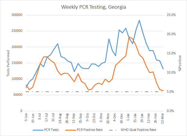
This week we saw a 16.6% decrease in PCR testing output (blue line above). The PCR test positivity rate still hasn’t cracked the 5% threshold but it is really close, 5.3% for the week. Remember, the goal is to be at or below 5% for a sustained period of time. If we can achieve that, it’s a good indication that we are unlikely to be missing cases. When we do drop below 5%, the real challenge is staying below that number. On a weekly basis, Georgia has never dropped below 5%. The state has come very close but then reverses quickly. Let’s hope things are different this time.
For antigen testing, there were 60,590 tests reported through Electronic Laboratory Reporting (ELR) and that was a 30% drop from the previous week. Of the antigen tests reported, 5.9% were positive.
However the DPH still does not provide data regarding demographic details for cases identified by the antigen test. Keep that in mind as we go through the demographic data in the following sections. You’re only seeing part of the data. Meanwhile, antigen testing identified 30.6% of the cases this week.
Cases
The number of combined new cases (by date of report) is as follows:
- 24 hours: 788 by PCR + 31 by antigen = 819 (+0.08%)
- 7 days: 7148 by PCR + 3151 by antigen = 10,299 (+1%)
- 4 weeks: 44,705 by PCR + 24,344 by antigen = 69,049 (+7.2%)
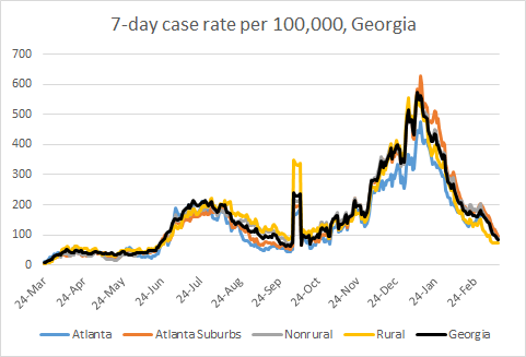
The new statewide total is 1,033,786, combining PCR and antigen-test identified cases. In the graph below, I show the Georgia cases by date of report for both PCR and antigen cases for each county type. Ignore the big bump around 11Oct - that was a data dump of antigen cases. You can check how your county is classified here. The case rate has leveled off over the past week which is not great news. The state’s case rate is starting to descend again, but it seems that the large drops in case rate are over for now. At this point, the state case rate is 119% higher than the pre-winter surge baseline.
Demographically, cases dropped this week for every age group and every race. So I won’t show those data today.
Hospitalizations
The number of new hospital admissions (by date of report) is as follows:
- 24 hours: 27 new COVID-19 admissions, 3 admissions to the ICU (weekend reporting is typically light)
- 7 days: 564 new COVID-19 admissions, 94 ICU admissions
- 4 weeks: 3982 new COVID-19 admissions, 597 ICU admissions
The graphic below shows us the Georgia Emergency Management Agency hospital regions. The table on the right tells you how each region is doing with respect to usage of their available ICU beds and how their COVID-19 patient population compares to their overall patient population. These numbers are all based on data from the Georgia GIO COVID-19 data hub.

There are no hospital regions that are using >90% of its ICU beds. Most of the state is in the yellow or green category for COVID-19 patient census, or how much of the total hospitalized population is there for COVID-19 treatment. There are just two hospital regions (F and N) in the orange zone. For COVID-19 patient census, eleven of the fourteen hospital regions have returned to their pre-winter surge baseline (A-C, E, G - M). This is all good news for now. But decreases in patient census have slowed and plateaued or are increasing slightly for 10 of the 14 regions. These plateaus might be temporary, or they may be our new post-surge baseline. We need more time to know for sure.
Next, let’s look at the demographic details that we have for hospitalizations. Only one age group saw an increase this week and it was children aged 1-4.

ICU admissions are generally heading down for most groups based on race. The only group that saw an increase was Native Hawaiian / Pacific Islanders and it was a small increase (one person over the week).
Deaths
The number of new confirmed deaths (by date of report) is as follows. The percentage in parentheses indicates how the increase compares to Georgia’s cumulative total at the start of each window of time.
- 24 hours: -1 (there must have been a data correction), 0 probable deaths
- 7 days: 273 (+1.8%), 36 probable deaths
- 4 weeks: 1907 (+13.7%), 437 probable deaths
This week the number of confirmed deaths decreased by 48% compared to the previous week. The graph below shows how the 7-day death rate per 100,000 residents has trended over time for each county type. The state death rate is 51% below the peak during the summer surge and 42% above the pre-winter surge baseline. The death rate is worst for rural counties and best for nonrural counties outside of the Atlanta metro.

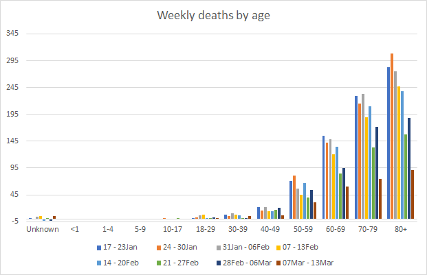
Next, let’s look at the demographic data for this week’s deaths. After a spike last week that impacted multiple age groups, deaths are down for most age groups this week. The exception is adults aged 30-39 years of age, who saw an increase this week.
If we consider race, all groups saw decreases in death this week with the exception of Asians who saw a small increase.
This is all really good news, of course! But we need to keep things moving downward. Please work on getting your COVID-19 vaccine. Or if you’re already vaccinated or currently ineligible, work to help the people around you to get vaccinated.
That’s it for today. I will be back tomorrow to discuss how the state fits into the national and global context.
References
https://dph.georgia.gov/covid-19-daily-status-report
https://covid-gagio.hub.arcgis.com/
https://beta.healthdata.gov/dataset/COVID-19-Community-Profile-Report/gqxm-d9w9
https://healthdata.gov/dataset/covid-19-reported-patient-impact-and-hospital-capacity-state
Georgia COVID-19 Updates is a free newsletter that depends on reader support. If you wish to subscribe please click the link below. There are free and paid options available.
My Ph.D. is in Medical Microbiology and Immunology. I've worked at places like Creighton University, the Centers for Disease Control & Prevention and Mercer University School of Medicine. All thoughts are my professional opinion and should not be considered medical advice.