
Combined Data
The graph below shows how four of our big metrics for tracking the COVID-19 pandemic are tracking over time. Cases are represented by the blue line and correspond with the left y-axis. All other metrics correspond with the right y-axis. The reason I graph all of these things together is so that we can see the way these things trend together (or differently) over time.
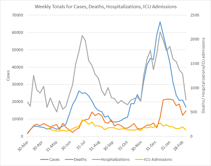
This week everything but deaths decreased. Hospitalizations finally saw a big decrease to reflect what’s been happening with cases. For deaths, I don’t think the increase this week is any reason to panic. We didn’t see a straight line down after the summer surge either.
Testing
The PCR test output trend over time can be seen in the graph below, represented by the blue line that corresponds with the left y-axis. The red line represents the test positivity rate over time, and corresponds with the right y-axis. The gray dashed line is the goal line for test positivity.

This week we saw PCR testing output that was nearly equal to the previous week. But the best news we see in the graph below is that the weekly test positivity rate was 5.6%. Remember, the goal is to be at or below 5% for a sustained period of time. If we can achieve that, it’s a good indication that we are unlikely to be missing cases. When we do drop below 5%, the real challenge is staying below that number. On a weekly basis, Georgia has never dropped below 5%. The state has come very close but then reverses quickly. Let’s hope things are different this time.
For antigen testing, there were 33,752 tests reported through Electronic Laboratory Reporting (ELR) and that was an 8% drop from the previous week. Of the antigen tests reported, 7.9% were positive.
However the DPH still does not provide data regarding demographic details for cases identified by the antigen test. Keep that in mind as we go through the demographic data in the following sections. You’re only seeing part of the data. Meanwhile, antigen testing identified 42% of the cases this week.
Cases
The number of combined new cases (by date of report) is as follows:
- 24 hours: 939 by PCR + 770 by antigen = 1709 (+0.2%)
- 7 days: 9,820 by PCR + 7,146 by antigen = 16,966 (+1.7%)
- 4 weeks: 55,358 by PCR + 27,138 by antigen = 82,496 (+8.8%)
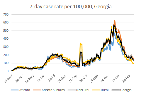
The new statewide total is 1,023,487, combining PCR and antigen-test identified cases. In the graph below, I show the Georgia cases by date of report for both PCR and antigen cases for each county type. Ignore the big bump around 11Oct - that was a data dump of antigen cases. You can check how your county is classified here. The case rate has leveled off over the past week which is not great news. The state’s case rate is starting to descend again, but it seems that the large drops in case rate are over for now. At this point, the state case rate is 119% higher than the pre-winter surge baseline. As the more transmissible variant is expected to become widespread and dominant in Georgia in March, this is a precarious position for the state to be in right now. We likely have at least one more surge to go before enough people are vaccinated to start our steady march down for good - even if the more transmissible variant wasn’t here. What we’ve seen happen in the past is that Georgia surges and then levels off at a higher baseline, each time. As a consequence, each new surge is bigger than the ones that preceded it.
The next two graphs show us some of the demographic details of those who are getting sick and testing positive. In each graph, you’re looking at 8-week timelines for each age group side by side.

This week we saw decreases in cases for every age group - a thing of beauty! You can also see cases decreasing across races in the graph below. However, the rate of descent is not the same for all groups.

Hospitalizations
The number of new hospital admissions (by date of report) is as follows:
- 24 hours: 35 new COVID-19 admissions, 3 admissions to the ICU (weekend reporting is typically light)
- 7 days: 758 new COVID-19 admissions, 137 ICU admissions
- 4 weeks: 4955 new COVID-19 admissions, 665 ICU admissions
According to the US Department of Health and Human Services, they’re tracking that Georgia currently has 2552 patients hospitalized for COVID-19, a decrease of 21% compared to a week ago. According to HHS, there are 54 children currently hospitalized for COVID-19 in Georgia.
The graph below shows daily COVID-19 hospital admissions in Georgia with the orange dashed line representing the 7-day moving average to help us see the trend through the noise.
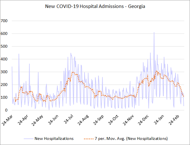
New admissions are just about back to the pre-surge baseline. Looking back, we can see that the winter surge had a spike that topped 600 admissions in a day, but otherwise the 7-day average reached a similar height as the summer surge. But the winter surge was more prolonged at that high level. Thank goodness it’s over. Let’s work together to make sure it doesn’t happen again, especially as we wait to vaccinate everyone.
The graphic below shows us the Georgia Emergency Management Agency hospital regions. The table on the right tells you how each region is doing with respect to usage of their available ICU beds and how their COVID-19 patient population compares to their overall patient population. These numbers are all based on data from the Georgia GIO COVID-19 data hub.

There is only one hospital region that is using >90% of its ICU beds - region L. But Region L’s COVID-19 patient census is in the green zone. So whatever is taking up its ICU beds is not COVID-19 related. Most of the state is in the yellow or green category for COVID-19 patient census, or how much of the total hospitalized population is there for COVID-19 treatment. There are just two hospital regions (F and N) in the red zone. For COVID-19 patient census, eight of the fourteen hospital regions have returned to their pre-winter surge baseline (B, C, G - J, L and M).
Next, let’s look at the demographic details that we have for hospitalizations.

We can see that hospital admissions dropped in a big way for those 60+. This could be due, in part, to the vaccine but also lower case counts and transmission rates in the community. Hospital admissions also declined for younger adults but to a lesser extent. They increased for children 5 - 17 years old.
ICU admissions are generally heading down for many groups based on race. However, we see that they’ve been increasing over the past 3 weeks for Asians. I suspect this may be an issue of delayed reporting or better data follow up (i.e. re-sorting people out of the “unknown” category) because we don’t see a matching increase in cases or hospitalizations for this group.

Deaths
The number of new confirmed deaths (by date of report) is as follows. The percentage in parentheses indicates how the increase compares to Georgia’s cumulative total at the start of each window of time.
- 24 hours: 1 (+0.01%), 0 probable deaths
- 7 days: 530 (+3.5%), 81 probable deaths
- 4 weeks: 2272 (+17%), 542 probable deaths
This week the number of confirmed deaths increased by 22% compared to the previous week. However, I don’t think this is cause for alarm. The previous week saw some atypically low death reporting and some of the increase this week is likely an artifact of catching up. Also, increases and decreases don’t often follow a perfectly straight line. The graph below shows how the 7-day death rate per 100,000 residents has trended over time for each county type. The state death rate is 5% below the peak during the summer surge but 177% above the pre-winter surge baseline. The death rate is worst for rural counties and best for the Atlanta suburb counties.

Next, let’s look at the demographic data for this week’s deaths. Deaths increased for every adult age group. Again, some of this is likely an artifact of delayed reporting in the previous week.

If we look at race, the only groups that did not see an increase in deaths in the past week are American Indian / Alaska Native and the “unknown” category.

So, all in all, there’s a lot of really good news this week as far as trends go. However, I would feel far more comfortable if we saw a further decrease in case rate in the coming weeks, getting closer to the pre-winter surge baseline. In the meantime, please work on getting your COVID-19 vaccine. Or if you’re already vaccinated or currently ineligible, work to help the people around you to get vaccinated.
That’s it for today. I will be back tomorrow to discuss how the state fits into the national and global context.
References
https://dph.georgia.gov/covid-19-daily-status-report
https://covid-gagio.hub.arcgis.com/
https://beta.healthdata.gov/dataset/COVID-19-Community-Profile-Report/gqxm-d9w9
https://healthdata.gov/dataset/covid-19-reported-patient-impact-and-hospital-capacity-state
Georgia COVID-19 Updates is a free newsletter that depends on reader support. If you wish to subscribe please click the link below. There are free and paid options available.
My Ph.D. is in Medical Microbiology and Immunology. I've worked at places like Creighton University, the Centers for Disease Control & Prevention and Mercer University School of Medicine. All thoughts are my professional opinion and should not be considered medical advice.