I’d like to begin this week with a discussion of some recent controversy. The tweet below is going viral and I’m being tagged in a lot of social media posts and also seeing my maps alongside this tweet. Full disclosure, I work with the state of Georgia including the Department of Public Health as a volunteer advisor to the COVID-19 Data Task Force. Part of my role is advising them on data visualizations like the maps we’re going to discuss today. That being said, I’m an advisor but not ultimately the decision maker. So let’s unpack some things that are going on here.

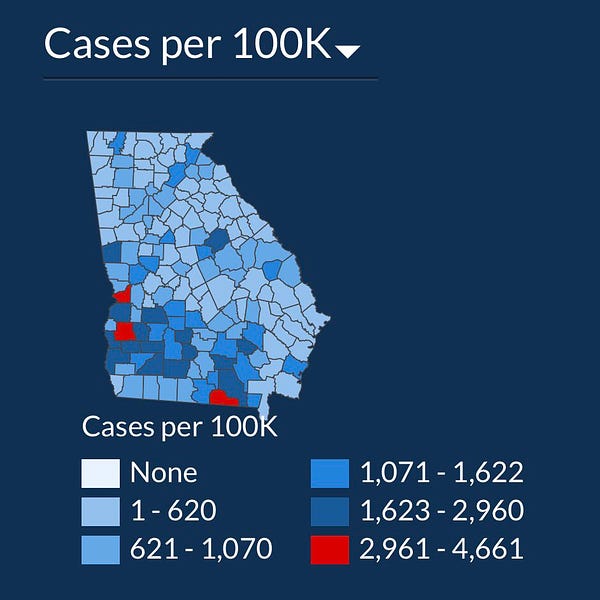
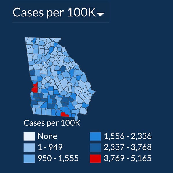
First, we have to make sure we have the right data set in order to answer a question. If the goal is to see how disease has intensified recently, then time is an important factor. To be honest, I skip right past the maps on the Georgia DPH website and have been since probably mid-May. The maps don’t have as much value anymore because they are showing cumulative data. As a result, southwest Georgia (i.e. Albany) will continue to look like a hot spot for a long time on their graphs, because of the spikes they saw in April. I would argue that the way the pandemic was moving in April is interesting from a historical perspective, but not very actionable and not very useful in making decisions in July. So instead of looking at data from the beginning of February to present, I think it is best to look at more recent data. There’s some argument over whether that should be 7 days, 14, days, 30 days. I feel pretty safe in using 14-day trends. I think 7 days is too short because it is more unstable and vulnerable to variations in testing output. I think 30 days is too long, because we’ve seen disease surge and then subside as the public grows more aware of a problem in their area. For example, when cases and hospitalizations surged in Glynn county, some of the area restaurants and bars voluntarily closed - limiting transmission of the illness. To me, 14 days seems long enough to give us a stable look at where the hot spots are.
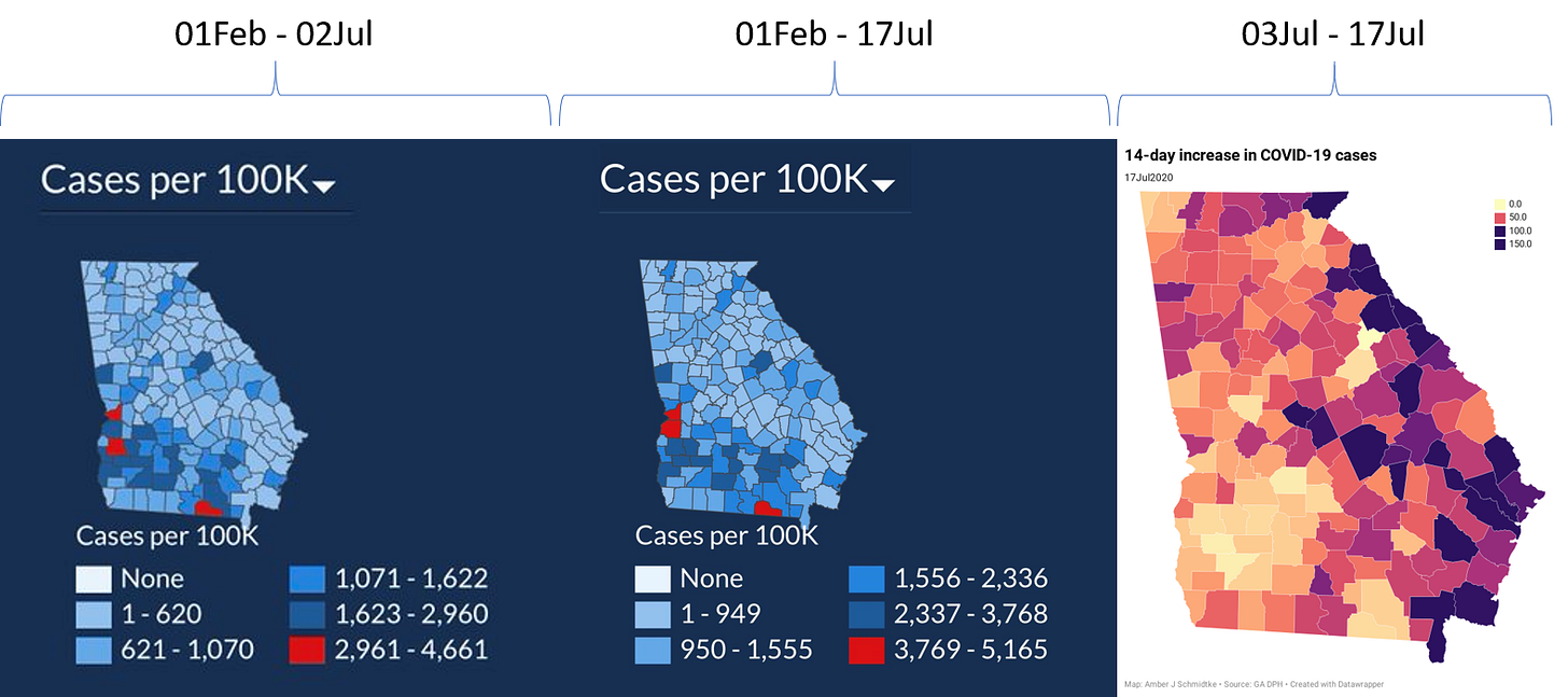
So as you can see, my map (purple, on the right) looks a LOT different than the ones on the DPH site. If we really want to get upset about something with the state and Department of Public Health, we should be demanding more timely maps that better account for what is happening on the ground now. I’ve been arguing for this for a while, along with several of my colleagues within the DPH.
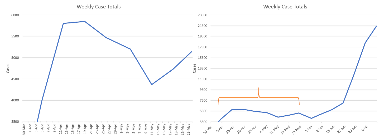
Second, I agree with the anger that it seems like the state is moving the goalposts of what counts as significant disease burden. Disease burden impacts nearly every industry in our state and decision makers need timely data. However, how to color code and adjust the scales is going to be an ongoing problem since we have an ever-expanding pandemic and no effective policy or strategy in place to slow it down. There is a balance that needs to be achieved between allowing us to see how bad things really are and also allow discrimination of intensity above the “bad” threshold. This is not all that different from changing the y-axis on a graph because the numbers get to large for the existing graph to accommodate. Consider the graphs (mine) below. The second graph has an orange-bracketed section that highlights the time frame of the first graph. Looking at the number of cases per week through the end of May, it made sense to use a y-axis that stopped at 6000. But this is a rapidly expanding outbreak of disease and our numbers are skyrocketing. So the scale has to adjust at some point to reflect that. If I had kept the y-axis at 6000, the trends we have seen recently where last week’s case total was ~21,500 would be invisible to us.
Perhaps the answer is to change the color code once 30% of the counties all fit into the top category, but I agree that the state can do more to prepare and educate the public about these mileposts that prompt them to change the color coding. I think the public can appreciate that eventually the scales will have to adjust because the pandemic doubles in size (as I’ll discuss in this week’s review). However, to do so without talking about it does give the appearance that there’s something to hide - regardless of whether that’s true. But moreover, I think we are asking the wrong data set to address a question that it simply can’t answer. To summarize, I want the public to demand more from the state in terms of data. Let’s just make sure we’re demanding the right data that can best aid us in decision making.
Cases
In the first graph below you'll see cumulative cases to date broken down by county type. Previously, I’ve shown this graph since the beginning of the pandemic, but I have since truncated it to when we reopened the state on 24Apr. I've marked the last four weeks with blue arrows.
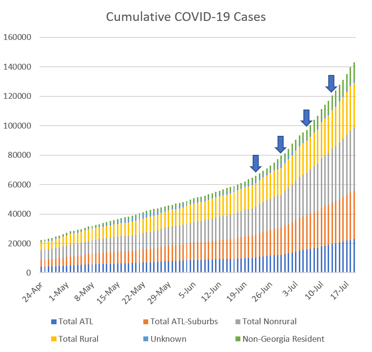
The number of new cases (by date of report) is as follows:
- 24 hours: 3,251 (+2.3%)
- 7 days: 26,197 (+22.4%)
- 4 weeks: 78,422 (+117.1%)
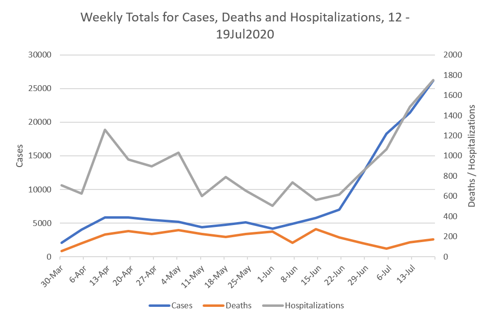
The 7-day and 4-week increases are new records for Georgia. In fact, the 4 week total tells us that the pandemic has doubled in the past month across the state. Unfortunately, there is no statewide policy or strategy in place right now to slow this down or interrupt transmission. The new statewide total is 143,123. So 54.8% of all the cases for Georgia were reported in the past month, telling you just how big this past month has been. In the next graph, I've graphed the total number of cases (blue), deaths (orange) and hospitalizations (gray) per week. Note that because the numbers of hospitalizations and deaths are smaller than our very large case count, they are graphed using the right side y-axis. This was the highest weekly increase for cases since the pandemic began and it continues a trend that started the week of 22June. Interestingly, the surge in cases is consistent with the surge in hospitalizations.
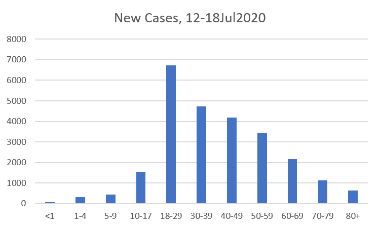
Here’s how the new cases from July 12-18 were distributed, according to age. As you can see, cases are being identified most in the younger adult population.
Hospitalizations
This week there were 1760 new hospitalizations for COVID-19 between July 12-18. Here’s how they were distributed by age. We see what looks like a nearly bell-shaped curve that is centered around the 50 - 59 year old age category.
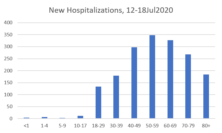
What I think we need to take away from this graph is that this is not just a severe disease for the elderly. And I presented data earlier this week that shows that those who do require hospitalization often suffer long term complications and symptoms. This is not a benign infection.
Deaths
The number of new deaths (by date of report) is as follows:
- 24 hours: 5
- 7 days: 172
- 4 weeks: 530
The new statewide total is 3173. So 16.7% of the total deaths to date took place in the past month (a decrease from last week). The statewide case fatality rate is 2.22%, also a decline from last week. This is welcome news for now, but as we see cases and hospitalizations increase, brace for deaths to increase in the coming weeks. I desperately hope that I’m wrong.
Below you can see how this week’s newly reported deaths were distributed, according to age. There were no new pediatric deaths this week, thank goodness.
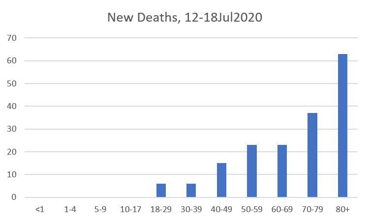
So cases are most common among the youngest adults (18 - 29), hospitalizations are most common among 50 - 59 year olds, and deaths are most common among those 80+, at least for this week.
During the week in review, I do a bit more of a deep dive on the fatality data. Starting with a statewide perspective, here’s where things are among those who have died. This week there has been a small shift in the mean age of death, from 73.7 to 73.5. Considering how top-heavy our deaths have been among the elderly in the past, seeing the mean decrease indicates that deaths are trending younger.

Note: the ? is indicated because Georgia Department of Public Health no longer provides age data for anyone over the age of 90. That makes it difficult to accurately calculate the mean, median, or characterize the range in age. 106 was the oldest individual identified before the DPH change.
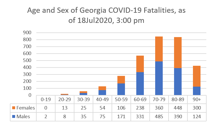
However, if we look at fatalities by age group, we see that there’s more to the story. The male:female predominance widens among those 30 - 79. Then it flip-flops and females comprise the majority of cases from 80 years and up. Deaths are most common in those aged 70 - 89. There has been just one pediatric death so far, in a 17-year old.
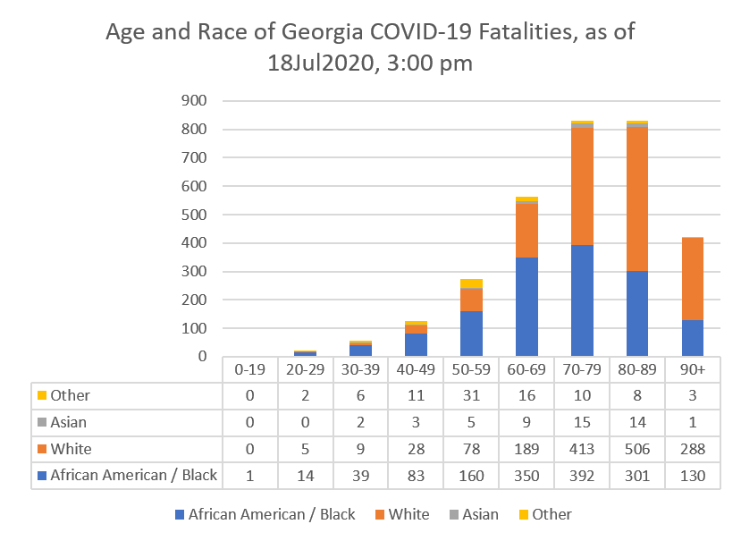
Next, let’s look at the fatalities by age and race. African-American or Black populations are disproportionately impacted by deaths, especially up to age 69.
Combined Data
Lastly, let’s look at how cases, hospitalizations and deaths have shifted among age groups. These data come from the demographics tab on the Georgia Department of Public Health website. Compared to a week ago, there is a shift in cases from those 60+ to younger populations, something we also observed last week.
The hospitalization rate has decreased for all age groups but, again, this may be a dilution due to the surge in cases - we should know whether this is real in a couple weeks. The case fatality rate has remained the same for adults 18 - 59 and decreased for those 60+. But this week, there has been a shift in the proportion of death toward younger adults. Last week, the 18 - 59 age groups comprised 14.7% of total deaths to date, but this week, they now comprise 15.4%. Considering how many deaths we’ve had so far, this seemingly small change is significant. Combined with the fact that our mean age of death has decreased from 73.7 to 73.5 tells us that our population of deaths is trending younger.

References
https://dph.georgia.gov/covid-19-daily-status-report
https://www.nytimes.com/interactive/2020/us/coronavirus-us-cases.html


Thanks for showing the differences in maps. It make much more sense. Why when comparing fatality data on Male vs Female and African American/Black vs White vs Asian do many only go to age 69 when the preponderance of deaths are over 69?
Besides a record number of cases, we also had a record number of tests. And - while the % positive is quite high, it’s finally showing signs of stabilization and possibly even easing back a bit. Any thought on this weeks test quantity and % positive?