Here we are, on the last day of September, closing out the sixth month of this pandemic for Georgia. In that time, a lot has happened as we’ve coped and learned more about the virus. As of today, we’ve had 318,026 cases of COVID-19 and this is likely an under count. There have been 28,522 Georgians hospitalized for COVID-19 including 5,269 ICU admissions. In total, there have been 7,021 deaths to date. Like cases, this is likely an under count too. Looking at how many deaths (of all causes) are above average for Georgia, the number up to 12September is 9030. As a state, we have gone through two surges so far, the second far greater than the first. And the declines we’ve seen in recent months are terrific. I’m pleased to see them. But our case rate and current hospitalization rate remain twice as high as they were prior to the summer surge. I say this to remind everyone that there’s a lot more disease circulating now than in June. Meanwhile, we are likely months away from a vaccine being widely available for the public and we are heading into influenza season. We had months to prepare for this. I hope our preparations were enough, I hope that people are getting their flu shot, and I hope that the public will follow public health guidance to curtail the spread of disease. I hope that our healthcare workers have not lost heart.
Speaking to friends and colleagues working in government, and particularly public health, morale is low. It’s hard to be in a position where you’re working as hard as you can, often times on nights and weekends, to get the people in your community the information they need to make good decisions in a pandemic…and then they don’t make good decisions. Meanwhile, we accumulate hospitalizations and deaths that might have been prevented. I think we can appreciate how hard that might be, to work in that situation. I bring these things up just to have a moment to pause and tell our healthcare workers and public health professionals that the work you are doing is important and regardless what the headlines say, you have a grateful public. You are doing incredibly important work. You matter and your work matters. This pandemic is a scientific problem with scientific solutions. We need you. Keep your chins up.
Today I’ll go over the latest information for Georgia and also the most recent White House Coronavirus Task Force report (hereafter abbreviated WHCTF). Speaking of which…I’ve been trying to get these documents for the states of Kansas and Missouri (my new area) and it has been a struggle. Some are publicly available through the Center for Public Integrity but there are gaps and I’ve been trying to fill them through Freedom of Information Act (FOIA) and open records requests. I know that Georgia DPH sometimes takes a beating in the press and I have had my share of frustrations also, but I have to say that our open records office is a lot better than other states I’m working with and I’m deeply appreciative. They are routinely able to send me the state report in a few hours after my request. Meanwhile, I’ve been waiting in excess of 7 days with both Kansas and Missouri. There’s also no easy way to route your FOIA to the White House Coronavirus Task Force itself. CDC says they don’t have the documents (seems odd since CDC director, Dr. Redfield, is on the task force). I’ve been on the phone with congressional committee staffers, governor’s general counsel, etc. It should not be this hard to get critical public health data for certain states when it’s robustly reported in other states. An ordinary person, trying to make informed decisions, does not have the time nor bandwidth to do this kind of pursuit. The 50 states report from the WHCTF should be available, in its entirety, to the public. Our tax dollars pay for that report and it’s critical to informed decision-making. Meanwhile, the WHCTF doesn’t even have a website.
To start us off, here is the summary table from the WHCTF for the most recent week. In their color coding red is bad, green is good. We’ll walk through each of these metrics and their context over time.

Testing
For the WHCTF, they note as I did on Sunday that after rebounding after a bad week of testing, Georgia declined slightly last week. Below you can see how total diagnostic (RT-PCR) tests performed per 100,000 residents compare between Georgia (blue) and the US (red). We have always underperformed compared to the national average. We have narrowed that gap at times but with this week’s information the gap has widened once again. Note this does not include antigen testing.

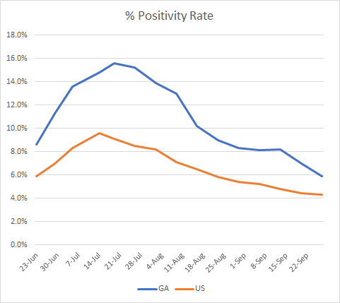
Our percent positive rate has outperformed the national average but we are much closer now than we ever have been. We’ve also come a very long way from our previous high (near 16%) in the time that these reports have been available.

For today, Georgia reported 22,846 newly reported test results today. Of those, 3410 were positive (14.9% positive). However, it appears that many of those were duplicates, because there was a net increase of 1720 new cases compared to yesterday’s total. Of today’s newly identified cases, 20% were reported prior to the 14-day window which is higher than it has been recently, but not abnormal. See what I mean in the graph below. The blue line shows the percentage of cases backdated prior to the 14-day window of uncertainty. The red dashed line is the trend line that helps us to see the trend through the noise of day to day variation. Our 20% today is consistent with where our trend was earlier this month.

Cases
Something great happened in the WHCTF report when it comes to case rate this week. Take a look at the graph below and notice what happened for Georgia relative to the national average.

For the first time in months, we are at or below the national average for case rate per 100,000.
There are currently 97 counties in the red, orange or yellow zone for cases (meaning, they’re on the WHCTF’s radar). This is the lowest number we’ve had since the WHCTF began including these lists in their reports. The dark blue line indicates the total number of counties of concern. The orange line looks a little strange (like data are missing) because that’s a distinction that only began in the WHCTF reports last week.

Today in Georgia, there was a net increase of 1720 newly identified cases. The largest single contributor was nonrural counties outside of the Atlanta metro. Next was rural counties, accounting for 25% of today’s new cases. Overall, the case rate per 100,000 continues to track downward. The new statewide total is 318,026. Today there were 181 newly reported infections among healthcare workers.
Hospitalizations
Starting with the WHCTF report, below you can see how hospital admissions among confirmed and suspected cases of COVID-19. The left y-axis corresponds to the red and blue lines for hospital admissions in total counts. The right y-axis corresponds to the gray line, identifying how many hospitals are reporting their data.

Our hospital reporting rate is very good and has been stable over the past month. That’s good because it means the data on hospitalizations are more trustworthy than say, the week of August 16th, when only 65% of hospitals were reporting. Admissions are declining for COVID-confirmed patients but leveling off for those suspected of having the disease who are waiting for pending test results. Overall, however, I think this is a good trend for us.
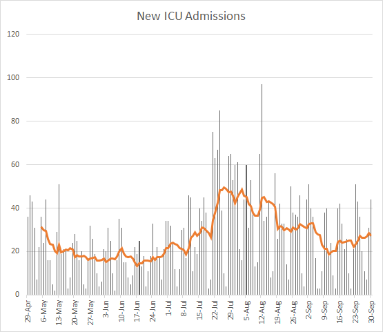
Today in Georgia, there were 183 new COVID hospital admissions (medium-high day for us) and 44 new ICU COVID admissions (also medium-high). The number of patients currently hospitalized is at 1349, nearly the same as it was yesterday. Thirty percent of our adult ventilators are in use, and this number has been stable for the past 6 days or so. Thirty percent is also what was typical for Georgia prior to the summer surge.
New admissions and currently hospitalized patients have been leveling off a bit after weeks of declines. But ICU admissions for COVID-19 have been trending up in recent weeks.

There are four hospital regions using >90% of their ICU beds today including regions C, E, H, and N. If you look at total COVID patients by hospital region, most of the map is a single color right now (and a good color). But if you look at the graphs for each of the regions, it seems that hospital region C (Rome and Carrollton area) are increasing over the past couple weeks after declining from their summer surge. This could be a short-lived period of increase or not…it’s too soon to tell. Note that they started to increase at a pretty high hospitalization rate compared to where they were prior to the summer surge. This is what we want to avoid both for hospital region C and for the rest of the state. So seeing that region C is in the red zone for ICU occupancy combined with this information in the graph is concerning.

Deaths
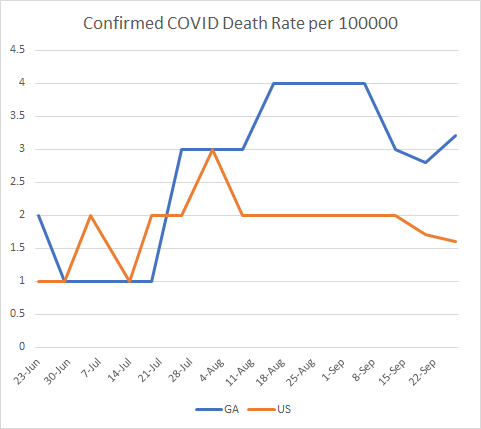
According to the WHCTF report, the death rate per 100,000 people in Georgia is trending up after a bigger week last week. We widened the gap between the state and national average as a result.

Today in Georgia, there was a net increase of 27 deaths compared to yesterday. That’s a medium day for us in the past week. The updated statewide death toll is 7021. For those keeping track, it took 24 days for us to go from 6000 to 7000 deaths. Of today’s deaths, rural counties contributed the most with 12 (44%). Next were nonrural counties outside of the Atlanta metro with 8 deaths (30%). Below you can see how the 7-day death rate has moved over time for the statewide average (black line) and the different county types. The death rate dropped in a big way today because we had a very high day 8 days ago (96 newly reported deaths) that has subsequently fallen out of range for the 7-day calculation. Meanwhile, rural counties continue to have a death rate that is 92% higher than the rest of the state.

In closing, here are the recommendations from the WHCTF report for Georgia. I’ve highlighted a couple things.
They’re getting more specific in their guidance to colleges and universities, instructing them to increase screening of students if test positivity among asymptomatic students is greater than 5%. Well, half of the universities in Georgia aren’t doing any surveillance testing. So good luck with that.
They are clearly concerned about the spread of disease from colleges and universities and now ask the state to track new daily hospitalizations in university towns, expecting that cases are spreading to more medically fragile members of the surrounding community.
They are using language that indicates they are bracing for a very rough fall and winter. They expect laboratories to be slammed with test demand again. We should heed that warning.
For the second week in a row, they are demanding that the state start reporting antigen positive results as well as total tests performed. Further, the antigen positive results should be reported as COVID cases.

Below you can see how the state of Tennessee is reporting their antigen tests, under “probable” cases (n = 7,414). Not all of those are antigen test cases. Some of them are family members of a confirmed case who weren’t tested, but were assumed to also have COVID-19 due to proximity and similar symptoms. But this is how we might expect for those results to be categorized, if/when Georgia DPH begins to do so.


I believe that’s it for now. Have a good evening and continue to make good, evidence-based decisions.
References
https://publicintegrity.org/health/coronavirus-and-inequality/white-house-coronavirus-red-zone-reports-covid/
https://www.documentcloud.org/documents/7219574-Georgia-9-27.html
https://amberschmidtkephd.substack.com/p/the-sunday-week-in-review-21-27sep2020
https://gagio.maps.arcgis.com/apps/opsdashboard/index.html#/e40c39564f724af7bfe8fd5d88deadb6
https://dph.georgia.gov/covid-19-daily-status-report
Georgia COVID-19 Updates is a free newsletter that depends on reader support. If you wish to subscribe please click the link below. There are free and paid options available.
My Ph.D. is in Medical Microbiology and Immunology. I've worked at places like Creighton University, the Centers for Disease Control & Prevention and Mercer University School of Medicine. All thoughts are my professional opinion and should not be considered medical advice.


GA is above national avg cases per population, and yet we don't report antigen cases. ICU admissions are going up while cases are going down. Rural has the highest cases. Hypothesis: is the gap the # of test and cases missed due to antigen testing in the city and suburbs?
Of those states that do report antigen cases, what percentage of their cases are antigen vs PCR?