

The Sunday Week in Review, 21-27Sep2020
Georgia COVID-19 Updates

Combined Data
I’d like to start off with a look at how three of our most important metrics are comparing with one another: cases, hospitalizations and deaths. Cases are represented by the blue line (left y-axis) and hospitalizations and deaths are represented by the gray and red lines, respectively (both on the right y-axis).

Last week we saw increases in case and hospitalizations but thankfully that has turned around this week. Both cases and hospitalizations are declining once again. However, deaths increased this week after several weeks of declines. Hopefully the deaths reverse this trend next week as cases and hospitalizations have done.
Testing
Last week we saw a big rebound in our testing output and this week we saw a decline in testing output once again. Last week there were 135,447 new tests reported, a 9% decline compared to last week. Of this week’s newly reported test results, 7.7% were positive. Below I have provided a graph that helps us to see how testing output (blue line, left y-axis) and percent positive rate (red line, right y-axis) have compared over time. For reference, the WHO goal of 5% is provided in the gray dashed line.

We are definitely in a better position in terms of percent positive rate now than we were in July. But we are still above the goal line. It should be noted that the tests reported by the state for this calculation and for testing output only pertain to the diagnostic PCR test. In recent weeks, there has been a shift toward the rapid antigen test that provides less reliable results but can be done more rapidly and inexpensively. Some states count those as “probable” cases and count those identified through PCR as “confirmed.” At present, the state of Georgia does not provide data to the public concerning the output or percent positive rate of the rapid antigen test. As the test gains favor, and PCR usage decreases, that may mask our ability to see what is actually happening. What may look like a decline in cases and percent positivity based on PCR testing may be matched by an increase in cases and percent positivity based on the rapid antigen test. We won’t know until the state starts providing the data they are collecting.
Cases
The number of new cases (by date of report) is as follows:
- 24 hours: 812 (+0.3%)
- 7 days: 8,530 (+2.8%)
- 4 weeks: 45,712 (+17.0%)
The new statewide total is 314,685 which means that of all the cases that have been recorded, 14.5% were reported in the past 4 weeks. That is a reduction compared to last week (17.1%). Bear in mind that these case totals are likely an under count of our actual case count - it’s a problem that plagues public health for multiple diseases and especially so when a disease has so many asymptomatic cases, as COVID-19 does. And these cases are those confirmed by the diagnostic PCR test. It does not include those who screen positive through other testing methods such as the rapid antigen test.
Below you can see how our 7-day case rate per 100,000 stands based on date of report. The solid black line is the statewide average. Last week we saw the case rate increase for the state. However, this week we are seeing declines. We are still twice as high as we were prior to the summer surge. So please don’t assume that the pandemic is over. Declines this week were greatest for rural and nonrural counties outside of the Atlanta metro.

A couple of weeks ago, the state provided information on where outbreaks were occurring in a press release. At that time, schools were the #1 source of outbreaks in the most recent week and the #2 source of outbreaks since the start of the pandemic (following long term care facilities). Understandably, anxious parents want to know where those outbreaks are happening, especially as decisions are being made about face to face instruction. This week, however, the Department of Public Health determined that “the public has no legal right to information about outbreaks that the state is investigating.” I am concerned that this hurts public trust at a time that we need more public trust in DPH rather than less. It’s hard to get community buy-in for public health efforts such as mask wear, social distancing and limiting social gatherings to mitigate the spread of this pandemic when the DPH withholds data that individual Georgians need in order to make informed decisions. I worry for what this means when a vaccine is released (or any vaccine for other preventable diseases). You can only say “trust us” so many times before that trust is completely eroded. It’s unclear if or when we will continue to receive information such as that provided in the press release regarding outbreak sources.
Also somewhat concerning is the increase in cases we are seeing among the Black / African-American and White populations - our two largest contributors to cases since the start of the pandemic. The increases this week are slight, but it shows that the declines we’ve seen in the past 8 weeks have plateaued among these two populations. A note about interpreting this graph: each of the bars represents another week’s worth of data for that race category. So when you get to the next race, the timeline starts over.

Last week we saw cases increasing across multiple age groups but that seems to have been an anomaly because cases are back down for most age groups. Cases have plateaued for kids ages 1-9 years old. Like the race graph, each of the bars represents another week’s worth of data for that age category. So when you get to the next age group, the timeline starts over.

Hospitalizations
Here’s a look at how hospitalizations have varied among age group over time. Hospitalizations are holding steady among children aged 1-9 years old. They remain high among those 30-39, 60-69 and 80+. Bottom line, we’re better than we were last week. But we need to hope that hospitalizations decrease next week for 60-69 year olds and those >80 years old, because they’re some of our higher risk age groups.

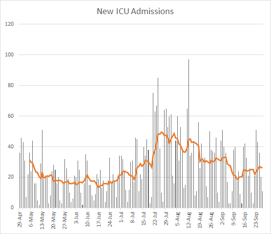
There were 802 new hospital admissions this week, an decrease compared to the 1008 that were recorded for the week before. There were 185 new ICU admissions this week, compared to 175 the week before. You can see how ICU admissions have varied over time below. The orange line is a 7-day moving average (trend line) to help us see through the noise in the data. ICU admissions have trended upward for the past two weeks.
Current hospitalizations continue to decline (see below). Just pay attention to how fast that curve shot up and compare that to how long it has taken to come down. Understand that with exponential growth, things will look okay until they are really not okay and that change will happen very fast. That’s why it’s really important that we remain vigilant. Despite our hard-earned decreases in current hospitalizations, we remain 64% higher than where we were prior to the summer surge (on June 7th).

Deaths
The number of new deaths (by date of report) is as follows:
- 24 hours: 32 (+0.5%)
- 7 days: 344 (+5.2%)
- 4 weeks: 1342 (+23.9%)
It’s interesting (and terribly sad) that we have such a high death count today, since usually the numbers are low over the weekends due to delayed reporting. This week we saw an increase in the weekly total from 269 last week to 344 this week. The current statewide total is 6946 and of those, 23.9% were reported in the last 4 weeks alone. The case fatality rate is 2.21%, the highest it has been since 19Jul.
Below you can see how the 7-day death rate per 100,000 has varied over time according to county type in Georgia. The statewide average is in the solid black line. Nonrural counties (those outside of the Atlanta metro with >50,000 residents) track right along with the statewide average but rural counties (those with <50,000 residents) have a rate that is twice as high as the rest of the state. Again, the Atlanta metro is below the statewide average, although increases have been seen in Atlanta counties in he past couple days. Because of the increases in death rate for both rural and nonrural counties, the statewide average 7-day death rate per 100,000 is higher this week than it was last week (based on date of report). With data like these, it seems like the state has two pandemics going on - the pandemic affecting the Atlanta metro, and the pandemic affecting the rest of the state. And, unfortunately, the rest of the state is suffering far more than the Atlanta metro.

As we did for cases, here’s how deaths have changed in the past 8 weeks for each race. Deaths increased for Black / African-American populations and more so with White populations. As you can see from the data, these two populations contribute the most to our deaths, so seeing their deaths increase is concerning.

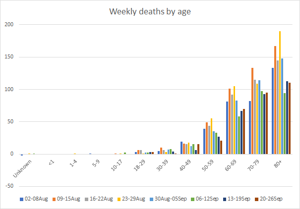
Below you can see how deaths compare week to week for each age group over the past 8 weeks. Deaths are decreasing for most age groups, they increased this week for those 40-49 and 60-69 and they remain high for those over the age of 70.
I’ll wrap up by showing more age-specific information on the hospitalization and fatality rate. The table below shows cumulative data and it is gathered from the demographics tab on the daily report from DPH, current as of yesterday. Pay attention to the hospitalization rate and CFR above the colorful boxes first. Infants have a hospitalization rate that is equivalent to those 30-39. But as kids get older, their hospitalization rate declines, bottoms out among those 5-9 years old, and then increases again in each age group for the rest of the population. For those >80 years old, one in three people who got sick required a hospital, according to these data. For those 60-69, the rate is slightly less than 1 in 5. In the next row, look at the CFR for each age group. We have had pediatric deaths but, thankfully, they have been so few in number that the CFR still rounds to 0%. It’s not until we get to 18-29 year olds that the deaths are large enough to register. The rate increases with age, and more dramatically so among those >60 years old. For those >80 years of age who were diagnosed with COVID-19, one in five of them have died.

The largest single contributor to our cases are those aged 18-29, with 25% of the state’s cases to date alone. Unfortunately, the disease does not stay there among the young and healthy. It spreads to those who are older and more medically fragile, with disastrous consequences. The case fatality rate among those 18-59 who account for 71.6% of the cases is 0.5%. However, for those >60 who account for just 18.8% of the cases, the case fatality rate is 20 times higher in Georgia.
References
https://dph.georgia.gov/covid-19-daily-status-report
https://covid-gagio.hub.arcgis.com/
https://khn.org/news/lack-of-antigen-test-reporting-leaves-country-blind-to-the-pandemic/
https://dph.georgia.gov/press-releases/2020-09-16/dph-provides-update-covid-19-trends-georgia
https://www.ajc.com/education/georgia-withholds-school-covid-19-counts-from-public/MSVEFPYMIJAMDO4TRMVPR2SWUE/
https://www.cdc.gov/mmwr/volumes/69/wr/mm6939e1.htm?s_cid=mm6939e1_w
Georgia COVID-19 Updates is a free newsletter that depends on reader support. If you wish to subscribe please click the link below. There are free and paid options available.
My Ph.D. is in Medical Microbiology and Immunology. I've worked at places like Creighton University, the Centers for Disease Control & Prevention and Mercer University School of Medicine. All thoughts are my professional opinion and should not be considered medical advice.