


Testing
Good evening! I’m going to discuss two research articles today so I’m going to go light on the Testing section today because it was a pretty lackluster day. There were 25,138 new results reported today, 11.7% of which were positive. The fact that we are seeing stable testing output despite significant demand and very long turnaround times probably indicates that we have hit a wall when it comes to testing - we have reached maximum capacity due to workforce, test reagents, etc. It’s not good.
Cases
You may have noticed that the Department of Public Health released some updates to their website and the one I like the most is the recent trends map. This map shows the number of cases, adjusted for population, for the past two weeks. This is an actionable tool that can be used by decision makers throughout the state.

This doesn’t tell us how big the increase is relative to a county’s history, so I’m still going to produce the percent increase map to help us see that. In the map below, I’ve set a 100% increase to the dark purple color and anything above it will also be that shade. The 100% increase means that the case total is at least twice the total it was two weeks ago. Shorter doubling times mean the cases are increasing faster. Some of the trends are similar between the two maps.

I’ve provided a table below that features the counties with at least a 50% increase over the past two weeks. There are two new columns to this table - the GEMA hospital region and the 14-day case rate per 100,000 based on 2018 census data for each county.

In all, there were 3271 new cases today and unfortunately that’s an average day for us now. The new statewide total is 178,323. Another interesting update on the DPH site is the ability to toggle between cases by date of symptom onset and date of report. The date of report is nice because it doesn’t have a 14 day window of uncertainty due to the gap in time between when a person starts having symptoms, when they seek testing, when that test comes back and when it is reported to the state. However, it is VERY vulnerable to backlogs in testing, which we ARE experiencing now. The date of symptom onset provides more context to when a person got sick and helps us to better see when and how disease moved throughout a community. However, the disadvantage is the 14-day window of uncertainty. With our significant delays and backlogs in testing, the 14-day window may not be sufficient. People are waiting upwards of 21 days to get their test results back in some cases so we may be looking at more of a 21-30 day window of uncertainty. That’s pretty frustrating, because we had a long time to prepare for this predicted surge in cases and our state did not do so. Without adequate testing we do not have the ability to identify cases and perform contact tracing.
Hospitalizations
Current hospitalizations have leveled off, but new hospitalizations are surging. Today the DPH reported 420 alone. The bigger story, however is bed capacity. Yesterday, the Atlanta Journal Constitution reported that Tifton (region L) and Athens (region E) are running out of ICU space and that COVID-19 is part of the reason why.
“I have no ICU beds,” said Chris Dorman (CEO of Tift Regional Medical Center). And for several days, he has been unable to find any anywhere else in the state…“I had a patient last week I was trying to get out of here, the nearest bed was Chattanooga,” Dorman said. “There was no way. No ambulance, airplane, nobody could accommodate that much oxygen.”
In fact, as of today’s GEMA situation report, only 13% of the state’s critical care beds are available for patients today. Region H is down to 1 bed, Region L (where Tifton is located) is down to four. You can see how the bed capacity varies across hospital regions in the table below.

Deaths
Today was a higher than usual day for us for newly reported deaths, at 79. The new statewide total is 3642. Unfortunately, deaths are climbing, both when graphed by date of death and date of report. In fact, by date of report, our 7-day average is the highest it has ever been.

There’s something funny going on for the DPH death reporting though. If you look at the Deaths in Georgia tab, I always sort it based on age to keep on eye on any pediatric deaths if/when they are reported. For the last week, there has been a Putnam county death with all sorts of demographic data (including underlying condition) but not age. The death of a female from Cobb county has been on the list for at least three days now. It seems very fishy to me that DPH would have all of these demographic details on a person who died, including sex, race, and the presence of a comorbidity, but not age. It’s pretty easy to track the age down - it’s on the death certificate. I don’t know what’s going on here and I’ve asked for clarification. I’ll let you know what, if anything, I find out.

We’ll wrap up the Georgia situation by looking at combined data for cases and deaths. Below is the cumulative graph that plots both cases and deaths since the beginning of the pandemic. You can see when cases surged starting around 24Jun. We now see that after leveling for a while, deaths are now surging since 15Jul.

Below I’ve provided a table that shows how many cases and deaths have taken place since the reopening.

Since reopening we have had 156,175 cases and 2760 deaths. We have probably reached maximum capacity for testing and are nearing maximum capacity for critical care beds. I would argue these numbers tell us that the experiment of reopening after three weeks of shelter in place has had disastrous consequences. We do not have the ability to adequately track and monitor the pandemic anymore and we are straining our healthcare infrastructure to cope with the consequences of our case surge. We desperately need to limit transmission back to manageable levels. Instead, it feels very much like our state has given up on even trying. Our death rate is 33 per 100,000 residents. With the calculations I did in the 27Jul update, that’s equivalent to the death rate of Mexico, whose population is 128.9 million compared to Georgia’s 10.6 million. The deaths we are seeing in Georgia were preventable.
Research
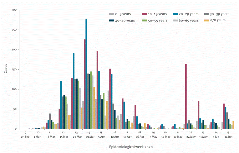
Today there are two studies I want to bring to your attention. The first is about how reopening schools worked out in Jerusalem, Israel. The city closed schools on March 13th and experienced a large peak around March 29th. Interestingly, their biggest age groups for cases during the peak were those 10-29 years of age (see graph below). But after they sheltered in place long enough to bring cases back to less than 50 cases per day, they began to reopen schools. First they reopened schools for small groups of students (kindergarten through 3rd grade and 11-12th grades). But they opened all schools on May 17th with guidance for social distancing, face masks, screening, etc. Nine days later, a school that served students from 7th - 12th grades had their first positive case and the next day they had another that was unrelated to the first - indicating that there was community spread within the school and the school closed. This outbreak led to a second spike in cases beginning around 24May that was primarily affecting children ages 10-19. Investigation showed that the school wasn’t able to adhere to social distancing because of overcrowded classrooms and, because of a heatwave, face masks weren’t being worn as directed.
Taking a deeper look at how cases were distributed among the student body and faculty/staff, consult the table below. Note, this is a co-ed school, but they are providing demographic data only on males as a shortcut. It’s a binary way to look at the world, expecting the reader to understand that if 53.8% of the 7th grade was male, then 46.2% of the students were female. The first column of males tells us the sex distribution of the entire school population (regardless of COVID). The second column of males tells us how cases were distributed male versus female among confirmed cases. Cases were most common in 7th - 9th grades and there was a male predominance among those infected children. Interestingly, if you look at the column all the way to the right, less than half of the infected students were showing symptoms of the illness. In total 13.2% of the student body was infected during the outbreak. But within the most infected grade levels, 20% of 7th graders, 17% of 8th graders and 32% of 9th graders were infected. Turning to the faculty and staff, 16.6% of them were infected and among those, 76% were showing symptoms. As of June 30th, over a month after the outbreak began, only 65.4% of the students and 64% of teachers had fully recovered (as determined by two negative PCR tests). Of those who were asymptomatic, 65% recovered within 25 days compared to only 37% of symptomatic patients. By mid-June, 82 additional cases could be linked to the school outbreak consisting of siblings, parents, friends, and family members of faculty and staff.

The second study has to do with recovery from COVID-19 in Germany. They tracked 100 patients after infection with COVID-19 and performed cardiovascular magnetic resonance imaging (MRI) on all of them at a median of 71 days after they tested positive. Sixty seven of the patients had mild enough symptoms to manage their care and recovery at home whereas 33 required hospitalization. However, 78 of the patients had evidence of heart abnormalities on MRI. 60% had ongoing inflammation in their hearts. These findings didn’t seem to be linked to underlying condition, severity of illness. So even including previously healthy people, heart damage was observed in 78% of recovering patients. This study is small and did not look at pediatric patients. But seeing data like these, it is not surprising that the US has considered barring COVID-19 survivors from enlisting in the military.
What do these studies tell us? We now have evidence that outbreaks should be expected when schools reopen, even in communities with low levels of disease due to prolonged shelter in place orders. Here in Georgia, our case count is enormous compared to what was happening in Jerusalem when they decided to reopen schools and continuing to climb. So it is more likely to happen here. Over half of the kids infected in that school were asymptomatic and could have been missed without thorough testing. Not only did the outbreak infect students, but also teachers, most of whom DID show symptoms, as well as family members and other members of the community outside of the school building. Meanwhile, the first school to reopen in Georgia is doing so the day after tomorrow, with masks being optional. Among adults, we now know that 78% of recovering COVID-19 survivors have prolonged heart damage, for more than two months after their infection was diagnosed. We don’t know whether similar effects are seen in the hearts of children, but children aren’t the only people in a school building. Teachers, administrators, school bus drivers, custodians, cafeteria staff and others are all vital parts of the school community and potentially vulnerable to the long term complications of even a mild infection with COVID-19.
That’s it for today. Be safe and be well!
References
https://www.eurosurveillance.org/content/10.2807/1560-7917.ES.2020.25.29.2001352?fbclid=IwAR0GhVIOtO7p0PVvRD0T9jPV2ZMpgOMzHNh_PuLhivOLUReN-l7uyIfWU5o#html_fulltext
https://jamanetwork.com/journals/jamacardiology/fullarticle/2768916
https://www.militarytimes.com/news/your-military/2020/05/21/the-ban-on-covid-19-survivors-joining-up-has-lifted-but-some-cases-could-still-be-denied/
https://www.nytimes.com/2020/07/27/us/covid-georgia-schools-masks.html
https://www.ajc.com/news/athens-tifton-hospitals-run-out-of-beds-for-critical-patients/ES7VFDLGO5EFLJ5JJEBR6MIVOE/
https://amberschmidtkephd.substack.com/p/the-daily-digest-27jul2020