The Daily Digest, 27Jul2020
Georgia COVID-19 Updates

Good afternoon! For those who are new to the page, on Mondays I typically do more of a national look at COVID-19 trends and how they compare to the situation in Georgia.
Georgia
Briefly, there were 2890 new cases reported today with 30.4% of them coming from nonrural counties that aren’t part of the Atlanta metro. The new statewide total is 170,843. For testing, there were 24,018 new tests reported (an average day for us) and the percent positive rate was 14.1%. As a reminder, we want to be at or below 5% positive to contain the virus. Current hospitalizations are back up after leveling off in the past few days, as shown below.

Today there were 11 new deaths reported. Eight of them came from nonrural counties not part of the Atlanta metro. The new statewide total for deaths is 3509. On Wednesday, I’ll focus again on Georgia with expanded analysis of cases, etc.
The map below comes from Harvard’s Global Health Institute, considering the 7-day average case rate per 100,000 residents. Below the map, I’ve provided their captions for what each color means. But I like this tool because it is very intuitive - like a stoplight, green means good, red means bad.


As you can see from the map and from the color coding, most of the state should be in a shelter in place order right now to blunt the spread of disease. Only 16 of Georgia’s 159 counties are in the yellow category, where it might be reasonable to continue phased reopening, including schools.
National
Cases
This next map comes from the CDC and compares disease trends among the states over the past 7 days. We are in the second highest tier, following Florida, Texas and California. But even these categories don’t make sense since the dark orange covers 9916-24,830 and the next category up (red-orange) 56,626-73,232. With our weekly total of 24,830, we define the upper bounds of the dark orange category.

The next graph also comes from CDC, showing the number of new cases each day by date of report. Because it is based on date of report, it might not be as susceptible to the reporting delays if we were graphing by date of symptom onset. There are pluses and minuses to graphing it each way. Graphing by date of symptom onset tells us when people were getting sick and a better sense of the situation as it unfolds. Graphing by date of report is less susceptible to reporting delays, but is more vulnerable to problems with testing output. The leveling that we see here could be real, or it could be the result of testing slow downs as demand is surging and there are shortages of some of the test supplies.

Hospitalizations
Next is a look at a sampling of US hospitals and the age of COVID-19 patients. Note, this does not include every hospital in the US or even every state. You can read more about the states included here. In the graph we are looking at weekly data since early March. The red population is those 65+ years of age. Dark blue is 50-64 year olds. Light blue is younger adults (18 - 49). Pediatric populations are hard to see, but are yellow and gray.

For the first three months of the pandemic, the largest age group to be hospitalized were those 65+. But things shifted around 13Jun when younger adults (18-49) took over as the largest group to be hospitalized.
Next, we can learn more about the race and ethnicity of people who require hospitalization as a function of age.

This chart can be overwhelming, so let me orient you to a couple things. With “rate” they are calculating the number of hospitalized people for that race and ethnicity and dividing it by the total population estimate (not those positive for COVID-19) for that race/ethnicity. It is distinct from how we normally calculate these rates where typically it is number of hospitalizations divided by number of total cases for a given population. That is one way to adjust for population to allow comparisons. The “rate ratio” compares everything to the non-Hispanic white category (note that they are all “1.0” as you go down the chart). So any number in the rate ratio category is that many times the case for the non-Hispanic white population. To me, the most important thing to follow in this chart is the rate ratio across race and age. We see that Asian / Pacific Islanders have a similar rate of hospitalization to non-Hispanic White populations. However, for other racial minorities, the rate of hospitalization ranges from 3 to nearly 10 times as high as for non-Hispanic White populations.
Pregnant women
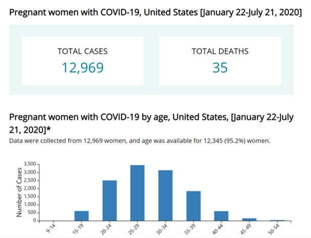
I get a lot of questions regarding pregnancy and COVID-19. I relate to this in many ways - I was pregnant during the 2009 H1N1 pandemic and remember the anxiety all too well. That pandemic ended up being pretty minor compared to this one so I want to give as many data points as I can. So far, there have been 12,969 COVID-19 cases among pregnant women in the US and 35 deaths. Keep in mind that in 2018, there were 3,791,712 births in the US. Some of those might have been multiple births (i.e. twins, etc) to the same woman, and this number doesn’t capture the number of women who were pregnant that year perfectly. But still, that is a huge number compared to the number of cases we are seeing. I am not a medical doctor so I cannot give medical advice. For that, please consult your OB/GYN regarding your unique scenario. But I think these numbers are reassuring for now. In the graph below, you can see the ages of pregnant women who were infected with COVID-19 and it pretty much just matches women of reproductive age anyway.
Deaths
On a national level, deaths can be tracked in multiple ways, including confirmed deaths, excess deaths (meaning deaths from all causes compared to past years) and this reporting system that compiles deaths from pneumonia, influenza and COVID-19. Remember that COVID-19 looks a lot like influenza, and might have been confused in the early days of the pandemic before testing was widely available. In addition, most deaths in the US do not have an autopsy so we can’t go back and test to find out. Pneumonia is caused by a lot of different things, including COVID-19. So this way of measuring things is not perfect, but it does help us to see around the problems we have had with testing and tracking COVID-19. The solid double black line is the threshold to determine excess compared to previous years’ averages. We spiked above that threshold in 2018 with a bad year of influenza. And, of course, we have spiked again with COVID-19. For a while, this peak was showing a sharp decline, but has seen an uptick lately. Given that death reporting can be delayed as much as a month, it’s possible this number will increase too. We need more time to figure out whether this is real or just natural variation like was observed in 2019, for example.

Combined Data
The age distribution for cases versus deaths (looking at cumulative data) for the nation is shown below. In some ways, it is similar to what we see in Georgia, although, our distribution is skewed more to younger adults (i.e. 18-29 year olds are far and away our largest group).

However, our data are similar when looking at the deaths where there is a 5% increase with age for each 15-year cohort starting at age 50-64.
Global
I usually stick to just Georgia and the United States, because that is plenty to keep me busy. However, periodically I take a look at how the US compares to other countries in their experience with COVID-19. Below I’ve compiled a table of the US and a selection of other countries including ones that have bigger population density than the US (i.e. China and India), share a continent with us, have similar land mass, or have a similarly high case rate (i.e. Brazil). Confirmed cases came from the Johns Hopkins Coronavirus dashboard, population sizes came from Worldometers.

What you see when you compare these data is that compared to our neighbors to the north and south, we have a disease rate (adjusted for population) that is about four times higher. India has a population that is four times our size and our disease rate is 12.3 times higher than theirs. The disparity is even more stark if we look at China, the epicenter of the pandemic. So population density isn’t the reason why our rate is so high. The point is, it is disappointing to see that our death rate is as high as it is when countries with greater population size or those in the developing world have really low death rates. It didn’t have to be this way in the US and these deaths could have been prevented. As a person passionate about public health, data on preventable deaths are the hardest numbers to see. I see comments sometimes that the people who are dying were probably going to die anyway, as if their lives are somehow disposable. Or that our case fatality rate is so low that it doesn’t justify the closures we have in our society. The reality is that our death rates are as low as they are within our country because of the very public health measures in place to protect our communities. But they aren’t enough compared to what other countries are doing. Seeing a chart like this shows us these lines of thinking that seek to minimize the impact of this disease are wrong. The people dying in our communities didn’t have to die at all. Countries with less resources than us are doing more to save their people. These aren’t acceptable levels of death - they are patently absurd.
This pandemic is a scientific and medical problem facing our world and its impacts are far reaching. We need scientific and medical solutions to the pandemic in order to address its root cause. Our country and state have prioritized political solutions to this problem and we are seeing the results of that strategy in our ongoing increase in numbers and in breathtakingly bad death rates. We need to call for our leaders at all levels of government to put politics and pride aside and let experts take more of a leadership role in our pandemic response. Just like you wouldn’t call an accountant to fix a leaky pipe, we need the right people with the right experience leading us out of this. If we want the low death rates of other countries, we need to adopt the science-driven strategies that other countries are using. I’ve said it here before that this virus does not respond to bravado, gut instinct or tough talk. We have to do the work. We need evidence-based approaches and the evidence for success is coming from other countries around the world. I realize it is an impossible thing to ask politicians (of all ideologies) to take a back seat in this during an election year, but our country will be better off if we can instead lean on the expertise of scientists and epidemiologists.
References
https://www.cdc.gov/coronavirus/2019-ncov/cases-updates/cases-in-us.html
https://www.cdc.gov/coronavirus/2019-ncov/covid-data/covidview/index.html
https://www.cdc.gov/covid-data-tracker/index.html#demographics
https://www.cdc.gov/coronavirus/2019-ncov/cases-updates/special-populations/pregnancy-data-on-covid-19.html
https://coronavirus.jhu.edu/map.html
https://www.cdc.gov/coronavirus/2019-ncov/if-you-are-sick/index.html
https://globalepidemics.org/key-metrics-for-covid-suppression/
https://www.cdc.gov/coronavirus/2019-ncov/covid-data/covid-net/purpose-methods.html
https://www.worldometers.info/world-population/population-by-country/