


Good afternoon. There’s a lot to talk about today, and I’ve tried to keep the text short since there are so many graphs. As a reminder, I’ll be back on Sunday with the Week in Review. Have a great (socially distanced) weekend!
Testing
It was a massive day for testing output today with 45,506 new PCR test results reported. As a reminder PCR is the only test used to confirm COVID-19 in Georgia. Antibody-based tests are not used to confirm cases. Today’s output was a new record - a welcome development. Meanwhile, even despite the large number of tests reported, the percent positive rate is 11.2%. We need to be at or below 5% to contain the outbreak. On a day when we doubled our usual testing output, to see that we still are seeing a high percent positive rate tells us that there really is significant community transmission of COVID-19. Even with a record-setting day of tests, we still aren’t testing enough people and that is alarming.
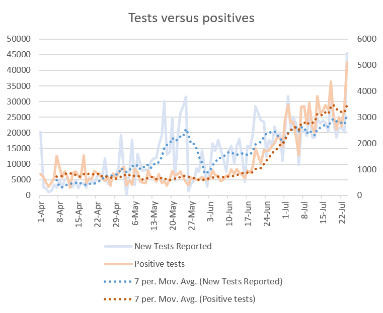
Here you can see a graph that compares how tests and positive test results have varied over time. The PCR tests are measured using the left side y-axis and the positive PCR test results are on the right y-axis. The raw data are in the subdued colors and the 7-day moving average is the darker color for new tests and positive tests, respectively.
Cases
We also set a new record for cases today at 4853. The new statewide total is 161,401.

When you look at the case curve from Department of Public Health (DPH), you’ll see that the 7-day moving average indicates that we have plateaued in cases. I don’t have a firm answer on why this is happening but I have two suggestions:
Human behavior - the strain on our hospitals has been making headlines for weeks now. I can’t speak for everyone but knowing what I do about the hospitalization rate, I’ve been extra careful about averting risk - wanting to avoid any mishaps that would require an ER visit, to save time and space for COVID patients who might need it and out of respect for our healthcare workers who are strained. We’ve seen this before when Glynn county spiked in cases around the beginning of July. Restaurants and bars voluntarily closed and that may have contributed to the decline in cases observed there.
Testing delays - there are reports that people are waiting as long as 10-14 days to get their test results back. Knowing that many people don’t seek testing on the first day of symptom onset, it’s possible that the 14-day window of uncertainty may not be long enough and we may see more backdated cases in the weeks to come. If today’s testing output is any indication, hopefully this backlog is being worked through.
Below I have provided a map that shows the 14-day increase in cases for each of Georgia’s 159 counties. I’ve set the top color on the legend to 100% so that any county that has doubled the size of their pandemic (or more) in the past two weeks can be easily identified.

The trends are largely the same as I presented on Wednesday. To see the actual numbers for 14-day increase in counties with at least a 50% change, consult the table below.

There are a LOT of rural counties in the mix. Of note, 7 of the 12 counties in Hospital Region E are on this list and that will be important when we get to hospitalizations.
Next I want to highlight a study that was released today looking at how well people recover from COVID-19. Last week I talked about a study that looked at recovery for hospitalized patients. This one looks at those whose infection was managed at home. Below is one of the figures from the study. They collected information on the symptoms people were experiencing at the time that their specimen was collected for testing and then followed up 14-21 days later to see what, if any symptoms they were continuing to experience. That time frame is important because 90% of outpatients with influenza have a full recovery with no lingering symptoms by 14 days after a positive test result. It turns out, people recovering from COVID-19 at home have a lot of lingering symptoms. The lighter blue is the symptoms observed at the time of testing. The dark blue are the symptoms observed at follow up.

Thirty five percent of the patients reported not returning to full health at the time of follow up and over 50% of patients reported having at least one symptom 14-21 days out from their test collection. The symptoms most common were cough, fatigue, congestion and dyspnea (shortness of breath). Interestingly, even among 18-34 year olds with no chronic medical condition, nearly one in five reported not returning to their usual state of health by the follow up interview. This is just another study that teaches us that COVID-19 is not a benign infection. It causes prolonged impacts on health, even among those who are healthy and even with infections that are mild enough to be treated at home.
Hospitalizations
Current hospitalizations have plateaued which is a GREAT development. However, there are certain areas feeling the strain of the pandemic more acutely than others.

Remember how in the cases section I made mention of Hospital Region E and that 7 of the 12 counties were on the counties of concern list? Well, the reason I pointed that out is because Region E maxed out their ICU capacity today. There are zero beds available for this region. It’s possible that hospitals are triaging patients and making it work in other parts of the hospital or they may be diverting patients to other hospital regions to share the burden. But this is not good. The critical care beds in use are displayed for each region below, along with the map from the Georgia Emergency Management Agency situation report.

The percentage of adult ventilators in use (for any cause, not necessarily COVID-19) set a new record today also, at 45%. At present the state does not provide data on pediatric ventilator availability.
Deaths
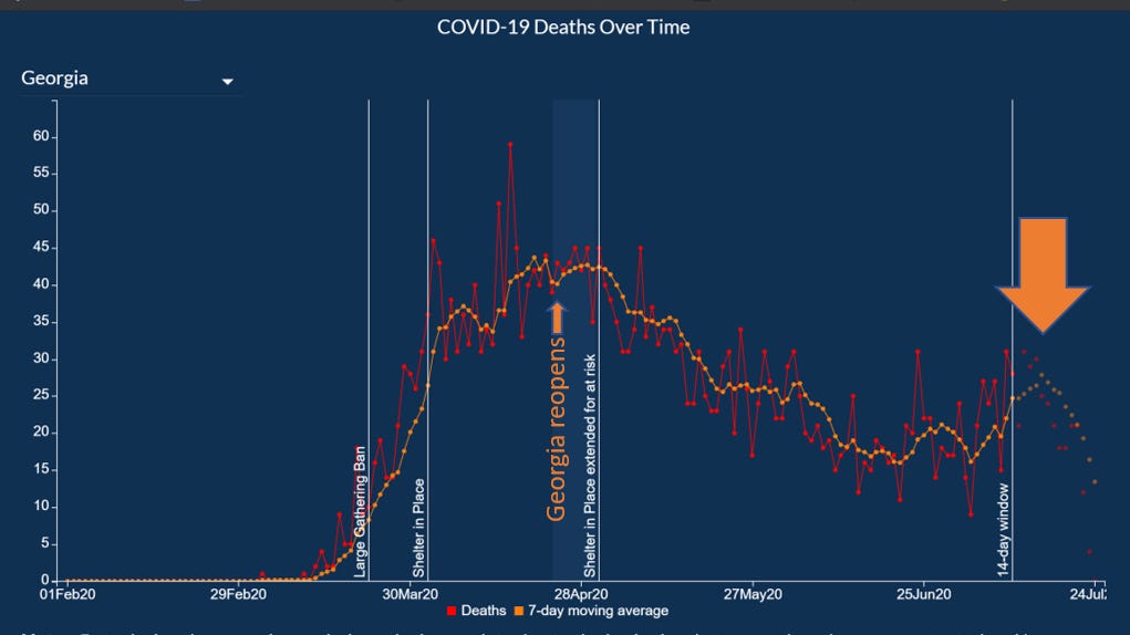
Today was another big day for deaths, with 82 new reports. As a reminder, these likely took place in the past several weeks - we are just learning about them today. There are significant delays with death reporting, even more so than with cases. The new statewide total is 3442.
For several weeks, our death curve has been declining or stable (thank goodness). But the death curve is now showing signs that the death rate is on the increase. The 14-day window of uncertainty is obviously subject to change, but rarely do the numbers go down in that window in any appreciable way. They can go up, however, as reports come in. For us to already see the 7-day moving average trending upward is not a good sign, knowing that these dates may see even higher numbers in the coming weeks. So this is not good news.
Below we can see more about how deaths have accumulated over time by county type. Rural counties have been the largest source of deaths for months now. But nonrural counties are about to overtake them.

This pie chart is a snapshot of today’s totals. Thirty percent of the deaths came from rural counties and 29% came from nonrural counties. In other words, 59% of the deaths are coming from outside of the Atlanta metro.

Combined Data
Sometimes it is helpful to see how the pandemic has played out in definable stages. For example, one mile marker was everything leading to the reopening on 24Apr when we were learning how to cope with the disease. I think we have another mile marker coming soon when schools reopen in August. But for this phase of the pandemic since the reopening I’ve collated the data for each county type for cases and deaths.

To summarize the table, 86.2% of the cases and 73.3% of the deaths were reported after the reopening, reinforcing the idea that what felt like a peak earlier in April was really a small blip on a much larger peak we are seeing now.
References
https://dph.georgia.gov/covid-19-daily-status-report
https://gema.georgia.gov/document/document/sitrep-724/download
https://www.cdc.gov/mmwr/volumes/69/wr/mm6930e1.htm?s_cid=mm6930e1_w
https://amberschmidtkephd.substack.com/p/the-daily-digest-17jul2020