

The Daily Digest, 22Sep2020
Georgia COVID-19 Updates

Hi there, last week and this week you may notice that I’m increasing the frequency of my emails and posts. Today’s update is going to focus on two main issues:
The latest White House Coronavirus Task Force report for Georgia
Analysis on how COVID-19 testing varies between county types
The White House Coronavirus Task Force report
Fun fact, the Georgia Department of Public Health has the White House Coronavirus Task Force (hereafter abbreviated WHCTF) reports and you can get them by filing an open records request (send your email here: DPH-OpenRecords@dph.ga.gov). I received the most recent report, dated 9/20/2020, this morning. Many thanks to Georgia Department of Public Health! You can see a copy provided by WABE here.
This week the WHCTF expanded the color categories. Instead of red, yellow and green categories, as has been the case in months past, we now have red, orange, yellow, light green and dark green. It’s good in some ways to be able to note that there’s a big difference between having 10 cases per 100,000 (lower limit of the yellow category past and current) versus >100 cases per 100,000 (lower limit of the red category past and present). The orange classification splits the difference, identifying those counties and metro areas that have between 50 - 100 cases per 100,000.
Here’s the summary table of how the numbers have shifted. As a reminder, red is bad, dark green is really good.

The next series of graphs put this week’s report into context over time for the state and the US. We’ll start off with looking at how case rate. Georgia remains above the national average, but the gap has narrowed. Case rate increased for Georgia as well as the US this week.

Next, let’s talk about testing. On Sunday I noted that we saw a big rebound in our testing output last week. The WHCTF notes that also.
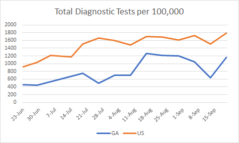
Testing per population increased for both the US and the state. But we remain 54% below the national average. According to the definitions on the final page of the report, these data only concern the diagnostic RT-PCR test and it does not include rapid antigen testing. So there’s definitely room for improvement here. Another important thing to look at is percent positive rate, shown below.

Things are trending better for both the state and the US. However, we remain well above the national average.
The next graph looks at how many counties are on the WHCTF’s counties of concern list, classified as red, orange or yellow. You won’t see a line for orange counties on the graph yet because we only have one week’s worth of information so far. However, you can see how all three classes total together by looking at the dark blue line.

At first glance, if we were only concerned with red and yellow counties (as we have been in the past) then this looks like a great week - everything is down or steady. However, the orange counties mean that we actually saw a small increase this week in counties on their counties of concern list. In total, there are 116 counties in one of these zones, or 73% of Georgia’s counties.
Turning next to hospitalizations, below you can see a graph that shows confirmed and suspected COVID-19 hospitalizations (meaning, they’re waiting for test results) using the left y-axis and percent of hospitals reporting to the system using the right y-axis.

First thing to note is how stable the hospital reporting has been over the past four weeks. That makes the data more reliable. We don’t get to see national data for comparison here. But the data provided by the WHCTF indicates that hospital admissions are decreasing. On a similar topic, below you can see how we compare to the national average for COVID-19 cases in skilled nursing facilities. The y-axis is a percentage.

We are above the US average and have been for the entire time these data have been made available. But the gap is narrowing and that is certainly a success.
Finally, here’s how the death rate in Georgia compares to the nation. This is another area that changed for the WHCTF reports - they are no longer rounding these numbers. We might expect to see more gradual changes in the graph as a result in the coming months.
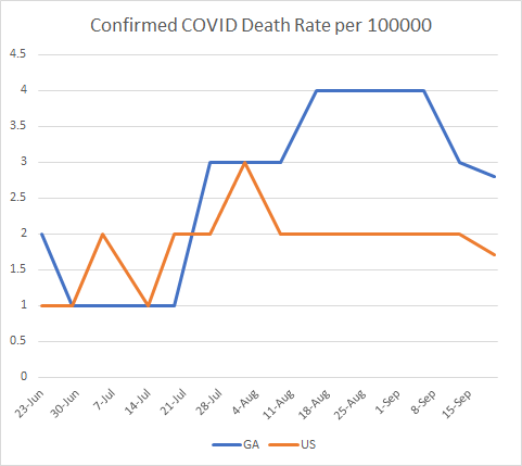
We continue to have a higher death rate than the national average, but this gap has also narrowed. Last week saw declines for both the state and the country (a good thing).
Below are maps showing where new cases per 100,000 are getting better or worse (shades of red = increase, shades of green = decrease). On the right, you can see that much of the state is getting better at testing their population if we’re considering percent positive.

Finally, we’ll wrap up with their recommendations. The WHCTF continues to express concern about college and university-driven disease transmission.
Do not send students who live on campus home to their families to isolate or quarantine.
They advocate greater surveillance testing of the university population instead of focusing only on symptomatic cases.
They are delivering rapid antigen testing equipment to Historically Black College and Universities.
They also indicate that they are bracing for a rough fall (see 10th bullet point). They ask that all Georgians (including students) to limit all social gatherings to 25 people or less. Last week this number was 15, so we’re doing better this week.
The last thing to point out is the mandate I’ve quoted below.
All antigen positive results must be reported: both the number of positive test and total tests. These must be reported as COVID-19 cases.
Having worked for the federal government (CDC) before, language like “must” is kind of a big deal. What they’re referring to here is the rapid antigen test that has gained favor recently. It is not as reliable of a test as the diagnostic PCR test, but because it is cheaper, we can afford to test more frequently allowing us to overcome that reliability issue somewhat. It also offers a much faster turnaround time, so that people can isolate or quarantine as needed. Currently, the state only gives us data on confirmed cases, those identified through PCR. Some states call the antigen tests “probable cases.” Georgia could do this too, they are collecting these data, we just don’t get to see them publicly. But I think the WHCTF is arguing that the probable case totals need to be made public. Perhaps that is in the works for Georgia Department of Public Health, already.
You can read the full list of recommendations below.

Testing by County Type
With the County Indicators Report that the DPH is now providing weekly on the daily report page, we now have numbers of tests performed in each county for the past 30 days. However, it’s a pain to get to these data - you can only get them by hovering over the bar graph on the “Number of PCR Tests Performed” column of the Laboratory Tests tab. But I’ve been wanting these data for a while so that we can judge how well we’re doing by population at measuring disease. With 159 counties, that’s a big task so for now I took the top four counties for case rate per 100,000 in the past 14 days for each county type and tallied their test totals and then calculated test rate per 100,000 and compared that to the county’s 30-day case rate per 100,000. So these counties selected are not necessarily a representative sample but the data presented might spur new ideas for analysis and help us to see important differences.
Ideally, you want to be doing a lot more testing than you need. It sounds counterproductive, but remember the adage that “an ounce of prevention is worth a pound of cure?” If we know where the cases are and isolate those individuals, they can’t spread to others. So testing and contact tracing is as close as we come to prevention right now minus a vaccine. So testing widely is really important. What we want to see in these graphs is big differences between test rate and case rate for each county. For each county type, I’ve indicated how many counties fit into that category so you can see how the counties presented compare to the overall number of counties for that class.
The Atlanta counties do show a big difference in the test versus case rate.

The same is true for Atlanta suburb counties. But the difference is smaller for Henry, Cobb and Gwinnett counties compared to Cherokee county. A reminder, these four were chosen because they were the top 4 for their county class.

The test rate versus case rate numbers narrow for some of the top four nonrural counties, specifically Bulloch and Walker counties.

Then we see areas that are underwater for test rate compared to case rate when we look at rural counties (see Chattahoochee and Stewart counties). Again, these are just the top four counties for case rate and this is not a representative sampling of all rural counties. But it shows that we may need to look at this more closely and we need more data.

What does this mean? It might be a useful tool for the state or nonprofit organizations that are working to overcome health disparities in the COVID-19 pandemic to know where testing is lacking. I don’t think it necessarily means that resources need to be re-allocated from high-performing counties to low-performing ones. We need to have that large difference in test rate versus case rate. But we need to shore up the counties that are deficient in testing. It’s possible those gaps are being covered by the rapid antigen test and we just aren’t seeing that information because the state doesn’t provide it to us. To see that rural counties are the ones with the greatest challenge is no surprise, but that doesn’t mean it’s okay. The case and death rates are roughly twice as high in rural counties than the rest of the state. So this is a county type that we are not supporting enough to prevent unnecessary suffering and death.
For today, the DPH is now providing data on testing regarding date of specimen collection. This helps to overcome some of the confusion that arises from reporting delays, a problem that is an unfortunately common part of public health work. You can see these new visualizations in the graphs for testing and percent positive. Here are the net increases for today:
Testing: 12,564, a low end day for us. 7.4% positive, a mid-range day for us. 105% of today’s cases were identified through ELR (meaning there were relatively few duplicates) and only 14.7% were backdated prior to 14 days ago (normal).
Cases: net increase of 882, a low end day for us. 43% came from nonrural counties, 28.5% from rural counties, 27.7% from Atlanta suburbs, 14.1% from Atlanta. The new statewide total is 308,221.
Hospitalizations: 96 new hospital admissions (medium-low for us), 21 were newly admitted to the ICU (a medium-low day for us. The number currently hospitalized declined to 1406 after holding steady near 1420 for the past 4 days. Only one hospital region is using >90% of their ICU beds, hospital region I (west central Georgia).
Deaths: net increase of 73, a medium day for us. 33 deaths came from rural counties, 25 from nonrural, 8 from Atlanta suburbs, 3 from Atlanta. There were four deaths in the non-Georgia resident category. Of note, we passed 200,000 deaths nationally today, a grim milestone.
References
https://www.wabe.org/wp-content/uploads/2020/09/Georgia-9.20.pdf
https://amberschmidtkephd.substack.com/p/the-sunday-week-in-review-14-20sep2020
https://khn.org/news/lack-of-antigen-test-reporting-leaves-country-blind-to-the-pandemic/
https://dph.georgia.gov/covid-19-daily-status-report
https://covid-gagio.hub.arcgis.com/
Georgia COVID-19 Updates is a free newsletter that depends on reader support. If you wish to subscribe please click the link below. There are free and paid options available.
My Ph.D. is in Medical Microbiology and Immunology. I've worked at places like Creighton University, the Centers for Disease Control & Prevention and Mercer University School of Medicine. All thoughts are my professional opinion and should not be considered medical advice.