

The Daily Digest, 15Jul2020
Georgia COVID-19 Updates

Good afternoon. I’m happy to announce that I’m now on Twitter. So if you’re on that social media platform, come find me and these updates.
Testing
Below you can see that our PCR positive test rate is holding steady around 13%. This metric is important because only the PCR test that looks specifically for the virus’s genome is used for confirming COVID-19 cases in Georgia. So of all the tests performed today, 13.6% of them were positive. According to the World Health Organization we want to be at or below 5% in order to contain the virus.

A follow up to Monday’s post regarding testing and the increase in cases. Last time I showed testing output compared to cumulative cases over time. Today I’m showing the testing output (orange) compared to the new cases reported each day (blue). Keep in mind, these are not on the same scale (orange is on left axis, blue is on right axis). So when they overlap, they do not actually have the same number, but the trend is what’s important here.
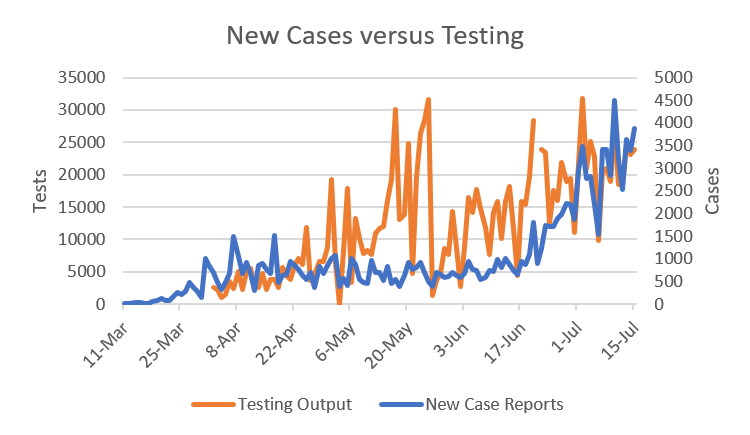
What you can see is that, yes, on poor test output days, we tend to see fewer cases and vice versa. This makes sense right? What’s interesting is that while testing output has stayed relatively consistent over the past three weeks, averaging about 20,000 tests per day, the number of new cases reported each day has increased.
Cases
Cases continue to increase. As a state, there were 3871 new cases reported today bringing the new statewide total to 127,834. Nonrural counties (not part of the Atlanta metro) led the way with 1145 cases.
Of course, total case counts don’t tell us what’s going on at a local level or even within recent history. In the past I’ve graphed and charted increases based on a 7-day span. I’ve since decided to expand that to 14-days and I’d like to explain why. When I was making the counties of concern list each day, it was too volatile, with counties popping up and falling off in ways that were impacted more by poor testing output (say, over a weekend) than by transmission of disease. So in order to make the map and chart more stable and to enable better decision making, I’m expanding to 14 days. Keep in mind though, that there will likely never come a time that we know who is sick in real time. So older trends are interesting, but there’s still a lot of room for variability. Below you can see how Georgia’s 159 counties compare with respect to 14-day increase of disease. Note that this will look different from the map on the Department of Public Health website, since their maps consider all cases since the beginning of the pandemic. My map shows only recent trends.

Anything in a dark plum is at 100% or greater and this means that they’ve doubled their total case count in the span of 14 days. Counties in the darkest purple have seen a 150% increase or more. The eastern half of the state is deeply impacted as is central Georgia. There are also pockets of intensity along the borders with Alabama and Tennessee. The only area seeing relative stability is in southwest Georgia.
Below is the table with counties of concern. To make this list, counties need to have >50% increase in the past 14-days (note: this is a change from 25% to adjust for the 14-day shift) and a >5% increase in the past 24 hours. Because I haven’t produced one of these tables in a few days, I’m including some counties that are below 5% 24-hour increase but still have large 14-day increase. If they’re shaded in tan, they’re in a grace period and could fall off in coming days. But I don’t want to remove them prematurely, in case this is a fluke of poor test output for a given county. I’ve highlighted any county that has >100% growth over 14 days in red.
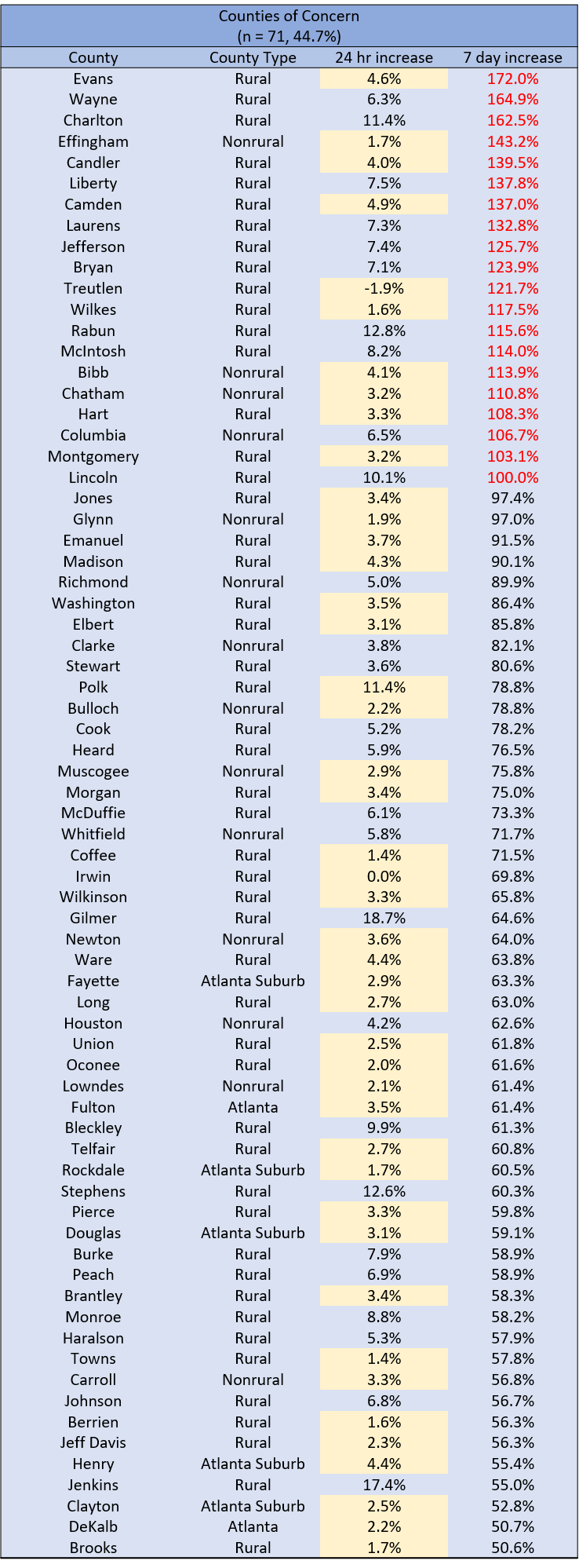
There are 71 counties or 44.7% of the state’s counties. Notably, Atlanta counties of Fulton and DeKalb are on the list as are several suburbs. Otherwise, it’s a good mix or rural and nonrural counties.
If we dig a little deeper into the recent increases we’ve had in the graph below, we can see that the county type with the greatest rate of increase since cases began to surge is nonrural counties. The Atlanta suburbs have overtaken rural Georgia. But overall, all county types and non-Georgia resident category have all trended upward at a steeper rate since about July 1. The unknown category is more of a holding pen while contact tracing and follow up are pending to sort cases into their correct county class.

Hospitalizations
As has been the case a lot lately, current hospitalizations are up and we continue to set new records. As of today’s report from Georgia Emergency Management Agency, there are 2786 currently hospitalized. Note: GEMA wasn’t providing these data prior to May 1, which is why the graph starts at that time rather than in March when the pandemic arrived. As a reminder, these are patients currently hospitalized for COVID-19.

I haven’t shown this next graph in a while because it was hard to tell whether anything interesting was going on without more time, but not only are current hospitalizations up, but the number of new hospitalizations each day (as in new admissions) is trending upward too, since June 9th. Today was the second highest day on record, since GEMA and Department of Public Health began providing these data. The purple line is new COVID-19 hospitalizations. The orange dotted line is the 7-day moving average to help us see the trend through the noise.

Adult ventilator use is also up, although today there was a small decrease (40 to 39%) compared to yesterday (see below).

Note, these are ventilators in use for all causes, not just COVID-19. But with cases surging as well as hospitals, it makes sense that some of this increase might be because of COVID-19. We would need more information from GEMA to be sure. The blue line is ventilators in use, as a percentage. The orange dotted line is the 7-day moving average. In May and June, the average usage rate has held steady around 30%. But since the surge in cases began, we have also seen a surge in ventilator use. At present, GEMA does not provide data on pediatric ventilator availability.
Next is the second page of the GEMA daily situation report. First notice that only 16% of the state’s ICU beds are currently available and a lot of these are spread out from each other. Keep in mind that when a person requires intensive care, it’s usually not a bed that can be turned over quickly - they could need that level of care for days to weeks.

The other thing to notice is how many hospital regions are short on ICU beds (I’ve circled them in orange). Only 5 of Georgia’s 14 hospital regions have at least 20 critical care beds. Some regions, like L and H span large geographic areas and have only 2 and 3 beds, respectively. The northwest suburbs of Atlanta (Region N) are also low on ICU bed availability.
Deaths
There were 37 deaths newly reported today and that brings the statewide total to 3091. This is a medium-low day for us, historically, when it comes to COVID-19. Twelve of these deaths came from nonrural counties not affiliated with the Atlanta metro.
Lastly, it can sometimes be helpful to see where we are at this stage of the pandemic. So far, we can sort of divide the pandemic into our initial response through the shelter in place to when the state began to reopen on April 24 as the first phase. I imagine our next natural milepost will be when schools reopen, on or around August 3rd, representing fresh opportunities for disease transmission. For now, though, here is where things stand with respect to cases and deaths today compared to where we were when we reopened on April 24th. I’ve provided data by county type.

The vast majority of the pandemic’s impact in Georgia has been experienced in this second phase of the pandemic, since the reopening, with 82% of the state’s cases being identified during that time. For frame of reference, on April 24th there were just 22,148 cases across the entire state. Since the reopening, that’s about how many cases have been identified in rural Georgia counties. Similarly, there have been almost 2000 deaths since the reopening, representing about 65% of the state’s total deaths to date.
That’s it for today. Be safe and be well!
References
https://dph.georgia.gov/covid-19-daily-status-report
https://gema.georgia.gov/document/document/sitrep-715/download
Dr. Schmidtke, I am seeing your data for the first time today. I led a large team of data analysts for a healthcare technology company before I retired. I've also been analyzing COVD-19 data (focused on the Atlanta metro area) and circulating my analysis to a few friends.
I note that you indicate that the WHO recommends a target of 5 percent positive tests to determine the appropriate volume of testing. Based on this article: https://www.npr.org/sections/health-shots/2020/04/22/840526338/is-the-u-s-testing-enough-for-covid-19-as-debate-rages-on-heres-how-to-know , I thought the WHO recommended 10 percent positive tests as the benchmark for testing volume. Could you point me to a source that has the 5 percent number? If I've been setting the wrong target, I'd like to fix it.
Thanks for your help.
Robert Wittenstein
Great info and thx for putting this together and sharing! Can’t stress that enough.
Only comment would be on the last table, wrt results since reopening, wouldn’t it be fair to mention that there are more days after the reopening vs before, from a pandemic perspective?
You mention March in the section on daily hospitalizations, as a timeframe of “when the pandemic arrived”. From a deaths standpoint, March 10th might be a good starting point. In that case, compared to July 15th, 64.6% of time is after the re-opening date.
As time marches on and 70% and 80% of the time is post re-opening, it might be even more important to add that context