

The COVID Digest, 28Aug2021
Georgia on my mind

Hello readers! Sorry for the delay in sending this newsletter. It’s an exciting time getting ready for the first day of classes at the University of Saint Mary on Tuesday. Today we welcomed new students who are moving in.
I have a lot of data to go through today so I’m going to be heavy on the figures and graphs and light on the commentary, so that everything can fit.
First up, how are the major metrics tracking for Georgia. Cases are graphed using the left y-axis, everything else uses the right y-axis.

Compared to the previous week’s totals, this week saw an increase of…
15% for cases
72% for deaths
70% for COVID-19 hospital admissions
37% for COVID-19 ICU admissions
Those hospital increases are stunning and unsustainable. Weekly hospital admissions have nearly matched previous maximum.
A 15% rise in cases sounds mild compared to the rise for hospital admissions. But because test positivity remains really high, it is likely that the state is undercounting cases. Below you can see the variation week to week in test volume and test positivity.

The next graph shows the 7-day case rate per 100,000 residents in different county types across the state. The case rate in rural Georgia counties (adjusted for population, mind you) is 183% higher than that of the Atlanta counties of Fulton and DeKalb. This can be explained by a combination of factors including vaccination rates, public health policy, attitudes regarding the pandemic, etc.

We can also look at PCR cases only (DPH does not provide demographic data for antigen cases) by age group. The graph below shows those weekly case totals for the past 8 week.

In the past, it used to be that college aged adults (aged 18-29) were the primary drivers of infection for the Georgia population. But they have been replaced by children aged 10-17. More on the school aged surveillance data report from Georgia DPH in the Twitter thread below.


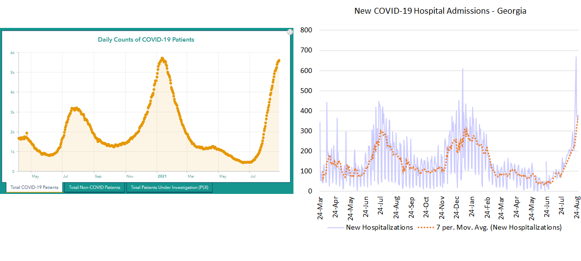
There are two ways to look at hospitalizations - new COVID-19 admissions (graph on the right, below) and how many COVID-19 patients are currently in the hospital over time (graph on the left, below). New COVID-19 admissions are the highest they have ever been. For COVID-19 patient census (left), it looks like things may be slowing down near previous maximum. However, it’s unclear if that’s because hospital demand is actually slowing down (the graph on the right would suggest not) or because hospitals have as many COVID-19 patients as they can hold. As of yesterday, hospital regions C, F and M are using an excess of their available ICU beds.
This is a really dangerous situation and we’re seeing the reason why in Louisiana and Mississippi this weekend. If you weren’t aware, they have Hurricane Ida predicted to make landfall tomorrow morning as their hospitals and ICUs are overwhelmed by COVID-19 patients. The storm is estimated to reach category 4 strength before making landfall. Many of those patients aren’t stable enough to evacuate, nor are there beds elsewhere for them to transfer to. This is the spillover effect of too many people not getting vaccinated who then get sick and overwhelm hospitals, leading to increased risk for anyone who needs a hospital or who is currently hospitalized. Nevermind the healthcare workers that will now be asked, yet again, to risk their lives not just against a deadly disease, but also for a category four hurricane. Please do your part and get vaccinated. We still have a ways to go for hurricane season and don’t want a similar situation for Georgia.
We can look at how hospitalizations are broken down by age for Georgia in the graph below. Most of these hospitalizations above the age of 12 are preventable with a free vaccine.

Let’s move on to deaths. The graph below shows the 7-day death rate per 100,000 residents by county type. You can see that rural Georgia counties have always been the worst off and their death rate is really accelerating now.

But there are a lot of rural counties in Georgia, 120 of the 159, in fact. So it can be more helpful to look at death rate by hospital region, as set by the Georgia Emergency Management Agency.

When we split up the counties in this way, we can see that the pandemic’s surges have hit different regions of the state very hard. The spring 2020 surge hit region K the hardest. At one point, Dougherty county was the nation’s top hot spot. The summer 2020 surge hit regions H and M the hardest. The winter 2021 surge was intense for many regions, but especially regions M, B, H, K and E. So far, the summer 2021 surge is most intense for regions M, J, and K.

Lastly, let’s take a look at the distribution of deaths by age group. In past surges, the deaths have correlated with age, with the greatest number of deaths among those 80+. The advent of vaccines and prioritization for older adults has meant that, so far, this surge is seeing a more even distribution of deaths for those in the top 3 age groups. As for hospitalizations, the vast majority of these deaths are preventable with a free vaccine. It’s not too late to get vaccinated today. You can find the nearest dose by visiting vaccines.gov.

Unless otherwise noted, the source data for all of these graphs is from the Georgia Department of Public Health daily status report and the Georgia Geospatial Information Office COVID-19 Data Hub. Many thanks to the public health data heroes at these organizations for providing these data to the public on a near-daily basis. Not all states offer this level of transparency.
The COVID Digest is a free newsletter that depends on reader support. If you wish to subscribe please click the link below. There are free and paid options available.
My Ph.D. is in Medical Microbiology and Immunology and I am Chair of the Division of Natural Sciences and Mathematics at the University of Saint Mary. I've worked at places like Creighton University, the Centers for Disease Control & Prevention and Mercer University School of Medicine. All thoughts are my professional opinion, do not represent the views or opinions of my employer and should not be considered medical advice.
Hi Amber,
I ran across something that a friend of mine posted about the numbers, and I want to get your take. He argues that, at least in terms of hospitalizations and deaths, there may be an argument for treating the rates differently now that an estimated 53% of the US population and 42% of Georgians are fully vaccinated.
Given a roughly 50% vaccination rate and what we know about the very high efficacy rates the vaccine has for minimizing major symptoms, hospitalizations, and deaths, he argues that the metrics we are using to measure morbidity and mortality are no longer appropriate and that we should be weighting these numbers according to vaccination rates.
For 14 years, I helped the Pima County, AZ government map all the migrant deaths in southern Arizona and, over time, saw a similar pattern. Over the long run, the number of undocumented border crossers decreased, but death frequency remained roughly constant. This means that the lethality of the crossing increased with time. Is this a similar situation? If not, why not? I hope this is a useful question and my apologies in advance if you've already addressed it elsewhere. Thanks for all your work and I hope the new gig is treating you well.
Best Regards,
John