This week things are nearing historic lows on the COVID-19 front as we look at the data nationally. Nationwide, the 7-day average for cases is lower than it has been in a long time, but still 173% higher than the previous low set on 21Jun2021. Similarly, COVID hospitalizations are nearing the 2021 low (set 29Jun2021), but remain 15% higher. The US is still averaging 801 deaths per day. But this is a big improvement considering that the US averaged >1000 deaths per day from 21Aug2021 - 21Mar2022. There was a day in that time period that we dropped below 1000, most likely due to delayed reporting for the Thanksgiving holiday.
On its face, this seems like really good news, right? It definitely is in many ways. The worry remains that we have yet to see what the impact will be of lifted pandemic precautions, waning vaccine and booster immunity and whether hospitals might be ready for another big wave.
We have a significant challenge now with data quality. Testing is not as common as it once was, both in terms of availability and use. Those who are totally ready to move on from COVID-19 in the first place are probably less likely to test and many of those who are still testing are using antigen tests, performed at home. These aren’t reported to state or national totals. Add to that the reality that the government is no longer paying for the uninsured to get tested for COVID-19 and states are closing testing sites and you can see that the country is doing whatever it can to plug its ears and pretend that COVID-19 is gone. You’re less likely to find COVID-19 if you aren’t looking for it, and especially if you’re going out of your way to make it harder for people to test. As a result, cases and test positivity are losing their value as early warning signs that something could be wrong. The new Community Levels map from CDC has thresholds so high that by the time an area pops out of the green zone, there is already a lot of momentum for the virus. It means we are scrambling to find other warning signs and unfortunately some of it is limited or anecdotal - not exactly where we want to be. For example, requests for travel nurses are starting to tick upward. We can also look at wastewater surveillance. More on that in a bit.
Last week I discussed that cases are rising sharply for countries in Europe that had as big (if not bigger) of an Omicron wave as the US and where vaccination rates are higher than the US. These same parts of Europe are seeing a rise in the BA.2 variant. Here’s a look at the BA.2 variant proportion of sequenced specimens across regions of the US.
Last week, BA.2 (pink) represented about a third of the specimens sequenced for Region 1 (the northeast). This week, it represents 55% of the specimens sequenced, a healthy jump. You can see how this proportion has grown over the past two months in the graph below.
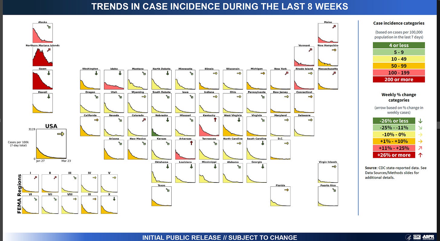
I said that case and test positivity data are not as reliable as they used to be, but it’s worth mentioning that the same states seeing the big rise in BA.2 are the states seeing the greatest concentration of red and orange counties (other than Alaska) using the Community Transmission Level map that evaluates case rate and test positivity.
In fact, the northeast states are seeing an increase in case incidence of between 11-25 percent over the past 7 days.
I mentioned earlier that wastewater surveillance can also be an important early warning sign that COVID-19 might be resurging. The problem is that even though we are more than 2 years into this pandemic, the network of testing sites is spotty and the CDC data tracker provides static numbers and percent change, but gives no history.
Of the data we do have, for 426 locations across the US, 37% are seeing an increase in viral RNA signal in waste water of 10% or more. Twenty eight percent are seeing viral RNA signal double or more. This includes cities like Atlanta, Houston, St. Louis, and Chicago.
In addition, there are states like Missouri that have seemingly shut down wastewater sampling across much of the state. The areas with gray circles on the national map or the gray squares on the state map below are ones with no recent test data. For the Kansas City metro (west side of the state), there hasn’t been any sampling since 2/14 or 2/28 for any of the 6 locations. There is a disagreement here between the state map and the national map for St. Louis. Perhaps there are data reported to CDC that are not being updated on the state map, for whatever reason.
Back to the northeast, there is now an uptick in SARS-CoV-2 virus RNA in the wastewater in Massachusetts. Wastewater surveillance isn’t a perfect measurement, but something we should pay attention to, especially as data collection for other metrics becomes less reliable.
That’s it for today. The data appears to be very promising nationally. But some of the early warnings we have are starting to ping. It remains to be seen whether those early warnings manifest into real surges.
Thank you for your support of the COVID Digest.
My Ph.D. is in Medical Microbiology and Immunology and I am Chair of the Division of Natural Sciences and Mathematics at the University of Saint Mary. I've worked at places like Creighton University, the Centers for Disease Control & Prevention and Mercer University School of Medicine. All thoughts are my professional opinion, do not represent the views or opinions of my employer and should not be considered medical advice.


