

The COVID Digest, 10Sep2021
Has Delta peaked in Georgia?

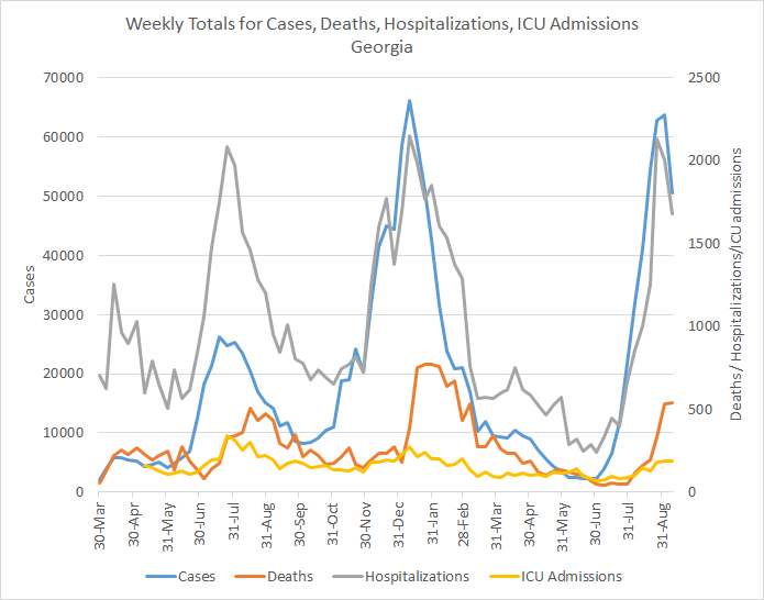
The possible good news we observed last week for Georgia COVID-19 data is holding. This week we can see that total cases (PCR + antigen) have declined by 21%, new COVID-19 hospital admissions have declined by 16%, ICU admissions are the same as last week, and deaths rose by 1.7%. We should keep in mind, however, that this is a weird week for data given the Labor Day holiday. But so far, things look very good.
As always, when we see a dip in cases, we should also look at what happened with testing. Because a decrease in testing output could also explain a decrease in cases, especially given the holiday. On the graphs below you can see test volume (blue) and test positivity (red) for PCR testing (left) and antigen testing (right).

We can see that PCR test volume decreased a bit. But so did the test positivity. So together that means that although testing volume decreased, it wasn’t to a degree that made Georgia miss more cases than it was missing the previous week. When we look at antigen testing, we can see that test volume actually increased. Antigen test positivity continues to decline, heading back to that goal line of 5% positivity or less.
The next graph is making its first appearance on the newsletter. In the past, I’ve always shown 7-day case rate per 100,000 residents by county type. And that is interesting. But that grouping doesn’t tell you how things are going regionally. For that, I’ve modified the graph to compare Georgia hospital regions. You can see a map of the hospital regions if you scroll down to where I discuss hospitalizations. Because we know that cases feed hospitalizations (and deaths), then knowing what is happening on a regional level with cases might predict what is to come for hospitals.

The data show us that the delta surge really took off in south Georgia first, peaking first in region L (Valdosta - Tifton and the I-75 corridor). It also hit region M, J, K, F and H hard too. But these areas have peaked and are in decline. There’s a middle tier of hospital regions including A, B, C, and E that have been seeing a more steady increase that has recently begun to level off, with the exception of hospital region B which continues to increase slowly.
A big part of the reason why cases are going down is because they’re going down in 10-17 year olds, who for a time led the state in case numbers. This is most likely attributable to some of the largest school districts pivoting to online learning or instituting mask mandates. All age groups saw a decline this week, but the descent is greatest for 10-17 year olds. I should note, however, that this graph below only accounts for the age data of PCR cases, not antigen cases. The Georgia DPH does not provide demographic data for antigen cases, so I can’t include them in this analysis.

As described above, cases decreased a bit for every age group. But when we consult the Georgia DPH school-aged surveillance data report, we see an interesting trend. The graph below shows case rate per 100,000 for children and college-aged adults for all laboratory tests, not just the PCR tests like in the graph above.

Case rate is going down for children under the age of 18, consistent with the graph above. But it continues to climb for 18-22 year olds. This population is more likely to take advantage of rapid antigen testing, so it’s possible this accounts for the difference in the two graphs. But whereas some of the largest school districts in the state have taken steps to reduce disease transmission in their schools, that’s not true of the University System of Georgia, which serves many of the college aged adults in the state. So, Georgia is not out of the woods yet. Limiting transmission in kids is a very good thing - we need to keep that going. But they’re not the only ones contributing to disease and the state has more work to do.
We are starting to see hospital burden level off. The graph below comes form the Georgia Geospatial Information Office data hub. It shows the number of patients currently hospitalized for COVID-19 over time across the state. The delta wave set a new record, but it has leveled off and may be showing signs of decline, certainly welcome news.

As of this writing, 11 of the 14 Georgia hospital regions set new records for patient census during the delta surge - all but regions D, E, and L. As of today, 8 of the 14 hospital regions are showing declines in patient census, including regions A, E, G, I - M. However, all regions remain in the dark red zone for patient census as shown in the graphic below.

As of today, there are only 62 staffed ICU beds available in the state of Georgia, with a population of 10.6 million people. It would be a very bad time to have a heart attack, stroke or car accident. Please use the utmost care to avoid unnecessary reasons to go to the hospital. It’s not the right time to be doing the milk crate challenge, for example.
Over the past year, Georgia has built a lot of staffed ICU bed capacity, as you can see in the graph below. But even despite that increased capacity, the state is using 98% of those beds at this time. Yesterday all 14 hospital regions were using >90% of their ICU beds, the first time that has ever happened during the pandemic. Today we see that region J is in the yellow zone and that is because they were able to staff an additional 28 ICU beds overnight. Hospitals are going to extraordinary lengths to try to maintain the capacity to preserve bed space for those unexpected acute and intensive care needs. But those beds are only available if they have staff to support the patients lying in them.

Next, let’s look at deaths. As you may remember death surges follow case surges. So even though cases may be peaking now, we probably still have a few difficult weeks to get through with respect to deaths. In the graph below, you’ll find a similar setup to the case rate graph presented earlier. It compares death rate by Georgia hospital region since late June.

We can see that hospital region M has paid the highest cost in lives so far for the delta surge. Their death rate is about 8x that of region D (metro Atlanta). Region B in the northeast corner of the state is climbing fast too.
If we compare the human toll since the start of the pandemic, we can see that the highest death rate is in rural counties, including in regions like M and B from the graph above. So the trend we’re observing in recent history is consistent with the past surges. What’s most regrettable about the current surge in deaths is that they were almost all preventable. The state didn’t get to these populations in time or they were convinced by disinformation not to get a lifesaving vaccine. What the graphs above and below show us, is that it didn’t have to be this way. That is probably the most devastating part of this pandemic - the lives that could have been saved, but weren’t.

Back in early July, I predicted that southeast Georgia was going to be the most vulnerable part of the state for delta, due to both low vaccination rates and high test positivity. It meant that disease was likely to strike there and that the current testing capacity was insufficient to meet pre-surge demand, let alone what delta would do to the area. It would make contact tracing and isolation and quarantine really difficult. It would mean that these regions were more likely to burn with COVID-19, uncontrolled, than their neighbors elsewhere in the state. This is one of those instances that I regret being correct.

If things have peaked for Georgia, that means 9 weeks of surge which is exactly what Missouri experienced when delta went through. The death surge in this delta wave began 4 weeks after the case/hospitalization surge began. So we should anticipate about 3 more weeks of high death counts before they begin to recede, assuming that the decline in cases continues.
I want to be clear about one thing here. These cases, hospitalizations and deaths didn’t need to happen. And certainly, they didn’t have to be as bad as they were, especially when you look at how much better things are in Atlanta. One thing I’ve heard said is “well the virus is going to do what the virus does.” This is ridiculous, lazy and depraved indifference to the pain and suffering of others from a preventable disease. We have agency here. We have the ability to prevent this suffering and to save lives with a free, safe and effective vaccine. What is the difference between how the delta surge transpired in Atlanta versus the rest of the state?
People who gave a damn.
People who saw COVID-19 and the delta variant for the threat that it was. People who rolled up their sleeves and got vaccinated. People who wore masks and avoided crowds. People who believed healthcare workers when they shared the strain and horrors they were seeing in the hospital. People who led their communities with the best public health advice and guidance they could find. People who believe in God, but also believe that God helps those who help themselves (consider the drowning man story). People who saw an opportunity to save lives and took it. These people saw opportunities to save people in their community and they sacrificed to make that happen. This commitment wasn’t universal, even in Atlanta. But there was enough of that community-level commitment to blunt how bad the delta surge would be. We need that commitment to stay in place. Because just because cases are on the decline does not mean that momentum can’t shift back in the opposite direction.
What happened in Georgia during the delta surge is a profound failure. I am relieved to see the cases starting to go down. But things got as bad as they did because too many people (including state leadership) could not be bothered to lift a finger to save people. This is government failing its people and communities failing each other. And I don’t think I can confidently say that the delta surge will be Georgia’s last surge either. As long as vaccination rates stay as low as they are, we should anticipate continued waves. In fact, using Georgia Tech’s Population Level Immunity estimation tool, the state is only estimated to be just above 70% immune and still behind the national average.

The other prediction I made when delta first emerged was that the South would be “ground zero” for the delta variant, even though it first took hold in Missouri. It is my hope that other regions of the country learn from the South’s mistakes and make better choices to save every person that they can. This pandemic has stolen so much from us. We should not feed one more person to it.
Unless otherwise noted, the source data for all of these graphs is from the Georgia Department of Public Health daily status report and the Georgia Geospatial Information Office COVID-19 Data Hub. Many thanks to the public health data heroes at these organizations for providing these data to the public on a near-daily basis. Not all states offer this level of transparency.
The COVID Digest is a free newsletter that depends on reader support. If you wish to subscribe please click the link below. There are free and paid options available.
My Ph.D. is in Medical Microbiology and Immunology and I am Chair of the Division of Natural Sciences and Mathematics at the University of Saint Mary. I've worked at places like Creighton University, the Centers for Disease Control & Prevention and Mercer University School of Medicine. All thoughts are my professional opinion, do not represent the views or opinions of my employer and should not be considered medical advice.
The matter of Delta peaking in Georgia is, perhaps, an oversimplification. While the Georgia total new infections has, indeed, declined, the state is not a homogeneous entity. Yesterday's county-level stats (from the NYTimes) suggest that there are communities where the opposite is taking place - Especially notable is Hall County where a fairly large population is experiencing a 46% increase in cases over the past 14 days. And, it's not alone. Gwinnett and Richmond counties are also experiencing an uptick right now although not, as yet, so much as Hall.