

The COVID Digest, 04Sep2021
A record setting week for Georgia

It was a big week for COVID-19 in Georgia. The state broke records for the number of patients hospitalized for COVID-19 (called patient census), there were three new pediatric deaths newly reported, and the state passed the grim milestone of 20,000 confirmed deaths due to the pandemic so far.
Despite that, there may be some good news with this week’s data. I’ll explain as we go. Below, you can see the graph that measures how four big COVID-19 metrics have shifted over time: weekly totals for cases, hospitalizations, ICU admissions and deaths.

Compared to last week, this week we saw the metrics change by the following amounts:
Cases rose by only 1.5%
Hospital admissions decreased by 6%
ICU admissions increased by 7.3%
Deaths rose by 60%
So the increases for cases and ICU admissions is slowing compared to recent weeks. A slowing in cases is important because cases fuel hospitalizations, ICU admissions and deaths. For example, you don’t need a hospital bed for COVID-19 if you never get it in the first place. Cases remain very, very high. But this week we are no longer seeing the giant increases that we’ve seen for the past month. It remains to be seen if this is a temporary respite before a continued climb. Just like we couldn’t tell a surge was really taking off based on a single data point, we can’t tell when it is truly receding based on a single data point. For hospitalizations, we are seeing some regions begin to decrease in patient census, particularly hospital regions K and L in the southwest corner of the state. Other regions, particularly in the northern parts of the state, continue to take off. When we see a decrease in hospital admissions it could mean a true decrease in the need for beds. It could also mean that the hospitals are full and cannot accept additional patients. So, like for cases, we need more time to make sense of what is happening here. The big increase in deaths is, unfortunately, expected. Surges in death follow surges in cases every time in this pandemic. We had hoped that with the advent of vaccines perhaps we wouldn’t see quite as much death as we saw for previous surges, especially considering that the state prioritized vaccinating older populations who are typically the most vulnerable. In this instance, the death surge began 4 weeks after the case surge. So if the cases are truly leveling off now, we might expect another 4 weeks of continued increases for deaths before they begin to recede. If deaths continue to accumulate as they are right now, then we will likely see this death surge surpass the one experienced in January 2021. I hope to be wrong on this. This week we saw a net increase of 531 newly reported deaths. The previous record was 769 in a week, set in late January 2021. This suffering and death is preventable with a free, safe and effective, fully FDA-approved vaccine. You can find your nearest dose at vaccines.gov.
You may be thinking…perhaps cases are leveling off due to testing output. However, testing volume continues to increase (blue line for both graphs below), particularly for PCR testing which is considered the gold standard.
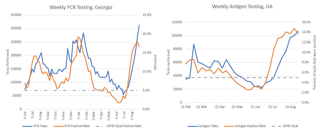
Test positivity is decreasing for both testing methods, meaning we are finally approaching a testing volume that can begin to get a handle on how many cases are truly out there. It doesn’t mean that the current testing volume is enough. We still need more in order to drive test positivity back down to 5% or below. But things are heading in the right direction. Many thanks to all of the laboratorians, pharmacists, and others who are collecting and performing these tests. You are doing critically important work right now.
For cases, the 7-day case rate per 100,000 (so adjusted for population) is shown below for different county types in Georgia.

The 7-day case rate for the state has nearly reached the previous maximum. Rural and nonrural counties outside of the Atlanta metro have already surpassed the previous maximum. The Atlanta metro is so far faring much better than they did in the winter surge, which is great news considering their population density in the face of a highly transmissible variant. These data are based on a person’s county of residence that they report when they get tested for COVID-19.
We can look at PCR cases by age for the past 8 weeks in the graph below.

Cases are increasing for most adult age groups, decreasing (mercifully) for those 80+. pediatric cases among 1-17 year olds decreased this week and this may be due, in part, to school districts pivoting to virtual learning as cases have spread among their study body. So the leveling that we’re seeing in cases overall does not mean that the case surge has ended for everyone. It is still rising consistently for those 18-79. But it has stalled and decreased for children and those 80+. The work is not yet done.
We can also see weekly PCR case totals by race in the graph below. An interesting trend is that we are seeing cases begin to decrease for African-American / Black and “Other” populations. The latter includes the majority of those who identify as Hispanic or Latinx. You can see from the continued increase for the unknown category that contact tracers are overwhelmed right now and playing “catch up.”

If we look at hospital data, we can see extraordinary strain for hospitals. The graph below shows how many of the 14 hospital regions are in the red, yellow and green zones for ICU bed usage. The state is in the worst position it has ever been in for the past year.

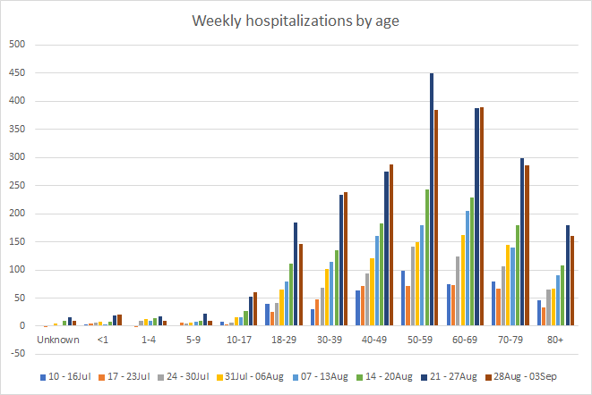
COVID-19 hospital admissions have risen for babies <1 year old, 10-17, 30-49 and 50-69 year olds. But it does appear that the increases are slowing compared to recent weeks. That’s really good news. But I should point out that as many 40-49 year olds were hospitalized this week as 70-79 year olds. Almost as many patients 18-29 were admitted as those 80+. So please don’t confuse youth with invincibility against this virus. Much of this suffering is preventable with the vaccine. Not only do we need to prevent the disease for the people who are sick with it, but also in order to decrease the COVID-19 burden on hospitals so that they are able to treat non-COVID illnesses and emergencies to the best of their ability.
Earlier, I showed you that case rates are better for the Atlanta metro compared to the rest of the state. But hospitalizations differ here. The graphic below shows the Georgia hospital regions and the COVID-19 patient census for regions D (Atlanta and most of the suburbs) and N (northwest Atlanta suburbs).

Whereas region D is leveling off below the previous maximum, region N continues to surge toward the winter peak. This might not make a lot of sense compared to what we are seeing with case rate for regions of the state, since case rates aren’t so bad in the Atlanta suburbs. There are at least a couple of possible explanations: (1) although fewer people are getting sick in region N counties, perhaps they are sicker than those in region D; (2) hospital data are reported by location of ADMISSION, not county of residence as is done for cases. So this could be an artifact of people going to a neighboring county for hospital treatment in region N from regions A and C.
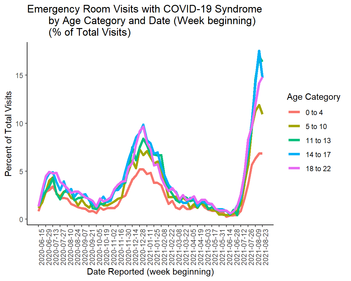
We also can see data on pediatric ER visits from the Georgia Department of Public Health school aged surveillance data report. These visits are starting to decrease or level off for children aged 0-17, but continue to rise for those 18-22.
This was unfortunately a significant week in the state for deaths. First, there were three newly reported pediatric deaths this week, all on the same day. That made August the deadliest month for COVID-19 deaths among children since the pandemic began.

The state also surpassed 20,000 confirmed deaths. This is a big number to wrap your mind around. So it may help to put a sense of scale on this. It is the size of at least six 9/11 attacks. It is roughly the total enrollment of the University of North Georgia. It is about the population size of Cartersville or Snellville.
So how are those deaths distributed? We can look at it a few different ways. First up is by county type, adjusted for population. You can see from the graph below that death rate has always been worst in rural counties and this surge is no exception. But you can also see that death rate is surging for all county types other than the Atlanta counties of Fulton and DeKalb.

Another way to look at the deaths is by age group. We have vaccinated a lot of seniors and that has shifted the peak of these distributions away from those 80+ to center over the 60-69 age group. Unfortunately, the state has not vaccinated enough people over 60 to slow the increases we are witnessing. Really, this week saw big increases for every group aged 30 and above. It is not too late to get vaccinated for COVID-19 in order to prevent this tragedy for your family and friends.

And another way to look at deaths is by race. Deaths are increasing for everyone when we examine things this way. But they are increasing most dramatically for those who identify as White and Other (again, this includes the majority of people who identify as Hispanic). There may be a tendency to think that COVID-19 is “somebody else’s problem.” Graphs like this help to remind us that this disease is everyone’s problem. We all need to protect ourselves and our families and communities by limiting transmission.

So it’s a bit of mixed news this week. There may be signs that things may begin to get better, but we need more time to see if those decreases are real and lasting. There are a lot of families mourning the loss of loved ones this week. I hope that we can honor those we have lost by preventing their suffering in others. Please work to get vaccinated or continue to speak to those around you about the importance of vaccination. Approach these conversations with an abundance of empathy, rather than derision. I’d like to think that people are doing the best that they can amidst fear, anxiety and disinformation.
I hope that my readers have a restful and relaxing Labor Day weekend. Please make good choices, keeping the pandemic in mind. Try to prioritize gathering outdoors, ideally with other people who are fully vaccinated. Be safe and be well!
Unless otherwise noted, the source data for all of these graphs is from the Georgia Department of Public Health daily status report and the Georgia Geospatial Information Office COVID-19 Data Hub. Many thanks to the public health data heroes at these organizations for providing these data to the public on a near-daily basis. Not all states offer this level of transparency.
The COVID Digest is a free newsletter that depends on reader support. If you wish to subscribe please click the link below. There are free and paid options available.
My Ph.D. is in Medical Microbiology and Immunology and I am Chair of the Division of Natural Sciences and Mathematics at the University of Saint Mary. I've worked at places like Creighton University, the Centers for Disease Control & Prevention and Mercer University School of Medicine. All thoughts are my professional opinion, do not represent the views or opinions of my employer and should not be considered medical advice.