

The COVID Digest, 06May2021
Georgia COVID-19 Updates

Good evening! Today’s newsletter is going to be a little shorter than usual. I had to start a new antibiotic today after the sinus surgery. It turns out that the lab culture from the surgery grew out an organism (they didn’t tell me which one! I’m dying to know) that was resistant to the antibiotic the surgeon put me on initially. And the new antibiotic is something I’m having to get used to, side effect wise.
I hope I make up for the brevity of today’s report by giving some much needed good news and encouragement when it comes to hospitalizations and deaths.
Georgia
Testing
The map below comes from the CDC COVID-19 Data Tracker. It shows the net change in PCR test positivity compared to last week for each county. Ideally, you want to be in the white shades, but green is sort of steady. If you’re in the turquoise or teal colors, it’s becoming more likely that your county might be missing some cases with the current testing output.

What’s interesting is that testing is actually going up, and the state positivity is flat. But that’s the state average. A lot of the rural counties are seeing increases in test positivity.

Today Georgia reported a net increase of 19,002 newly reported PCR tests, a pretty big day by recent standards, and 4.6% of them were positive. For antigen tests, there was a net increase of 9,795 newly reported test results, and 4.6% of them were positive also.
Cases
Today Georgia reported a net increase of 1213 newly reported cases (865 by PCR + 348 by antigen test).
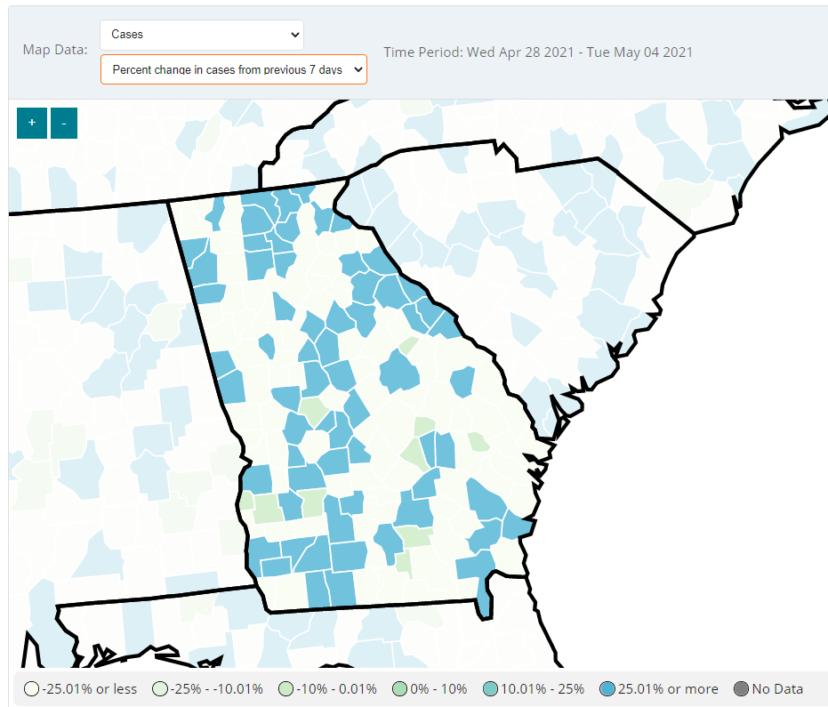
The map below looks very similar to the one for testing with the same color scheme (sorry!) but shows the percent change in cases compared to the previous 7 days. Again, you want to be in the pale shades as much as possible showing a decrease or steady state of disease. But there are a lot of counties in the +25% or more category and these overlap in many ways with the test positivity map.
Hospitalizations
I have some good and bad news here as we start to see how the vaccines are impacting one of our key metrics for understanding the pandemic - hospital burden. First, let’s begin with really good news, by looking at what’s happening with COVID-19 patient census in hospital region N which includes the northwest Atlanta suburbs. If you look at the graph in the lower left, the patient census is dropping off a cliff right now, reaching pre-winter surge baseline. This region has consistently been in the red or orange zone for patient burden for the past 6 months. But is now solidly in the yellow zone and continuing to fall. Considering the population density of this area, the decline on this graph is pretty remarkable.

This next graph is the good news / bad news part. The data that support these graphs come from the HHS COVID-19 Reported Patient Impact and Hospital Capacity data set, which is publicly available. Last week, they started telling us the daily COVID-19 admissions for all states by age group - both confirmed by PCR at the time of admission and suspected COVID-19 but pending test results at the time of admission. We see a similar pattern to what I showed on Sunday. We are seeing admissions drop for those 60+ but rise among younger populations. And the confirmed admissions among 20-29 year olds are huge - as big as for 50-59 year olds for 4 of the past 7 days.

When looking at suspected admissions, these are declining among 70+ but growing for younger age groups, especially 40-69. The number of children with suspected COVID-19 appears dramatic in this graph, but is likely an artifact of the fact that we do not test children nearly enough for COVID-19. So they are unlikely to have a PCR test result by the time of admission. All the same, the number of kids being admitted is rising for both confirmed and suspected COVID-19 over the past four days.
Again, I think what we see here with the trends is the work of the highly effective vaccines we have. They are doing what we want them to do among older adults. But we need to continue to work to vaccinate younger adults because as we see here, they’re not invincible. I’m especially talking to the young and fabulous (20-29). The bad news is that we haven’t done enough to vaccinate younger adults yet and the data confirm it.
Deaths
Today there was a net increase of 21 newly reported COVID-19 deaths (19 confirmed and 2 probable). Deaths have thankfully continued to trend downward, especially this week. In fact, the best news of today’s newsletter is that the 7-day death rate for the state is the lowest it has been since 09Jul2020, before the summer surge in deaths began. The vaccines have done something Georgia couldn’t do previously - return the death rate to the pre-surge baseline - not just of the most recent surge but the one that preceded it. Thank goodness for these vaccines. Please work to get one if you haven’t done so already.
That’s it for now. Thanks for reading and I’ll be back on Sunday!
References
https://covid.cdc.gov/covid-data-tracker/#county-view
https://beta.healthdata.gov/dataset/COVID-19-Reported-Patient-Impact-and-Hospital-Capa/6xf2-c3ie
https://dph.georgia.gov/covid-19-daily-status-report
https://covid-gagio.hub.arcgis.com/
Georgia COVID-19 Updates is a free newsletter that depends on reader support. If you wish to subscribe please click the link below. There are free and paid options available.
My Ph.D. is in Medical Microbiology and Immunology. I've worked at places like Creighton University, the Centers for Disease Control & Prevention and Mercer University School of Medicine. All thoughts are my professional opinion and should not be considered medical advice.