Hello readers! I want to provide a compiled list of resources that I use for analysis or that I would consider to be trustworthy resources for you. This is not an exhaustive list and I plan to update is as I am made aware of additional resources. So it might be helpful to bookmark this page for easy reference.
State Resources
Department of Public Health Daily Report: I’m sure everyone knows this one already, but our data for cases, deaths, and hospitalizations at a state and county level come from here.
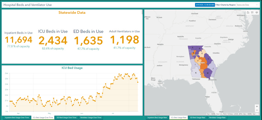
Georgia Emergency Management Agency COVID page: daily reports on hospital bed capacity, ventilator usage, etc. Note, they often update their social media pages before the report is available on their website in case you need things rapidly.
Georgia Geospatial Information Office COVID data hub: TONS of information here on COVID including another dashboard that compiles data from DPH, a hospital bed capacity dashboard as well as a COVID patient census dashboard. It features other tools on social mobility, economic impacts, and links to dashboards for neighboring states.
Federal Resources
Center for Disease Control and Prevention’s COVID Data Tracker: nationwide state-by-state data on cases, deaths, testing, emergency department visits, mobility, underlying conditions and more. Lots of demographic data in here.
CDC’s COVID-NET: follows hospitalizations by age group, underlying conditions, etc, in a select number of states and hospitals. It is not an exhaustive look at what is happening in the US.
CDC’s list of underlying conditions as risk factors for severe illness with COVID-19: Not only do they indicate diseases, but also gauge how solid the evidence is to support a disease’s inclusion on the list (with references).
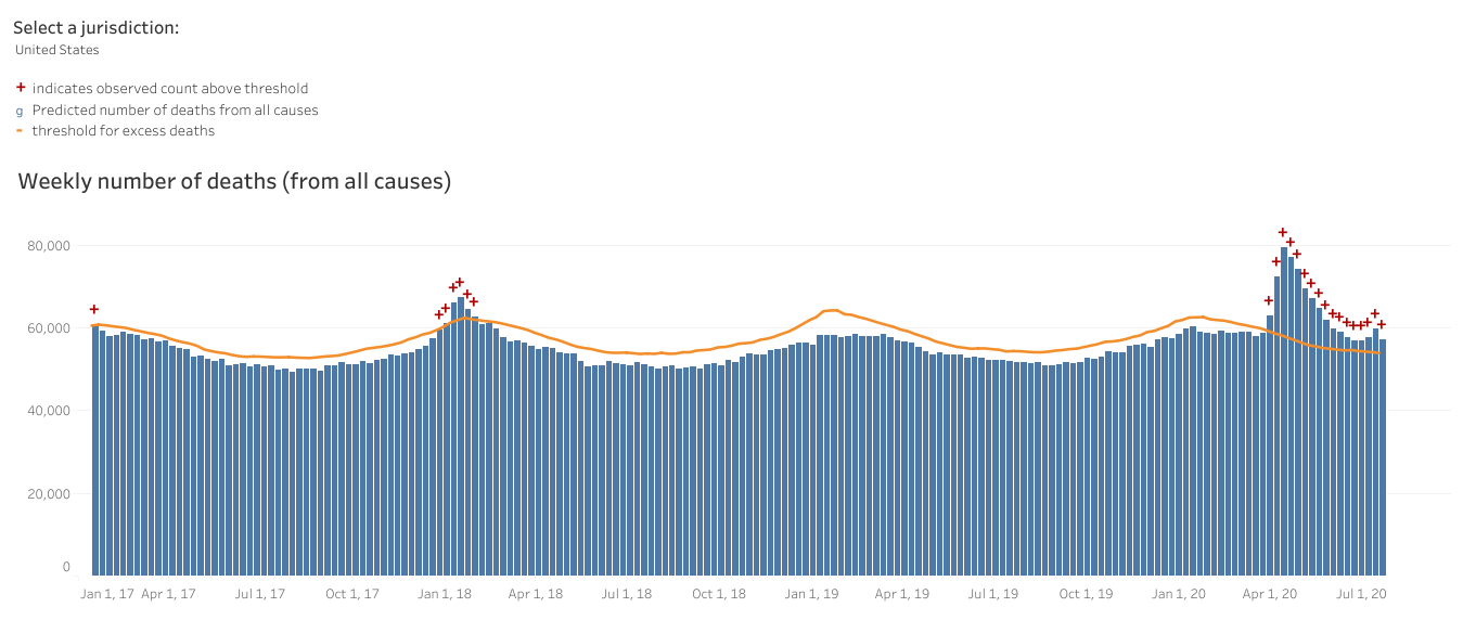
CDC’s estimate of excess deaths: This tool looks at deaths from all causes for the past 2.5 years compared to the average for seasonal trends. Anything above the orange line is above the threshold for “normal” or expected amount of death. Data are reported weekly. The Tableau visualization features drop down menus to change the jurisdiction, age groups, race/ethnicity, underlying conditions, COVID-related deaths, etc.
CDC’s what to do if you’re sick guidance: includes instructions on self-isolation, symptoms to keep an eye on, how to prevent spread to others with whom you live.
CDC’s guidance on death reporting: what are the criteria for a coroner or state health department to rule a death as due to COVID or related to COVID illness?
Health and Human Services hospitalization dashboard: this is the infamous outcome of the spat between the White House and the CDC over where states should report their hospitalization data. It has had some hiccups (such as not updating between August 2 - 12) but does provide data on how bed usage compares across states.
Federal Bureau of Prisons: COVID-19 data that concerns the prison population. This population is going to have a difficult time adhering to social distancing and might have challenges in accessing medical care.
Global resources
World Health Organization’s guidance on criteria for testing and phased reopening: This is the guidance that includes the 5% percent positivity rate that is much discussed in my updates and elsewhere.
WHO’s COVID dashboard: see how disease trends compare among nations
Non-Government - National
Johns Hopkins Coronavirus Resource Center: this was one of the earliest resources we had for comparing data across the world. It is still a very powerful database of information, but I have found it difficult to navigate.
Harvard Global Health Institute risk maps: very intuitive color coding that rates counties as high risk to on the path to containment based on the average daily case rate per 100,000 residents. High risk counties are advised to shelter in place to bring disease transmission to within manageable levels for testing and contact tracing.
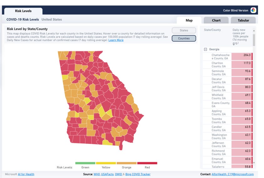
COVID Exit Strategy: this is a think tank of several high profile individuals in the field of public health, including the former director of the CDC, Dr. Tom Frieden. It is a treasure trove of compiled data for disease trends, testing, mask mandate policies, and hospital capacity.
New York Times COVID Data Tracker: this is one of the best compilations of data in the United States looking at cases, deaths and recent trends across counties. All of their data come from state health departments.
The Atlantic’s COVID Tracking Project: another great resource on state to state and even county level data trends.
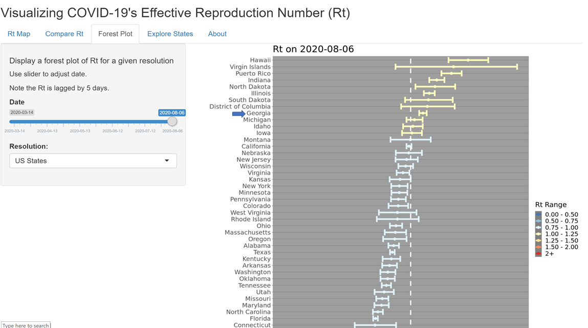
Harvard Chan School of Public Health Rt model: Rt is a prediction model and not all models are created equal. Rt can be used to estimate how much transmission is taking place within a community. If Rt is greater than 1, then the disease is growing. If it is less than 1, then the disease is estimated to be on the decline. Models depend on assumptions and when assumptions need to be made on disease trends, you want people in public health to be making those assumptions, rather than the founders of a popular social media platform. The forest plot is the most helpful for seeing state to state comparisons and has a time slider to see how Rt modeling has changed over time.
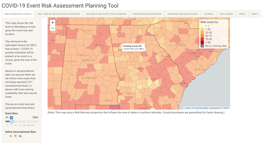
Georgia Tech’s Event Risk Assessment Planning Tool: serves the entire US at a county level. Uses county level transmission data to predict the relative risk that public gatherings (you choose the size of the gathering) will have a guest who is COVID-19 positive.
New York Times & Harvard Global Health Institute School Reopening risk tool: much like the other Harvard GHI risk tool, this assesses the relative risk of a school reopening at a county level, across the US.
School database for COVID-19 cases, deaths, etc: this was compiled by a teacher in Kansas. Yay! I’m moving there and grateful to know there’s someone so motivated to track data for all of us. There are tabs for each state and it is limited to K-12.
New York Times Coronavirus Vaccine Tracker: summarizes the research required to bring a vaccine to market and characterizes the status of each coronavirus vaccine under development.
New York Times Coronavirus Testing Summary: tool developed with the Harvard Global Health Institute to estimate how each state is doing on testing relative to the target.
Non-Government - State level
Neighborhood Nexus: this is a collaborative effort between the Atlanta Regional Commission and other partners. It mainly focuses on the Atlanta metro region.
Backdated epi curve: this link shows how newly reported cases have been backdated over time. It has much the same formatting as the DPH. A similar graph is available for backdated deaths as well.
Grady Regional Coordinating Center Hospital Diversion Status tracker: used by EMTs to determine the nearest hospital that can serve a patient’s needs for care. For laypeople, this shows the relative strain for the hospitals in your area. Note: this is for total hospital need, regardless of COVID status. You can sort by county, but it serves the entire state.
Mercer University School of Medicine Skelton Medical Libraries: This is a great resource, and not just because I used to work at Mercer University School of Medicine. For those who like reading the scientific literature they have a reading list of the latest articles as well as links to various resources.
Atlanta Journal Constitution’s COVID dashboard: a robust collection of graphs and maps that uses DPH and GEMA data to track the pandemic over time.
Compiled list of links to college and university coronavirus data offerings.
Georgia COVID-19 Updates is a newsletter that depends on reader support. If you’d like to subscribe to these updates via email, please click on the button below. Free and paid options are available.


Dr Schmidtke, I’m trying to find the children’s book you recommend. You mentioned on in one of the newsletters this summer. I love science communication and am collecting anything related to immunology.