Week in Review, 24-31May2021
Georgia COVID-19 Updates

Combined Data
The graph below shows how four of our big metrics for tracking the COVID-19 pandemic are tracking over time. Cases are represented by the blue line and correspond with the left y-axis. All other metrics correspond with the right y-axis. The reason I graph all of these things together is so that we can see the way these things trend together (or differently) over time.

This week we can see that cases continue to decline, down 17% compared to last week. But hospitalizations and deaths both rose, +10% each, continuing the increases that were recorded last week. ICU admissions decreased 8% this week, reversing the increase noted during the previous week.
Testing
The PCR test output trend over time can be seen in the graph below, represented by the blue line that corresponds with the left y-axis. The red line represents the test positivity rate over time, and corresponds with the right y-axis. The gray dashed line is the goal line for test positivity.

PCR testing output was nearly equivalent to the previous week. Meanwhile, the test positivity rate decreased to 2.8%. The state’s PCR positivity rate has been below 5% for the past 5 weeks.
Antigen testing decreased this week, by about 7%, and the positivity rate decreased to 3.2%. Antigen test positivity in Georgia has been below 5% for the past three weeks.

The DPH does not provide data regarding demographic details for cases identified by the antigen test. Keep that in mind as we go through the demographic data in the following sections. You’re only seeing part of the data. Meanwhile, antigen testing identified 32% of the cases this week.
Cases
The number of combined new cases (by date of report) through Sunday is as follows:
- 24 hours: 200 by PCR + 61 by antigen = 261 (+0.02%)
- 7 days: 2472 by PCR + 1153 by antigen = 3625 (+0.3%)
- 4 weeks: 14,396 by PCR + 6,419 by antigen = 20,815 (+1.9%)
This week cases decreased for all age groups. The 7-day case rate per 100,000 is shown below for the state and for different county types in the state. There is very little variation across county types. Case rate is highest in the Atlanta suburbs and lowest in the Atlanta counties of Fulton and DeKalb.

Something interesting is going on with demographic data. First, if we look at cases by age group for the past 8 weeks, we can see that they’re decreasing across the board, or flat for 60-69. In the past, we’ve been able to sense how overwhelmed (or not) the DPH and its contact tracers are by looking at what happens in the “unknown” category. This is sort of a holding spot while they’re gathering data. For the past two weeks, the change in this category is negligible. So perhaps they are caught up with the backlog and able to keep up with the new cases as they are reported. There’s not a lot to be concerned about with this graph. But we’ll come back to this thread in the hospitalizations and deaths sections below.

Hospitalizations
The number of new hospital admissions (by date of report) as of Sunday is as follows:
- 24 hours: 5 new COVID-19 admissions, 0 admission to the ICU (weekend reporting is typically light, and I’m sure the holiday is impacting this too)
- 7 days: 575 new COVID-19 admissions, 112 ICU admissions
- 4 weeks: 2092 new COVID-19 admissions, 438 ICU admissions
Let’s pick back up with the demographic data by looking at confirmed COVID-19 admissions by age for the past 8 weeks. Remember, when we were looking at cases, things were decreasing for all age groups and were flat for 60-69. But while cases may be decreasing, hospital admissions are increasing for everyone over the age of 50. So while fewer people are getting sick, more of them are going to the hospital, perhaps because there is more room to care for them than earlier this year. What’s disappointing about this trend is that many of the people in these age groups were prioritized for vaccine eligibility and didn’t take advantage of that due to either problems with accessing the vaccine or disinterest in taking advantage of a free, life-saving technology.

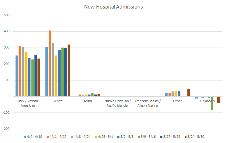
If we look at the 8 week hospital admission numbers by race, we can see that admissions have been rising steadily for the past 4 weeks for the White population. Increases were also observed this week for Asian and “Other” population, which includes the majority of those who identify as Hispanic.
There is only one hospital region in the yellow zone for COVID-19 patient census, region F in central Georgia. Every other hospital region is in the green zone. For ICU bed usage, there are no hospital regions in the red zone.
Deaths
The number of new confirmed deaths (by date of report) is as follows. The percentage in parentheses indicates how the increase compares to Georgia’s cumulative total at the start of each window of time.
- 24 hours: 0 confirmed, 0 probable deaths
- 7 days: 138 (+0.8%), 38 probable deaths
- 4 weeks: 490 (+2.8%), 135 probable deaths
This week, deaths increased for those over the age of 50. This is the same trend as we are seeing this week for hospital admissions. Because death reporting is more delayed than hospital admissions, the increase in hospital admissions might predict that we will see continued increases in deaths for the 50+ age groups in the coming weeks.

A bit of personal news, this weekend I was able to get my son his first dose of the Pfizer vaccine. We were camping this weekend and thankfully the local, rural Walgreens had Pfizer available. I enrolled him in v-safe to report symptoms (if any) after the vaccine. So far we don’t really have much to report except some soreness at the injection site.

We were on vacation and it was his birthday. But this is really, really important. It also sets us up for a well timed second dose as our camping adventure for next month will have us passing through a larger town that day. You might think he’d be upset about getting poked on his birthday, but he didn’t have any anxiety or protest at the suggestion that there was an appointment in 30 minutes for him and that he needed to get dressed and brush his teeth for it. As it turns out, I’m not alone, vaccinating my 12-15 year old as early as he was eligible.

Polling data from the Kaiser Family Foundation shows us that vaccinated parents are more likely to vaccinate their children under age 12 as soon as possible once they are authorized. I hypothesize that a good chunk of the “wait and see” crowd might be persuaded by full FDA approval for the vaccines (which is expected as early as June for Pfizer). But the vaccinated parent population is far more persuadable when it comes to vaccinating their children than adults who have declined vaccination for themselves. That makes sense, of course.

This next graph from CDC was striking to me. If you look on the left, the yellow dashed line represents the percentage of the total 12-15 year old US population. And in a very short time, just a few weeks, we have already vaccinated almost 20% of this population, or one in five adolescents. No other age group has seen that steep rise except adults over the age of 75. Parents are not messing around and part of this may be because the community safeguards that parents have depended on for the past year (i.e. masking, social distancing, reduced capacity) are gone. Summer camps and a desire to return to normalcy for their kids are likely to also be big motivators.

References
https://dph.georgia.gov/covid-19-daily-status-report
https://covid-gagio.hub.arcgis.com/
https://beta.healthdata.gov/dataset/COVID-19-Reported-Patient-Impact-and-Hospital-Capa/6xf2-c3ie
https://www.nytimes.com/interactive/2021/05/29/us/covid-vaccine-teens.html?smid=tw-share
https://covid.cdc.gov/covid-data-tracker/#vaccination-demographics-trends
Georgia COVID-19 Updates is a free newsletter that depends on reader support. If you wish to subscribe please click the link below. There are free and paid options available.
My Ph.D. is in Medical Microbiology and Immunology. I've worked at places like Creighton University, the Centers for Disease Control & Prevention and Mercer University School of Medicine. All thoughts are my professional opinion and should not be considered medical advice.