The Week in Review, 30Nov - 06Dec
Georgia COVID-19 Updates

Good evening!
Let’s begin with a look at the combined data, for cases (left y-axis, blue line), hospitalizations (gray) and deaths (red) over time. There are some interesting trends going on.

First, and maybe the most obvious, we had a BIG week for cases and hospitalizations. In fact, the number of cases this week (31,889) is the biggest that Georgia has ever recorded in a week and an increase of 56% over the previous week. Hospital admissions also rose but by an even bigger percentage, 73%, and are comparable to the peak we saw during the spring.
Second, notice the temporal association between cases and hospital admissions because there’s something very different about this surge compared to the one in the summer. In June, when cases started taking off, hospitalizations followed almost in sync. But the increase in hospital admissions is asynchronous this time, showing a delay of about four weeks. Some of the case surge is impacted by the new data on antigen cases, especially impacting the data to include the first “shoulder” on the climb upward for the blue line in early November. So even without those, the hospital surge is about two weeks delayed compared to cases, which is different than we saw last time.
Deaths increased, although more modestly than cases or hospital admissions. There’s been some back and forth in these numbers over time, but if the last surge is in any way predictive of how this one will go, we might expect deaths to surge four weeks after the surge in hospitalizations. But, as I pointed out, this surge is different so far.
Testing
Where it was a big week for newly reported cases, it wasn’t due to a surge in PCR testing, since test output has been falling for the past two weeks (blue line below), by 23% since 22Nov.

Meanwhile, this week’s average percent positive rate has increased 59% in that same time. We are now well above the 5% goal line and again, if the last surge is anything like this one, we should expect that it will continue to increase. What this tell us is that we are not testing widely enough to identify most cases. The cases we are missing may not realize they’re sick and are out and about, contributing to ongoing disease spread. We cannot find the disease if we aren’t looking for it. The White House Coronavirus Task Force has been begging Georgia to conduct active surveillance in the places where communities tend to gather. But there’s a manpower and funding problem with this too - these tests don’t happen by magic and public health staff are already managing more than their job description’s workload. The state needs money to do the testing that would be needed to get ahead of this pandemic. Until Congress passes CARES Act, version 2, then the disease will continue to go undetected and we will all suffer for it.
The Georgia Department of Public Health does not provide data regarding the number of antigen tests performed nor the percent of them that are positive. But we do know that antigen cases accounted for 27.2% of this week’s total cases. So by only having the PCR data, we are only seeing 72.8% of the pandemic this week, for cases as well as demographic data. As we learned from the November election, a lot can change between 72 and 100% of county precincts reporting.
Cases
The number of combined new cases (by date of report) is as follows:
- 24 hours: 1805 by PCR + 229 by antigen = 2034 (+0.4%)
- 7 days: 23,221 by PCR + 8,668 by antigen = 31,889 (+6.8%)
- 4 weeks: 95,344 (+23.5%)
The new statewide total is 501,405, combining PCR and antigen-test identified cases. Bear in mind that these case totals are likely an under count of our actual case count - it’s a problem that plagues public health for multiple diseases and especially so when a disease has so many asymptomatic cases, as COVID-19 does. In the graph below, I show the cases by date of report for both PCR and antigen cases, where the red dashed line is the 7-day moving average. Ignore the big bump around 11Oct - that was a data dump of antigen cases.

You’ll notice that we are now well above our previous peak in the summer, by about 31%. Given that we bottomed out from the post-summer decline at a case rate that was about twice as high as where we entered the summer surge, it is not surprising that we have already exceeded the summer peak. There was more momentum for the virus this time around. And the surge is impacting all county types, as shown below. This graph shows the 7-day case rate per 100,000 residents including both PCR and antigen cases. Ignore the weird peak in early October - that’s when DPH let us know about 26,000 antigen cases all at once. The nonrural counties outside of the Atlanta metro led this surge and the Atlanta suburb counties have subsequently followed in the past week. They both have been tied, with the highest case rates for the past week now.

The next graph shows us how the PCR cases (or 72.3% of the week’s cases) were distributed across age. You’re looking at 8-week timelines, side by side, for each age group.

The 18-29 year olds continue to have the greatest case counts in the entire population and their weekly total has risen by 132% over the past 8 weeks. The case increases are really large for those 30-59 as well. Every age group, including the elderly and all children, showed increases this week. What’s concerning to me in this graph and the ones that follow, however, is the growing number of cases in the “unknown” category. That’s a holding spot while contact trace investigations and follow up are pending. I keep an eye on these numbers because it might indicate when our contact tracing workforce (heroes they are!) are getting overwhelmed and behind on cases. I have no idea what “normal limits” are for this, but we saw similar increases during the summer surge.
The next graph is formatted the same way. But this time, instead of looking at age groups we are looking at different races.

This week, we saw increases for every race other than American Indian / Alaska Native. And, again, we see that the unknown category saw a big increase too. For White populations, their weekly case total has risen 88% over the past 8 weeks. For Black / African-American populations, their increase was 101%. For Asian populations, the increase is 193%. For “other” populations (including those who identify as Latinx), the increase is 220%. These are all very, very worrisome trends.
Hospitalizations
There were 1257 new hospital admissions this week for COVID-19 and 183 new admissions to the ICU. For weeks, I’ve been showing you the graph below that shows that the number of patients currently hospitalized for COVID-19 disease has been steadily rising. Our level now is only 23% below our summer peak, when many hospitals were at their breaking point.

However, we’re starting to see that new hospital admissions are also starting to trend upward. The graph below shows that new hospital admissions have been relatively flat, even as the number of patients currently hospitalized was trending upward (graph above), meaning that the patients needing care were needing it for longer, perhaps with more severe disease. Increasing new admissions on top of those already in the hospital for lengthy stays will further strain our healthcare infrastructure and staff.

As we did for the other sections, here’s how each week’s new hospital admissions have varied by age group. Whereas the 18-29 year old age group is leading this surge, that’s not where the hospitalizations are most prominent.
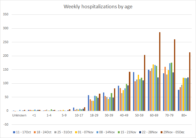
Pay attention to the fact that the increases this week aren’t limited to the elderly. These really big increases are happening to all who are 40+. The graph below shows the same 8-week timeline, but this time it is for race. The biggest increase we see this week is for White populations (+77%).

White populations were also showed the biggest increase in new ICU admissions this week. However, there were also concerning increases for the “Other” category too.

Deaths
The number of new confirmed deaths (by date of report) is as follows. The percentage in parentheses indicates how the increase compares to Georgia’s cumulative total at the start of each window of time.
- 24 hours: 2 (+0.02%)
- 7 days: 193 (+2.2%)
- 4 weeks: 777 (+9.5%)
This week the number of deaths was an increase of 42 compared to the week before (+28%). The current statewide total is 8971 and of those, 8.7% were reported in the last 4 weeks alone. We will probably cross 9000 by Tuesday or Wednesday of this week.
As for cases and hospitalizations, here is a graph of deaths by age over time. As you get to the next age group, the timeline starts over. A reminder, this graph is built using data for deaths among PCR-identified cases only.
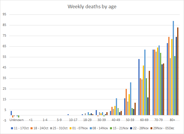
So where cases are growing biggest and fastest among 18-29 year olds, and hospitalizations are growing most among those 40+, for deaths the biggest increases this week are among those 60-69 and 80+. Just keep in mind that even if you are young and might think you’re invincible, the disease doesn’t just stay among your age group. In this pandemic, none of us get to see the impact of our actions immediately. The people we infect don’t get sick for days afterward, don’t need a hospital for weeks later, don’t die for a month. I think if we did see the impact of our actions (lives lost and lives saved), we’d get a lot better adherence to public health recommendations.
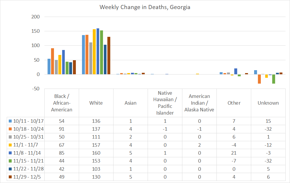
With respect to race, the biggest increase in deaths was for White populations, but increases were also noted for Black / African-American, Asian, and “Other” populations.
Looking at different county types, the death rate per 100,000 has decreased for rural counties and now their rate is roughly equal to the statewide rate. The highest death rate is for nonrural counties outside of the Atlanta metro. The lowest death rate is nearly equivalent between Atlanta and Atlanta suburb counties.

While it’s certainly welcome news to see that rural death rate come down, what we’ve learned from the past two surges of death rates is that eventually the rural counties catch up and are disproportionately worse overall.
References
https://dph.georgia.gov/covid-19-daily-status-report
https://covid-gagio.hub.arcgis.com/
Georgia COVID-19 Updates is a free newsletter that depends on reader support. If you wish to subscribe please click the link below. There are free and paid options available.
My Ph.D. is in Medical Microbiology and Immunology. I've worked at places like Creighton University, the Centers for Disease Control & Prevention and Mercer University School of Medicine. All thoughts are my professional opinion and should not be considered medical advice.