The Week in Review, 23-29Nov2020
Georgia COVID-19 Updates

I want to begin today with another reminder that the data for the past week might not reflect reality very well, with laboratory closures and reporting delays over the Thanksgiving holiday. There are things that look really promising in the data and things that don’t. But I think we need to get to the later part of this coming week to see how much of this is due to delayed reporting.
A second reminder, if you traveled for the Thanksgiving holiday, ate inside a restaurant, or gathered with non-household friends or family indoors, please plan to get a COVID-19 test this week. Then be sure to communicate your test results (if positive) to those with whom you gathered so that they can quarantine and seek their own test. Do not assume that they will be notified by a contact tracer.
Combined Data
Let’s begin with a look at our big three metrics for orienting ourselves in this pandemic: cases, hospitalizations and deaths. In the graph below, cases are represented by the blue line and correspond to the left y-axis. Hospitalizations and deaths are represented by the gray and red lines, respectively, and correspond to the right y-axis. The data are added to this graph weekly, which helps to avoid some of the “noise” of day to day variation.

So like I said in the introduction, I think there are some things that look good in the data, but might not reflect reality. I mean, I certainly hope that cases, hospitalizations and deaths are truly trending down. But I think it’s reasonable to expect that with the Thanksgiving holiday we might not be getting a good look at the situation. For now, however, cases and new hospital admissions are down compared to the previous week. Deaths also declined, but at a smaller rate than cases and hospitalizations. I should note that in this graph, antigen cases are included in the weekly total.
Testing
This week, Georgia recorded 190,147 PCR tests. Normally, that would be a lot, but after breaking a new record last week, this is a big drop (-15.7%). Some of this may be because of less demand - a lot of people were seeking tests the week before Thanksgiving to have peace of mind regarding holiday travel and gatherings (though, this is not actually a good idea - a negative test only represents your infection status on the date of collection). Some of it may be because of a drop in laboratory output. Commercial laboratories (i.e. Quest, LabCorp, etc) do the majority of COVID-19 testing in Georgia and they aren’t as likely as hospital and public health laboratories to work over the holiday. In addition, testing centers closed or had reduced hours over the holiday. So again, it’s hard to say with any certainty how things are going right now.
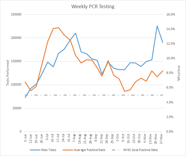
However, of the 190,147 tests reported this week by PCR, 8.3% were positive and that is an increase of 10.7% compared to last week. There has been quite a bit of variation in the past month, with one week showing an increase and the next, a decrease. But the overall trend is up 51% since 11Oct. A reminder, the percent positive rate is an indication of whether we are doing enough testing and often considered alongside the case rate. The case rate tells us how intense disease is for a given area. The percent positive rate tells us how much that case rate might be an under-representation of reality. The higher the percent positive rate, the more likely we are missing cases that go on to contribute to community transmission. The goal is to be at or below 5% on a consistent basis.
Meanwhile, it’s important to remember that the Georgia Department of Public Health does not provide any data regarding the number of antigen tests performed nor the percent that are positive. Antigen testing accounted for 20.6% of this week’s total cases. That means that the PCR test data is only telling part of the story. As we all witnessed with the recent election, we can’t be sure about the data when only 80% of precincts are reporting vote tallies. The Atlanta Journal Constitution had a good article today describing the problem in data reporting when DPH does not include antigen cases in the totals and demographic data.
Cases
The number of combined new cases (by date of report) is as follows:
- 24 hours: 1665 by PCR + 287 by antigen = 1952 (+0.4%)
- 7 days: 16,190 by PCR + 4,194 by antigen = 20,384 (+4.5%)
- 4 weeks: 107,534 (+21.2%)
The new statewide total is 469,516, combining PCR and antigen-test identified cases. Bear in mind that these case totals are likely an under count of our actual case count - it’s a problem that plagues public health for multiple diseases and especially so when a disease has so many asymptomatic cases, as COVID-19 does.
The graph below shows how each week’s cases have been distributed by age according to PCR-based testing alone. Each bar represents a separate week. This kind of graph lets us look at timelines for each age group at the same time. Note, the Department of Public Health does not yet include antigen-identified cases in their demographics data table or graph. This week, antigen-identified cases made up 20.6% of the week’s newly reported cases. So there is a lot of data we aren’t seeing. But the graph below shows what we *do* know, based on PCR-based testing. The maroon bar is the most recent week and, again, this is just PCR-based data.

Again, cases are reduced this week compared to the previous week, so it’s not surprising that we see decreases in most age groups. However, the decreases are small and cases remain high for most age groups. We do see small increases for babies less than one year old, and those 70+. Thankfully, the number in the unknown category this week is small, which would suggest that contact tracers are not being overwhelmed yet by the increase in cases over the past month. However, the situation is reversed and in a big way when you look at the race data for cases. For 5 of the past 8 weeks, we’ve noted decreases in the unknown category as contact tracers followed up on identified patients and cleared their backlog. However, for the past three weeks we are seeing positive numbers in the unknown category and the highest number in the past 8 weeks was recorded this week. In fact, we haven’t seen a number this high for the unknown category since the week of 08Aug2020.

If we look at how cases have trended across different county types, including both PCR and antigen cases, the results are provided below. Ignore the big spike around early October - that’s when the DPH notified us of about 26,000 antigen cases all at once.
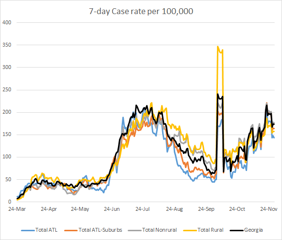
We’ve seen a drop in the past week or so but the overall trend is an upward trend since late September. We are not far below the rate we experienced at the height of the summer surge in late July. As noted in the AJC article I referenced in the testing section, the Department of Public Health graphs and maps only reflect the cases identified by PCR test. The 7-day case rate graph above and the maps below reflect PCR *and* antigen cases. The maps below show how the situation has changed in a week with respect to 14 day case rate per 100,000 residents. There are improvements this week, but they are subtle. You can click on the image below to see the live image where you can click and hover on the county of your choice to see their case rate.

Hospitalizations
As noted in the combined data section, new hospital admissions are down this week compared to the previous week. On its face, that would appear to be a good thing. However, our patients who are currently hospitalized is trending up and, in fact, there was a large increase today. As of today, the number of patients currently hospitalized is 2139 and this is 106 more patients than yesterday’s total and 14% higher than a week ago today. So how do we hold both ideas in our head, that hospital admissions are flat or decreasing, but current hospitalized patients are increasing? One possible explanation is that the patients who are being admitted are not being discharged quickly - their disease course might be more complicated or require a lengthier stay.

Of course, the pandemic is not being experienced at the same level throughout the state. You can view how many patients are currently hospitalized for COVID-19 in your hospital region by visiting this resource on the Georgia Geospatial Information Office data hub. The screenshot below shows the data for hospital region A, which includes the northwestern-most counties of Georgia. The graph on the lower left shows you how the number of COVID-19 patients hospitalized has trended over time. Right now, they are at a record-breaking level, higher than their peak during the summer surge. And that number has increased 45% in the past week. Similar trends are observed for region B, C and N. For region D, which serves most of the Atlanta metro, the trend is more similar to the statewide curve provided above. You can view your area’s data by choosing your region from the drop down menu in the top right of the dashboard (see the blue block arrow in the screenshot below).

Let’s be clear about one thing, a weekly increase in hospital demand of 45% is not sustainable. This hospital region and others like it will reach their breaking point if weekly increases of 45% are continued. At hospitals all over the country, hospitals are canceling elective procedures for important things like cancer, heart surgery, etc, because of the demand that COVID-19 is placing on their resources and staff. We do not want this to happen in Georgia. Please do what you can to limit your exposures so that you and your loved ones do not need a hospital bed for COVID-19 disease.
The graph below shows how hospital admissions compare across age groups and over time. Remember, you are looking at age-specific timelines, side by side, and this graph only reflects PCR-identified cases. Hospital admissions decreased for many age groups this week, but there was an increase for babies under 1 year of age, 10-17 year olds and those 80+. Hospital admissions remain high for those 40-49.

Deaths
The number of new confirmed deaths (by date of report) is as follows. The percentage in parentheses indicates how the increase compares to Georgia’s cumulative total at the start of each window of time.
- 24 hours: 3 (+0.03%)
- 7 days: 151 (+1.8%)
- 4 weeks: 797 (+10.0%)
This week the number of deaths was a decrease of 14 compared to the week before (165 deaths). The current statewide total is 8778 and of those, 9.1% were reported in the last 4 weeks alone.
As for cases and hospitalizations, here is a graph of deaths by age over time. As you get to the next age group, the timeline starts over. A reminder, this graph is built using data for deaths among PCR-identified cases only.

This week there were small increases for those 18-39, but a much larger increase for those 80+.
Thankfully, the 7-day death rate per 100,000 continues to descend. I think it’s important to point out a couple things though. Take note of how long it has taken us to come down this far from the summer surge - three months and counting to reverse the trend that built over the course of one month. Keep in mind also that the death rate is disproportionately worse for rural counties compared to all other county types in Georgia. Third, our current statewide death rate is still 81% higher than it was on 09Jul before the surge in deaths took off.

That’s it for today. Enjoy the rest of your evening!
References
https://dph.georgia.gov/covid-19-daily-status-report
https://covid-gagio.hub.arcgis.com/
https://www.ajc.com/news/ga-virus-rates-likely-a-third-higher-than-official-tally-ajc-analysis-finds/XP64D634Q5E3XJL7TDSENJM52E/
https://datawrapper.dwcdn.net/xn1T9/1/
Georgia COVID-19 Updates is a free newsletter that depends on reader support. If you wish to subscribe please click the link below. There are free and paid options available.
My Ph.D. is in Medical Microbiology and Immunology. I've worked at places like Creighton University, the Centers for Disease Control & Prevention and Mercer University School of Medicine. All thoughts are my professional opinion and should not be considered medical advice.