The Week in Review, 18-25Oct2020
Georgia COVID-19 Updates

Atlanta Magazine came out with an investigative report yesterday describing how the state of Georgia’s COVID-19 dashboard housed by the Department of Public Health met or failed to meet the challenge presented by COVID-19. It’s something every person in Georgia (or analyzing Georgia data) should read. In many ways, the article highlights why people like myself and others who try to provide context and understanding of the numbers were needed at all in this pandemic response. From the sounds of it, the epidemiologists and professionals working at DPH had little to no control over what goes on the Daily Status Report and that is consistent with my experience working on the state’s COVID-19 Data Task Force. Any changes needed for the site all had to go through the Governor’s office and most suggestions I was aware of were shot down.
I also want to point out that two of the public servants identified in the article are my colleagues and people I consider to be friends. They have been dedicated to getting the data to the public who needs it despite challenges and political obstacles. For example, they invited me to join the data task force. Their email exchanges were retrieved through open records requests to piece together the story, but I very much hope that one day they’ll be able to tell the story of what happened in the way that they want to tell it, too. If we don’t learn from our mistakes, we are doomed to repeat them.
The overarching theme of the investigative report is that the mishaps that happened with the COVID-19 daily situation report at DPH were not, in fact, DPH’s fault. But they ultimately took the blame for those problems, diminishing public trust in public health during a time when public trust was a critical resource in combatting a pandemic. I encourage you to read the report and then offer your solidarity and support for public health in any way that you can. Because they are the people who are going to get us through the pandemic. Without their data, investigations and interventions, we are lost. They have been working around the clock while having their budget slashed and being furloughed themselves. They are being tasked with job responsibilities they were never hired to do on top of managing the responsibilities of their actual job description. People are leaving and those abandoned responsibilities get picked up by someone who remains who is already piled higher and deeper than ever before. With the budget shortfall, no relief is coming for them. The people who have been working behind the scenes in this pandemic at DPH and elsewhere are heroes. This is not to say that we shouldn’t demand more of our government right now. We absolutely should. Rather, the point I’m trying to make is that I think DPH is trying very much to meet our demand for timely and reliable data. But the decision often isn’t up to them. My deepest respect and gratitude to the people working at DPH to get us the information we need.
Combined Data

Probably the best summary of how things are going this week in Georgia is that we are reversing the downward gains in cases from the summer surge. If we are seeing the beginning of a new surge and it matches the trajectory of the last one, then we should expect this coming week and the four after it to be big. The concerning thing about this increase in cases is that we are starting what may be a new surge from a disease rate that is twice as high as where we were prior to the summer surge. It is therefore likely that our next peak will be even bigger than the summer surge. So where we peaked at 26,197 cases in a week in July, we will see much bigger numbers this time. That, of course, is not a forgone conclusion. We have the power to stop these cases, but we need to do so now with our actions.
Hospitalizations are down slightly this week but there are some reports that hospital reporting is off for Georgia. Deaths decreased compared to last week (very good news). But since deaths tend to lag behind cases and hospitalizations by about 2-3 weeks, these gains may be short lived.
Testing
This week’s testing output was similar to last week’s. Meanwhile, the percent positive rate has increased over the past two weeks, more sharply in the most recent week. This sort of negates the disinformation effort that we are seeing more cases because we are doing more testing. We did the same amount of testing this week, yet more of the tests were positive. Keep in mind, these data are based only on PCR tests. It does not factor in antigen testing.

In total, there were 146,574 new test results reported this week through Electronic Laboratory Reporting. Of those, 6.8% were positive.
Cases
The number of new cases (by date of report) is as follows:
- 24 hours: 1318 (+0.4%)
- 7 days: 10,365 (+3%)
- 4 weeks: 36,238 (+11.5%)
The new statewide total is 350,923 and this week’s case total is 13% greater than last week’s. Bear in mind that these case totals are likely an under count of our actual case count - it’s a problem that plagues public health for multiple diseases and especially so when a disease has so many asymptomatic cases, as COVID-19 does. And these cases are those confirmed by the diagnostic PCR test. It does not include those who screen positive through other testing methods such as the rapid antigen test.
The graph below shows how each week’s cases have been distributed by age. Each bar represents a separate week. This kind of graph lets us look at timelines for each age group at the same time.
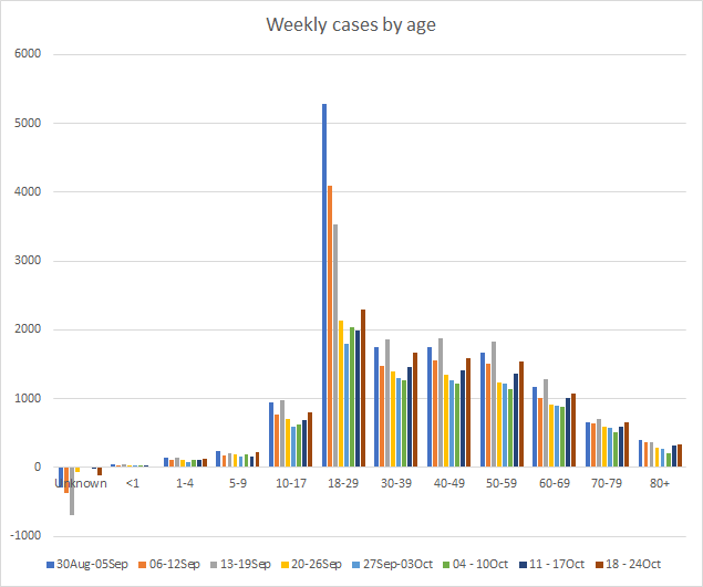
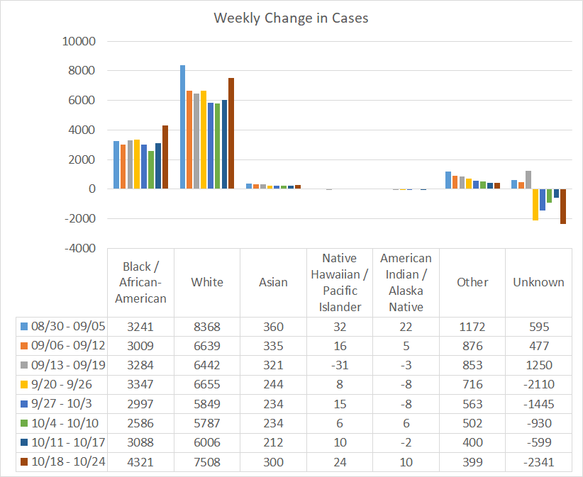
This week, we saw increases in cases for every age group. However, thankfully, the increase is not as dramatic for those over the age of 60. As has happened in the past, though, the increases we see in younger population eventually make their way to the older populations with disastrous consequences. If we look at a similar graph below that shows the timeline for different races, we can see that increases were noted for every race, or in the “other” category (which includes the majority of those who identify as Hispanic/Latinx) it held steady. There was a large reduction in the “unknown” category, which shows us that contact tracers are not (yet) overwhelmed by the influx of cases and are able to work through some of the backlog. Just so you know, the number of “unknown” cases for race in Georgia is huge, 84,211 cases (25% of the cases identified so far).
The case rates per 100,000 people are increasing across all county types. The statewide average (black line) is trending up sharply.

Hospitalizations
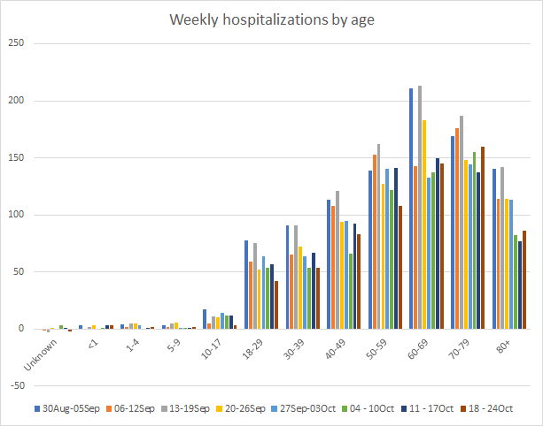
If we look at how hospitalizations have varied over time with age, we can see that this most recent week featured decreases in hospitalizations for many age groups including 10-59. Hospitalizations held relatively steady for those 60-69 and they are increasing for those 70+.
About three weeks ago, the Department of Public Health expanded the data offerings that could be downloaded each day. Among those expanded offerings are data on hospitalizations and ICU admissions by race and ethnicity. New hospital admissions and ICU admissions for the most recent two weeks are shown below.

It’s hard to see for the races with relatively few counts on these graphs, but new admissions are up for Black / African-American, White, and American Indian/Alaska Native race categories. ICU admissions (below) show similar increases, but also include increases for the Asian and Other race categories.

This all makes sense based on what we’re seeing for the state overall. We bottomed out on the current hospitalization graph around 09Oct and have been increasing ever since.
For our healthcare workers, there were 529 newly reported cases, 29 hospital admissions and 5 newly reported deaths this week. A reminder, our healthcare workforce is not an unlimited or renewable resource. Please limit your exposures to honor the risk that our healthcare workers are taking to care for the ill right now.
Deaths
The number of new deaths (by date of report) is as follows:
- 24 hours: 1 (+0.01%)
- 7 days: 171 (+2.2%)
- 4 weeks: 863 (+12.4%)
This week we saw an decrease in the weekly total from 222 last week to 171 this week (a very good thing). The current statewide total is 7809 and of those, 11.1% were reported in the last 4 weeks alone. The case fatality rate is 2.23%.
As for cases and hospitalizations, here is a graph of deaths by age over time. As you get to the next age group, the timeline starts over.

This week we only saw an increase in deaths for those aged 40-59 and 80+. Deaths are a lagging indicator compared to cases, usually by about 2-3 weeks. So as we see cases increase across the state, we can expect the deaths increase in about 1-2 weeks from now. Next, let’s look at how the most recent week’s deaths were distributed by race.

Increases were seen primarily for the Black / African-American population but also for the Asian population. Below you will find the updated 7-day death rate per 100,000 graph, showing how deaths have varied across county types. As noted elsewhere, death rates are declining. But rural death rates remain 86% higher than the state average. The death rate in rural Georgia is equivalent to the weekly death rate in Bosnia and Herzegovina.

I’m sometimes criticized for not being more optimistic, especially as cases and deaths declined after the summer surge. My goal is to be a realist - I felt we needed to keep limiting transmission so that the descent continued back to pre-summer surge levels and then keep disease rates low. It wasn’t time to eat in restaurants or to go back to life as usual. Instead, people wanted optimism and unfortunately we now see that optimism breeds complacency. Without a vaccine, the optimism many espouse is costing lives. I will favor being a realist any day because in this pandemic we need honesty. I know this update isn’t happy news and I take no pleasure in delivering it to you. I imagine most of the people who follow this newsletter have probably been doing all the right things for months now. I know that you’re tired and I know that this feels like the biggest failure of a group project ever. It’s easy to get frustrated when you see people flouting the public health guidance and pretending the pandemic doesn’t exist. As for many aspects of public health, it doesn’t matter to some people until it impacts them personally. The deaths that are predicted to follow this surge in cases (if it really takes off) were and are preventable. Please make good decisions and limit your exposures. And send bagels and coffee along with a note of thanks to your local/regional/state health department.
References
https://dph.georgia.gov/covid-19-daily-status-report
https://covid-gagio.hub.arcgis.com/
https://www.atlantamagazine.com/great-reads/behind-georgias-covid-19-dashboard-disaster/
https://covidtracking.com/blog/weekly-update-oct-22
https://www.nytimes.com/interactive/2020/world/coronavirus-maps.html
Georgia COVID-19 Updates is a free newsletter that depends on reader support. If you wish to subscribe please click the link below. There are free and paid options available.
My Ph.D. is in Medical Microbiology and Immunology. I've worked at places like Creighton University, the Centers for Disease Control & Prevention and Mercer University School of Medicine. All thoughts are my professional opinion and should not be considered medical advice.