Vaccine Update
Today the Advisory Committee for Immunization Practices (ACIP), a collection of medical and scientific experts from various academic institutions and public health departments across the US and headquartered at the Centers for Disease Control and Prevention, met today to discuss the next steps in the vaccine roll out. You can see the slides from this meeting including the many considerations they had to weigh and discuss in forming their recommendations. But the recommendation for who receives the vaccine after healthcare workers and long term care facility residents is to first vaccinate those 75+ and those considered frontline essential workers. These people are in what’s called Phase 1b. The phase that follows will aim to vaccinate those aged 65-74 and anyone aged 16-64 who have high-risk medical conditions as well as other essential workers not included in Phase 1b.
They also provided a list of who they consider to be essential workers. Frontline essential workers (left side) will be offered vaccination in Phase 1b. Other essential workers (right side of the list below) will be offered vaccination in Phase 1c.
I have to admit that when I went through these slides from the meeting and recognized all that these people had to weigh, I was surprised to have an emotional response of intense pride. Not pride for having anything to do with the decisions they are making, obviously, but proud of the collective effort that it took to get to this point where America now has its marching orders to the end of this pandemic. Way to go Team Science and Team Public Health! Their effort to balance science, implementation and ethics is an incredible breath of fresh air when so much of this pandemic response has featured none of those things.
This week’s episode of This American Life featured a story about the COVID-19 vaccine development process, connecting the basic science to the vaccine that will save us so much suffering and death and the emotions of all involved.
Combined Data
This week we set a new record for the most cases (PCR + antigen) in a single week, 45,080, and this is an increase of 8.9% over the previous week’s total. It is also 72% higher that our previous weekly case record. Weekly case totals can be viewed over time in the graph below using the blue line (corresponds to the left y-axis). Hospitalizations and deaths (gray and red lines, respectively) correspond to the right y-axis.
Hospitalizations also increased this week, with 1775 Georgians newly admitted to the hospital for COVID-19 disease. Hospitalizations have risen 145% over the past three weeks. Whereas cases have quickly surpassed the records we set during the summer surge, hospitalizations have not yet reached that point. But if current trends continue, we might meet that previous record next week. Deaths were nearly the same this week as last week. Death surges typically follow case and hospitalization surges.
Testing
This week there were 244,630 new PCR test results reported, the second highest weekly total Georgia has recorded. The percent of those tests that were positive was 13.6%. The goal is to be at or below 5% consistently over time. When the percent positive rate exceeds 5%, it is likely that we are missing cases out in the community that contribute to ongoing disease transmission. The higher our percent positive rate, the more cases we are missing. So while we are setting records for the number of cases recorded this week, it is likely an undercount of the case total that is out there.
Of the cases identified this week, 25.6% of them were identified using the antigen test. Unfortunately, the Georgia DPH does not provide any data regarding the total number of antigen tests performed nor how many were positive. So I can’t do a similar analysis for antigen tests.
For the second weekend in a row, we really aren’t seeing that much of a weekend effect for test reporting. We are for hospitalizations and deaths, but not for testing. So our case totals over the weekend are not that different from the totals Monday - Friday.
Cases
The number of combined new cases (by date of report) is as follows:
- 24 hours: 5087 by PCR + 531 by antigen = 5618 (+1%)
- 7 days: 33,544 by PCR + 11,536 by antigen = 45,080 (+8.3%)
- 4 weeks: 105,177 by PCR + 33,609 by antigen = 138,786 (+30.9%)
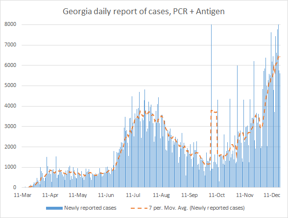
The new statewide total is 587,918, combining PCR and antigen-test identified cases. Bear in mind that these case totals are likely an under count of our actual case count - it’s a problem that plagues public health for multiple diseases and especially so when a disease has so many asymptomatic cases, as COVID-19 does. But also because we know that our percent positive rate is high. Of all the cases that have been recorded in Georgia to date, 23.6% were reported in the past 4 weeks. In other words, more than one in five of the cases we’ve had so far were in the last month, even as we are in the 9th month of this pandemic. In the graph below, I show the Georgia cases by date of report for both PCR and antigen cases, where the red dashed line is the 7-day moving average. Ignore the big bump around 11Oct - that was a data dump of antigen cases. You’ll notice that we are well above the previous summer surge now. In fact, our 7-day rolling average is now 82% higher than our previous peak.
The next graph shows us where the week’s new PCR cases are coming from in terms of age groups. The Georgia Department of Public Health does not provide demographic data for any of the antigen cases, in spite of the fact that they investigate those cases the same way that they do PCR cases. Given that antigen cases contributed 25.6% of the week’s total cases, the graph below only tells us about 74.4% of the situation. In the graph below you are looking at 8 week timelines for each age group, side by side. The most recent week is shown in maroon.
What we can see from the data we have is that there were increases across all age groups except those <1 year old. But this week’s increases are smaller than the jumps we saw in the previous week. Another issue of concern is the number of cases who fall in to the “unknown” category for age. This is a holding spot for cases while more information is gathered through contact trace investigation and follow up. Seeing big increases in this category might suggest that our contact tracing workforce is getting overwhelmed and backlogged. This observation is even more prominent when you look at the weekly change in cases by race in the graph below. Again, you’re looking at 8 week timelines side by side but for race instead of age this time.
In fact, there were more cases for people in the “unknown” race category than for Black / African-American, our second highest group historically. Small decreases were seen this week for those who are Asian and Native Hawaiian / Pacific Islander. Every other race saw increases.
Hospitalizations
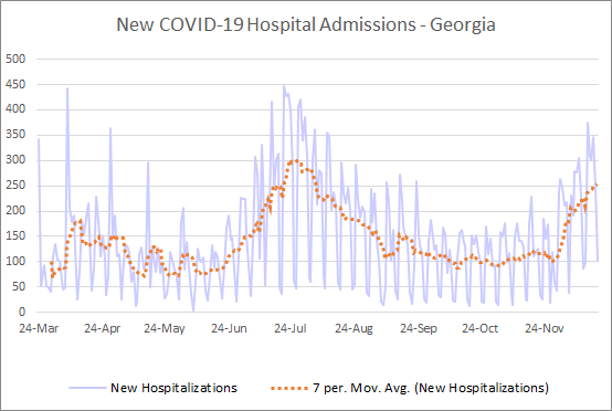
There were 1775 patients newly hospitalized this week and 196 new admissions to the ICU for COVID-19 illness.
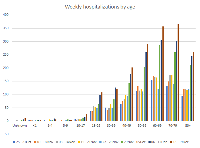
In the graph below, we can see where these new hospital admissions came from, in terms of age groups. The most recent week is shown in maroon.
We saw large increases in hospital admissions for those 60-79. Increases were seen for every age group other than children <5 and those 30-39. Of all the hospital admissions for COVID-19 in Georgia so far, 52.7% have been among those 60+. Another 45.4% are among those 18-59 and children make up 1.7%.
This week we surpassed our previous record for the number of patients currently in hospital for COVID-19.
In addition, the number of new admissions each day is trending up. Without question, the demand that COVID-19 is placing on our hospitals is greater now than it was at any time in the past three months.
Deaths
The number of new confirmed deaths (by date of report) is as follows. The percentage in parentheses indicates how the increase compares to Georgia’s cumulative total at the start of each window of time.
- 24 hours: 2 (+0.02%)
- 7 days: 232 (+2.5%)
- 4 weeks: 810 (+9.4%)
This week the number of deaths was more or less equal to last week, just two fewer deaths this week. The current statewide total of confirmed deaths is 9437 and of those, 8.6% were reported in the last 4 weeks alone.
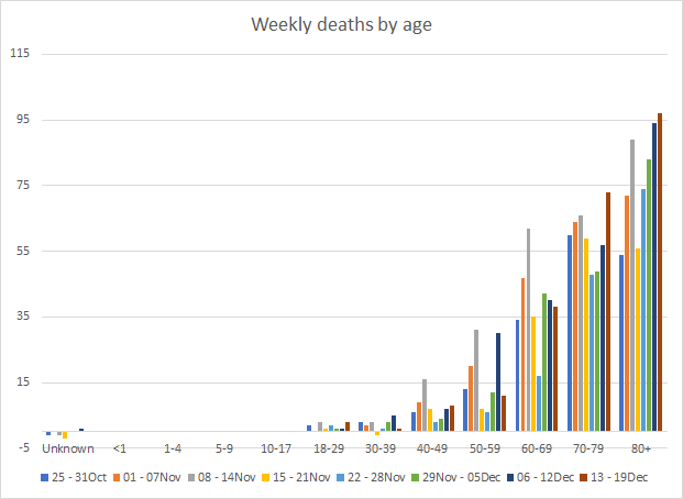
As for cases and hospitalizations, here is a graph of deaths by age over time. As you get to the next age group, the timeline starts over. The most recent week is shown in maroon. A reminder, this graph is built using data for deaths among PCR-identified cases only.
This week we saw increases in deaths for those 18-29, 40-49, and those 70+. The increase was greatest among those 70-79.
The 7-day death rate per 100,000 is trending up slightly this week for the state. However it is probably too early to say whether this is just a temporary thing before the trend continues downward or if, perhaps, this is the start of a sustained increase in death rate. More broadly, we can see from this graph that the Atlanta metro (Atlanta counties and suburb counties) are faring better than the rest of the state.
References
https://dph.georgia.gov/covid-19-daily-status-report
https://covid-gagio.hub.arcgis.com/
https://www.cdc.gov/vaccines/acip/meetings/downloads/slides-2020-12/slides-12-20/02-COVID-Dooling.pdf
Georgia COVID-19 Updates is a free newsletter that depends on reader support. If you wish to subscribe please click the link below. There are free and paid options available.
My Ph.D. is in Medical Microbiology and Immunology. I've worked at places like Creighton University, the Centers for Disease Control & Prevention and Mercer University School of Medicine. All thoughts are my professional opinion and should not be considered medical advice.


