The Week in Review, 11-18Oct2020
Georgia COVID-19 Updates

Combined Data
Probably the best summary of how things are going this week in Georgia is that I think we have bottomed out on the descent from the summer surge. We are seeing increases once again in cases and hospital admissions. The concerning thing about that is that we are starting what may be a new surge from a much higher disease rate than where we were prior to the summer surge. It is therefore likely that our next peak will be even bigger than the summer surge. That, of course, is not a forgone conclusion. We have the power to stop that, but we need to do so now with our actions.

Deaths decreased compared to last week. But since deaths tend to lag behind cases and hospitalizations by about 2-3 weeks, these gains may be short lived.
Testing
We had a much bigger week for testing this week than the past several weeks. Despite that, the percent positive rate continued to decline. Keep in mind, these data are based only on PCR tests. It does not factor in antigen testing.
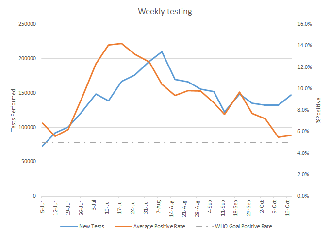
In total, there were 147,419 new test results reported this week through Electronic Laboratory Reporting, an 11% increase over the previous week.
Cases
The number of new cases (by date of report) is as follows:
- 24 hours: 1174 (+0.4%)
- 7 days: 9,149 (+2.8%)
- 4 weeks: 34,403 (+11.2%)
The new statewide total is 340,558 and this week’s case total is greater than last week’s. Bear in mind that these case totals are likely an under count of our actual case count - it’s a problem that plagues public health for multiple diseases and especially so when a disease has so many asymptomatic cases, as COVID-19 does. And these cases are those confirmed by the diagnostic PCR test. It does not include those who screen positive through other testing methods such as the rapid antigen test.
The graph below shows how each week’s cases have been distributed by age. Each bar represents a separate week. This kind of graph lets us look at timelines for each age group at the same time.
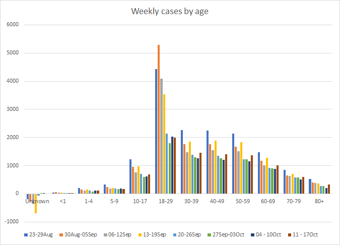
This week, we saw increases in cases for those aged 10-17, and all adults over the age of 30. If we look at a similar graph below that shows the timeline for different races, we can see that increases were noted for Black / African-American, White and Native Hawaiian / Pacific Islander populations. The increase was greatest, however, for Black / African-American populations.

The case rates per 100,000 people are increasing in the Atlanta suburbs (orange line below) and nonrural counties outside of the Atlanta metro (gray line). The Suburb counties that show an increase in their 14-day window of uncertainty are Cobb, Clayton and Rockdale. For the nonrural counties, the 14-day window shows increases for the following counties: Bartow, Bibb, Clarke, Columbia, Coweta, Effingham, Gordon, Houston, Jackson, Lowndes, Spalding and Walton. So please be extra cautious if you live in these counties. Anything you can do to flatten the curve that might be coming will make a difference.

Hospitalizations
If we look at how hospitalizations have varied over time with age, we can see that this most recent week featured increases in hospitalizations for all adult age groups aged 18-69. The increase was largest for those aged 40-49.

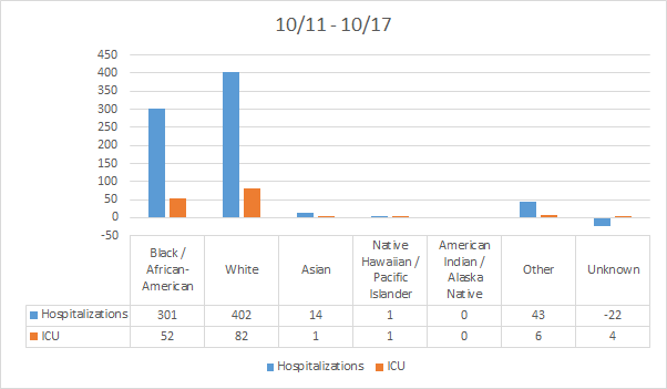
About two weeks ago, the Department of Public Health expanded the data offerings that could be downloaded each day. Among those expanded offerings are data on hospitalizations and ICU admissions by race and ethnicity. New hospital admissions and ICU admissions for the most recent week are shown below. As we get additional data in the coming weeks, I can show a similar timeline-based graph by race for these metrics.
For our healthcare workers, there were 588 newly reported cases, 43 hospital admissions and 2 newly reported deaths this week. A reminder, our healthcare workforce is not an unlimited or renewable resource. Please limit your exposures to honor the risk that our healthcare workers are taking to care for the ill right now.
Deaths
The number of new deaths (by date of report) is as follows:
- 24 hours: 31 (+0.4%)
- 7 days: 222 (+3%)
- 4 weeks: 1036 (+15.7%)
This week we saw an decrease in the weekly total from 254 last week to 222 this week. The current statewide total is 7638 and of those, 13.6% were reported in the last 4 weeks alone. The case fatality rate is 2.24%.
As for cases and hospitalizations, here is a graph of deaths by age over time. As you get to the next age group, the timeline starts over.
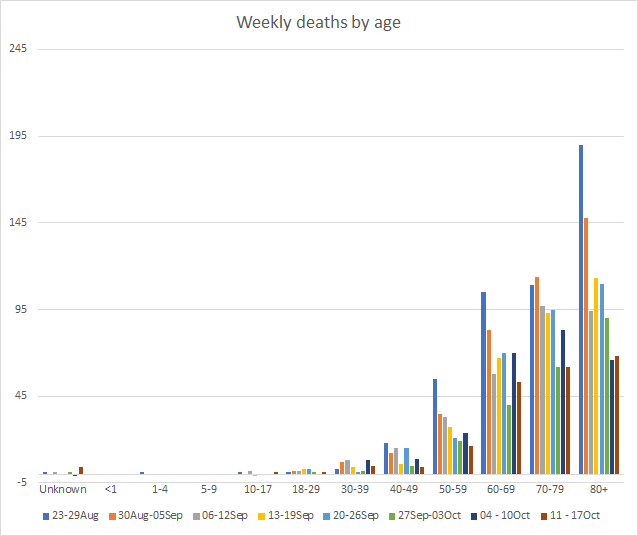
This week we only saw an increase in deaths for the unknown category and for those 80+. However, deaths remain high for those 60-69. Deaths are a lagging indicator compared to cases, usually by about 2-3 weeks. So as we see cases increase across the state, we can expect the deaths increase in about 2-3 weeks. Next, let’s look at how the most recent week’s deaths were distributed by race.

Almost all races saw a decrease in deaths this week. The exceptions were the “other” category, which includes the majority of those who identify as Hispanic or Latinx, and the unknown category.
I do a lot of analysis of the deaths each week by sex, age, race, county type, etc. And I noticed today that the male : female predominance is expanding for certain age groups. Across the state, the male : female ratio among deaths is 52% to 48%. But if we look at different age groups the disparity widens. Among the young, 80% of the deaths are in males. Things narrow starting with 20-29 year olds, where the difference is 54 - 46%. However, the disparity widens for those 40-79 years of age, with males making up as much as 57 - 61% of the deaths. Then at age 80-89, the disparity disappears and then reverses among those 90+. This is probably a function of the longer life expectancy for women compared to men.

I’ll leave you today with a good metaphor for how all of these public health interventions such as wearing masks, social distancing, avoiding unnecessary errands, hand and cough hygiene, keep encounters brief, etc, are supposed to work together. None of these recommendations are 100% protective on their own and each is like a piece of swiss cheese, with a hole in it through which risk (i.e. disease) can get through. But the more pieces of swiss cheese we layer together, the more of those holes we close from one side of the cheese stack to the other. So it’s not sufficient to wear a mask. You need to wear a mask AND keep 6-12 feet apart from others, for example. The scientist who made this graphic is from Australia. You can learn more on Twitter.

References
https://dph.georgia.gov/covid-19-daily-status-report
https://covid-gagio.hub.arcgis.com/
https://twitter.com/MackayIM
Georgia COVID-19 Updates is a free newsletter that depends on reader support. If you wish to subscribe please click the link below. There are free and paid options available.
My Ph.D. is in Medical Microbiology and Immunology. I've worked at places like Creighton University, the Centers for Disease Control & Prevention and Mercer University School of Medicine. All thoughts are my professional opinion and should not be considered medical advice.