The Week in Review, 11-17Jan2021
Georgia COVID-19 Updates
Combined Data
There are hopeful signs in the data this week. It could be a brief respite before something worse. But for now, we see signs of improvement and after so many weeks of deterioration I think we’d all like to see some good news. The graph below shows how weekly totals for cases, hospitalizations and deaths are trending over time. This week we saw an 11% decrease in cases and 8% decrease in COVID-19 hospital admissions. ICU admissions also decreased by 22% compared to the previous week (data not shown). That’s the good news. The bad news is what happened with deaths. This week the number of deaths rose 93% compared to the previous week. It was the deadliest week Georgia has recorded so far, with 750 confirmed deaths.
Seeing the cases and hospital admissions decrease is good news. In the summer surge we saw that these two things trended together with deaths peaking 2-3 weeks later. If the case/hospitalization decrease is real and the start of a descent, then we are probably looking at 2-3 more weeks of high death counts, at least. But it is good news to potentially see a peak. What we should remember from the summer surge experience, though, is that it’s much harder and slower to descend from a peak than to ascend it. We will not be out of the woods for some time.
Testing
We’ve seen a lot of talk about how public health departments are shifting focus from testing to vaccinations. But it was actually a very robust week for testing, not far off from our record. Public health departments actually only do a small portion of the state’s overall testing. Most of the testing is done by commercial laboratories that are not part of the vaccination effort. The graph below shows how testing (blue line, left y-axis) and test positivity (red line, right y-axis) have trended over time.
The number of tests performed increased 21% this week. Meanwhile, test positivity decreased 9% relative to the week before. Again, it’s too soon to know for sure that this is the peak to this surge, but it corroborates the data we are seeing for cases and hospitalizations. The more these things agree with each other, the more I tend to trust that the decrease is real.
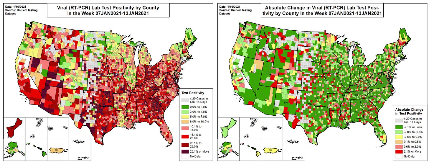
The maps below comes from the 16Jan2021 HHS Community Profile Report (PDF). On the left we see test positivity and on the right it shows how percent positivity is changing compared to the previous week for each county in the US. For the map on the left, any color that’s yellow - red is higher than the 5% goal. Georgia is mostly red to dark red (not good). For the map on the right, the color coding is that green is decreasing, red is getting worse. We can see that test positivity is improving for much of Georgia although there are pockets here and there where the rate is increasing. So our positivity rate is alarmingly high for many counties in Georgia. But there are signs of improvement and that’s a good thing.
Cases
The number of combined new cases (by date of report) is as follows:
- 24 hours: 5384 by PCR + 948 by antigen = 6332 (+0.8%)
- 7 days: 44,005 by PCR + 14,945 by antigen = 58,950 (+7.8%)
- 4 weeks: 170,790 by PCR + 57,287 by antigen = 228,077 (+38.8%)
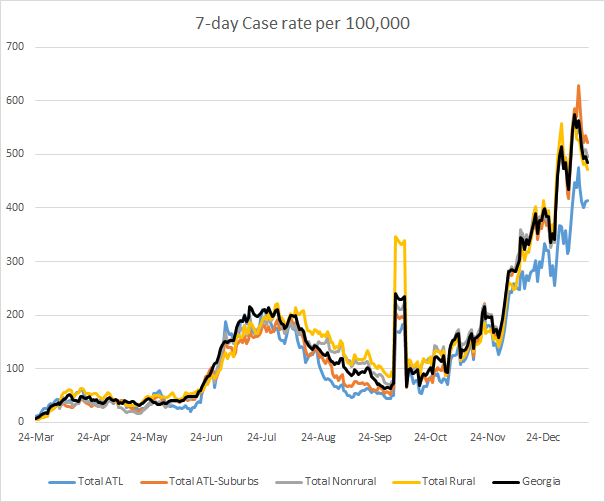
The new statewide total is 815,995, combining PCR and antigen-test identified cases. Bear in mind that as large as these case totals are, they are likely an under count of our actual case count - it’s a problem that plagues public health for multiple diseases and especially so when a disease has so many asymptomatic cases, as COVID-19 does. But also because we know that our percent positive rate is high. In the graph below, I show the Georgia cases by date of report for both PCR and antigen cases for each county type. Ignore the big bump around 11Oct - that was a data dump of antigen cases. You’ll notice that we are well above the previous summer surge, but there’s a decrease from a peak a week ago. Again, it may be too soon to know for sure that this decrease is part of a prolonged descent. For now, our 7-day rolling average is now 127% higher than our previous peak. The Atlanta counties (Fulton and DeKalb, blue line) are faring better than other county types in the state. Atlanta suburb counties have the highest 7-day case rate in the state.
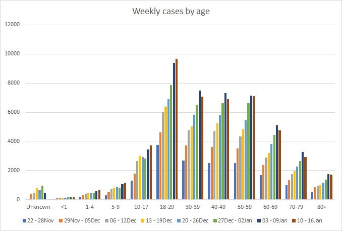
In this section of the newsletter as well as the hospitalizations and deaths section, I’m going to present some demographic data with respect to age and race. Understand that the Georgia Department of Public Health does not provide any demographic details for cases, hospitalizations or deaths identified by antigen test. That’s unfortunate, because they investigate those cases the same way they investigate PCR-identified cases. They likely have the information but don’t make the data available to the public. So for the demographic data, just understand that you’re only looking at about 70-75% of the data that are out there. It’s possible that trends would vary if the antigen case data were available. Let’s begin with the graph below that shows the weekly case totals for each age group, examining 8 week timelines side by side. The most recent week is the maroon-colored bar.
For all age groups >30, the weekly case total has plateaued or decreased, certainly welcome news. For children and young adults (ages 1-29), the cases continue to increase. It’s possible that we’re peaking for this surge when it comes to case totals. But we really want to see case totals among 18-29 year olds decrease since they’re the largest contributor to cases. Given that universities across Georgia recently resumed face to face instruction for the spring semester, it’s possible that social interactions among 18-29 year olds will slow our descent from the peak or even contribute to further increases. Hopefully that doesn’t happen.
Hospitalizations
The number of combined new hospital admissions (by date of report) is as follows:
- 24 hours: 104 new COVID-19 admissions, 3 admissions to the ICU (weekend reporting is typically light)
- 7 days: 1984 new COVID-19 admissions, 215 ICU admissions
- 4 weeks: 7207 new COVID-19 admissions, 907 ICU admissions
Today there are 5518 COVID-19 patients currently hospitalized, a decrease from the day before. This metric has plateaued and decreased over the past week. So it’s another good sign of progress, taken together with other hospital metrics.
We also see that the percentage of ICU beds in use for the state has leveled off, at least for now. The blue line is the day to day percentage. The red dashed line is the 7-day moving average, a trend line to help us see through the noise of day to day variation.
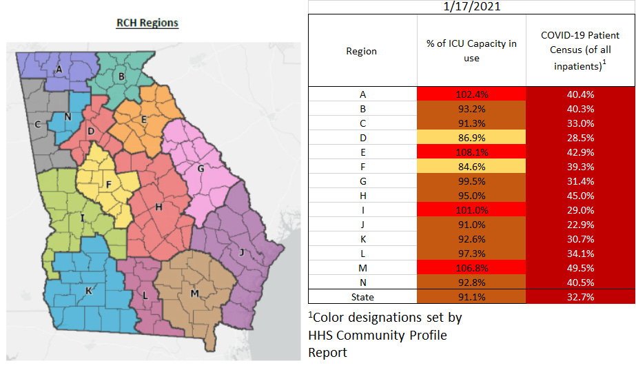
That being said, just because hospital admissions and ICU admissions are less than the previous week does not mean that we are out of the woods. Things are still very intense for Georgia hospitals. The map and chart below shows us that there are four hospital regions coping with an overage of ICU bed usage and, in fact, 12 of the 14 hospital regions are using >90% of their ICU beds. The percentage of patients who are hospitalized for COVID-19 compared to all patients is shown in the second column below. Six of the 14 regions have a COVID-19 patient census that is >40% of all their patients.
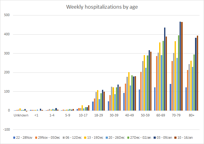
This next graph shows weekly totals for hospital admissions by age group in 8 week timelines. The most recent week is the maroon-colored bar.
As for cases, hospital admissions have leveled off or decreased for almost all age groups. The exceptions are 5-17, 40-49, and 80+. It is definitely a good thing to see hospital admissions decrease compared to last week. Let’s hope this trend continues so that our hospitals and healthcare workers can get some relief.
The graph below comes from the HHS Community Profile Report (16Jan2021) and shows how hospital admissions compare across different regions of the country over time. The South is represented by the green line. You can see that the South’s COVID-19 admission rate is 20% higher than the national rate. Thankfully, it appears that hospital admissions are decreasing.
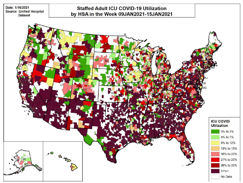
The map below shows how counties across the nation compare when it comes to average number of COVID-19 ICU patients as a percentage of all ICU patients in the past 7 days. We can see that ICUs across the nation but especially the southern half of the US and the Eastern seaboard are under tremendous strain. When the demand is this high in so many areas, it’s hard for hospitals to bring in contract staff from other regions to cope with the increasing burden - because those traveling doctors and nurses are needed everywhere.
Deaths
The number of new confirmed deaths (by date of report) is as follows. The percentage in parentheses indicates how the increase compares to Georgia’s cumulative total at the start of each window of time.
- 24 hours: 3 (+0.3%)
- 7 days: 750 (+7.3%)
- 4 weeks: 1595 (+16.9%)
This week the number of deaths increased 93% compared to the previous week. The current statewide total of confirmed deaths is 11,032 and of those, 14.5% were reported in the last 4 weeks alone. Of this week’s 750 newly reported deaths, 37% came from nonrural counties outside of the Atlanta metro and 28% came from rural counties. Another 20% came from Atlanta suburb counties and 10% came from the Atlanta counties of Fulton and DeKalb. The graph below shows how the 7-day death rate per 100,000 residents has trended over time for each county type. The state death rate is 55% above the peak during the summer surge. The death rate is worst for rural counties and best for the Atlanta counties of Fulton and DeKalb.
As I did for cases and hospitalizations, here’s the weekly breakdown of newly reported deaths by age group. Again, these are 8-week timelines side by side with the maroon-colored bar representing the most recent week.
There was an enormous increase in death this week. Increases were observed for those 30-39 and 50+. The death total for 80+ more than doubled. If these newly reported deaths are recent deaths (that’s a big “if”), the timing would suggest that they may have been exposed at Christmas gatherings. If cases and hospitalizations are actually peaking, we likely still have a few more weeks to go of high death counts. At least, that’s what we saw for the summer surge. We need to continue to be really diligent about limiting transmission so that this surge in deaths is as brief and small as it can possibly be.
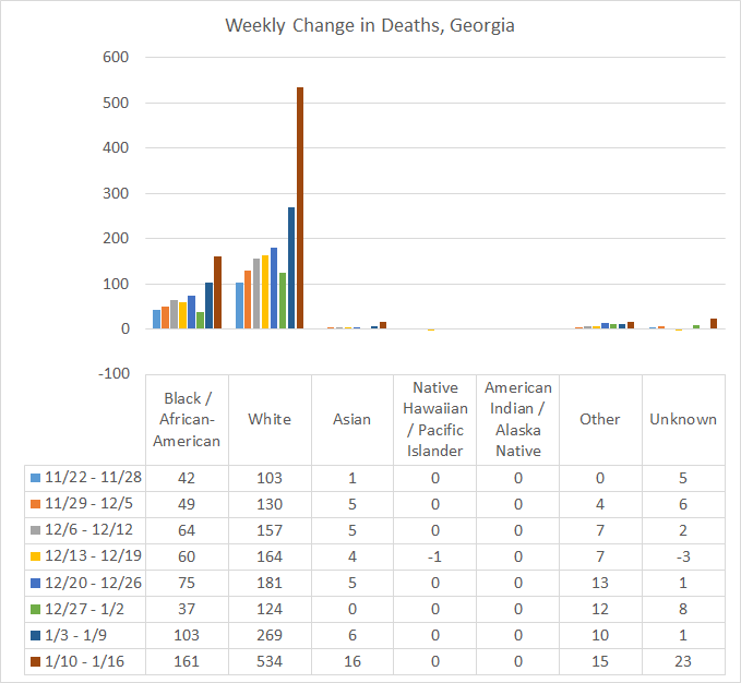
Another thing that’s really interesting is how the giant increase in deaths this week broke down by race. As for the age group graphs, these are 8-week timelines side by side, and they are only for the PCR-identified cases.
This week we saw deaths for Black / African-Americans and Other (includes the majority of those who identify as Hispanic) increase by >50%. But we saw larger increases among Asian (+167%) and White populations (+99%). Some of this concentration of deaths among the White population may be due to longer life expectancy and how many more deaths we saw in the 80+ age group. It’s also concerning to see so many deaths are in the “unknown” category. This is a holding spot for deaths until more information can be learned. But we have really good race/ethnicity data on deaths because there’s a death certificate for each of them with this information. That’s easier to track down than cases, who might be lost to follow up and contact tracing when the workload overwhelms the contact tracing workforce. I imagine this information will be sorted eventually, but it might indicate how overwhelming this increase in deaths is for the people who investigate them.
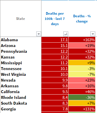
The 16Jan2021 HHS Community Profile Report indicates that deaths have risen 131% for Georgia in the past 7 days. But even as devastating our recent increase is, things are even worse for 12 other states, when we adjust deaths by population. Our neighbor to the west, Alabama, actually has the highest death rate in the country right now and an even bigger increase in deaths than Georgia. Mississippi and Tennessee are also in the top 10.
So to summarize, we are in for at least 2-3 more weeks of high death counts. But there is agreement between cases, hospitalizations and test positivity all in a downward trend. It’s possible that we have peaked for this surge - we should be able to say so more confidently next week. However, that downward trajectory depends on all of us continuing to work to limit disease transmission. With the vaccine now available to those 65+, I’m hopeful that we will see further declines in the hospitalizations and death numbers. But the vaccine rollout is slow and it might be a while before we see that benefit.
References
https://dph.georgia.gov/covid-19-daily-status-report
https://covid-gagio.hub.arcgis.com/
https://beta.healthdata.gov/National/COVID-19-Community-Profile-Report/gqxm-d9w9
Georgia COVID-19 Updates is a free newsletter that depends on reader support. If you wish to subscribe please click the link below. There are free and paid options available.
My Ph.D. is in Medical Microbiology and Immunology. I've worked at places like Creighton University, the Centers for Disease Control & Prevention and Mercer University School of Medicine. All thoughts are my professional opinion and should not be considered medical advice.


