The Week in Review, 02-09Aug2020
Georgia COVID-19 Updates
This newsletter is free and available to all who wish to learn. To support this effort financially and have access to analysis of other issues in public health and science, consider becoming a paying subscriber by clicking the link below.
Whew, it was a busy week. This week, many of the schools in Georgia that were returning to in-person instruction did so. Safety precautions were unevenly executed across Georgia’s school districts with some highlighting social distancing, mask wear, etc, like Houston County, while other school districts made national headlines for not adhering to any of the public health recommendations. And now, we have some of the first cases among children linked who tested positive after attending school.
Of course, the other troubling news for this week was the death of a 7-year old boy from Chatham county, the youngest Georgian to die from COVID-19 to date.
Testing
Earlier this week, I identified that testing backlogs have extended our 14-day window of uncertainty to 21 days. It sort of makes our case graph by date of symptom onset from DPH less valuable because it means our best data to understand where we are in the pandemic are three weeks old rather than two weeks old. We really do not have a good grasp of what the situation is at present time in Georgia. Disease transmission is widespread and completely out of control in Georgia. But the fear with this backlog in testing is that we won’t know how bad things are until three weeks after a date has passed.
For now, though, here is how the weekly number of tests reported and weekly average percent positive rate have compared over time. The left y-axis shows tests performed, the right y-axis shows percent positive. The WHO guidance is that we need to be at or below 5% positive for at least 14 days. The gray dashed line represents that goal.

You can see that as our tests reported has grown, our average percent positive rate has declined - a very good thing! In fact, this week’s output was a new record for Georgia, at 210,408 tests performed in a week’s time. Unfortunately, with this week’s average percent positive rate at 10.4%. It’s still twice as high as the WHO goal. So this is a step in the right direction. But we are still not in striking range of that goal for containing the virus.
Testing is meant to go hand in hand with contact tracing. These are the people who reach out to confirmed cases and ask them about who they were in close contact with during their infectious period prior to self-quarantine. National Public Radio recently did an investigation to measure staffing levels for contact tracing and this is what they found

For Georgia, we have just 11.9% of the estimated need to contain the spread of this pandemic. There 13.1 investigators for every 100,000 people in Georgia. So not only are we facing a backlog in testing, we lack the personnel to take action based on those test results when they do come in. Testing, contact tracing, and hospital capacity are the main pillars of our response to this pandemic. With contact tracing so woefully inadequate, it’s hard to see how we successfully beat this thing without changes.
Cases
In the first graph below you'll see cumulative cases to date broken down by county type. Previously, I’ve shown this graph since the beginning of the pandemic, but I have since truncated it to when we reopened the state on 24Apr. I've marked the last four weeks with blue arrows.

The number of new cases (by date of report) is as follows:
- 24 hours: 3169 (+1.5%)
- 7 days: 23,419 (+12.1%)
- 4 weeks: 99,670 (+85.2%)
The new statewide total is 216,596 which means that of all the cases that have been recorded, 46% were reported in the past 4 weeks. That is an intense amount of growth, but actually our case growth is leveling off right now. I discussed the testing backlogs above and in the Friday post (linked in the references) and I don’t think this leveling is real, but rather an artifact of our intense testing backlogs.
I want to take a minute to discuss two different ways of graphing the case data as shown on the DPH website. Graphing by date of symptom onset (left graph below) is typically how outbreaks are investigated. They are useful because they show when people got sick and help us to see whether different interventions have an impact. However, they are limited - our best data are often 14 days old because of the window of uncertainty. Briefly, because we are graphing by date of symptom onset and some of the people who are infected with the virus over the past few days haven’t begun experiencing symptoms or seeking out a test, we can’t see them yet and can’t graph them on the chart. It makes the graph always look like it is in decline in recent history, but this is an artifact of how infectious diseases work.

Graphing by date of report (right graph) doesn’t have the window of uncertainty. It’s just the number of cases reported by DPH each day**. For that reason, however, it is very vulnerable to variations in testing output (i.e. a low test output day is more likely to have fewer cases) including weekend effect. However, it is easier for the public to understand.
**However, something is amiss with the case and death graphs by date of report on the DPH website. It seems that they are going back in time and adjusting the numbers for the number reported each day, contradicting what they have told the public. I’ve provided data for the past 10 days, but this extends well to the beginning of the pandemic for both metrics. Some of the changes are small, some of them are large (especially for cases). So it’s hard to reason that these are data entry errors.

The very purpose of these graphs is to indicate cases and deaths by date of report to the public because date of onset was confusing. It seems pretty straight forward - how many did you report today and how does that impact our overall total now? It doesn’t seem like something that needs adjustment - they reported them or they didn’t. These adjustments aren’t being communicated to the public or anyone who tracks Georgia data, including the Centers for Disease Control and Prevention, Johns Hopkins, the COVID Data Project, the media, etc. I have defended DPH on a lot of things but this anomaly is so weird that I really can’t defend them. Why, at a time when cases are surging at a rate of 100,000 per month, would you want to erode public trust in the state’s data? This is just the latest in a series of unforced errors in the ways that data are presented to the public in Georgia - some of which were artifacts of the differences in the ways that scientists communicate versus laypeople, while others were justifiably called out.
You may recall that I’m part of the State’s COVID-19 Data Task Force. This week the team ran out of funds and had to stand down as a result. It seems like a bad time for the ongoing development of data visualizations to aid state agencies and better inform the public to stop. Hopefully that can be resolved soon.
Hospitalizations
It’s noteworthy that GEMA has been slow to produce their daily situation report since the data team stood down. In fact, they didn’t produce the report at all on August 7th. Are we going to get regular updates on hospital capacity in the future?
As of the midnight update today, our ICU beds are at 82.6% capacity. You can explore further by visiting the Georgia GIO COVID Hub.

For multiple days this week, Region H has run out of ICU bed space entirely. In the map above, orange signals the most intensely impacted areas. So Regions H, N and L are all >90% occupied for ICU beds.
Current hospitalizations are declining as are new hospitalizations. I’m wary of whether that is real, given the reports I’m hearing from healthcare workers, or if this trend is also impacted by our problems with testing backlogs. According to what I’ve been told, these hospitalization data are based on people who were identified as positive by the time they were admitted. Anyone who had a test result pending that was reported later is not part of those hospitalization counts.
In total, 1564 people were newly hospitalized this week for COVID-19 and this is likely a low-end estimate for the reasons stated above.
Deaths
The number of new deaths (by date of report) is as follows:
- 24 hours: 13 (+0.31%)
- 7 days: 359 (+9.3%) <- a new record
- 4 weeks: 1,198 (+39.9%)
The new statewide total is 4,199 which means that of all the cases that have been recorded, 28.5% were reported in the past 4 weeks. Our deaths have increased by nearly 40% in the past month alone.
The mean age of death decreased this week from 73.35 - 73.2 this week. That doesn’t seem big, but considering that so many of our deaths are among those 80+, this shows how much death among younger populations has grown. The median also shifted downward from 76 to 75.
Below you can see how deaths vary by age and sex and then by age and race.


Combined Data
This last section looks at multiple data points over the past week. First is the weekly totals for cases, deaths and hospitalizations over time. Cases (in blue) correspond to the left y-axis. Deaths and hospitalizations have smaller numbers (thankfully) so they correspond to the right y-axis (in red and gray, respectively). But graphing them together helps us to see any relationships that might exist.
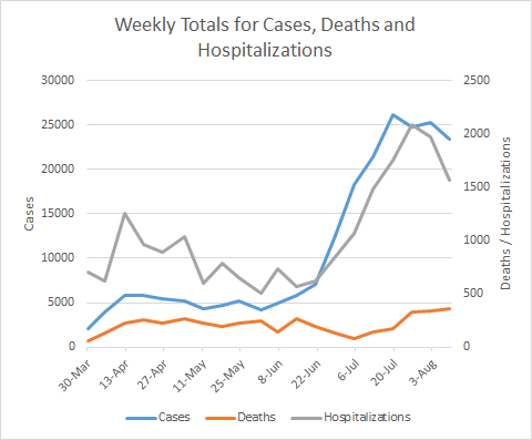
Over the past three weeks, cases appear to have leveled off and hospitalizations have declined. Again, I think we need more time to know if these trends are real or impacted by our testing problems. However, deaths are higher than they’ve ever been.
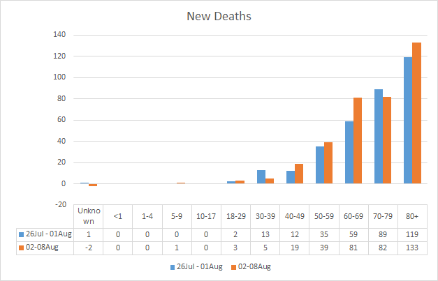
This week’s new deaths compared to last week’s new deaths are shown below. The increases this week are seen in those 40-69 (especially in those 60-69), and those 80+. Of course, we have one new death in the 5-9 year group.
Lastly, the graph below is another representation of the DPH graph under the demographics tab. Sometimes seeing the numbers is more meaningful.

We see another big increase in the unknown category for cases this week (3028 compared to 1742 last week) and that tells us that the contact tracers are overwhelmed. The age categories for hospitalizations all decreased slightly, except for children <1 year old who now make up 5.5% of total hospitalizations.
I believe that’s it for this week. I’ll be back tomorrow with a look at how Georgia fits into the national picture for COVID-19. Be safe and be well!
References
https://www.nytimes.com/2020/08/06/us/north-paulding-high-school-coronavirus-georgia.html
https://www.ajc.com/education/9-cases-of-covid-19-reported-at-north-paulding-high-school/OWH6MN7DZ5A2XDQMXX337AQEWI/?fbclid=IwAR3YB31PjMta7IDdDd453grWCvSbeX6iQYUD0nkXt_TY0DQymuVHQgaosyY
https://www.facebook.com/pg/HoustonCountySS/photos/?tab=album&album_id=4051594364911405&__tn__=-UC-R
https://www.ajc.com/news/atlanta-news/more-details-released-on-7-year-old-georgia-boys-coronavirus-death/MNTHT4CKBJCRNDHPAIF7UHDWEM/
https://amberschmidtkephd.substack.com/p/the-daily-digest-07aug2020
https://www.who.int/publications/i/item/public-health-criteria-to-adjust-public-health-and-social-measures-in-the-context-of-COVID-19
https://www.npr.org/sections/health-shots/2020/08/07/899954832/coronavirus-cases-are-surging-the-contact-tracing-workforce-is-not?origin=NOTIFY
https://covid-hub.gio.georgia.gov/
There are local discussions saying that the positive test rate and daily case rate are so high because they include multiple test results from the same person. Such as 2nd and 3rd positive tests from a person required to test negative before returning to work from Covid-19 illness. Is that possible?