
Good afternoon! This is the Week in Review for Georgia’s experience with the COVID-19 pandemic. I’ll be back tomorrow with the Daily Digest, looking at Georgia and how it fits into national trends.
Before beginning today’s update, I just want to say thank you to all of my readers. This audience is large and active enough that this newsletter ranks third of all of the free publications on Substack, despite only being part of this platform for about a month. For those who remember how this newsletter began, I expected this to be a handful of readers and my dad. We quickly outgrew MailChimp and transitioned to Substack in late June. I’m thrilled to know that the data presented in the updates is providing clarity in confusing times.

Testing
I have a new graph to show you today that looks at the weekly totals (Sunday - Saturday) for tests performed, the average positive rate of those tests and then I’ve included the WHO goal for positive rate that would indicate when a community is within range to contain the virus. The left y-axis is for new tests performed (blue line) and the right y-axis is for the positive rate (red) and goal line (gray, dashed).

Testing has increased over the past two weeks, and our weekly average positive rate has declined in turn. However, it is still well above the goal of 5% positive. There was a time in June when our percent positive rate might have put us in good shape to contain this pandemic, but we are a long way from that now.
Cases
In the first graph below you'll see cumulative cases to date broken down by county type. Previously, I’ve shown this graph since the beginning of the pandemic, but I have since truncated it to when we reopened the state on 24Apr. I've marked the last four weeks with blue arrows.

The number of new cases (by date of report) is as follows:
- 24 hours: 3165 (+1.7%)
- 7 days: 25,224 (+15.0%)
- 4 weeks: 97,661 (+102.2%)
When you see the rate of increase surpass +100%, that means that we have more than doubled the number of cases in that time frame. We have had an explosive month, and this 4-week total is a new record. The number of cases this week is up compared to last week, 24,830. The new statewide total is 193,177. To put that big number into perspective, the city of Columbs had a census population estimate of 194,060 in 2018. In total, 50.6% of all the pandemic’s cases were reported in the past 4 weeks.
Later, in the Combined Data section, you can how the weekly totals for cases have changed over time.
Hospitalizations
Healthcare workers have been sounding the alarm that things are not okay in hospitals across the state for weeks now and pleading for the public to wear masks and minimize exposures. Even more sobering details came out this week with this report from Georgia Public Broadcasting:
“Doctors at one metro Atlanta hospital were greeted with a grim message on a whiteboard: “Morgue full.” Medics in southeast Georgia tended to sick patients in ambulances for 30 minutes to an hour in hopes a hospital bed would become free. An emergency room in middle Georgia overflowed so much stretchers lined the walls.”
Current hospitalizations have plateaued over the past week, which is a very good thing given the accounts we are hearing from hospital staff. However, I want to make sure that people who are sick with COVID-19 are not dissuaded from going to the hospital because they see the news reports regarding surges in hospitalizations. Because we saw emergency department visits drop during the early stages of the pandemic due to fear of contracting the illness and that could be happening now too. If you are positive for COVID-19 and experiencing some of the more concerning symptoms including the list below (source: CDC), you need to seek emergency medical care. Let the hospital sort out the best way to manage your care.
Trouble breathing
Persistent pain or pressure in the chest
New confusion
Inability to wake or stay awake
Bluish lips or face
The total hospitalization rate is 9.9% statewide and this number has been decreasing since early April but in a bigger way since the surge in cases began, last month. I suspect that the reason our cumulative hospitalization rate is declining is because hospitalizations are being diluted by the surge in cases. Something to keep in mind is that hospitalizations and deaths are lagging indicators for disease. People don’t test positive and head straight to the hospital. There can be a significant delay between when a person tests positive and when they might need advanced care.
It’s also important to remember that survival and death aren’t the only outcomes with COVID-19. We now have some studies that demonstrate the recovery time and lasting symptoms of COVID-19 are significant, whether a patient is hospitalized or if they manage a milder case at home. We still don’t know what the long term health impacts will be for survivors because the pandemic is relatively new.
Deaths
The number of new deaths (by date of report) is as follows:
- 24 hours: 15 (+0.4%)
- 7 days: 342 (+9.8%)
- 4 weeks: 980 (+34.3%)
The new statewide total is 3840. So 25.5% of the total deaths to date took place in the past month. This week’s total of 342 is the most we have ever recorded in a week’s time and represents a 9.8% increase. The statewide case fatality rate is 1.99%, a decline from last week. This is welcome news for now. However we can see that deaths (by date of death and date of report) are increasing on the Department of Public Health death curve. Because deaths are lagging compared to cases and hospitalizations, I think we should brace for a continued surge in deaths in the coming weeks. Of course, I hope I’m wrong about that.
If we look at cumulative cases and deaths graphed together, we can see the way that deaths lag compared to case increases. The surge in cases began around 24Jun. The increase in deaths started around 15Jul, so about 3 weeks’ lag.

During the week in review, I do a bit more of a deep dive on the fatality data. Starting with a cumulative statewide perspective, here’s where things are among those who have died.

Note: the ? is indicated because Georgia Department of Public Health no longer provides age data for anyone over the age of 90. That makes it difficult to accurately calculate the mean, median, or characterize the range in age. 106 was the oldest individual identified before the DPH change.
The mean (also known as the average) has ticked downward in the past two weeks. Considering how top-heavy our deaths are, primarily affecting those 70+, seeing that number decline is significant.
Each week, I take a deeper look at our fatalities due to COVID-19. Last week I examined things by county type. Today, I’d like to focus on race and age groups.
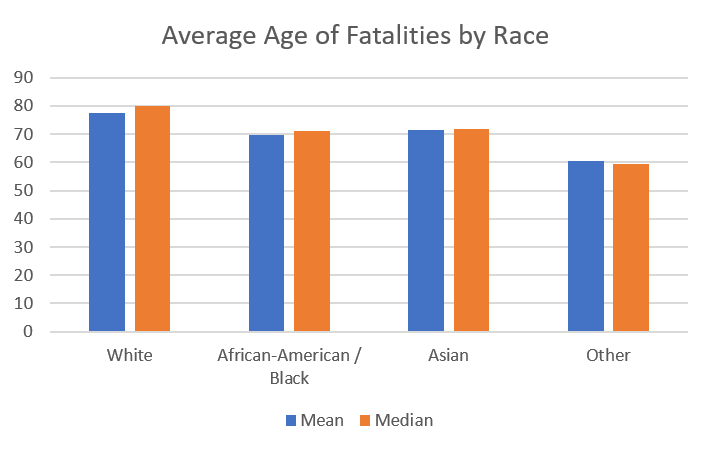
First let’s look at the mean and median age of death for each deaths among the largest race categories that DPH reports. The median is often presented alongside mean data because it is less susceptible to influence from outliers in a data set. However, there’s pretty good agreement here. What you’ll notice is that among White Georgians who have died in this pandemic, they tend to be older than all other populations. Those classified as “other,” including those who identify as Latinx are much younger.
Remember that there’s a slight male:female predominance among deaths statewide. If we look a little deeper at the male:female ratios across race, some interesting trends emerge. Among White populations, males are dying at a nearly equal proportion to women. Males are greater than females for death among the other three populations, with really large disparities within Asian and Other populations.

This next graph helps us to see how deaths compare when looking at different age groups and race. Up to age 70, deaths are predominantly among African-American / Black populations, and not by small amounts. Compared to the White population, African-American / Black populations are dying at the following rates:
30-39 year olds: 4.8x higher
40-49 year olds: 2.8x higher
50-69 year olds: 1.8x higher, for each decade

This observation is consistent with what is being seen in other states and nationwide. There are two important potential contributors to these disparities: (1) social determinants of health and (2) the fact that many of our essential workers who have had to return to work during the pandemic come from racial minority populations. In other words, the the virus has greater opportunity to spread to racial minorities who don’t have as many of the jobs that can be performed from home, and these same populations have systematic barriers to healthcare throughout the lifespan that might make them more vulnerable to severe outcomes with COVID-19. Unfortunately, the pandemic is shining a bright light on some of the failings of the way our country conducts healthcare. Hopefully, greater awareness of these problems can lead to reforms that will improve health equity in the years to come.
Below, we can see two stacked bar charts that show us the male:female differences among races in each age group (red-blue graph) and comorbidity status (blue-yellow-gray graph). The bar adds up to 100% and the color coding helps you to see how much of the group was male or female, etc. It’s kind of like looking at a lot of pie charts side by side. For the sex distribution graph, we see that the male predominance exists but varies among races through age 79. But from 80 years and up, it shifts to women and that is consistent with what we know about life expectancy.

When we look at comorbidity status, we see some interesting things. Among the youngest deaths (ages 20-29), most of the deaths do not have a known underlying condition (gray bar) that may have contributed to their outcome. However, the presence of an underlying condition becomes more common across age and race in older age groups.
Combined Data
Here’s a look at the weekly totals for cases, deaths and hospitalizations over time. You can see that cases and hospitalizations have declined slightly this week (good news). We also set a new record for deaths this week but it is not that much larger than last week.

Lastly, let’s look at how cases, hospitalizations and deaths have shifted among age groups over the past week. These data in the table below come from the demographics tab on the Georgia Department of Public Health website and represent cumulative data from the beginning of the pandemic. I then compare the numbers for each category this week from what was presented last week to see what, if any changes, are happening. There was a slight increase in the proportion of new cases that came from children (8.1% this week compared to 7.8% last week). A month ago, during the week that ended on 04Jul, children made up just 6.4% of Georgia’s new cases. So this age group is growing. Another interesting thing is the way that the unknown category has grown over the past few weeks. The unknown category is a holding area for cases that are pending investigation. So seeing the numbers climb for this category may indicate that contact tracers are getting behind and overwhelmed by our surge in cases.

The next two graphs show us where the new cases, hospitalizations and deaths came from this week in terms of age groups. It’s important to note that these “new” metrics are just those that were reported this week. Because of delays in testing and reporting, they may have actually happened weeks ago, but we just learned about them now. For all of the following graphs, this week is presented in red and the previous week’s data are presented in blue.

This week we saw increases (red bars) in the unknown category and the 70-79 category.
From this graph you can see that young adults, aged 18-29 are the largest single age group for new cases. It seems we are doing a good job keeping this away from our more vulnerable elderly population and this may contribute to our decreasing death rate in recent weeks.

New hospitalizations have a bell-shaped distribution (also referred to as a normal distribution) that is centered around 60-69 years of age. This week we saw increases among those 60 - 79 years old compared to last week.

For new deaths, there were increases among those 30-39 and 70-79 this week compared to last week.
To summarize the new data, young adults (18-29) are the largest group for new cases, adults 60-69 for new hospitalizations, and 80+ for deaths.
References
https://dph.georgia.gov/covid-19-daily-status-report
https://www.fox5atlanta.com/news/as-coronavirus-cases-surge-georgia-hospitals-see-large-jump-in-patients?fbclid=IwAR0qSDqocqpoExnoTzkFF4wpInWx7Ht9w1qF6DVTV2TBxkbK7AHAThEKDTA
https://jamanetwork.com/journals/jama/fullarticle/2768351
https://www.cdc.gov/mmwr/volumes/69/wr/mm6930e1.htm?s_cid=mm6930e1_w
https://www.cdc.gov/mmwr/volumes/69/wr/mm6923e1.htm
Media
https://www.fox5atlanta.com/news/georgia-hospitals-see-record-surge-of-covid-19-patients
https://www.forsythnews.com/news/health-care/what-do-numbers-say-about-covid-19-forsyth-county/