
Good afternoon! This is the Week in Review for Georgia’s experience with the COVID-19 pandemic. I’ll be back tomorrow with the Daily Digest, looking at Georgia and how it fits into national trends.
Testing
I have a new graph to show you today that looks at the weekly totals (Sunday - Saturday) for tests performed, the average positive rate of those tests and then I’ve included the WHO goal for positive rate that would indicate when a community is within range to contain the virus. The left y-axis is for new tests performed (blue line) and the right y-axis is for the positive rate (red) and goal line (gray, dashed).
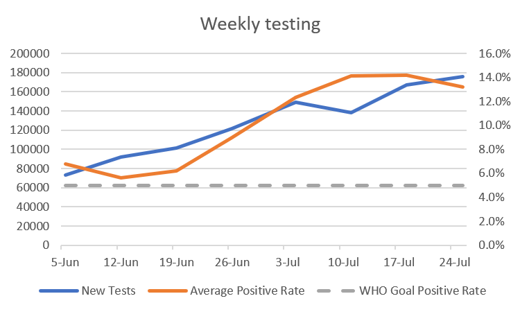
Testing has increased over recent weeks, but our average positive rate has outpaced that growth in testing output. There was a time in June when our percent positive rate might have put us in good shape to contain this pandemic, but we are a long way from that now.
Cases
In the first graph below you'll see cumulative cases to date broken down by county type. Previously, I’ve shown this graph since the beginning of the pandemic, but I have since truncated it to when we reopened the state on 24Apr. I've marked the last four weeks with blue arrows.

The number of new cases (by date of report) is as follows:
- 24 hours: 2,765 (+1.7%)
- 7 days: 24,830 (+17.3%)
- 4 weeks: 90,743 (+117.5%)
When you see the rate of increase surpass +100%, that means that we have more than doubled the number of cases in that time frame. We have had an explosive month, and this 4-week total is a new record. However, the number of cases this week is down compared to last week, which was a new record (26,197). The new statewide total is 167,953. To put that big number into perspective, the city of Macon had a population estimate of 153,095 in 2018. In total, 54% of all the pandemic’s cases were reported in the past 4 weeks.
Later, in the Combined Data section, you can how the weekly totals for cases have changed over time.
Hospitalizations
Healthcare workers have been sounding the alarm that things are not okay in hospitals across the state for weeks now and pleading for the public to wear masks and minimize exposures. This week we saw Region E run out of ICU bed capacity and several other regions reach 90%+ of their capacity for ICU beds. We also saw new records set for adult ventilator usage. The next graph looks at how current hospitalizations for COVID-19 have changed over time. Today there are 3079 currently in the hospital, a decrease of 15 compared to yesterday.

Seeing the number of currently hospitalized level off is a very good sign.
The total hospitalization rate is 10.2% and this number has been decreasing since early April but in a bigger way since the surge in cases began, last month. I suspect that the reason our cumulative hospitalization rate is declining is because hospitalizations are being diluted by the surge in cases. Something to keep in mind is that hospitalizations and deaths are lagging indicators for disease. People don’t test positive and head straight to the hospital. There can be a significant delay between when a person tests positive and when they might need advanced care.
It’s also important to remember that survival and death aren’t the only outcomes with COVID-19. We now have some studies that demonstrate the recovery time and lasting symptoms of COVID-19 are significant, whether a patient is hospitalized or if they manage a milder case at home. We still don’t know what the long term health impacts will be for survivors because the pandemic is relatively new.
Deaths
The number of new deaths (by date of report) is as follows:
- 24 hours: 3
- 7 days: 325 (+10.2%)
- 4 weeks: 720 (+25.9%)
The new statewide total is 3498. So 20.6% of the total deaths to date took place in the past month. This week’s total of 325 is the most we have ever recorded in a week’s time. The statewide case fatality rate is 2.08%, a decline from last week. This is welcome news for now. However we can see that deaths (by date of death) are increasing on the Department of Public Health death curve. Because deaths are lagging compared to cases and hospitalizations, I think we should brace for increased death in the coming weeks. Of course, I hope I’m wrong about that.
If we look at cumulative cases and deaths graphed together, we can see the way that deaths lag compared to case increases. The surge in cases began around 24Jun. The increase in deaths started around 15Jul, so about 3 weeks’ lag.

During the week in review, I do a bit more of a deep dive on the fatality data. Starting with a cumulative statewide perspective, here’s where things are among those who have died.

Note: the ? is indicated because Georgia Department of Public Health no longer provides age data for anyone over the age of 90. That makes it difficult to accurately calculate the mean, median, or characterize the range in age. 106 was the oldest individual identified before the DPH change.
These data have not changed much compared to last week. Neither has the distribution across age groups when looking at sex or race - things have just intensified. Instead, this week I’d like to do a closer examination of differences across county type. First, let’s begin with some definitions. Atlanta is considered to be Fulton and DeKalb counties. I follow the definitions of Atlanta suburbs as set forth by the Atlanta Regional Commission and they include the counties of Cherokee, Clayton, Cobb, Douglas, Fayette, Gwinnett, Henry, and Rockdale counties. Nonrural counties are defined by the State Office of Rural Health as those with at least 50,000 residents. Rural counties have fewer residents than that threshold. Non-Georgia residents are people who don’t fall into one of those other categories and can include people who cross state lines for care, federal prisoners, immigrant detainees, migrant workers, military families living on military installations and Veterans Affairs nursing home residents. Unknown is a holding pen while waiting for further follow up by contact tracers, etc.
Starting off with some age information, I’ve provided the mean and median for each county type below. For those who might not remember the big differences between those two metrics, mean is another word for average. Median is the middle-most number in a series of numbers. The median is less vulnerable to outliers that skew the result and so it is often helpful to see both metrics side by side.
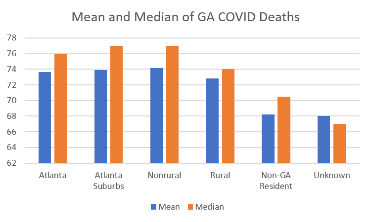
Some things to notice include that people who die in more populated areas are dying at an older age and this may have to do with access to medical care throughout their lifetime, not just during COVID-19. On the other hand, people who are dying in rural counties are younger. Non-Georgia resident fatalities are even younger than that.
Next, let’s compare male to female trends across county types among COVID-19 deaths.

Male deaths are more common among all county types except Atlanta suburbs and nonrural counties.
Some of the biggest disparities are seen when we look at race and county type among deaths.

African-American / Black residents make up the majority of deaths in Atlanta and among non-Georgia residents. For Asian populations, their deaths are most prominent among Non-GA residents. Those included in the Other category (includes those who identify as Latinx) are most represented in the Atlanta suburbs.
Combined Data

Here’s a look at the weekly totals for cases, deaths and hospitalizations over time. You can see that cases have declined slightly this week (good news), but hospitalizations continue to set records. We also set a new record for deaths this week.
Lastly, let’s look at how cases, hospitalizations and deaths have shifted among age groups. These data come from the demographics tab on the Georgia Department of Public Health website. There was a slight increase in the proportion of new cases that came from children (7.8% this week compared to 7.3% last week). That shift to the pediatric population came from those 60+ where the proportion of cases decreased from 19.8% last week to 19.3% this week.
Within the pediatric population, the hospitalization rate increased for those <1 year old (5.3 - 5.7% this week). The hospitalization rate decreased for those 40-59. Thankfully, the hospitalization rate decreased among those 60-79. However, it increased slightly for those 80+. The case fatality rate has not changed for adults 18 - 59 and decreased slightly for those 60+ (previously 9.7%, now 9.3%).

The next two graphs show us where the new cases, hospitalizations and deaths came from this week in terms of age groups. It’s important to note that these “new” metrics are just those that were reported this week. Because of delays in testing and reporting, they may have actually happened weeks ago, but we just learned about them now.

From this graph you can see that young adults, aged 18-29 are the largest single age group for new cases. It seems we are doing a good job keeping this away from our more vulnerable elderly population and this may contribute to our decreasing death rate in recent weeks.

New hospitalizations have a bell-shaped distribution (also referred to as a normal distribution) that is centered around 60-69 years of age. Newly reported deaths were among those aged 18 to 80+ but they increase with age starting with the 40-49 year group.
To summarize the new data, young adults (18-29) are the largest group for new cases, adults 60-69 for new hospitalizations, and 80+ for deaths.
References
https://dph.georgia.gov/covid-19-daily-status-report
https://www.cdc.gov/mmwr/volumes/69/wr/mm6930e1.htm?s_cid=mm6930e1_w
https://www.fox5atlanta.com/news/as-coronavirus-cases-surge-georgia-hospitals-see-large-jump-in-patients?fbclid=IwAR0qSDqocqpoExnoTzkFF4wpInWx7Ht9w1qF6DVTV2TBxkbK7AHAThEKDTA