

The Sunday Week in Review, 07-13Sep2020
Georgia COVID-19 Updates

Good afternoon! This is the week in review for the COVID-19 pandemic in Georgia for the week of 07-13Sep2020.
Testing
Our testing output continues to drop which is distressing because now that we have students back to face to face instruction for college and universities but also for some K-12 schools, we really should be doing more testing, not less. This week we did a total of 122,634 tests which is a decrease of 19.4%. At the same time, however, the percent of those tests that are positive has also decreased. This week we averaged 7.6% positive compared to 8.7% last week. It should be noted that we had two days this week where the tests coming through Electronic Laboratory Reporting were ~55%. So our 7.6% rate may not be a reliable estimate of our true rate.

In the graph above you can see how testing output has varied over time (blue line, left y-axis) as well as percent positive (red line, right y-axis). For reference, I’ve provided the World Health Organization goal line in gray. While it’s certainly good news to see our percent positive rate declining, it is still well above where we want it to be.
Cases
The number of new cases (by date of report) is as follows:
- 24 hours: 1409 (+0.5%)
- 7 days: 11,115 (+3.9%)
- 4 weeks: 57,284 (+24.2%)
The new statewide total is 294,314 which means that of all the cases that have been recorded, 19.5% were reported in the past 4 weeks. That is a reduction compared to last week (23.5%). Bear in mind that these case totals are likely an under count of our actual case count - it’s a problem that plagues public health for multiple diseases and especially so when a disease has so many asymptomatic cases, as COVID-19 does. And these cases are those confirmed by the diagnostic PCR test. It does not include those who screen positive through other testing methods.
Below you can see how our 7-day case rate per 100,000 stands. The solid black line is the statewide average. You can see that rural and nonrural counties have disease rates above the state average and the Atlanta metro is below the state average. We are seeing continued declines, but we haven’t yet reached the level we were at before the summer surge began in early June.

Also encouraging is that we are seeing cases decline across all races (see the graph below). The unknown category is a holding pen while contact tracers are conducting their investigations. So seeing those numbers low in that category means that the workload is likely more manageable for those investigators these days (a very good thing). A note about interpreting this graph: each of the bars represents another week’s worth of data for that race category. So when you get to the next race, the timeline starts over.

Cases are declining across most age groups. They have sort of plateaued for the 18-29 year group (our single largest age group contributor to disease) and those 70+. Like the race graph, each of the bars represents another week’s worth of data for that age category. So when you get to the next age group, the timeline starts over.

Hospitalizations
Here’s a look at how hospitalizations have varied among age group over time. We are seeing multi-week declines among most age groups. The exceptions are 40-59 and 70-79 year olds.

Deaths
The number of new deaths (by date of report) is as follows:
- 24 hours: 46 (+0.7%)
- 7 days: 296 (+4.9%)
- 4 weeks: 1,631 (+34.7%)
For the first time in several weeks, we are not setting any new death records with these totals. Below you can see how the 7-day death rate per 100,000 has varied over time according to county type in Georgia. The statewide average is in the solid black line. Nonrural counties (those outside of the Atlanta metro with >50,000 residents) track right along with the statewide average but rural counties (those with <50,000 residents) have a rate that is 49% higher than the rest of the state. Again, the Atlanta metro is below the statewide average. Once again, it is very good to see death rates declining as they are. But we remain much higher than we were before deaths surged this summer.

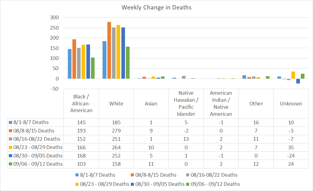
As we did for cases, here’s how deaths have changed over time for each race. Deaths decreased this week for Black / African-American and White populations. But they increased for Asian and Other populations. FYI, the “other” category contains the majority of people Georgia is tracking who identify as Hispanic/Latinx.
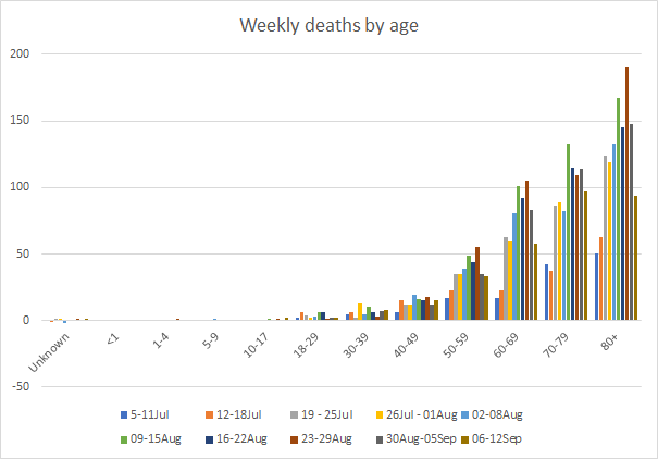
Below you can see how deaths compare week to week for each age group. Deaths are decreasing for most age groups, but holding steady for those aged 30-59.
About once a month, I do a bit more of a deep dive on the rural-urban divide as it pertains to the COVID-19 pandemic. Below you can see how deaths are distributed for each age group and county type. So unlike the previous graphs, this isn’t a timeline. Rather, each bar represents a different county type and we are looking at cumulative data, total counts.

Since the start of the pandemic, deaths among those 50+ are higher outside of the Atlanta metro than within it. There is near parity between nonrural and rural counties, however, keep in mind that the rural counties have a smaller population. So the reason they’re outperforming nonrural counties on the other graphs is because population size is taken into account.
Likewise, here is how deaths have been distributed by race and county type. Again, these are cumulative total counts.

The only county types where Black / African-American populations outnumber the others is the Atlanta counties of Fulton and DeKalb and the non-Georgia resident category. Otherwise, White populations are the largest contributor to deaths in other county types. Deaths among Asian and Other populations are highest in the Atlanta suburbs compared to other county types.
Combined Data
We’ll wrap up with a look at how three of our most important metrics are comparing with one another: cases, hospitalizations and deaths. Cases are represented by the blue line (left y-axis) and hospitalizations and deaths are represented by the gray and red lines, respectively (both on the right y-axis).

Every one of these metrics is declining and this is very, very good news. However, it’s not time to run out and eat a hamburger in a restaurant or go visit a medically vulnerable family member. We still remain at a high level for cases, hospitalizations and deaths, despite our declines. We need to continue to wear our masks, maintain social distancing, avoid unnecessary (especially indoor) errands, and practice good cough/sneeze etiquette.
Have a great remainder to your weekend. I’ll be back tomorrow with the context of how Georgia’s recent trends fit into the national picture.
References
https://dph.georgia.gov/covid-19-daily-status-report
https://covid-gagio.hub.arcgis.com/
Georgia COVID-19 Updates is a free newsletter that depends on reader support. If you wish to subscribe please click the link below. There are free and paid options available.
My Ph.D. is in Medical Microbiology and Immunology. I've worked at places like Creighton University, the Centers for Disease Control & Prevention and Mercer University School of Medicine. All thoughts are my professional opinion and should not be considered medical advice.