The Daily Digest
Georgia COVID-19 Updates, 03Aug2020
Hello! We made it to another week in this year where time seems to drag slowly by…do you remember that at the beginning of this pandemic the show Tiger King was trending? That’s how long we’ve been in this strange new normal.
Starting today, I’m offering paid subscriptions here on Substack. I view this sort of like how people donate to National Public Radio (although, please continue to donate to them too): the content is by and large available to the public, but people recognize the value of what they’re getting and want to contribute to the effort and sustain it. There are some perks to being a subscriber including members only Q&A with me, and additional posts that don’t fit into the subject matter or space requirements of the Daily Digest or Sunday Week in Review, etc. The subscription is $7 per month or $70 per year. Of course, if you feel that the content is worth more than that, you’re welcome to donate more (with my thanks) but it is not expected. If you feel called to donate just once, you can do that too (or so I understand). To reiterate - the content you currently enjoy will continue to be free to all subscribers and viewers from other platforms. I’ll be closing down my Patreon page in the next couple days and those who donated through that page on August 1 will be given the month of August free over here on Substack. For paid subscribers, I anticipate having some of your member’s only content up by Thursday this week.
For those new to the newsletter, Mondays are set aside for taking a wider look at the pandemic to include national trends and how Georgia fits into them. First, we need this perspective, but second because a lot of the data on Monday are impacted by weekend effect when many laboratories work at reduced capacity. For that reason, the data are artificially low and don’t represent the reality of our situation. So I talk about national trends when things aren’t so informative for Georgia. For Georgia though, here are some quick stats for today.
2258 cases (a low day for us based on recent trends)
21,761 tests, 12% positive rate (also a low day for us)
2 deaths (a low day)
Current hospitalizations are back up after three days of decline
Research
Just a brief explanation on how viruses work (I will not do this justice in the space I have here): viruses exhibit something called tissue tropism, meaning they can only infect certain tissues in the body that have the receptor that recognizes and allows the virus inside. Now normally, those receptors don’t exist to allow viruses in, why would we make such a thing? They serve other purposes in the body, allowing human proteins, hormones, etc, to enter the cell or trigger other activities in the cell. But the virus looks close enough to the human receptor partner molecule that it behaves like a Trojan horse. Once inside, it hijacks the cell’s machinery causing it to produce viral materials rather than human ones.
Our early understanding of SARS-CoV-2 (the virus that causes the disease, COVID-19) was that it was a respiratory virus and early studies demonstrated that its receptor was the angiotensin I converting enzyme 2 (ACE2). As such, one would expect that it could infect any cell that produces ACE2 on its surface. But given that there are a lot of cell types in the body, we didn’t really have an encyclopedia of all the tissues that produce ACE2 so predicting the virus tropism wasn’t so straight forward. Meanwhile, we knew that certain vascular conditions seemed to predispose people to worse outcomes and that multi-organ system involvement was happening too. This paper looked at where in the body the receptor is expressed both by RNA (a genetic material that is like the working copy of the instruction manual for building proteins) and the actual ACE2 enzyme (enzymes are proteins that perform biochemical work for us).
The first image below shows all the different places they checked for the presence of ACE2-encoding RNA.
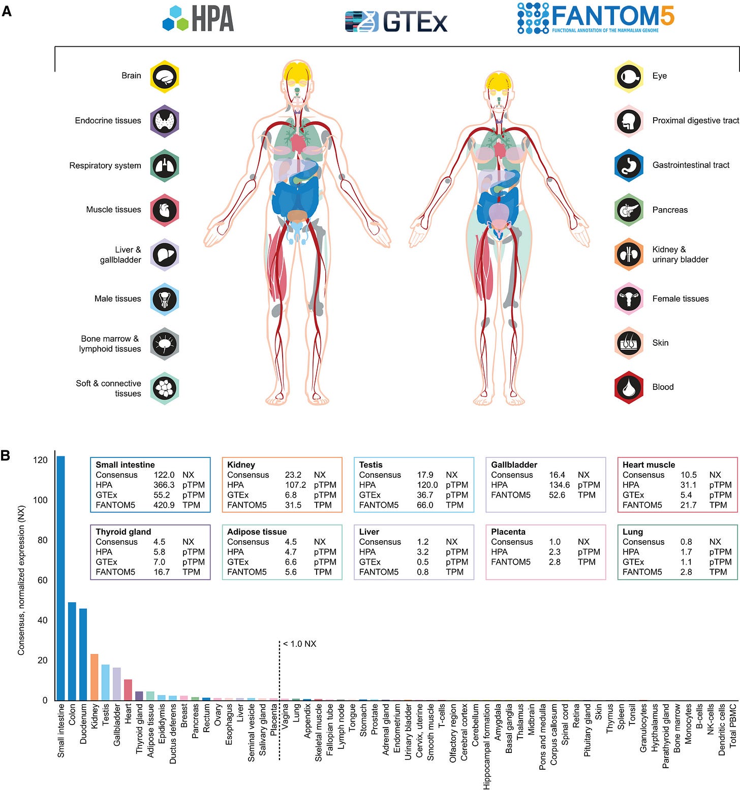
A lot of this is more information than a layperson needs to have, but the dashed line in the graph above is their threshold for what constituted significant presence of the ACE2-encoding RNA. The biggest sites (to the left of the dashed line) were in the gastrointestinal tract, kidney, testis, gallbladder, and heart. But there were other areas too including parts of both the male and female reproductive organs. Interestingly, the lung, olfactory region (nose) and tonsil, all things that are located along the respiratory tract, did not produce significant amounts of ACE2-encoding RNA. Without the RNA, you can’t make the protein. And the protein is the thing the virus needs to dock with. So the next step was to look at the presence of the ACE2 protein, but they didn’t need to look for it in areas where the RNA was absent, or minimally produced. For that we look at the next graphic.
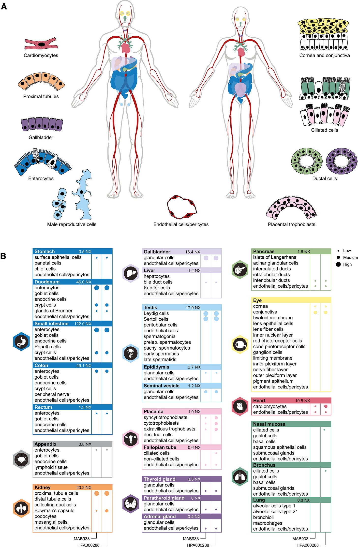
This next chart looks at how much of the protein is produced in different tissues, driven by what they found in the RNA experiments. The bigger the dot, the more they found and they categorize protein levels as low, medium or high. If there is no dot, it wasn’t found there. There are two columns of dots because they used two different kinds of antibody that were directed against the ACE2 protein from different manufacturers, sort of as a double check. They did include the lung, bronchus and nasal mucosa since the prevailing wisdom is that’s the route of entry for the virus, despite the RNA findings. What they found was that there was low-level production of the receptor protein in ciliated cells (cells covered in a structure that looks like hair) in the nasal mucosa and the bronchus, but only with one of the antibodies they tested. However, they found a LOT of ACE2 receptor in the small intestine (including its first section, the duodenum), cells in the kidneys, the gall bladder, and cells in the testis. This diversity of tissues that express the ACE2 receptor may explain why the virus is able to cause as much damage as it does inside of certain people. It also helps to explain why we’re able to detect virus in feces. But it is remarkable that so little of the ACE2 protein is found in the lungs.
Testing
Georgia ranks 10th in the nation for testing this week in terms of total tests performed. Despite that, we still have a 10-20% percent positive test rate. Below we can see data on tests performed at state and local public health laboratories. The very complex graph below comes from the CDC. Let’s start with how to read it.
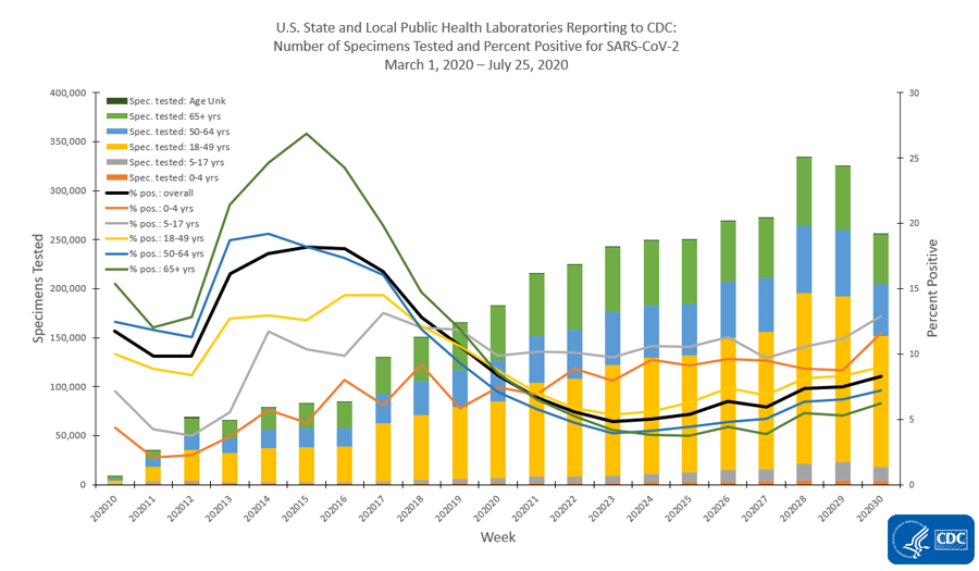
The x-axis along the bottom looks at weekly totals for the 10th - 30th weeks of 2020 so far. The left y-axis is looking at specimens tested and this corresponds to the bars in the graph. The color coding refers to the age groups tested. You can see that the yellow category (ages 18 - 49) makes up the largest group of specimens collected. The right side y-axis measures percent positive tests and this corresponds to the lines. The color coding is consistent with that for the bars. What we see is that we used to have really high percent positive tests, in excess of 25% positive for those 65+, but with expanded testing criteria, that number has decreased and stabilized (on average, black line) just about 8%. But that number has been increasing in the last few week of this analysis. As a reminder, we want to be at or below 5% to contain the virus. Something interesting is that the gray line (representing children 5-17) has the highest percent positive rate, consistently above 10%. The second highest line for percent positive is children 0-4, at or just above 10% and it is increasing sharply. This tells us that children are a weak spot for us right now. We aren’t testing enough children and we are likely missing cases that might contribute to community transmission. Note, the graph above is looking at testing performed by public health laboratories. However, they aren’t doing the bulk of the testing for the US right now - commercial laboratories are. Their data are presented below.
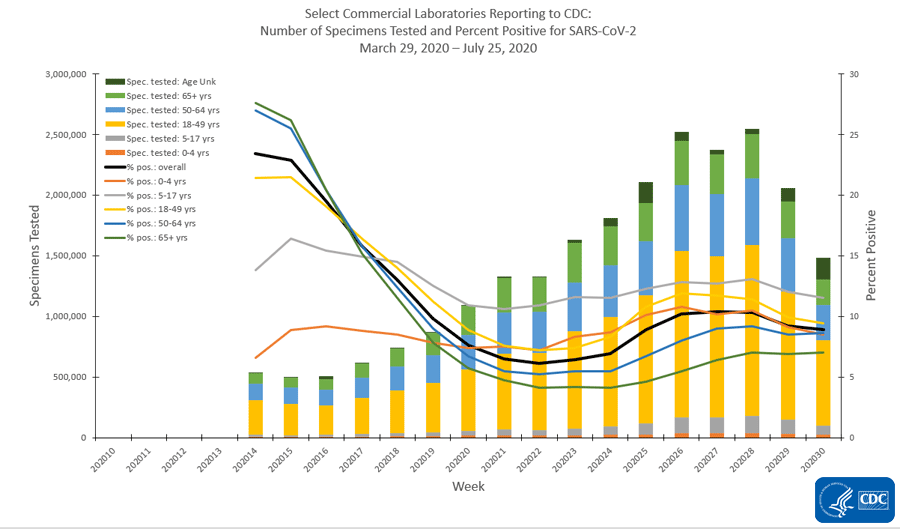
Many of the same trends exist with children being among the least tested and children 5-17 having the highest percent positive rate. Also, despite 18-49 year olds being the largest subgroup of people tested, they have the second highest percent positive rate. So even our largest subgroup isn’t being tested widely enough. Something else that’s interesting to note is that testing has declined in the most recent two weeks’ worth of data collection. This could be a result of reporting delays. But the same trend isn’t being observed for public health laboratories or clinical laboratories (i.e. those based at a hospital).
Cases
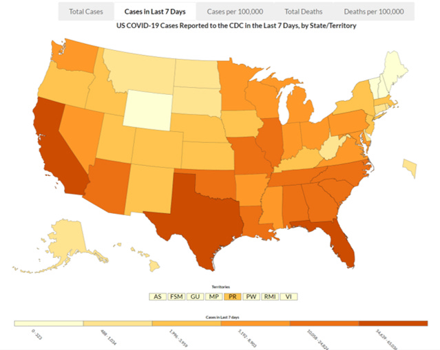
This map looks at the cases in the past 7 days across the US. Georgia is ranked #4 in the nation behind Florida, California and Texas. We define the upper limit of the second darkest color category, with 25,824 cases. The next state after us (Arizona) had 16,453 cases last week. So while we are in the second tier of colors, we are not similar to the other states in this tier - we are well above them.
Here’s a more granular look, allowing us to see what is happening at a county level over the past week. And this map is adjusted for population (cases per 100,000 people). Blank areas have little activity, and any color indicates an increase with increasing redness indicating greater rates of increase.
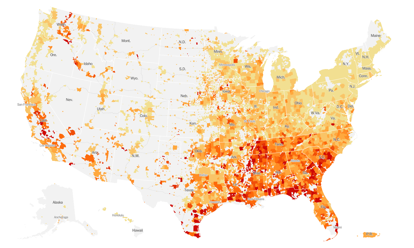
You can see that the reddest parts of the country are clustered in the South. California has red areas and their case count is huge not because of geography but because of population density - there are more opportunities for the virus to spread in a congested population.
Hospitalizations
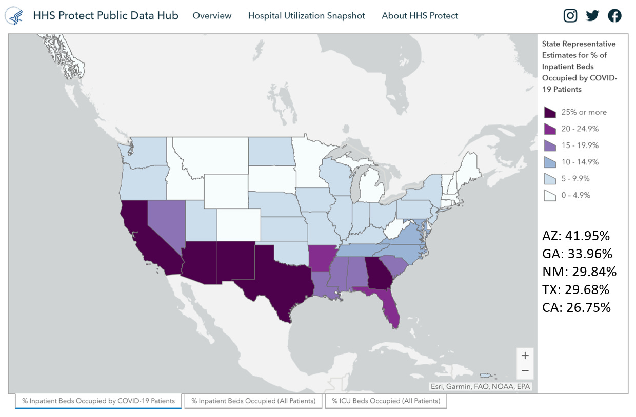
For hospitalizations, we rank 2nd in the nation for the number inpatient beds (that’s anyone who has been admitted to a hospital) that are occupied by COVID-19 patients. I’ve included the percentages in the bottom right of the graphic. And yes, this is the HHS hospitalization dashboard that made headlines recently as data shifted from the CDC pipeline to the HHS one. I suspect that the HHS dashboard is including patients under investigation for COVID-19 which is different than the way that the Georgia Department of Public Health reports the data.
For those being hospitalized, these are the proportions of people who have various underlying medical conditions. This graphic is hard to read, so you can view the original here.
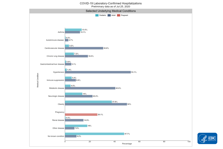
For adults, the top three conditions are hypertension, obesity and metabolic disease (includes diabetes). Among kids, the largest subgroup have no underlying conditions. The next two are obesity and neurologic disease (which is nearly equal to asthma).
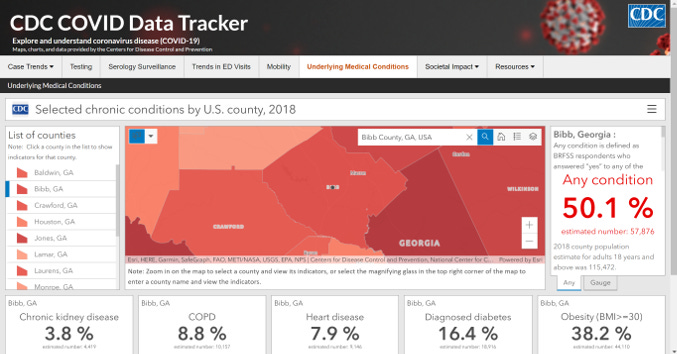
I stumbled on something new today and wanted to share. On this site, you can explore estimates of how many people in a given county have underlying medical conditions that might put them at higher risk for COVID-19 complications. I chose a county close to home (Bibb county) to show you how this works. I found the search box to be the most useful. The list of counties on the left kept taking me to Alabama which was unhelpful.
Deaths
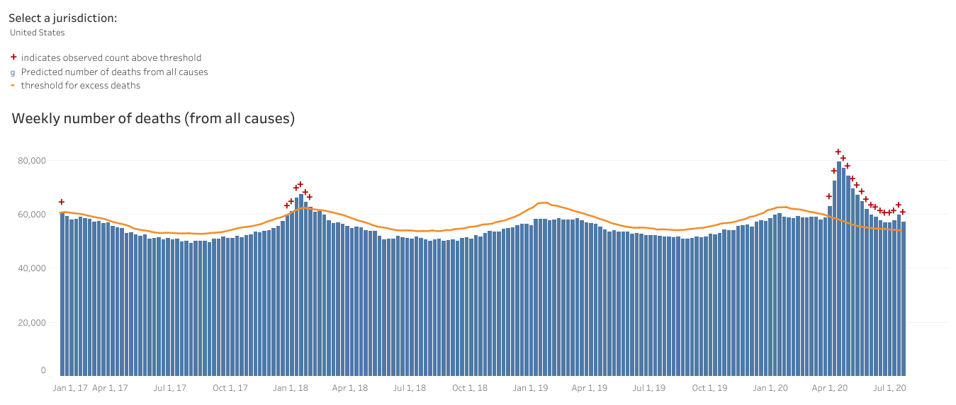
For cumulative deaths per 100,000 people, Georgia ranks 16th in the nation. In the early days of the pandemic we didn’t have enough tests and we still don’t have enough tests. As a consequence, we tend to prioritize testing those who have the most obvious symptoms and we miss mild or asymptomatic ones. That has implications for cases but also deaths. After all, in a testing shortage, we’d probably rather use a test on a living person who we can still save then a person who is deceased. We also don’t perform autopsies on every death in the US so there aren’t tissues stored that could be tested later when tests become more widely available. To get around this really important problem, we can look at the total number of deaths this year compared to the average of past years. Anything above a certain threshold is called “excess death.” Since the only thing that has really changed this year is the arrival of the pandemic, this helps us to see COVID-19’s impact. Below you can see the graph for the United States that shows deaths per week. The orange line is the threshold that determines excess. We are well above the threshold this year and despite a decline in deaths, we may be starting to see the beginning of a new increase. The previous area where we surged above the orange threshold in January 2018 was due to a particularly bad influenza season. Just saying…infectious disease is kind of a big deal.
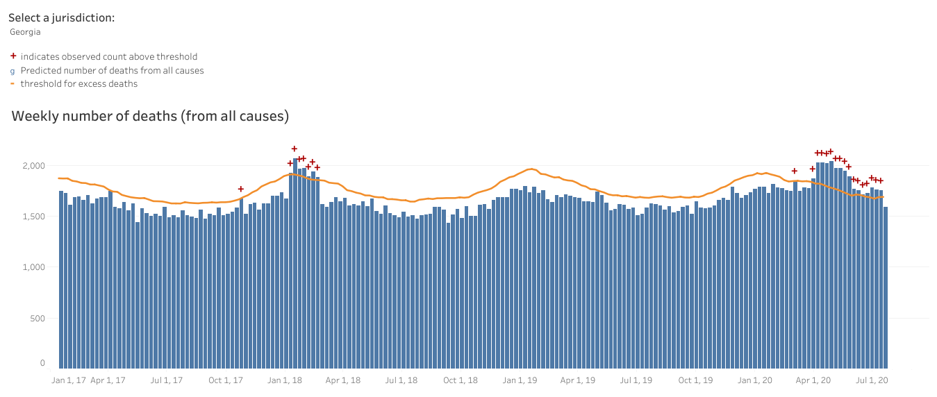
The situation is much the same for Georgia (below). What concerns me is what happens when influenza season comes around this year. Or if this year’s influenza season is like the one in 2018. We know that coinfections can happen and that influenza kills people each year too. When a person coughs for influenza, the common cold, etc, they may also be transmitting COVID-19 if they are coinfected. A lot of things look like influenza too. We really need this to be the best year we’ve ever had for the influenza vaccine. Please make a commitment today to getting that shot. It is not a perfect vaccine and sometimes we guess the next year’s most prevalent strain wrong. But it can reduce the severity of illness if you do get influenza and that’s really more important this year than ever before.
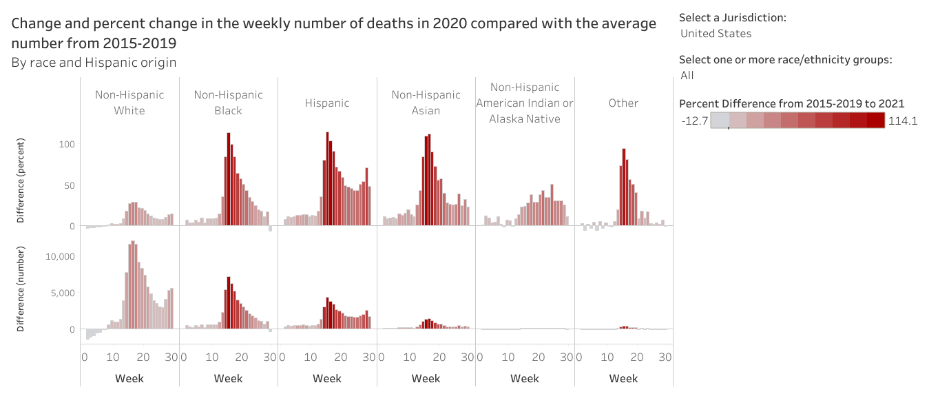
Lastly, we can look at excess death according to different race and ethnicity. Anything above the 0 mark is an increase relative to the past five years. Anything below is a decrease. The top set of graphs show percent increase/decrease. The bottom set of graphs show total numbers. To me, these data are stark. We are seeing modest increases among non-Hispanic White populations. But people of color are dying at rates that are double the rate of last year at their peaks.
It’s not a happy way to end the report, but that’s it for today. Hoping for better news with next week’s national outlook.
References
https://www.cdc.gov/coronavirus/2019-ncov/covid-data/covidview/index.html
https://www.cdc.gov/covid-data-tracker/index.html#trends
https://www.nytimes.com/interactive/2020/us/coronavirus-us-cases.html
https://gis.cdc.gov/grasp/COVIDNet/COVID19_5.html
https://protect-public.hhs.gov/pages/hospital-capacity
https://www.cdc.gov/nchs/nvss/vsrr/covid19/excess_deaths.htm
https://www.embopress.org/doi/10.15252/msb.20209610
https://dph.georgia.gov/covid-19-daily-status-report
