The Daily Digest
Georgia COVID-19 Updates, 30Jun2020

Good evening! If you’re in the Macon area, you can hear me talking about COVID-19 on 100.9 The Creek’s Gospel Gothic show this Sunday at 9:30 am. If not, I’ll try to post the link with the week in review.
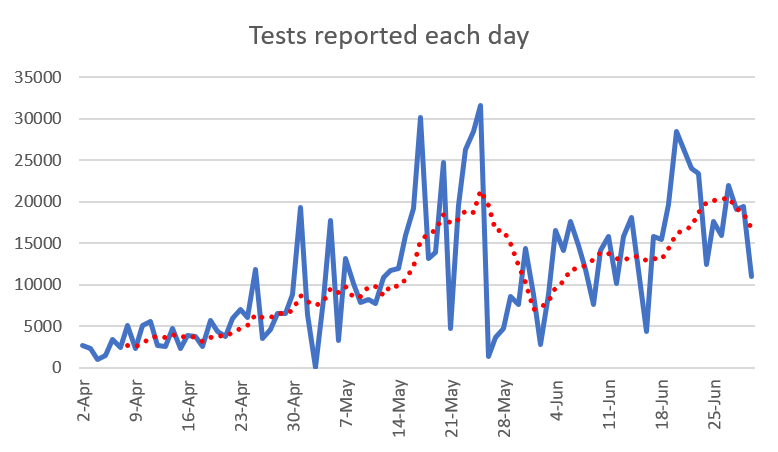
Testing
Today we saw a slowdown in tests, at 11,009. This is about half of where we’ve been recently and I’m not sure if this is leftover impacts from closures over the weekend or laboratories slowing down with the 4th of July holiday.
Cases
Today there are 1874 new cases reported, and this isn’t as high as we’ve seen lately, but still well above where we’ve been on average for the past month. So based on today’s testing alone, that’s a 17% positive rate for these tests. Here’s how new case reports have varied over time. To be clear, these are graphed by date of case report - not symptom onset. You can see that our 7-day moving average trendline (red) is increasing dramatically. The new statewide total is 81,291.

This next image comes from the New York Times COVID hotspot map. You can see that Georgia has several hotspot counties and we are surrounded by hot areas in neighboring states as well. For the past week, there has been this belt of inactivity from southwest Georgia to northeast Georgia on the hotspot map. It’s still there, but you can see that parts of central Georgia are starting to heat up, including Bibb, Houston, Laurens and Dodge counties.

In fact, there are several counties on my list of counties of concern today. These counties have both a >5% 24 hour increase as well as a >25% increase over the past 7 days. I use both criteria to ensure that a sharp increase is part of a sustained trend. I’ve highlighted any county that has >50% increase in the past 7 days and these include Bulloch, Candler, Chatham, Emanuel, Glynn, McIntosh and Telfair. One thing you might notice is that it’s a good mix of rural and nonrural counties. But the Atlanta counties and Atlanta suburbs aren’t part of this, for now. However, looking at the NYT hotspot map, they might be soon.

So which areas are most impacted by these recent jumps in cases? This next graph looks at all the data since the beginning of the pandemic and breaks the cases down by county type. Many of the lines are holding steady, but Nonrural and Atlanta Suburb counties have increased their rate of increase over the past two weeks. Atlanta counties have increased also, but to a lesser degree.

Hospitalizations
There was a 7% increase in the number of patients currently hospitalized with COVID-19 symptoms today. Adult ventilator use also increased by 40 patients today.

Deaths
Today there were 21 deaths reported, a medium-low day for us. The new statewide total is 2805. However, hospitalizations and deaths are lagging indicators compared to cases. So as we see our case counts rise, we should brace for hospitalizations and/or deaths to rise in the coming weeks. Below you can see how deaths have accumulated over time for each county type. The largest category for deaths is rural counties followed by nonrural counties that aren’t affiliated with Atlanta suburbs. In total, 59% of the deaths come from outside the Atlanta metro.

That’s it for today. As a reminder, things are not good right now for Georgia with respect to this pandemic. If you are able, please behave as though the shelter in place order is in effect. We flattened our peak in April and could potentially do so again. But we have to interrupt the transmission of the virus as much as possible in order to do so.
References
https://dph.georgia.gov/covid-19-daily-status-report
https://gema.georgia.gov/document/document/sitrep-630/download
https://www.nytimes.com/interactive/2020/us/coronavirus-us-cases.html