The White House produced a state by state report describing how the pandemic is unfolding with recommendations for controlling transmission. I will refer to it a lot and I would encourage you to read the report for yourself. Georgia’s section begins on page 81. In the summary on page 81, we are described as “experiencing widespread community spread without evidence of improvement. Improvement will require much more aggressive mitigation efforts to change the trajectory of the pandemic in Georgia.”
In the report there is a chart that compares the situation in Georgia to the United States, adjusted for population size. Our new case rate is 1.76 times higher than the national average and our test positivity rate is nearly twice as high as the national average. Meanwhile, our testing output is one third of the national average. We are also doing a worse job than the national average at keeping COVID-19 out of skilled nursing facilities (SNFs in the chart). In summary, we are doing poorly in all metrics.

I’m also planning to highlight a lot of new resources that were recently made public from the COVID-19 State Data Task Force on which I volunteer. You’ll probably notice that the language that supports some of these tools sounds familiar (see the “About the Symbology” section). I’m grateful for the opportunity to add an educator’s touch to these public-facing tools.
Testing
There were 33,298 new test results reported today and 11.7% of them were positive. As a reminder, we need to be at or below 5% to contain the virus. This is a sign that we aren’t testing enough people. Test output has been fairly stable, with the 7-day average between 25,000 - 30,000 each day. But our number of positive tests keeps climbing.

An interesting piece of data to come out of the White House state report for Georgia is our percent positive rate per county in a map (below, on the right) … which begs the question, if the state can provide these data to the White House, shouldn’t Georgians be allowed to see them too? Many of Georgia’s counties are shaded red, indicating a percent positive rating of 10% or more. Dark red indicates >20% positive rate.

Cases
Today there were 4066 new cases identified compared to yesterday. Note that this does not agree with the “New Today” section on the DPH daily report. When I sought clarification they indicated this shows the number of new cases identified prior to de-duplication, because as I’ve discussed previously, each confirmed case represents just one person regardless how many times they tested positive. The largest county type for cases today was nonrural (n = 1343). Below, I’ve provided a map that shows the rate of increase over the past 14 days for each county. The darkest color is set to 100% so that we can easily identify every county that has doubled their pandemic (or more) in the past 2 weeks. Data are not provided for Taliaferro county because they have so few cases.

The counties with at least 50% increase over 2 weeks are shown below.

Note that the Unknown category is in the table too. It’s a holding area for cases pending contact tracing. So to see that category climb like it has might indicate that the contact tracers are getting behind due to the surge in cases. It’s not a good sign.
One of the new tools is another way to look at the data from the Department of Public Health. It features informative pop-ups for each county that give demographic details about the cases. Selecting a county from the drop down menu updates the data fields on the left.

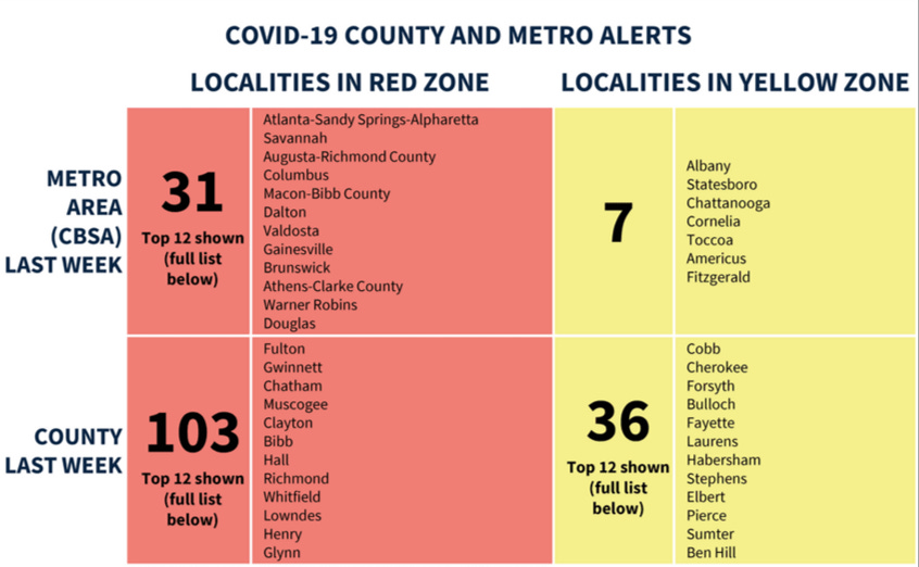
From the White House report, they identified 31 metro areas and 103 counties in Georgia that they classify in the Red Zone. I was discouraged to see the areas where I live and work (Macon-Bibb County and Warner Robins) both in the top 12 list.

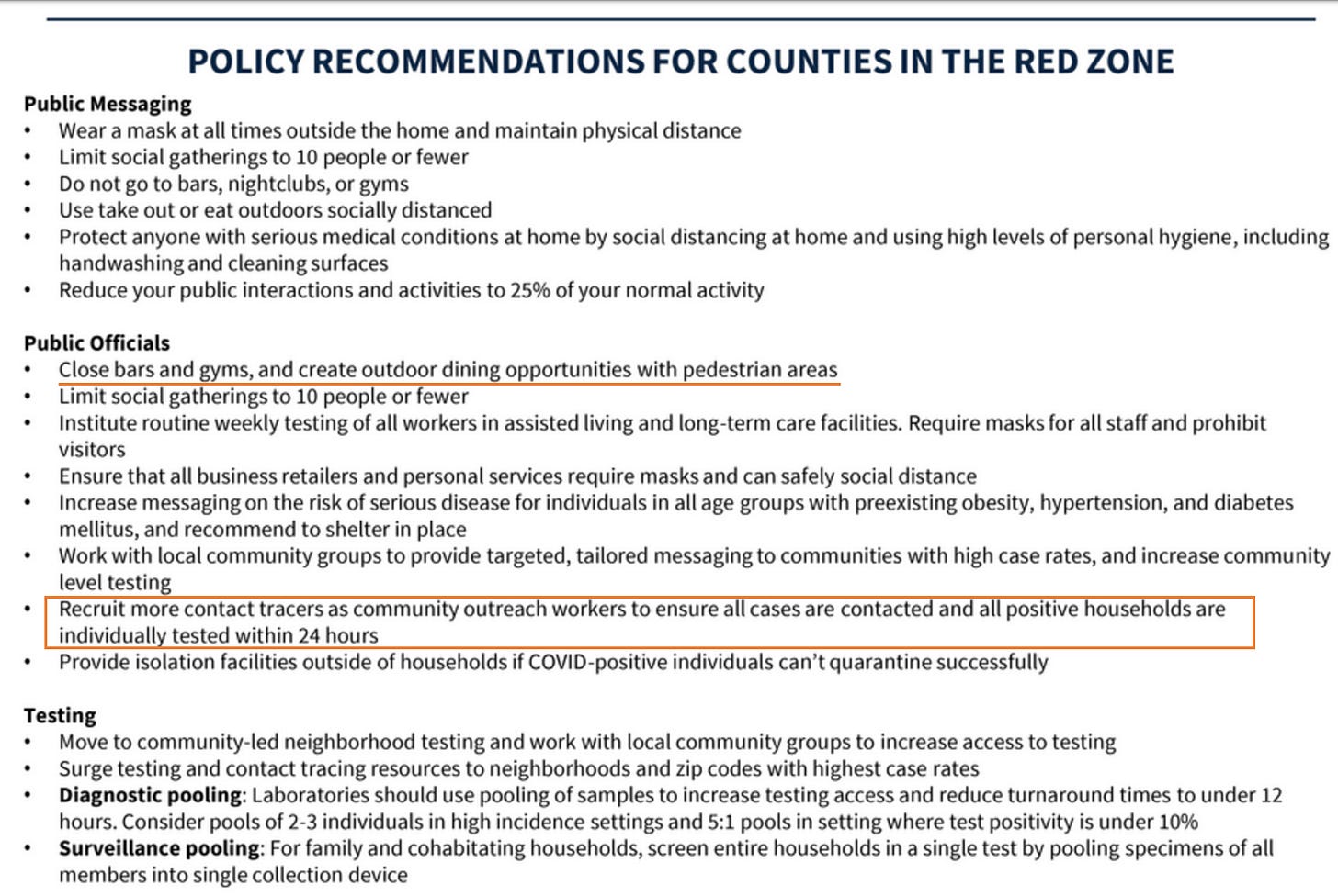
For areas in the red zone, the White House recommends the following. I am posting these as a heads up for local business owners - you should prepare for these possibilities. I think it is contradictory that the White House wants us to limit social gatherings to fewer than 10 people but is simultaneously advocating for schools to reopen.

Hospitalizations
Here’s the latest on bed capacity from today’s GEMA report. The number of currently hospitalized decreased slightly today (a positive development!).

But we added 386 new hospitalizations today. When summarizing hospitalizations in Georgia, the White House report states the following:
“During Jul18 - Jul24, on average, 339 patients with confirmed COVID-19 and 365 patients with suspected COVID-19 were reported as newly admitted each day to hospitals in Georgia. An average of 74% of hospitals reported each day during this period; therefore, this may be an underestimate of the actual total number of COVID-related hospitalizations.”
Wow. We haven’t previously seen numbers on suspected COVID-19 patients entering the hospital. The Department of Public Health only reports hospitalizations that were positive prior to admission. If we are admitting at least 700 patients a day, it is no wonder that so many hospitals are experiencing strain.
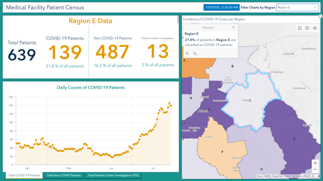
There’s a new resource to help Georgians understand what is happening with hospital bed capacity and how many hospitalizations are related to COVID-19. I’ve previously shared this website before for other COVID-19 resources but there are two new dashboards near the top of the page that I helped develop with the Georgia Geospatial Information Office. The first looks at hospital capacity, similar to the daily GEMA report, but gives us context over time and more specifics by hospital region. Note, these data describe capacity regardless of medical condition - it is not COVID-specific. The second dashboard specifically looks at the proportion of patients that are COVID-positive or under investigation. It’s important to remember that not all hospitals report persons under investigation so it is likely an under count of reality.
First, let’s look at how ICU bed usage has varied over time. There’s no denying that our ICU bed usage is way up compared to previous months, including our earlier peak in April. A common question I get is how do these bed usage rates compare to normal times. On a certain level, it doesn’t matter what it was a year ago at this time because we weren’t facing a pandemic at that time. We are at a point now that we have so few ICU beds available in multiple regions of the state that we are one bad car accident or one cluster of severe cases away from running out of beds entirely. In addition, in the time that GEMA has been producing the situation reports, there has never been a time that so many regions had less than 10 ICU beds remaining. Our situation is dire.

The patient census dashboard helps to provide some needed context to the hospital capacity problems we are experiencing in certain regions. We’ve seen reports over the past week of hospital regions E (Athens-Clark) and L (I-75 corridor in south Georgia) running out of ICU bed space. When we look at the patient population in those areas, their COVID-positive population has trended sharply upward in recent weeks.

In Region L, one in three patients is either COVID-19 positive or suspected to be positive with tests pending.

Deaths
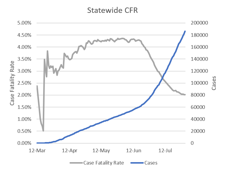
Unfortunately, it was a big day for deaths with 81. The new statewide total is 3752. Thirty six of these deaths came from nonrural counties that aren’t part of the Atlanta metro. Five of those came from Lowndes county alone and 4 from Troup county. Atlanta and Atlanta suburbs each had 15 deaths. Because of our recent surge in deaths, it is impacting the statewide case fatality rate. It has leveled from it’s previous decline. I’m concerned that it will turn upward in the coming weeks.

As the White House said, we are not showing signs of improvement and need more aggressive measures to change the trajectory of the pandemic. I think that’s a fitting way to end today’s update. I’ll be back on Sunday with the Week in Review.
Media
I was a guest on a podcast called Good Faith Weekly.
References
https://dph.georgia.gov/covid-19-daily-status-report
https://www.facebook.com/GEMA.OHS/photos/pcb.10158211079461391/10158211078601391/?type=3&theater
https://int.nyt.com/data/documenttools/states-report-virus-response-july-26/e241189157b34378/full.pdf
https://covid-hub.gio.georgia.gov/


