

The Daily Digest, 31Aug2020
Georgia COVID-19 Updates

Georgia COVID-19 Updates is a free newsletter that depends on reader support. If you wish to subscribe please click the link below. There are free and paid options available.
My family arrived at our destination today. While we were crossing Missouri, we had to pull over to shelter inside of a McDonald’s during a tornado warning. It was a mad dash to grab masks, get four people (plus a dog) inside, etc. As we progressed, I found a lot of comfort in the orderly rows of corn and soybeans. In this pandemic and in the midst of current events when it seems like everything is chaos, it was soothing to see something that was seemingly in control. I also did three media interviews with a very quiet kid in the back seat, mostly correcting the recent bout of disinformation regarding the ways that deaths are reported to CDC. The easiest way to see the impact that COVID-19 has had is to look at excess deaths that have taken place this year compared to previous years’ trends.
Each bar represents each week’s death total, for all causes. The orange line is the threshold for what is considered “normal” based on trends over the past five years. Any bar that surpasses the orange line is excess, above and beyond normal. The graph below shows Georgia.
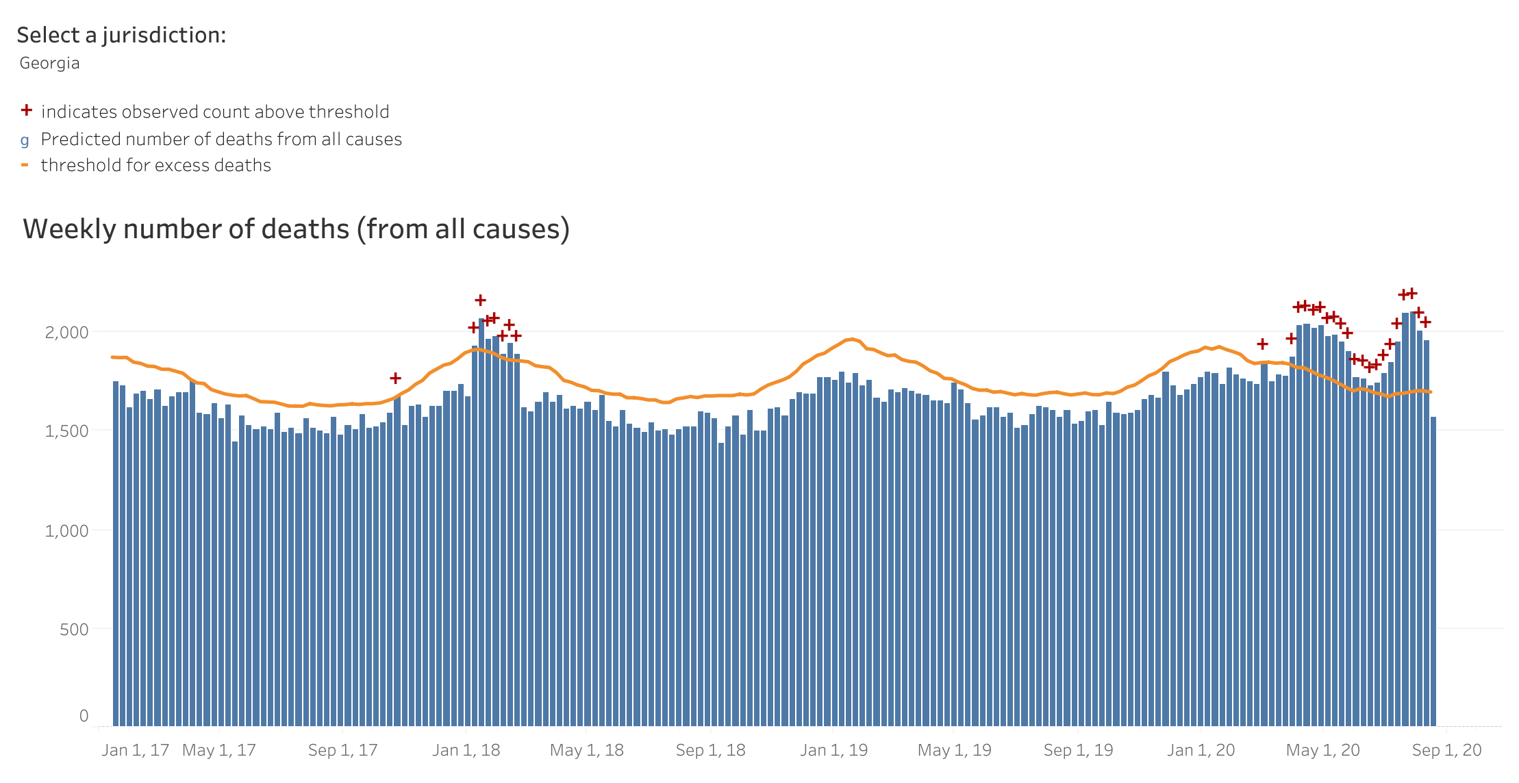
The only thing that is different this year compared to past years is the pandemic. And that previous time that we surpassed the threshold in January 2018 was an especially bad year of seasonal influenza. So infectious disease has an enormous impact on human death. But for those who like to compare COVID-19 to the flu, I’ll just point out that COVID’s impact is both greater and longer duration than what we saw during the worst flu year we’ve had in years.
White House Coronavirus Task Force Report
The latest White House Coronavirus Task Force report on Georgia is available from the Center for Public Integrity.
They’ve added a new row to the summary table, to indicate how many skilled nursing facilities (SNFs) have at least one new resident COVID death.

Our case rate per 100,000 is down to 148 compared to 167 last week, but we remain 1.7x higher than the national average. The viral test positivity rate has also declined by 0.7%. Georgia is doing 74% of the testing that the US is doing overall, so we are performing below the national average, but this is an increase compared to last week.
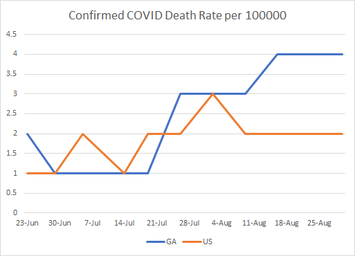
Our death rate per 100,000 remains twice the national average.
Further, our rate of infections among residents of an SNF remains 1.6 times higher than the national average.
Lastly, here is how the White House Coronavirus Task Force is tracking our hospitalizations. Confirmed and suspected infections are down this week, which is in keeping with the data we are seeing from the state.

What’s most interesting to me is that the White House Coronavirus Task Force seems rather concerned about what is happening on college and university campuses. In fact, the top five recommendations have to do with monitoring and coping with disease in the college setting, superseding even their messaging on nursing homes and long term care facilities.

The Harvard Global Health Institute ranks Georgia as #6 in the nation behind Iowa, North Dakota, South Dakota, Alabama and Mississippi for average daily case rate per 100,000. The Georgia Tech Risk Assessment Tool also ranks Georgia as #6. Meanwhile, the CDC’s COVID Tracker still lists Georgia as #4 in the nation for total new cases in the past 7 days. If we dig a little deeper, the New York Times Coronavirus tracking page indicates a few Georgia towns among the top 20 for recent cases per 1,000 residents. The inclusion of Macon-Bibb County may be due to the data dump that we had last week. But Milledgeville and Statesboro are both on the list. Notably, many of the towns on this list are college towns.

For deaths, Georgia is #2 in the nation for deaths per 100,000 over the past 7 days.

Georgia remains the highest state in the nation for percentage of inpatient hospital beds that are occupied by a COVID-19 patient, and #1 by a lot. But it is better than where we were last week (25.9%).

Today in Georgia there was net increase of 1498 cases and 29 deaths. Forty five percent of new cases came from nonrural counties outside of the Atlanta metro. Another 32% came from rural counties. In other words, 77% of the cases are from outside of the Atlanta metro. For the deaths, 41% of today’s newly reported deaths came from rural counties and another 24% came from nonrural counties outside of the Atlanta metro. Hospitalizations also have reduced numbers today, partly due to weekend effect.
I think that’s it for now. Have a good evening!
References
http://www.documentcloud.org/documents/7049085-Georgia-8-30-20.html
https://globalepidemics.org/key-metrics-for-covid-suppression/
https://covid19risk.biosci.gatech.edu/
https://covid.cdc.gov/covid-data-tracker/#cases
https://www.nytimes.com/interactive/2020/04/23/upshot/five-ways-to-monitor-coronavirus-outbreak-us.html
https://www.nytimes.com/interactive/2020/us/coronavirus-us-cases.html
My Ph.D. is in Medical Microbiology and Immunology. I've worked at places like Creighton University, the Centers for Disease Control & Prevention and Mercer University School of Medicine. All thoughts are my professional opinion and should not be considered medical advice.