The Daily Digest, 26Aug2020
Georgia COVID-19 Updates

Hello there! For today’s update let’s begin with the latest White House Coronavirus Task Force report and some of the notable findings in it. Below I’ve provided this week’s summary table (left) and last week’s summary table (right). The Center for Public Integrity has provided all of the White House Coronavirus Task Force reports for Georgia as well as the rest of the nation if you would like to read the report yourself or explore other states.

Let’s unpack this table with some good news, bad news. Starting with good news, our case rate per 100,000 is down 22.5% compared to last week. That being said, we are still 1.8 times higher than the national average. We also saw a decrease in skilled nursing facilities (SNFs) with at least one COVID case, down 2.7% compared to last week. Meanwhile, our proportion of such facilities with a COVID case remains more than twice the national average. Our tests per 100,000 are characterized as green despite a 16.1% decrease from last week. As our total tests performed decreased, so did our percent positive rate, which is…..weird. We saw a 7.8% decrease in deaths last week but still have a death rate per 100,000 that is twice the national rate. Now that we have access to reports dating back to late June, it’s a great opportunity to see how things have trended over time. Many of today’s graphs are based on data pulled from the summary tables for each White House Coronavirus Task Force report since 23Jun.
Testing
It is disappointing to know that the state of Georgia had percent positive rates for each county and was able to provide them to the White House Coronavirus Task Force since late June, but those data were not provided to the public. Percent positive test data for all 159 Georgia counties were only made public after numerous journalists and people like me submitted repeated open records requests for the data, and notably after K-12 administrators had to make decisions regarding school reopening. Considering the importance of the percent positive rate data in gauging how much disease is in the area and how well testing is going to monitor it, it seems like these are data that should have been available to decision-makers if controlling this pandemic was the goal. However, it is a relief to have access to those data going forward.

Georgia has been far below the national testing rate per 100,000 since these data were reported. We have certainly made improvements, but are still performing at 71.2% of the national average. Meanwhile, the percent positive rate for Georgia has exceeded the national average the entire time. We are more closely approaching the national average recently and I certainly hope that trend continues.

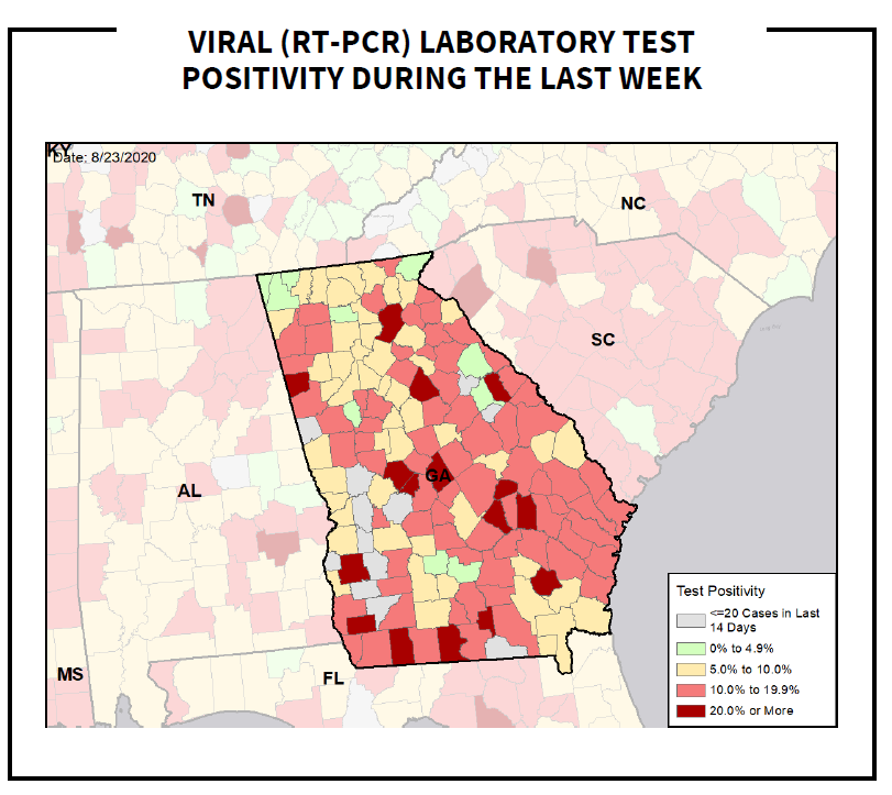
The color ramp on the DPH website for percent positive rate can sometimes make it difficult to tell how well different counties are performing. So I appreciate this stoplight-inspired color coding from the White House Coronavirus Task Force. Any shade of pink-red indicates that a county is performing poorly for testing. Yellow is approaching the goal and green is at or below 5%. It’s important to remember that the 5% threshold line is not a finish line. A region’s percent positive rate can wax and wane depending on disease transmission and our adherence to public health guidance. So the green counties should continue their efforts to limit disease transmission and protect vulnerable members of their communities.
For Georgia, today there were 18,051 new test results reported, a below average day for us. Of those, 9% were positive. Interestingly, only 72.5% of today’s cases were reported through Electronic Laboratory Reporting. For the past four days it has been at or above 100%, meaning that results were de-duplicated. So seeing that about a quarter of today’s cases weren’t part of the percent positive calculation means that today’s percent positive rate might be unreliable.
Cases
From the White House Coronavirus Task Force, here is how Georgia has performed for confirmed cases per 100,000 relative to the US. We sort of exploded relative to the nation in late June and have remained quite high ever since. It is reassuring, however, to see that the case rate is declining recently.

In Georgia today, there was a net increase of 2236 cases added to our tally today, bringing the statewide total to 260,590. Of the cases identified today, 19.5% were backdated prior to the 14-day window of uncertainty. That’s below average for us, and good news. Forty one percent of today’s newly identified cases came from nonrural counties outside of the Atlanta metro. Another 39% came from the Atlanta suburbs. The counties with the greatest increase over the past 14 days are Chattooga (+62.6%) and Lumpkin (+66.8%), both are rural.
Hospitalizations
There’s something confusing going on with hospitalizations, however, when you compare the White House Coronavirus Task Force report to the data we see from Georgia Department of Public Health and Georgia Emergency Management Agency.
The White House Coronavirus Task Force began reporting hospitalization data in mid-July, around the time that the Department of Health and Human Services took over that data collection and management from the Centers for Disease Control and Prevention. The data are part of the summary statement on the front page of each report since mid-July. They track both confirmed (blue line) as well as suspected (orange line) COVID-19 case hospitalizations. They also identify how many hospitals in Georgia were reporting daily into their system as a percentage (gray line, right y-axis).
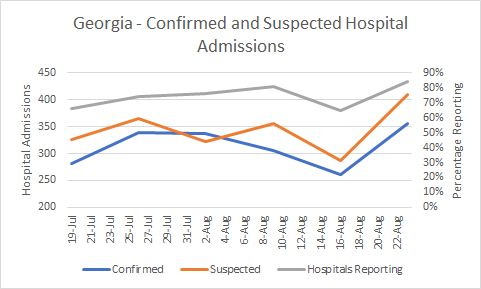
Numbers dipped the week prior to the most recent report, probably an artifact of decreased reporting from hospitals during that time. However, the hospitalizations for both confirmed and suspected cases are higher this week than they have previously been this month. Meanwhile, the data from the state of Georgia indicate that both current and new hospitalizations are down (see shaded area in both graphs below) for the same time frame as the White House Coronavirus Task Force data collection. I don’t know what accounts for this difference but I wanted to mention it in case you also read the report and were confused - you aren’t alone.

Meanwhile, if we look at how COVID-19 contributes to our current patient population at the Georgia Geospatial Information Office data hub, COVID-19 patients (confirmed) make up 14.6% of the total patient population and an additional 4.4% are under investigation. The latter is equivalent to what the White House Coronavirus Task Force is labeling “suspected.” So statewide, COVID-19 patients make up 14.6 - 19% of the total patient population that are hospitalized as of last night at midnight.

Hospital Region H and Region M have higher rates of COVID-19 hospitalizations than the rest of the state. That makes sense since these regions have seen some of the biggest increases in cases over the past 14 days. For Region H, 21.7% of their hospitalized patient population is COVID-19 positive and another 7.9% are under investigation. For Region M, the situation is more intense with 32.3% of hospitalized patients identified as COVID-19 positive and another 8.8% under investigation. Regions H and M feature all rural counties and rural counties have a disproportionately high death rate compared to the rest of Georgia. So it is concerning to see both cases and hospitalizations high for these areas.
Today there were 222 new hospitalizations and 38 new ICU admissions relative to where we were yesterday. You can see how ICU admissions (statewide) have varied over time.

Patients currently hospitalized has continued to decline according to data provided by GEMA and new hospitalizations leveled off from their descent (see New Hospitalizations graph above). Hopefully that’s just a pause before further descent.
Deaths
With our case surge in June and July, we also saw our death rate begin to climb the week of 21Jul. Our death rate overtook the national average and remains twice as high.

Today there was a net increase of 49 deaths, bringing the statewide total to 5311. The statewide case fatality rate is 2.04% after bottoming out at 1.93% on 10Aug. The Atlanta counties of Fulton and DeKalb didn’t record any deaths today (whew!). Instead, today’s newly reported deaths were distributed as follows: 19 in nonrural counties, 17 in the Atlanta suburbs, 11 in rural counties and one each in the unknown and non-Georgia resident categories, respectively.
Outreach and Media
Tomorrow (Thursday) at 10:00 am, I’ll be joining Drs. Grace Bagwell Adams and Mark Ebell both of University of Georgia’s College of Public Health on WUGA FM for a panel discussion on how the pandemic is going in Georgia. If you’re in the Athens area, consider tuning in.
This Friday, I’ll be doing one of my last Q&A sessions before the big move. I’ve been invited by Georgia House Representative Betsy Holland to educate her district on Georgia COVID-19 trends and answer their questions. My participation is not an endorsement, but rather an opportunity to inform the public. If you’d like to join the event you can see more details here: https://www.facebook.com/events/771742063601386/
References
https://publicintegrity.org/health/coronavirus-and-inequality/white-house-coronavirus-red-zone-reports-covid/
https://gagio.maps.arcgis.com/apps/opsdashboard/index.html#/e40c39564f724af7bfe8fd5d88deadb6
https://www.facebook.com/GEMA.OHS
https://dph.georgia.gov/covid-19-daily-status-report
http://208.97.140.204:8080/epicurveInteractive-cases.html
Georgia COVID-19 Updates is a free newsletter that depends on reader support. If you wish to subscribe please click the link below. There are free and paid options available.
My Ph.D. is in Medical Microbiology and Immunology. I've worked at places like Creighton University, the Centers for Disease Control & Prevention and Mercer University School of Medicine. All thoughts are my professional opinion and should not be considered medical advice.
A question to consider -- many schools in GA are basing reopening on falling below 100 cases per 100k across 14 days. For my county of Dekalb, that metrics can be met by averaging 54 cases/day for 2 weeks; we are currently at 94 cases/day as a 7-day average and quickly falling.
If we look at Date of Onset for Dekalb, we never hit a consistent 7-day average, even during the statewide Shelter-in-Place order/mandate/encouragement. As of today, there is no county with less than 100 cases per 100k across 14 days.
My question is this -- is this county goal even achievable?
https://dph.georgia.gov/covid-19-daily-status-report