The Daily Digest, 24Oct2020
Georgia COVID-19 Updates

Good morning! I apologize for the delay. For whatever reason yesterday was the day that several of my open records act requests were answered by multiple state agencies. There was a lot to think about and I was pushing up against some planned family activities yesterday evening. Thank you for your patience. With that, let’s get going.
You may have seen or heard that CDC has redefined what it means to be a close contact for the purposes of contact tracing and testing. Now instead of requiring an individual to have been in close proximity (less than 6 feet) of a confirmed COVID-19 case patient for at least 15 continuous minutes, the definition now includes anyone with a combined total of 15 minutes in close proximity over a 24 hour period.
Ultimately, I think this is a good thing. We’ve gotten too accustomed to the idea that you have to be in close proximity with someone for 15 continuous minutes in order to cross an imaginary threshold for disease to be transmitted. But what this indicates is that the exposure can be cumulative over the course of time. And that makes everyone more aware of their risks. It expands who is eligible for testing following an exposure, which tells us who is sick. The change might impact policies in workplaces and K-12 settings, colleges and universities, etc. I’ve included some of the exposures that CDC considers as part of the close contact investigation below so that you can think about how it would impact your day-to-day routine.

Remember that contact tracing is not a magic bullet - it cannot stop this pandemic alone. It is meant to be part of of an integrated effort of governments, communities, laboratories and public health officials. In North Dakota, the state with the highest case rate in the country, officials have suspended contact tracing efforts, instead dedicating their National Guard staff who had previously been doing that work to assist with the enormous task of informing everyone who has tested positive. That means there is no proactive work being done to limit spread, just to react to who has been tested positive so far.
Yesterday was a record-setting day for new COVID-19 cases, with more than 85,000 in a single 24 hour period. Of course, this is problematic for many reasons, but among them is the fact that is happening through multiple regions of the country. So unlike previous surges that were relatively localized to a region, it won’t be possible to send healthcare workers and equipment to reinforce overstrained healthcare infrastructure. Because they’re needed in their own communities. We still don’t have enough personal protective equipment (PPE) for healthcare workers, many of them are still re-using N95 masks, more than 8 months into this pandemic. This week, the US was able to land a probe on an asteroid and collect samples. But we can’t produce life-saving medical equipment.
Testing
Yesterday, Georgia reported 40,089 new test results through Electronic Laboratory Reporting, a large output day. If the state had an active surveillance strategy this would be considered a good thing. But since our state’s strategy is largely anyone who wants a test can get a test, seeing a large test demand in a single day means there are more people who have symptoms or know someone who does than we have seen in recent weeks. We haven’t had a test output day like this since early August. MEANWHILE, that large number doesn’t even include antigen tests which have gained in popularity and use. In fact, according to an article released by WABE Atlanta yesterday, in southwest Georgia’s Clay county the majority of tests performed are rapid antigen tests. So even 40,089 new tests is an undercount of how many tests were reported yesterday. By how much we are undercounting cases is unclear until we get the probable case data from the county indicators report on Monday. We’ve been told that the antigen tests are eventually going to be included in the daily status report for weeks now.
The COVID Tracking Project recently published a blog post discussing the problem of the patchwork of case reporting across states either including or excluding antigen test data. Previously, the best information we had on antigen test reporting was from Kaiser Health News, indicating which states gathered, reported and included antigen testing in their case totals. That analysis indicated that 31 states were including antigen test-identified cases in their state’s case totals. The COVID Tracking Project post is the next analysis of the same problem and their analysis indicates more ambiguity than Kaiser Health News had previously found.

Of today’s new PCR test results, 5.2% of them were positive and these positives represented 94% of the net increase in cases yesterday compared to the day prior. So it was a solid reporting day and that 5.2% estimate is reliable. In addition, of the newly reported cases, all but 13.6% were within the 14-day window of uncertainty, within normal limits (<20%). So 86% of the newly reported cases are current or recent.
Cases
There was a net increase of 2224 new cases reported today, bringing the statewide total to 347,759. We haven’t had a number this high since September 19th. Of these new cases, 34% came from nonrural counties outside of the Atlanta metro. Next were Atlanta suburb counties, contributing 23% of today’s cases. Atlanta counties and rural counties were nearly equal, contributing 20.8% and 20.2% of cases, respectively. Here’s the latest look at how the 7-day case rate per population is trending.

As these case rates increase for different county types, it’s also interesting to learn which age groups account for these increases. In the demographics section of the daily status report from Georgia DPH, you can find these two graphs. Compared to where we’ve been, it’s hard to see the recent increase, but it is there. In the top graph, it is noticeable for the red (30-59) and the purple (60+) age groups. The blue line represents children ages 0-17. We can toggle to the children only view (second graph) to get a better look at that population.
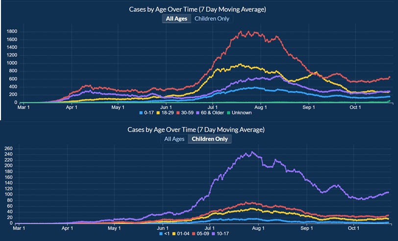
The children only view tells us that large increases are happening for children aged 10- 17 (i.e. middle school and high school kids). I calculated the percent increase for each age group from these graphs and the downloadable data from DPH and this is what I found for the most recent 2 week period. The left side reflects the data in the all ages graph (above) and the right side of the bar chart reflects the “children only” graph above.

Almost all age groups are increasing. The only exception is 18-29 year olds who recorded a 4% decrease.
On Fridays we get the latest school-aged surveillance data and there are some items of concern in it. Cases are increasing among K-12 aged children. They are increasing for both 14-17 year olds and 11-13 year olds. They appear to be decreasing for 5-10 year olds in this graph.

Many of you know that I recently relocated to Kansas and have begun writing about the situation here. The Kansas Department of Health and Environment has a lot more transparency about what’s happening with outbreak clusters of COVID-19 in the state including which individual schools, prisons, long term care facilities are involved, and how many cases, hospitalizations and deaths are linked to the clusters. I’ve written about it here. Using the Kansas data, I was able to identify that the top four cluster settings associated with deaths were long term care facilities, meat packing plants, religious gatherings and correctional facilities, in that order. This lead me to ask for the same data from Georgia Department of Public Health. They had previously released the number of clusters associated with each setting in some of the Governor’s updates. I was asking for the cumulative number of cases, hospitalizations and deaths for each through close of business on October 21st. All things considered, the open records office at the Georgia Department of Public Health is the best one I’ve worked with so far, including other states and various federal agencies. They were kind enough to fulfill my request but made sure to tell me (and now I pass it along to you) that these numbers are subject to change as investigations identify new data or remove clusters from the total. One hiccup in the report they gave me was that so much of it was redacted. In my experience in public health there’s a tendency to limit access to information when the numbers are small for privacy reasons, because there’s a chance that someone could Google with the right key words and identify the individuals or the business that are associated with that cluster. But redacting this document seemed really odd…with close to 350,000 cases and 7,766 people dead, it doesn’t seem likely that we could identify a single person or business associated with the pandemic, because so many of us are associated with the pandemic. When I asked for clarification, the records officer told me that any data entry equal to or less than 5 was redacted, including one cluster setting all together. The previously most recent cluster report was distributed to the media but not provided to the public by the DPH or Governor’s office on Tuesday, October 6th and I received a copy by email. Comparing the redacted cluster table with the October 6th report, the only cluster categories missing are unknown (previously associated with 1 cluster) and cafeteria (also previously associated with 1 cluster). As I did for the Kansas data, I wanted to look at the average number of cases, hospitalization and deaths associated with each cluster setting in Georgia. The top five settings for the most clusters in general are ranked in order of long term care facility / nursing home (n = 787), school (407, an increase of 77 since the October 6th report), workplace (256), prison/jail (245) and manufacturing facility (180). Using that information I have provided the average number of cases, hospitalizations and deaths per cluster so that we can identify whether certain settings are more problematic than others. I’ve noted where redactions took place meaning that the data entry is somewhere between 1 and 5. Green color coding means they are in the top 5 for that category.
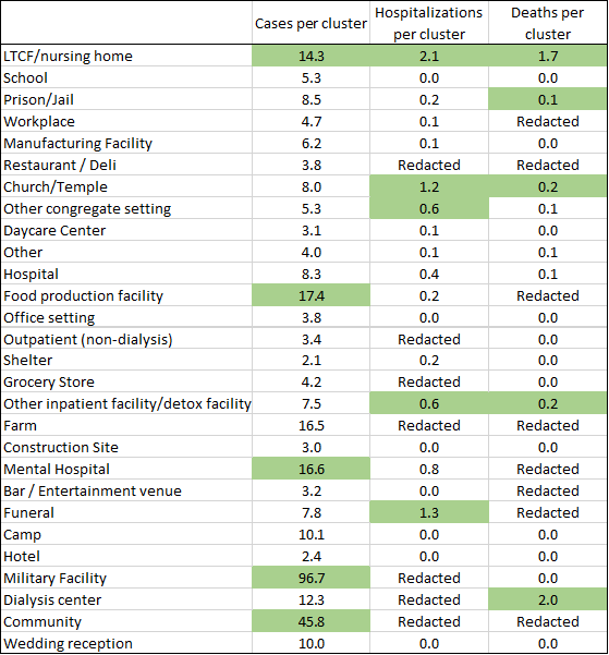
The highest number of cases per cluster are associated with (ranked in order) military facilities, community (don’t know what that means), food production facilities, mental hospitals and LTCF/nursing homes. The top five for average hospitalizations per cluster were (ranked in order) LTCF/nursing homes, funerals, church/temple, and a tie between other congregate setting and other inpatient facility / detox facility. The top five settings for average deaths per cluster were (ranked in order) dialysis center, LTCF / nursing home, then there was another tie between church/temple and other inpatient facility / detox facility, and then prison/jail. The only settings that were in the top 5 for at least two categories (making them especially problematic) were LTCF / nursing homes, churches and temples, and other inpatient facilities / detox facilities.
The last thing to note from the open records request data is how many of the cases, hospitalizations, and deaths were associated with outbreaks, and how many weren’t. In total, just 6.7% of the state’s cases reported to date were associated with an outbreak, 6.5% of hospitalizations and 18.4% of deaths. That means that the remainder were never investigated by contact tracing (because they were behind and overwhelmed) or never linked to a known cluster. Instead, they are the result of widespread, uncontrolled community transmission. It’s all the more reason for us to be diligent about wearing masks, maintaining at least 6 feet of distance, avoiding unnecessary errands and interactions and staying home when we’re having any symptoms.
Hospitalizations
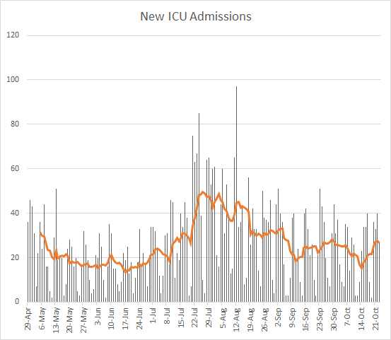
Yesterday there were 120 new hospital admissions for COVID-19 and 27 new ICU admissions. The current number of hospitalized patients as of yesterday’s update was 1359. Thirty percent of adult ventilators are in use. Current hospitalizations and ICU admissions have both been trending up in the most recent weeks.

If we look at what happened prior to the summer surge, it was a a gradual build in current hospitalizations before exponential growth began. We appear to be in a similar trend now and although I hope we don’t see exponential growth I think hospitals should prepare for it.
A more concerning finding in the school aged data report is this next graph on Emergency Department visits due to COVID-19 syndrome.

They are increasing for every age group. Look elsewhere on the graph - where else do you see such agreement between the age groups? The week beginning 6/15/2020, the start of the summer surge.
Deaths
There was a net increase of 37 deaths reported yesterday, bringing the statewide total to 7766. Of those deaths, 51% came from rural counties, and 30% came from nonrural counties outside of the Atlanta metro.
Here’s how the death rate per 100,000 has moved over time for different county types in Georgia.

The death rate is declining (a great thing). But there are increases for the nonrural counties (gray line).
References
https://dph.georgia.gov/covid-19-daily-status-report
https://covid-gagio.hub.arcgis.com/
https://www.cdc.gov/coronavirus/2019-ncov/global-covid-19/operational-considerations-contact-tracing.html
https://www.nytimes.com/live/2020/10/21/world/covid-19-coronavirus-updates/swamped-with-virus-cases-north-dakota-suspends-contact-tracing
https://www.nytimes.com/2020/10/23/us/covid-worst-day.html
https://www.cnn.com/2020/10/23/world/asteroid-bennu-sample-update-scn-trnd/index.html
https://www.wabe.org/georgias-covid-case-count-doesnt-include-rapid-test-results/
https://covidtracking.com/blog/antigen-testing-reporting
https://khn.org/news/lack-of-antigen-test-reporting-leaves-country-blind-to-the-pandemic/
https://kansascovid19updates.substack.com/p/the-week-in-context
https://dph.georgia.gov/document/document/dphnewsrelease-covid-19update9-15-2020pdf/download
https://drive.google.com/file/d/1kT5GeSoRu32LzFjFlpHAjPyk2NA_XcNh/view?usp=sharing
Georgia COVID-19 Updates is a free newsletter that depends on reader support. If you wish to subscribe please click the link below. There are free and paid options available.
My Ph.D. is in Medical Microbiology and Immunology. I've worked at places like Creighton University, the Centers for Disease Control & Prevention and Mercer University School of Medicine. All thoughts are my professional opinion and should not be considered medical advice.