We have the latest White House state reports that were finalized last Friday but released to the public yesterday. I’ll talk about Georgia-specific data and trends in the following sections but I want to talk about national numbers first.
For new case rate per 100,000
Top states: NJ, RI, NY, MI, DE
28 states + DC in the red zone (-1 compared to last week)
Test positivity
Top 5 states: SD, NJ, ID, NE, FL
17 states in yellow zone (5-7.9%), same as last week.
There are NO STATES IN THE RED ZONE.
COVID-19 hospital admission rates per 100 beds.
Top 5: NJ, GA, KY, NY, MD
45 sates in the green zone (+33 compared to last week!)
COVID-19 death rates per 100,000
Top 5: WV, KY, AR, TX, LA
18 states in red zone (-9 compared to last week)
Vaccinations - as of last Friday, 23.3% Americans have received at least one dose of the vaccine (well done! Keep going!). As of today, the number is 25.3% or one in four Americans.
Top 5: NM, AK, SD, CT, ME
Bottom 5: PR appears to be tied with GA, AL, DC, TN
There’s something new now where they no longer count how many counties are in the red, orange or yellow categories. Instead, they have changed to counting counties based on the CDC community transmission criteria that factor in both case rate and test positivity rate. You want to be in the blue or yellow categories for this. The table on the bottom of the image below shows you how we’re doing this week relative to last week. The graph on the right is sort of a pie chart that trends over time, showing you the percentage of counties that were red, orange, yellow or blue over time. You can clearly see where we emerged from the summer surge on the far left and the data dump of antigen cases that happened around 01Nov2020. You can also tell just how prolonged and intense the summer surge was for Georgia, impacting all 159 counties. But you can also see how much better things are now. In fact, there are fewer red counties now than there were in the fall between the summer and winter surges.
Vaccine Update
The Governor announced yesterday that every Georgian over the age of 16 will be eligible for vaccination starting tomorrow (Thursday, March 25). For anyone over the age of 18, you can get any vaccine that is available. For those 16-17, I want to point out a few details that you should know as you’re signing up.
Because only Pfizer included 16-17 year olds in their clinical trials, this is the only vaccine authorized for use in 16-17 year olds under the EUA from FDA.
You can most reliably find Pfizer doses at CVS, Walgreens and the GEMA mass vaccination sites.
Because these are minors, they will need to have a parent or guardian present to provide consent.
While we’re on the topic of vaccinations, last week Governor Kemp claimed that there was a data error that they had identified with people at CDC where 250,000 doses administered through the federal direct-to-pharmacy program weren’t accounted for in the CDC state-level data for Georgia. The Governor cited this as an explanation for why the state is consistently ranked last or nearly last in vaccine administration for weeks now. An article by Nick Wooten came out yesterday that follows up on this. When pharmacies were entering vaccine data, some of them were not filling in a box that asked for their site location. Without that information, the system defaulted to the pharmacy’s corporate headquarters address and that’s what was reported to the federal government. So for example, the Walgreens corporate headquarters is in Illinois. If a patient in Waycross, Georgia got vaccinated at a Walgreens and the pharmacist didn’t select that box, then it was reported in Illinois data. Note: I’m using Walgreens as an example, they’re one of several direct-to-pharmacy partners. According to Mr. Wooten’s investigation, he was able to verify this error was taking place with staff at the Centers for Disease Control and Prevention and they indicated it was a problem for “several states.” They couldn’t confirm the 250,000 number though, and said it was a problem for a “small subset” of shots.
I don’t think this changes anything for the national numbers. For example, where I said that 25.3% of Americans have received at least one dose, that is still correct. However, we need to probably spend more time looking at the numbers based on state of residence rather than state/county/zip code of administration. We don’t have a way to verify the 250,000 number, but let’s give the benefit of the doubt on this for a moment. The chart below is the data you can download every day from the CDC COVID-19 Vaccine Data Tracker. I’ve inserted the four columns on the right so we can compare states. In this view, the states and territories are sorted based on the column for “% of available supply used.” Using the CDC numbers, Georgia would be ranked the #48 state for use of the doses they’ve received. And they would have an inventory of 1.54 million doses on hand. If we give the benefit of the doubt and add an additional 250,000 to the “administered” number for Georgia, then the percent of supply used moves up to 73% and the available surplus becomes 1.29 million doses on hand. So even with these corrections, Georgia would still be in the bottom 10 states in the nation. And it’s still really hard to accept the talking point that “supply is limited” when somewhere between 1.29 - 1.54 million doses are on hand. So this data reporting error does not solve the mystery of why Georgia is so far behind other states.
CDC doesn’t provide us data based on state of residence for each person vaccinated, which would clear this whole thing up really quickly. Until this whole thing is sorted out, perhaps the best way to compare states is to look at the percent of the total population who has received at least one dose of the vaccine by state of residence since that corrects for population differences and avoids the site of administration problem. Using this metric, 19.4% of Georgia’s total population has received at least one dose (by state of residence). When compared to other states, Georgia is ranked #50.
In yesterday’s press conference, Governor Kemp pointed out that Georgia is #48 in the country for doses delivered per 100,000 by the federal government. Perhaps he was hoping to explain Georgia’s rankings as a function of doses delivered. I checked this and he’s correct, Georgia is ranked #48. I think there’s two possible explanations here. First, I imagine a key priority for the federal government in its allocations is to give states ample supply but not overwhelm their capabilities, especially considering the storage requirements for the vaccines. But second, there might be a desire to give doses to places that are getting them out the door as efficiently as possible. Right now, Georgia has somewhere between 1.29 - 1.54 million doses on hand and is using between 68 - 73% of its available supply. If you’re looking at those numbers, it’s reasonable to conclude that Georgia has more doses than it can efficiently manage. In other words, Georgia has vaccine and lots of it. It needs to do a better job at matching supply to demand such as correcting the imbalance between Atlanta and the rest of the state. We are seeing those corrections being made with the Governor announcing that 70% of this week’s allocations are going to North Georgia (including Atlanta), but it remains a point of frustration for many. Hopefully, if we can move more of the stockpile into arms, the doses distributed to the state will improve. But on this point too, doses delivered does not explain why Georgia is ranked so low. We have yet to get a credible explanation and accountability for the pace of vaccine administration in Georgia.
The two graphs below look at how well Georgia is doing at vaccinating its population (again, this is by state of residence not administration) compared to the national trend for first doses full course administered to all adults. These data come from the White House State Report. The good news is that Georgia continues to increase. However, we can see that Georgia has always been below the national average for first doses. The disparity narrowed in mid-February. Whereas the rate has really taken off for the US, Georgia has not shared that rapid rate of increase. Georgia is closer to the national average when we look at full course administered (right), but the disparity is widening recently. I don’t think anyone expects this effort to be perfect and I know a lot of people are working really hard on this. But it’s hard to see Georgia falling behind in this way. But part of correcting these disparities is acknowledging that they exist in the first place. We aren’t really seeing that from state leadership. Hopefully there are efforts behind the scenes that we don’t get to see that are working to correct this.
Testing
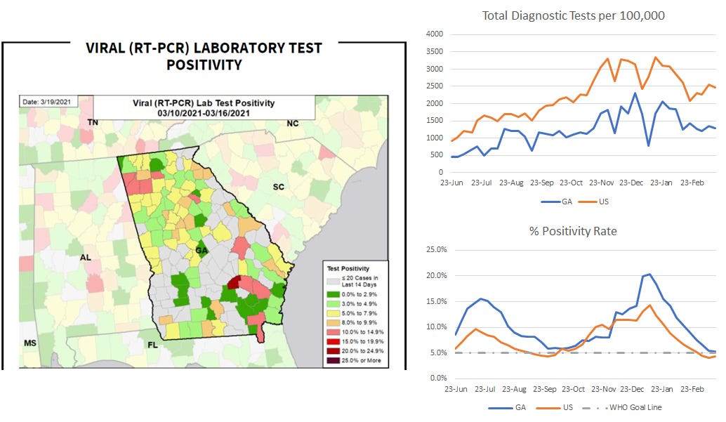
For each of these sections, you’re going to see a graphic similar to what’s provided below. The map comes directly from the White House state report and gives us a look at where we are now. The graphs on the right are related to that same metric, but show us how Georgia and the US have trended weekly over time (where we’ve been). The graphic below all relates to testing.
For the map, you want to be in the green categories as much as possible. In the upper right, we can see how Georgia (blue line) has compared to the US (red line) for tests performed per 100,000 residents. Here too, you will see that Georgia has always underperformed relative to the national average. The lines tend to move in parallel, but right now testing is increasing nationally whereas it remains flat over the past couple weeks for Georgia.
Test positivity is shown over time in the graph on the lower right. The gray dashed line shows the WHO goal line (5%). The US is now below that goal line and Georgia is just above it (5.3%). Georgia has never dropped below 5% since the White House/HHS has been compiling this information. It would be really great to get there this time and we are REALLY close. Test positivity is often considered alongside case rate to gauge how much the case rate might be an undercount of present disease burden. Seeing a test positivity rate at or below 5% means we are unlikely to be missing very many cases with the current level of testing. It doesn’t mean the pandemic is over. It means that case rate numbers are more accurately capturing disease burden.
Today, Georgia reported 14,674 PCR test results and 9090 antigen tests. This is a really low number for PCR tests, especially during the week. Of today’s PCR tests, 5.4% were positive. Of the antigen tests, 3.9% were positive. PCR testing identified 68.6% of today’s newly reported cases.
Cases
Case rate per 100,000 is improving a lot compared to where Georgia has been in the recent past. For the map, it’s best to be in the yellow or green categories and we see a about a dozen yellow counties. There are still red zone counties and a lot of them are clustered around the Atlanta metro and on state borders. But there are fewer of them this week than last week.
If we look at where we’ve been (on the right), we can see that Georgia’s case rate has continued to decline after a brief plateau. Georgia is under the national average for the second week in a row which is really good to see.
Today, Georgia reported a net increase of 840 newly reported PCR cases and 384 antigen cases, for a combined total of 1224. Last week, we saw that the 7-day case rate was starting to tick upward again. But given more time, it appears that the case rate might be decreasing again, a good thing. Remember, we want to pay attention to trends rather than single-day data points. And often, we don’t see the trend well until we look back in time. All we can say about the last couple weeks is that the dramatic decreases in case rate are over, transitioning into a more varied descent. We are getting close to doing something Georgia has never done before - returning to pre-surge baseline. The 7-day case rate per 100,000 is about 27% above the pre-winter surge bottom.
Hospitalizations
This week, some of the areas of the map that were green before became dark green (a good thing). Some of the areas that were dark red are now light red or orange. But we have a lot of parts of the state that transitioned into that orange category that were previously yellow. If we look at the trends over time (upper right) then we can see that hospital admission rates for COVID-19 have sort of leveled off over the past three weeks for Georgia. In fact, even though things are better, Georgia is ranked the #2 state for COVID-19 admission rate.
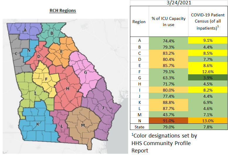
However if we look at the lower right we can see that the COVID-19 burden on adult ICU beds continues to decrease. So people are being admitted at a plateauing rate, but perhaps their cases aren’t severe enough to require an ICU bed. But the graph also shows us how far Georgia has come since the height of the winter surge when 49% of ICU beds were being used by COVID-19 patients. Since that time, COVID-19 demand for ICU beds has dropped 69%. The state is nearing the national rate.
Today Georgia reported a net increase of 115 new hospital admissions and 14 admissions to the ICU. 79% of the state’s ICU beds are in use and the HHS Community Profile Report tells us that 13% of those ICU beds are being used by COVID-19 patients (#4 state in the US). Inside the state, only one region is in the red zone for ICU bed usage (region N - northwest Atlanta suburbs). For patient census, the regions with the greatest burden are regions F (middle Georgia) and N.
Deaths
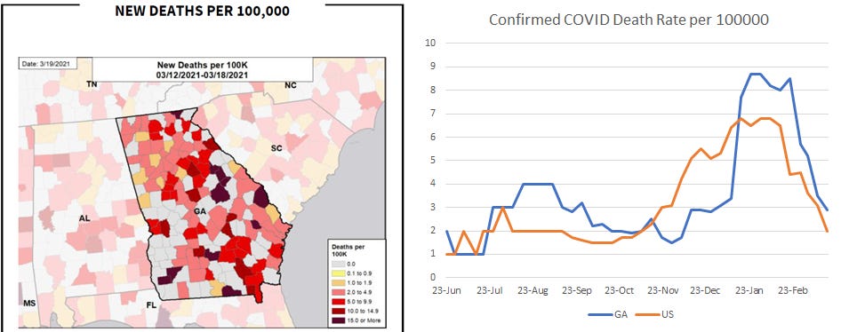
Deaths are a lagging metric compared to cases and hospitalizations. By this, I mean that there is a delay in deaths compared to the surges in cases and hospitalizations that feed into death surges. As a consequence, there is also a delay in when the surge recedes for deaths too and we are still on the downhill from that now. So whereas the maps all showed a lot of green and yellow for the other metrics, the Georgia map for death rate remains largely red. We will get there.
The graph on the right shows just how much better Georgia is doing now compared to the peak of the winter surge. The state has almost caught up to the national death rate, but in the past week the national rate dropped more than the state rate. Hopefully we see the state’s weekly death rate drop down to pre-surge levels (see 23Nov) in the next week or two.
Georgia reported a net increase of 70 newly reported confirmed deaths and 2 probable ones. Mercifully, the 7-day death rate continues to decline. At this point, the 7-day death rate for the state is 25.6% above the pre-winter surge baseline. Death rate is highest for rural counties and lowest for Atlanta suburb counties at this time.
References
https://dph.georgia.gov/covid-19-daily-status-report
https://covid-gagio.hub.arcgis.com/
https://beta.healthdata.gov/browse?tags=covid-19-spr
https://covid.cdc.gov/covid-data-tracker/#vaccinations
https://beta.healthdata.gov/Health/COVID-19-Community-Profile-Report/gqxm-d9w9
https://www.ledger-enquirer.com/news/coronavirus/article249983709.html
https://www.macon.com/news/coronavirus/article250061644.html
Georgia COVID-19 Updates is a free newsletter that depends on reader support. If you wish to subscribe please click the link below. There are free and paid options available.
My Ph.D. is in Medical Microbiology and Immunology. I've worked at places like Creighton University, the Centers for Disease Control & Prevention and Mercer University School of Medicine. All thoughts are my professional opinion and should not be considered medical advice.


