The Daily Digest, 21Oct2020
Georgia COVID-19 Updates
Good evening! As you may have seen, the Georgia Department of Public Health daily report has been delayed due to technical problems. Whenever something like this happens I find myself hoping that the reason for the delay is because we’re about to see some new data offerings, but it doesn’t always work out that way. At this point, I don’t think we’re going to see today’s data until tomorrow. In the absence of that update, today I’m going to focus on the White House Coronavirus Task Force report (WHCTF) and some recent studies that were released this week.
The White House Coronavirus Task Force report for this week was delayed but I got it late this afternoon. I’ve forwarded it on to the Center for Public Integrity to add to their growing collection of these reports, but you can view it here for now. We get to see the national picture at the back of each state’s WHCTF report. Georgia is ranked #35 by their estimation for case rate, in the orange zone. Unlike every state that surrounds it, Georgia is not fully colored in right now. It’s not clear whether that’s because there isn’t actually disease there or because we aren’t looking for disease in those counties. But that observation is consistent throughout the national picture pages.

They have us ranked #27 for test positivity (yellow zone) and #14 for weekly death rate per 100,000 (orange zone).
Here’s how Georgia compares to the US case rate per 100,000 in the most recent week. We’re below that national average, but both the national and state rates are increasing.

The number of counties on their list of counties of concern bounced back up this week (black line below). It looks like this increase is due to increases in the yellow and orange county lists.

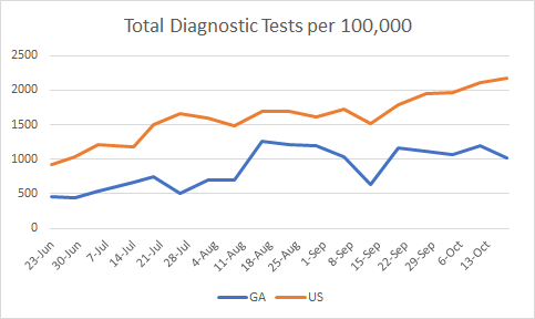
For testing, our test rate per population declined in the most recent week and the disparity between our rate and the national rate is widening. We are testing at a rate that is 53% less than the national average…the wrong direction.

Our percent positive rate for testing has held steady over the past month at about 6%. The national average is creeping up but this week it is just below the Georgia rate.

I thought this increase in confirmed hospitalizations was a typo in the report last week, but it appears that it is real with the same increase this week compared to previous weeks. According to the WHCTF, the average daily hospitalization rate is up 113% compared to where we were on October 4th. We haven’t seen this reflected in the data that the Georgia Department of Public Health provides us.

As I noted also on Sunday, the death rate for Georgia decreased in the most recent week compared to the week prior. We still remain 33% higher than the national average, but the gap is narrowing.

Next, I’d like to highlight some of their recommendations. They’ve started providing a series of maps for cases, testing and deaths that allow us to see how things have moved over time. They write, “This time series also shows early signs of deterioration in the Sun Belt as mitigation efforts were decreased over the past couple of weeks.” As we look through the series of maps for case rates together, you can see that Georgia (and the South) was very much dark red three months ago. But things got better up to one month ago, where many counties weren’t colored in at all. But for our neighboring states, especially, things have intensified once again. I think that’s what the WHCTF is talking about.

They also write, “Georgia remains mostly stable, with very early evidence of increasing test positivity and cases.” As we see cases surge throughout the rest of the country and among our neighbors, we should remember that viruses don’t care about state borders. One reason we might appear to have so many unshaded counties is because our neighbors are including antigen test results in their case totals whereas we are not. The WHCTF again repeats their recommendation that Georgia “must” report these as COVID cases. Another possibility is that the disease really and truly is not there. The third possibility is that the cases are there, but we aren’t testing widely enough in some of those rural counties to detect them.
Next, I’d like to discuss two important COVID-19 journal articles that were released yesterday in the CDC’s Morbidity and Mortality Weekly Report. Let’s first begin with a large study that compared hospitalization data among Veterans Health Administration patients for COVID-19 (2020) compared to past influenza seasons (2018 until February 2020 to avoid confusion with COVID-19 illness). Below, I’ve put together some of the biggest findings from the article. What this tells us is that COVID-19 disease and influenza really are not the same thing at all. So hopefully with these data, we can stop spreading the disinformation that this is just the same (and the implication is just as minor) as the flu.

Not only are hospital stays longer, a person with COVID-19 is more likely to be admitted to the ICU and more likely to die in the hospital than someone suffering from influenza. They are also 19 times more likely to suffer from the complication, Acute Respiratory Distress Syndrome, a rapid form of respiratory failure that features widespread inflammation in the lungs. But there are also a lot of other complications that have to do with blood clotting.
The second study has to do with excess deaths that have taken place in 2020 compared to past years. Some of this is not new information, because I’ve talked about excess deaths here in the past. But the study helps us to put some numbers on things and really see some of the disparities that exist. As of October 3rd, there have been 299,028 excess deaths and and 66% of them are attributed to COVID-19. But here again, we get to see how COVID-19 compares to flu.
First, let’s look at how deaths of all causes compare this year to the trends over the past 5 years for Georgia (below). The orange below is the threshold above which deaths are considered to be above normal and “excess.” Each bar represents a week’s total deaths, with delayed reporting impacting the most recent 1-8 weeks. You can see that we’re well above the orange line this year. But you can also see that we’ve surpassed that number before, in January of 2018. The 2017-2018 flu season was a particularly bad one so a lot of this excess is likely due to flu. That year, we did see excess deaths and while they were intense, they were brief. In recent history, since the start of the pandemic, the excess has been intense and sustained. This is a stark difference between COVID-19 and flu.

In the current study they quantified the percent change in deaths for age and race/ethnicity. One of the most surprising things to come out of this study is that the largest shift in excess deaths (26.5%) has taken place among the young, aged 25 - 44. This is important for two big reasons: (1) we tend to think of the death impact being most problematic for those >65 years of age. It negates the notion that young people are not impacted. (2) This is another big departure from how influenza usually affects our population, where the ones most likely to die are the very young and the very old.

For race and ethnicity, here’s what they found. The excess deaths increased by 12% for White populations and they fared the best. However, the increase was much greater for all other races and particularly large for Hispanic populations (+54% compared to past trends).

If we look at this similar information but for Georgia (top row, percent difference), here’s what it looks like.

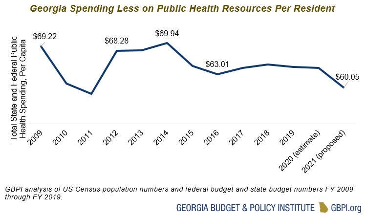
It’s noteworthy that this is the first time that I can recall that we aren’t getting a daily report from the state of Georgia since they began their daily updates. It’s important to remember that public health infrastructure isn’t built overnight and it isn’t built just through sheer force of will. It requires funding and upkeep. I don’t know the source of the DPH’s technical problem that is impeding access to the state’s data today. But I do know that the COVID-19 Data Task Force hasn’t met since early August (because I serve on the task force). I know that we ran out of funding through the CARES Act and it’s possible that some of the IT needs that drive the DPH update were funded through the same mechanism. No relief bill is coming from the federal government to replenish those funds. Public health funding has deteriorated for the past decade and that can’t be fixed overnight, least of all during a pandemic that has hurt economies as well as people. But let this be a reminder to all of you that you get what you pay for. And when you don’t pay for public health, it’s hard for public health to answer all of the needs and questions we have with limited resources and limited staffing. Meanwhile, public health is one of the greatest returns on investment for our communities. The Georgia Budget and Policy Institute wrote up a rallying cry earlier this summer for prioritizing public health funding for COVID-19 and beyond and the points they make are excellent. The graph below shows how much money Georgia spends per resident on public health. It’s not a good look now that over 7000 Georgians are dead from COVID-19.

Even during a pandemic, the Department of Public Health has taken a sizeable budget cut this year. Employees are being furloughed…which means they aren’t able to work on this pandemic for us. The way we are going to get to the end of this pandemic is through it. We have to do the work and that includes making sure that our Department of Public Health is fully funded and fully staffed.
References
https://www.cdc.gov/mmwr/volumes/69/wr/mm6942e3.htm?s_cid=mm6942e3_w
https://www.cdc.gov/mmwr/volumes/69/wr/mm6942e2.htm?s_cid=mm6942e2_w
https://drive.google.com/file/d/1UgYTKeTxI7dX50W_CE3lLL8gJVwTnwLv/view?usp=sharing
https://gbpi.org/make-public-health-a-priority-in-georgia-during-the-covid-19-pandemic-and-beyond/
https://www.forbes.com/sites/nicholasreimann/2020/05/21/georgia-plans-to-furlough-health-workers-due-to-budget-cuts-report-says/#14233728e78e
