You may have noticed that I haven’t talked about the White House Coronavirus Task Force report from 13Dec, still. And the most recent one was issued yesterday (20Dec), so the 13Dec one is already out of date. A colleague at the Center for Public Integrity found out that the WHCTF no longer automatically sends the reports to the state governors. Instead, the governors have to request the document now. In any case, we do have the 50 states report for 13Dec now that covers all 50 states and the District of Columbia. There is a new section on the summary table page that indicates how many Georgia hospitals are experiencing staffing and supply shortages. That will be important as hospitalizations continue to climb in Georgia due to COVID-19. Twenty nine percent of Georgia hospitals reported staff shortages and 15% of Georgia hospitals reported PPE shortages last week. We’ll see what the current week’s report shows when it is made available.
The World
Globally, the SARS-CoV-2 virus that causes COVID-19 disease has sickened >76.9 million people (+5.4 million since last week) and killed at least 1,694,700 (+81,600 in the past week) as of this morning.
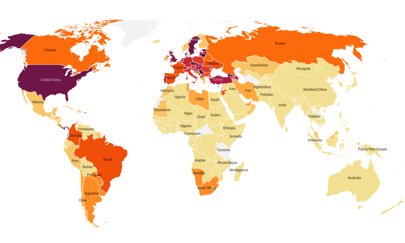
The US is ranked in the second highest color category for hot spots. We are ranked #12 in the world for average daily case rate per 100,000 people over the past 7 days (last week, 8th) with a rate of 65.1 compared to 63.3 last week. The top five countries for average daily case rate per 100,000 in the past week are Lithuania, Liechtenstein, San Marino, Georgia, and Gibraltar. This week Canada crossed 500,000 cumulative COVID-19 cases. When I heard that on the radio, I shook my head, because the state of Georgia has a total of 587,918 cases as of yesterday. Whereas Georgia has 10.6 million residents, Canada has 37.6 million. In other words, if we adjust for population, the cumulative case rate for Canada is 1,351 and the cumulative case rate for Georgia (the US state) is 5,546, or more than 3 times greater than the Canadian disease rate. It’s just a frustrating reminder that things didn’t have to get this bad.
For deaths, the US average daily death rate per 100,000 over the past week is 0.8 (previous week was 0.7), and we are ranked #21 in the world for this (last week we were ranked #25). The top five countries for average daily death rate per 100,000 in the most recent week are Slovenia, Liechtenstein, Croatia, Bulgaria, and San Marino.
The United States
As of this morning, there have been over 17.8 million cases (+1.5 million in the past week) and 317,800 deaths in the US (+18,472 in past week). Keep in mind that both of these numbers are probably an under-count of the situation in our country.
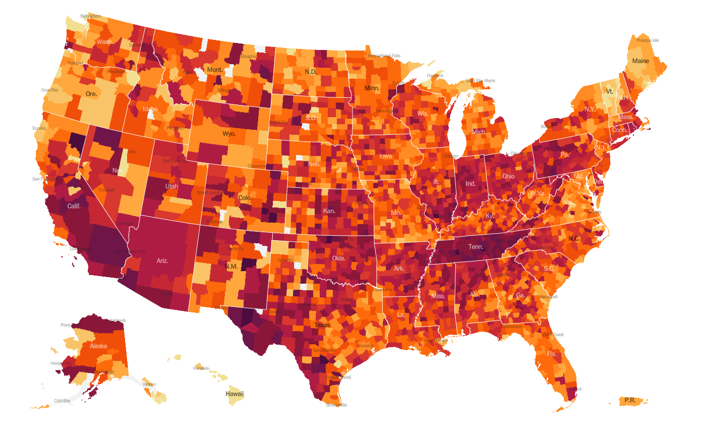
This week we see things have gotten better for parts of the Midwest, upper plains states and the Rocky Mountain states of Colorado, Wyoming and Montana. The top five states in the nation for average daily case rate in the past 7 days are Tennessee, California, Rhode Island, Arizona and Oklahoma. There are two southern states in the top 10 - Tennessee and Alabama. The top five states in the nation for average daily death rate in the past 7 days are Iowa, South Dakota, Rhode Island, Pennsylvania, and North Dakota. There are no Southern states in the top 10 for the metric.
There’s a new data resource available to us now from the federal government, called the COVID-19 Community Profile Report and it is a TREASURE TROVE of data for counties and cities. It is formatted in much the same way as the White House Coronavirus Task Force reports but with one key difference - this resource DOES include Georgia’s antigen cases in their total whereas the WHCTF does not. So this resource is the best head to head comparison we have for how Georgia is faring relative to other states. There is both a PDF and an excel file (this is the gold mine of data) of the report at the link above that you can download and review. They break the US into FEMA regions and you can find how your state is classified here. My Georgia readers are in region 4. Kansas readers are in region 7. Among the maps and graphs that the 20Dec2020 Community Profile Report provides is this map below of rapid riser counties. What you’ll notice is that the red counties (most rapid rise) are clustered in California and Tennessee. The upper Midwest and northern Plains states are relatively quiet, things are holding steady or decreasing. Instead, the counties of concern are the coastal states and sunbelt. Several Georgia counties are in their red zone for rapid increase. There’s more to discuss in this report and I’m thinking it may ultimately replace my analysis of the WHCTF reports, both because of the breadth and depth of the data provided and the fact that this is publicly available and does not require an open records request to obtain. I honestly wish we’d had this resource since the start of the pandemic.
The table below tells you where we are this week and how that compares to the previous week (in parentheses). The data for everything but the percent of inpatients with COVID-19 comes from the New York Times coronavirus tracker and is current as of this morning. The hospital data comes from the HHS Protect Public Data Hub that was last updated on 15Dec2020.
Next, let’s look at how seasonal influenza is impacting different states across the US. You can consult FluView any time you’d like to see this map and other data visualizations. You can read the weekly report from Georgia Department of Public Health here. The maps below show last year’s map for the 50th week of the year (left side) and this year’s map for the same week on the right side.
This week we see that Oklahoma has moved up into the moderate category. Overall, influenza activity is low in the US right now. Compare that to where we were a year ago for week 50 in the map on the left. The things we’re doing to limit the transmission of COVID-19 are also interrupting the transmission of influenza. Good job! Remember, it’s not too late to get your flu shot. Please do so, if you haven’t already.
Georgia
The map below is calculated and formatted the same way as the Harvard Global Health Institute tool, but includes Georgia’s antigen cases. The HGHI tool relies on the data Georgia DPH supplies to USAFacts.org and Georgia only provides PCR case data to this data repository. You can click on the image below to see the live map where you can click or hover over your county of interest to see its number.
There are 127 counties in the red category, 30 in the orange category, and 1 county each is in the yellow and green category, respectively.
For today, here are the net increases for each key metric for Georgia.
Testing: 25,142 new PCR tests (an average number, similar to what we saw last Monday), 14.6% were positive. The state does not provide data regarding the number of antigen tests performed.
Cases: 3520 cases were newly reported today (3111 by PCR, 409 by antigen test). The new statewide total is 591,438. Of today’s cases, 37% came from nonrural counties outside of the Atlanta metro. Atlanta suburb counties were the second highest contributor, with 24% of cases.
Hospitalizations: 90 new COVID hospital admissions and 5 new ICU admissions. The new hospital admissions (90) is a higher number than we usually see on a Monday, but similar to what was reported last Monday. There are currently 3516 COVID patients hospitalized and this number is 554 additional patients compared to last Monday. Our current patient census is 9.8% higher than the previous record set during the summer surge. Adult ventilators are being used at 37% of our state’s capacity as of today.
There are three hospital regions using >90% of their ICU bed capacity - regions B (94%), E (93%), and region N (94%). There is no hospital region using less than 80% of their ICU beds.
Deaths: 16 newly reported confirmed deaths (net change), which is a low day for us. It should be noted that nursing homes typically do not report over the weekends, and Mondays tend to be low count days for this reason. The statewide total of confirmed deaths is 9453.
The Georgia Department of Public Health released a new website and dashboard for the COVID-19 vaccine including answers to frequently asked questions, resources to learn more about the vaccines and the DPH plan for distributing the vaccine. Of note, on page 15 of their distribution plan, they indicate they will follow the plan set forth by the Advisory Committee on Immunization Practices. So we should anticipate that phase 1b and phase 1c will proceed in Georgia the same way it will for much of the US.
So far, 74,100 doses of the Pfizer vaccine have been shipped to Georgia so far and 1,258 doses have been administered. There are 10.6 million residents in Georgia, so we have a long way to go. But this is a step in the right direction and I think it is great that DPH is now providing these resources to us.
You’ve probably noticed that yesterday and today’s newsletters are being sent later than usual. With my kids out of school now for the holidays, I’m having to adjust my writing time. So please don’t worry, I’m fine. That’s it for today. See you on Wednesday!
References
https://www.nytimes.com/interactive/2020/world/coronavirus-maps.html
https://www.nytimes.com/interactive/2020/us/coronavirus-us-cases.html?name=styln-coronavirus®ion=TOP_BANNER&block=storyline_menu_recirc&action=click&pgtype=Interactive&impression_id=97ba8610-2dbb-11eb-a0bf-4f82d045d121&variant=1_Show
https://countyindicatororeport.s3.amazonaws.com/county_indicator_report_20201123.html#emerging-counties
https://dph.georgia.gov/covid-19-daily-status-report
https://covid-gagio.hub.arcgis.com/
https://www.cdc.gov/flu/weekly/fluviewinteractive.htm
https://protect-public.hhs.gov/pages/hospital-capacity
https://beta.healthdata.gov/National/COVID-19-Community-Profile-Report/gqxm-d9w9
https://www.fema.gov/about/organization/regions
https://dph.georgia.gov/covid-vaccine
Georgia COVID-19 Updates is a free newsletter that depends on reader support. If you wish to subscribe please click the link below. There are free and paid options available.
My Ph.D. is in Medical Microbiology and Immunology. I've worked at places like Creighton University, the Centers for Disease Control & Prevention and Mercer University School of Medicine. All thoughts are my professional opinion and should not be considered medical advice.


