

The Daily Digest, 20Jul2020
Georgia COVID-19 Updates

Today I’ll start off with an abbreviated Georgia update. The main focus for today is to compare our trends to what is being observed nationally.
For Georgia, the news hasn’t changed all that much. Things continue to intensify for cases and hospitalizations.
There were 18,462 new PCR (diagnostic) tests reported through Electronic Laboratory Reporting (ELR), 2537 of which were positive. That means 13.7% of the tests were positive.
There were 2452 new cases reported today. I don’t fully know why there’s a discrepancy between the PCR test report (which exceeds today’s total number of new cases) other than we are seeing the ELR data before de-duplication of test results. For example, there are more positive tests than there are positive people because some of them are repeat tests and they are subtracted out before reporting the total new cases. Generally, there were fewer tests today than our average output last week, probably an artifact of commercial labs that slow down over the weekend. The counties below have doubled (or more) their case total in the past 14 days, listed in alphabetical order. Interestingly, they’re all rural.
Bryan (rural), +115%
Candler (rural), +110.6%
Charlton (rural), +177.1%
Evans (rural), +233.3%
Jefferson (rural), +109.2%
Laurens (rural), +113.0%
Liberty (rural), +134.2%
Montgomery (rural), +160.6%
Rabun (rural), +107.0%
Wayne (rural), +237.2%
Current hospitalizations continue to rise, with 147 more currently hospitalized today than were hospitalized yesterday.
There were only three deaths reported today which is low for us - a good thing.
Testing
The very complex graph below comes from the CDC. Let’s start with how to read it.
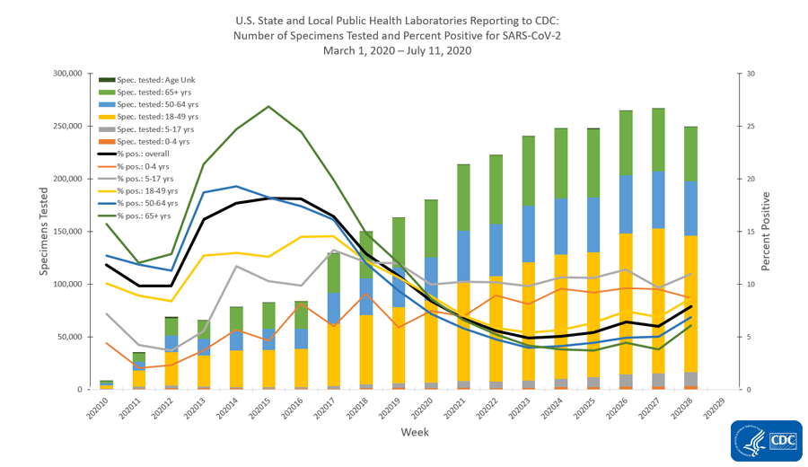
The x-axis along the bottom looks at weekly totals for the 10th - 29th weeks of 2020 so far. The left y-axis is looking at specimens tested and this corresponds to the bars in the graph. The color coding refers to the age groups tested. You can see that the yellow category (ages 18 - 49) makes up the largest group of specimens collected. The right side y-axis measures percent positive tests and this corresponds to the lines. The color coding is consistent with that for the bars. What we see is that we used to have really high percent positive tests, in excess of 25% positive for those 65+, but with expanded testing criteria, that number has decreased and stabilized (on average, black line) just above 5%. But that number has been increasing in the last week of this analysis. Something interesting is that the gray line (representing children 5-17) has the highest percent positive rate, consistently above 10%. The second highest line for percent positive is children 0-4, at or just below 10%. This tells us that children are a weak spot for us right now. We aren’t testing enough children and we are likely missing cases that might contribute to community transmission. Note, the graph above is looking at testing performed by public health laboratories. However, they aren’t doing the bulk of the testing for the US right now - commercial laboratories are. Their data are presented below.
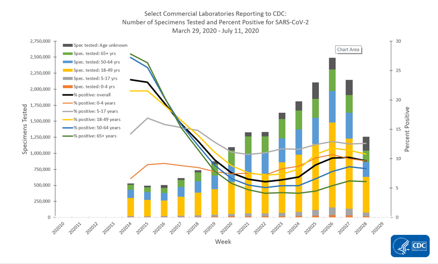
Many of the same trends exist with children being among the least tested and children 5-17 having the highest percent positive rate. Something else that’s interesting to note is that testing has declined in the most recent two weeks’ worth of data collection. This could be a result of reporting delays. But the same trend isn’t being observed for public health laboratories or clinical laboratories (i.e. those based at a hospital).
Cases
The map below comes from the New York Times, who is compiling data from each state and local public health department in the country. This map shows the rate of increase, adjusted for population, in the last week. The darker the color, the more intense the increase. White space indicates few or no cases in the past week.
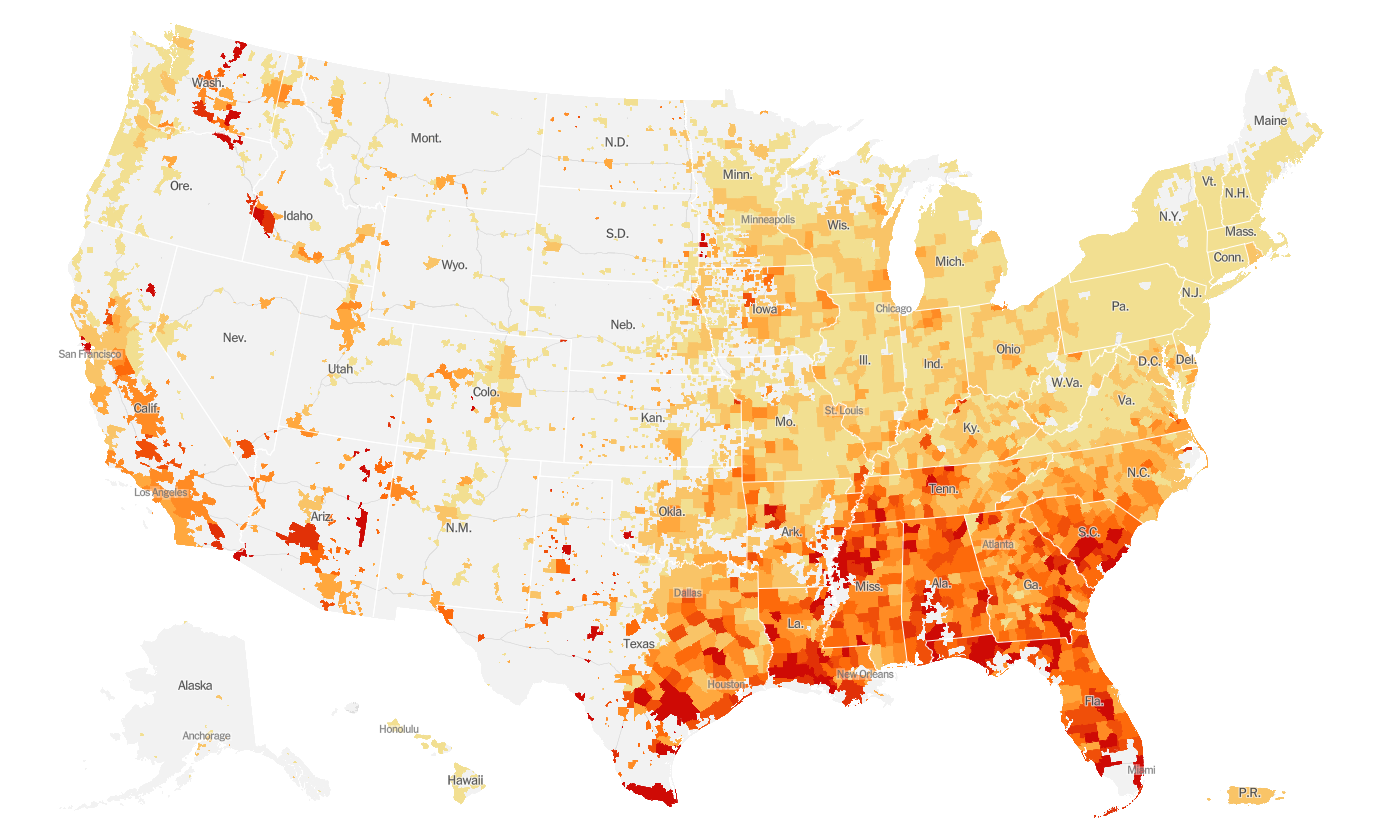
We can see that the entire eastern half of the US is seeing increases and the west coast is as well. However, the most intense areas of increase are in the south, eastern Washington, southwest Idaho, and parts of Arizona.
Hospitalizations
The CDC has been updating their list of underlying conditions for which there is evidence that they may contribute to worse outcomes with COVID-19. It doesn’t mean people with these conditions are more likely to catch the illness, but that they may be in a more vulnerable position if they are infected. Note: limited evidence does not mean untrustworthy - it’s on their radar, but perhaps the sample sizes were too low to make sweeping conclusions just yet.
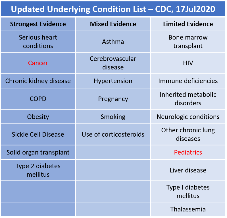
I’ve highlighted the two new conditions that were added on 17Jul in red: cancer and pediatrics.
Next, let’s look CDC’s data on hospitalizations. Note, this just a sampling of some hospitals in some of the states and does not represent the entire US population. Also, this data stream should not be impacted by the HHS reporting change since these states and counties are enrolled in the Emerging Infections Program. Read more here.
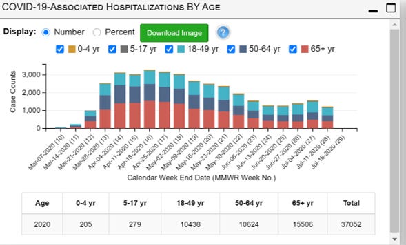
Something interesting to note is that while the early weeks of the pandemic saw mainly older persons being hospitalized, that proportion has shifted to adults younger than 65 since May. In fact, adults 18 - 49 years of age have comprised the largest portion of hospitalized patients for the last five weeks worth of data collection.
Among those who are hospitalized, the most common underlying conditions are shown in the graph below. Note that people can have more than one condition at once, so the percentages do not necessarily add up to 100%.

The most commonly observed conditions among adults are hypertension, obesity and metabolic disease (including things like diabetes). For children, nearly half have no underlying condition. For those who do, the most common are obesity followed by asthma and neurologic disease.
Deaths
The next couple of graphs are hard to see. Feel free to visit the original CDC source to view them more clearly.
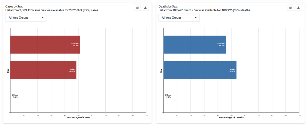
First, there is a slight female:male predominance in those who are infected (51.4% versus 48.6%). However, the opposite is true for deaths, where males outnumber females by an even larger margin (53.8% versus 46.2%) than we are observing in Georgia (51.2% vs 48.8%, as of yesterday’s week in review).
The next graph compares cases (left, red) with deaths (right, blue) according to age groups.
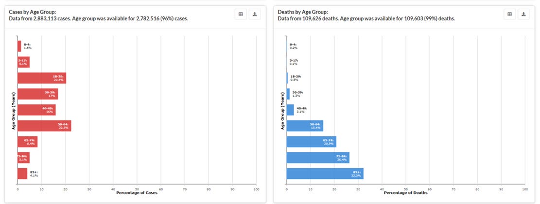
We can see that cases are most concentrated among those 18-64. However deaths are more common among those 50+.
Because we had limited testing capacity in the early days of the pandemic and because COVID-19 looks like a lot of other things and most deaths don’t have an autopsy, it has been hard to pinpoint the exact impact of COVID-19 in terms of deaths. To that end, we can look at how deaths compare this year to last year, first by looking at things that look like COVID-19, including pneumonia and influenza (first graph below), and by looking at all deaths regardless of their cause (called excess deaths, second graph below). Note there are significant delays in death reporting, so it will always look like deaths are decreasing over the past month. We need more time to know whether that is an artifact of reporting delays or not.
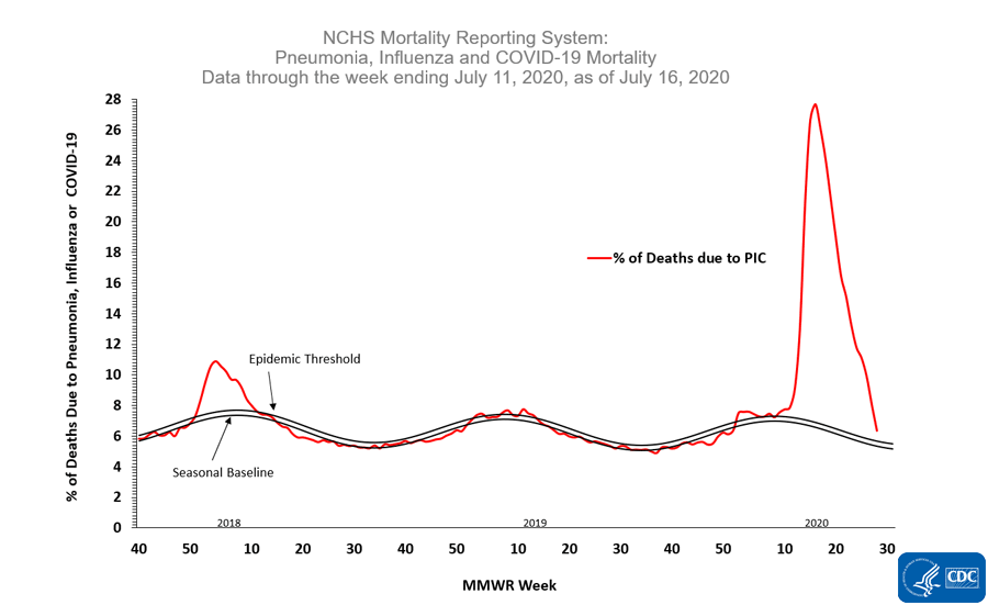
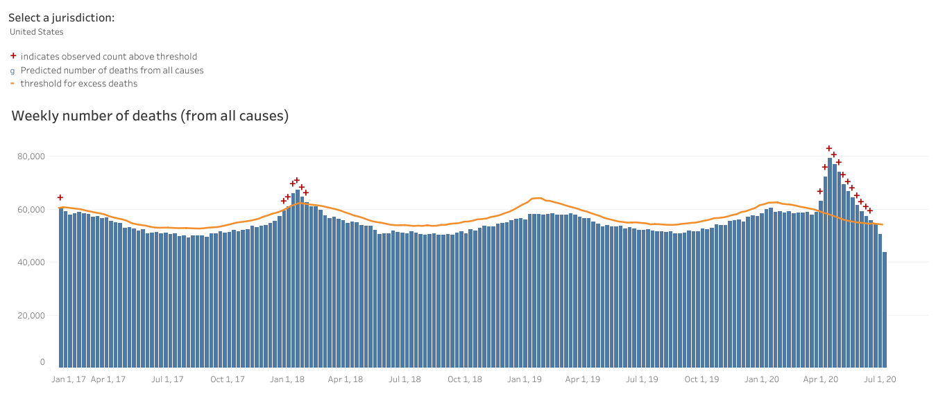
Even looking at both things that look like COVID-19 and all deaths, we are well above previous years’ trends for this time of year. The only thing that’s different about this year is the pandemic.
References
https://dph.georgia.gov/covid-19-daily-status-report
https://www.nytimes.com/interactive/2020/us/coronavirus-us-cases.html
https://www.cdc.gov/coronavirus/2019-ncov/need-extra-precautions/evidence-table.html
https://www.cdc.gov/coronavirus/2019-ncov/covid-data/covid-net/purpose-methods.html
https://gis.cdc.gov/grasp/COVIDNet/COVID19_5.html
https://www.cdc.gov/covid-data-tracker/index.html#demographics
https://amberschmidtkephd.substack.com/p/the-sunday-week-in-review-19jul2020
https://www.cdc.gov/nchs/nvss/vsrr/covid19/excess_deaths.htm
I've finally reached a place where I can make a comment! Whew! I could not find where to comment on recent posts, but hopefully here will do. I used to own Bradford Map Company, and I did thematic mapping for a living. I find the way you are showing the 14 day increase in covid 19 a bit misleading. Example, I live in Taliaferro County now, I have retired here. I used to like in DeKalb County. We have had 2 cases confirmed and 0 deaths for a long time. Recently, the number of confirmed cases went to 5, with 0 deaths. Thematically, my county is represented in dark purple. One could be alarmed that the virus is spreading like wildfire here, and a cursory look by someone not trained in the data could conclude erroneously that we have an out of control situation, which we do not. We went from 2 people to 5 people positive. One could come to all sorts of negative opinions. Don't travel there, they are rednecks that don't wear masks, etc....Actually the opposite is true. I have seen much more mask wearing out in the country that I have seen near Atlanta. I had to go to the Home Depot in Covington a few weeks ago and it was full and I was the only customer wearing a mask! A lot of the purple counties you portray thematically are rural and have small populations. Percentage wise, going from 2 to 5 is 250%, but numerically is is wayyy insignificant to the possibility of being exposed in the Atlanta MSA. My 2 cents.
Dear Amber,
It's nice to see a fellow doctor also writing about COVID-19 here.
All the best,
Carl