

The Daily Digest, 20Apr2021
Georgia COVID-19 Updates

Welcome to the first Tuesday edition of this newsletter. The previous Monday and Wednesday newsletters had a lot of overlapping focus on national trends and I’m hoping that streamlining the two into one issue on Tuesdays will reduce the redundancy and make your time reading the newsletter as productive as possible. Many thanks for your flexibility during the changes. I’m open to feedback.
Vaccine Update
The data provided in the table below are publicly available and current as of the CDC update at 6:00 am on 19Apr2021. The table compares Georgia’s data to the US average. CDC indicates that 8,033,225 doses have been delivered in the state of Georgia and 5,542,994 have been administered in the state of Georgia. That leaves an inventory of 2,490,231 doses on hand. That’s enough vaccine to dose 23% of the total Georgia population. And that seems like a lot. But Georgia made enormous progress in the past week. For starters, the state has now used 69% of its available supply when last week that number was 65%. That’s pretty impressive considering that additional vaccine supply came in last week. So while we have a lot of supply on hand, we are making more efficient use of it. Hopefully that trend improves further. Also noteworthy is that the percentage of adults who are fully vaccinated jumped from 19.6% last week to 25.5% this week in Georgia. The state is still far behind the national average. However, I think we can all appreciate what an improvement this is. Whereas Georgia has been ranked 49 or 50 for most things for the past months, this week the state is clawing its way up especially for first doses. All the applause for our vaccinators. Thank you for the work you’re doing!

The United States
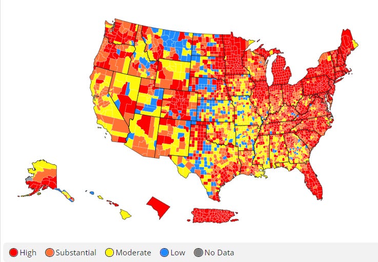
The map above comes from the CDC COVID-19 Tracker on the Community tab, county view. The map above looks at the combined community transmission indicators that looks at both case rate and test positivity. Red and orange are considered the danger zone, yellow is safer and blue is safest. The northeast corner of the country and upper Midwest continue to be areas of intensity. Closer to Georgia, many of its neighbors majority red/orange including Tennessee, the Carolinas and Florida.
According to data from the 18Apr2021 HHS Community Profile Report (the source document for the White House Coronavirus Task Force reports), the top five states in the nation for new case rate per 100,000 residents are Michigan, New Jersey, Pennsylvania, Delaware and Minnesota. The top five states in the nation for new death rate per 100,000 in the past 7 days are New Jersey, Delaware, Georgia, New York, and West Virginia.
The table below tells you where we are this week and how that compares to the previous week (in parentheses). The data for everything comes from the HHS Community Profile Report from 18Apr2021.

Georgia has just one county in the top 20 counties in the US for new case rate, Chattahoochee county at #4, down from #1 the previous week.
The table below shows the highest and lowest ranking states and territories from the latest HHS State Reports (formerly known as the White House Coronavirus Task Force Reports). You can find the most recent report here.

Note that Georgia isn’t in the bottom five for vaccines anymore! Well done, Georgia vaccinators!
Georgia
We can zoom in on a current view of Georgia using the CDC community transmission criteria. Last week, there were 8 counties in the blue category and 59 counties in the yellow category, with 58% of Georgia’s counties in the substantial or high transmission categories. This week, there are 14 blue counties and 49 counties in the yellow category. That leaves 60% of the state’s counties in the substantial or high transmission categories. So on a county to county level, disease transmission is more or less the same as the previous week, maybe just a little bit worse than the previous week. There’s this track through Georgia that extends from the southwest corner up to Augusta or so that typically is better off than other parts of the state. But this week that track is starting to fill in with orange counties.

Testing
Georgia’s PCR testing output is dropping like a stone. If you look at the graph on the lower right below, you can see that the state is doing 73% fewer tests than the national average. It really should not come as a surprise to anyone then that the percent positive rate is rising for Georgia. In the past week alone, it jumped from 4.8% to 5.7%, matching the US average. Georgia is ranked #30 in the nation (with #1 being best) for test positivity, in the yellow zone.
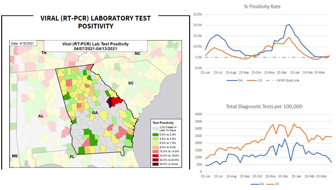
The map above shows PCR test positivity for the most recent week by county. Something you’ll notice in this section and also cases is that things are heating up in the counties around Augusta. The Masters Tournament was just held there 08-11Apr, within the reporting window for this map. That’s concerning. These maps would suggest that testing was insufficient to properly quantify disease burden during the tournament. One worry is that people who traveled to Augusta for the tournament may have engaged in risky behaviors thinking that the pandemic was over or disease burden was really low when it wasn’t and then took disease home with them.
The South is FEMA Region 4 (see graph on lower left). The graph on the right shows national trends for test positivity by age group. Some good news - the test positivity for those 65+ is flat, so testing is stable and able to accurately characterize disease burden for this age group. For the South, the 65+ population is the only population under 5% test positivity. But test positivity is rising for every other age group nationally and it is especially true for children 12-17 years of age. In the South, test positivity is highest for 12-17 year olds and just behind them is 5-11 year olds. So these are K-12 aged children. These graphs come from the executive summary of the HHS State Reports (PDF).

If we drill down to Georgia, we can see the following test positivity rate by age group in the chart below. It shows similar data to what is presented for FEMA Region 4. Only children <5 and adults 65+ are under 5% test positivity. We are undercounting disease in all other age groups, and especially among children 12-17.

It was a low testing volume day for Georgia. There were 11,461 newly reported PCR tests and 6.7% were positive. There were 7788 newly reported antigen tests and 4.4% were positive.
Cases
The map and graph below represent data found in the HHS State Reports. For the map, you want to be in green or yellow (or gray) as much as possible. Red and orange are not good places to be. The region in the northwest of Georgia extending down into the Atlanta metro is mostly orange and red. For the counties around Augusta, they were yellow last week and are red this week. That’s a pretty big increase in a short time. It’s something to keep an eye on.

Comparing the state to the nation, both case rates are rising. Whereas Georgia’s increase is recent, over the past week, the national case rate has been building since mid-March. Georgia is ranked #18 (with 1 being best) for new case rate, in the orange zone. However, it’s on the bubble for the red zone. The best-ranking red zone state is South Carolina at #20.
Today there was a net increase of 1312 newly reported cases for Georgia, with 927 identified by PCR and 385 by antigen testing. For reference, last Tuesday’s total was 1913. So it’s a better week so far.
Hospitalizations
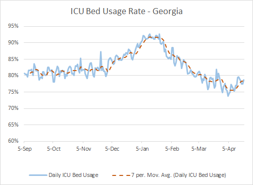
Today there were 131 newly reported COVID-19 hospital admissions and 33 admissions to the ICU. We haven’t seen an ICU admission number above 30 since 17Mar, so over a month. ICU bed usage has been rising since 04Apr.
Here’s a look at how Georgia’s hospital regions are faring. ICU bed usage is in the first shaded column in the table and the proportion of all hospitalized patients who are there for COVID-19 is in the second column.
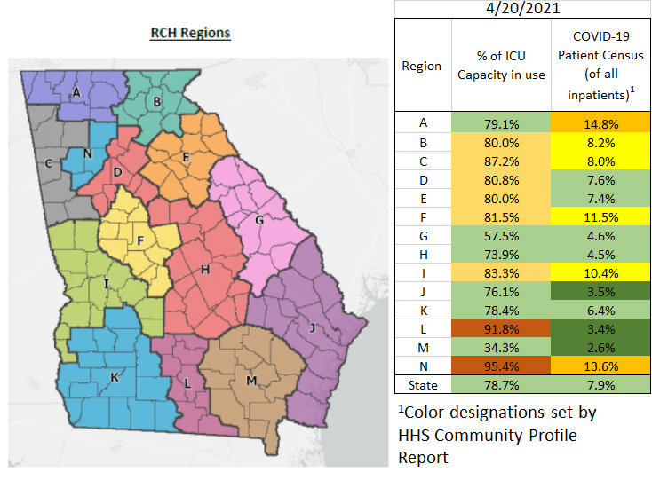
Georgia is ranked #45 in the US (#1 being best) for confirmed COVID-19 hospital admission rate per 100 beds, in the orange zone.
Deaths
The graphic below uses data from the HHS report for the map and the graph on the upper right and Georgia DPH data for the graph on the lower right. New death rate for Georgia has been decreasing generally, thank goodness. It ticked up slightly this past week, but is continuing the downward trend overall. If we look at where the new death rate is most intense in the map, we see a lot of rural counties are red or dark red. And that’s not a new thing. If you look at the graph on the lower right, you can see that the cumulative death rate since the start of the pandemic is much, much higher for rural counties than in the Atlanta metro. Georgia is ranked #49 in the US (with 1 being best) for new death rate per 100,000, in the red zone.

Today Georgia reported a net increase of 9 newly reported confirmed COVID-19 deaths and 5 probable deaths. This is a low day, thank goodness.
So to summarize, the best news for Georgia out of this report is the pace of improvement for vaccinations. A real area of concern is testing. Cases are rising and so is test positivity. If we aren’t testing widely enough, we are unlikely to get an accurate picture of how intense disease burden is as it grows. As such, hospital burden is going to be a really important metric to track.
References
https://covid.cdc.gov/covid-data-tracker/#vaccinations
https://dph.georgia.gov/covid-19-daily-status-report
https://covid-gagio.hub.arcgis.com/
https://covid.cdc.gov/covid-data-tracker/#county-view
https://beta.healthdata.gov/Health/COVID-19-Community-Profile-Report/gqxm-d9w9
Georgia COVID-19 Updates is a free newsletter that depends on reader support. If you wish to subscribe please click the link below. There are free and paid options available.
My Ph.D. is in Medical Microbiology and Immunology. I've worked at places like Creighton University, the Centers for Disease Control & Prevention and Mercer University School of Medicine. All thoughts are my professional opinion and should not be considered medical advice.
Thank you, Amber! We appreciate all you continue to do for us here in Georgia! I just wish we, on the ground here could do our part as well as you are doing yours!