The Daily Digest, 19Oct2020
Georgia COVID-19 Updates

The World
Globally, the SARS-CoV-2 virus that causes COVID-19 disease has sickened > 37.6 million people (+2.5 million since last week) and killed 1,114,100 (+36,600 in the past week) as of this morning. The US accounts for 20.4% of global cases and 19.7% of global deaths.

The US has rejoined the ranks of the hottest countries in the world for COVID-19 cases per population after several weeks in the second tier. Argentina and Panama are other counties in the Western hemisphere that share this distinction. Things are intensifying quickly in Europe. We are ranked 36th in the world for weekly case rate over the past 7 days (last week, 25th). Our weekly case rate per 100,000 is 119 (up from 105). So as our case rate increases, we slide down in the rankings - this is not an indication that the US is doing well, but rather that other countries are doing much worse. The top five countries for case rate per 100,000 in the past week are Andorra, Czech Republic, Belgium, Netherlands, and Luxembourg.
For deaths, our weekly death rate per 100,000 remains at 1.5 and we are ranked #32 in the world for this (down from #27 last week). Again, the fact that our death rate held steady but our ranking declined tells you how much deaths are increasing in other parts of the world. The top five countries for death rates per 100,000 this week are Montenegro, Argentina, Andorra, Czech Republic, and Bahamas.
The United States

As hot spots go, they didn’t move that much this week but got more intense. They are mainly concentrated throughout the Midwest and much of Wisconsin is bright red. Minnesota has new hot spots compared to last week. As of this morning, there have been over 8.1 million cases and 219,541 deaths in the US. Keep in mind that both of these numbers are probably an under-count of the situation in our country.
Cases: Georgia is ranked #36 in the nation for 7-day case rate per 100,000, a drop from #33 last week. Our case rate is 95 per 100,000 in the past 7 days (up from 87 last week). So our case rate is climbing but our ranking is declining. Again, this tells you how much more intense things are in other parts of the country. Keep in mind that most states include the rapid antigen test-identified cases in their case totals whereas Georgia does not. So our case rate is even higher than what the New York Times is counting here. Of the top 10 states for 7-day case rate per 100,000, none are in the South.
Georgia has no counties in the top 20 counties in the nation list for cases per 100,000 in the past week. We also don’t have any cities in the top 20 for case rate per population.
Testing: In the past week, Georgia decreased in the rankings from 38th in the nation (178 tests performed per 100,000 in the past 2 weeks) to 41st in the nation, despite increasing the testing rate to 188 tests per 100,000. Together with the Harvard Global Health Institute, they estimate that Georgia is performing at 48% of the ideal testing target (down from 54% last week). It’s possible that we’re doing much better than this if rapid antigen tests are included, but the state of Georgia only reports those data weekly (today, in fact) and the New York Times and Harvard Global Health Institute can only use what the state of Georgia tells them.
Hospitalizations: Georgia is now ranked #6 in the nation (down from #3 last week) for proportion of inpatient beds occupied by COVID patients (8.9%). The top three states in the nation for this metric are North Dakota, Mississippi and Wisconsin. These data come from the Health and Human Services dashboard which was last updated on 13Oct.

Earlier this month, the CDC updated their list of underlying conditions that might contribute to more severe COVID-19 disease. The two changes are listed in red. Smoking moved from the mixed evidence to strongest evidence column. Being overweight (but not obese) joined the list in the limited evidence column.

Deaths: We have slid down in the rankings for death rate per 100,000 in the past 7 days, from #11 in the nation last week to #15. Southern states still make up 3 of the top 10 positions on that list, I’m sorry to say. Florida, Alabama and Mississippi make up the 7th - 9th positions on the list.
Influenza: Here’s the latest look at FluView, showing how influenza-like illness compares across states. The map below depicts how states compare when considering the average percent of outpatient (meaning, not warranting a hospital admission) visits for influenza-like illness for the current week compared to non-influenza season weeks.

The changes compared to last week is that Iowa intensified into the moderate activity zone, joined by West Virginia. North Dakota dropped back into the lowest minimal category. Minnesota, North Carolina, and New Mexico jumped up slightly in the minimal category. Georgia remains in the most minimal of the minimal section. Keep in mind that influenza is not a mandatory notifiable disease for public health departments like COVID-19 is. But there is a robust surveillance network for tracking trends. So we aren’t likely to see case counts and death counts like we do for COVID-19 because we are seeing estimates for influenza rather than actual numbers. Both diseases feature a wide spectrum of disease severity that can make it hard to identify all cases. You can read the weekly report from Georgia Department of Public Health here.
Georgia
Here is how the state of Georgia is looking based on the risk tool from the Harvard Global Health Institute. The color coding is explained below the map.

There are some noticeable shifts this week. There are three green counties compared to four last week. Meanwhile, there are 61 yellow counties this week, compared to 65 last week. For yellow counties, there is community spread that might be manageable with adequate testing and contact tracing. These counties include some of our most populated ones such Fulton. However, this week almost all of the Atlanta suburb counties shifted from yellow to orange this week. So have many nonrural counties outside of the Atlanta metro. There are 95 counties have >10 cases per 100,000 people which are color-coded orange and red. So they remain counties of concern. There are some populated counties classified as red right now: Whitfield, Floyd, Bartow and Hall. Where last week we saw red counties clustered in the northeast corner of the state, this week they are in the northwest corner. We’ve also seen a spread of red counties in the rural counties of central and southwest Georgia. Keep in mind that the Harvard Global Health Institute is only using what Georgia Department of Public Health reports in its case totals…and that case total does not currently include those cases identified by the rapid antigen test. So while many of these counties look like they’re in better shape, we know that antigen testing has driven cases up as much as 33% for some rural counties.
For today, here are the net increases for each key metric for Georgia.
Testing: 15,821 new tests (a low day for us), 6.7% were positive. 142% of today’s cases were identified through electronic laboratory reporting (ELR), so there are a few duplicate results in today’s report. The state counts tests regardless of whether they come from the same person in their calculation of percent positive rate - it is all positive tests divided by all tests performed (positive and negative). However, multiple positive tests from the same person are de-duplicated when case counts are tallied. So the case count is where the correction is made for duplicates.
Cases: 752 cases (low count for us, probably due to weekend effect). The new statewide total is 341,310. Of today’s cases, 39% came from nonrural counties outside of the Atlanta metro. Rural counties contributed 25% of today’s newly reported cases. Atlanta suburb counties contributed 23% of cases. You can see how case rates per population are impacting different county types below. The nonrural case rate (our current leader) is 28% higher than the state average and 37% higher than it was two weeks ago.

Hospitalizations: 12 new COVID hospital admissions and 2 new ICU admissions (these are low numbers for Georgia). We typically see low numbers on Mondays due to delayed reporting over the weekend. There are currently 1296 COVID patients hospitalized and this number is 18 additional patients compared to yesterday. Adult ventilators are being used at 27% of our state’s capacity as of today, the lowest this number has been since the state of Georgia began providing these data.
There are two hospital regions that are using over >90% ICU beds: region E (90%), H (93%), and N (91.4%).
Deaths: 19 newly reported deaths. It should be noted that nursing homes typically do not report over the weekends, and Mondays tend to be low count days for this reason. Fourteen of the deaths reported today came from outside of the Atlanta metro with rural counties leading with 8 newly reported deaths. The new statewide total is 7657. Among today’s newly reported deaths is a baby boy from Wheeler county.


The Georgia Department of Public Health County Indicators report is released on Mondays. This report provides a lot of county level data, including testing, confirmed and probable cases (i.e. those identified through the rapid antigen test) and the counties of concern as far as DPH is concerned. In the most recent week, there were 1,167 probable cases reported, meaning that instead of the 9149 weekly cases I reported yesterday, the total is more like 10,316. That puts us at a 7-day case rate of 103.9 per 100,000, which means Georgia should be in the red zone by the White House Coronavirus Task Force definition.
Another thing that I find really helpful is to look at the last week’s county indicators report in a internet tab next to the current week’s report and then toggle between them to see the change. Here’s a comparison of where the emerging counties are (this is code for “counties of concern”) last week compared to this week, on the right.
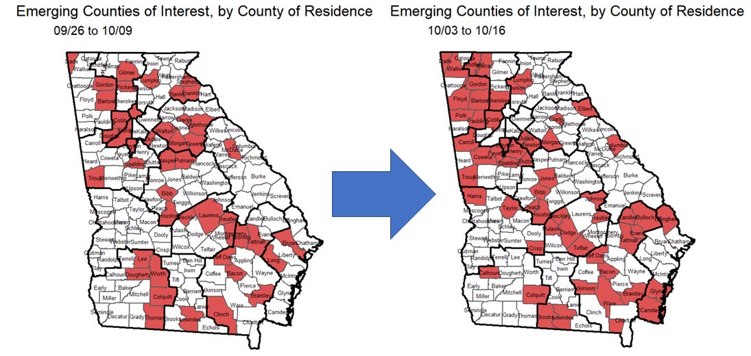
The map is subdivided according to public health districts, not hospital regions. We can see that things have intensified along the western border and throughout northwest Georgia. Things seem to have calmed in what would be hospital region E, near Athens-Clarke county, but intensified in region H. The Georgia coast is seeing more counties on the list this week also.
The White House Coronavirus Task Force reports are produced and released on Sundays but I usually don’t get a copy until Monday/Tuesday. So I’ll be back with that analysis on Wednesday.
To summarize, Georgia appears to be doing better in several rankings while our rates are getting worse. That’s really a reflection of how badly things are going elsewhere in the country. The map shown below from COVID Exit Strategy explains what I mean. The vast majority of the country is either trending poorly or showing uncontrolled spread of the disease. Georgia stands out as a holdout in the trending poorly category and I wonder if the inclusion of antigen test-identified cases (as all of our southern neighbors are doing) would probably put us in the uncontrolled spread category. I certainly don’t want that to be the case, but just want people to be cautious. Things are not going well for Georgia.

But there are still things we can do to improve our situation. I hate to keep saying the same things over and over, but if we can do better at following the already existing public health advice, each of us has the power to save lives. Be a hero in your community today and wear your mask, keep 6-12 feet of distance, practice good hand and cough hygiene, avoid unnecessary interactions with others, etc.
References
https://www.nytimes.com/interactive/2020/us/coronavirus-us-cases.html
https://www.nytimes.com/interactive/2020/world/coronavirus-maps.html
https://protect-public.hhs.gov/pages/hospital-capacity
https://globalepidemics.org/key-metrics-for-covid-suppression/
https://www.cdc.gov/flu/weekly/index.htm
https://dph.georgia.gov/covid-19-daily-status-report
https://covid-gagio.hub.arcgis.com/
https://www.covidexitstrategy.org/
https://dph.georgia.gov/epidemiology/influenza/flu-activity-georgia
https://www.cdc.gov/coronavirus/2019-ncov/need-extra-precautions/evidence-table.html
https://dph.georgia.gov/county-indicator-reports
Georgia COVID-19 Updates is a free newsletter that depends on reader support. If you wish to subscribe please click the link below. There are free and paid options available.
My Ph.D. is in Medical Microbiology and Immunology. I've worked at places like Creighton University, the Centers for Disease Control & Prevention and Mercer University School of Medicine. All thoughts are my professional opinion and should not be considered medical advice.