

The Daily Digest, 18Nov2020
Georgia COVID-19 Updates

Today we’ll mostly focus on unpacking the White House Coronavirus Task Force report and the trends over time for Georgia compared to the national average. But first, I want to remind my readers that the data visualizations you see on the Georgia Department of Public Health daily situation report does NOT include the cases identified by antigen testing. It is only PCR testing. Meanwhile, 27% of last week’s cases were identified by antigen test. So it’s not an insignificant amount. What this means is that the data visualizations on the DPH report are becoming less and less valuable and meaningful over time because they don’t accurately depict the disease intensity that Georgia is experiencing. Despite this, looking at the graph to the right below, even looking just at PCR cases, we are seeing dramatic increases. What I’m telling you is that the situation is even worse if you also consider cases identified by antigen testing.

Meanwhile, the CDC *is* including cases identified by antigen testing in their case total for Georgia. You can tell both by the total case count, but also this graph. On November 12th, they added all of Georgia’s antigen cases to date. So again, if the antigen test is good enough for CDC to count those cases and the WHCTF also wants them counted as cases, then I’m not sure why Georgia isn’t doing so. To see these data for yourself, go to the CDC COVID Data Tracker, click on US and State Trends in the tabs at the top and then select Georgia from the drop down menu.

Many in science communication and public health have been working for months to teach the public how to evaluate data and to encourage data-driven decision making. It is incredibly frustrating to have built a more scientifically-literate population but that population doesn’t have the data they need to make decisions right now. Whatever the data are, good or bad, they need to be presented to the public.
Let’s transition to the WHCTF report. I saw some media talk yesterday and sat for an interview also where the buzz was that Georgia was doing “really well compared to other states.” I think this is a bad take on the situation. The entire country is on fire with COVID-19. The case rate for Georgia is up 52% since the 04Oct WHCTF report and we are doing literally nothing to slow the increase. And the WHCTF is only considering the PCR-identified cases because that’s what Georgia chooses to provide to them. The reality is that Georgia is doing poorly at the moment but the situation is even worse for many states in the country. I’m not sure that’s something to celebrate.

In this summary table from the report you’ll notice there’s a lot of red. In fact, apart from testing, every measure is in the red zone for the US. The WHCTF again recommends that Georgia begin performing proactive surveillance testing. The WHCTF did sneak in an interesting collection of data regarding mitigation strategies that are improving the situation in Europe.

Testing
For PCR testing, the national rate has increased 19% in the past week. For Georgia, we also noted an increase though it was smaller, at 15%.

Meanwhile, the percent of those tests that was positive is increasing 20% on the national scale. For Georgia, we saw an increase of 11%. Remember, percent positivity is considered alongside case rate to estimate how much the case rate we currently detect might be an under count of reality. The greater that number above 5%, the more likely we are missing cases. On a national level, this is the first time that the US rate has been in the red zone (>10%) since the WHCTF began producing these reports on 23Jun. It is, in fact, the highest it has ever been.

Today Georgia reported 20,647 new PCR test results, 10% of which were positive. PCR identified 80% of today’s newly reported cases and the remainder were identified by antigen test.
Cases
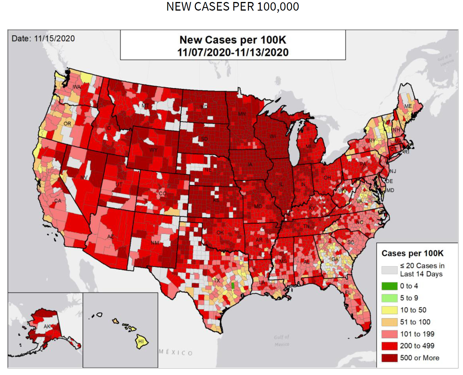
We have seen exponential growth before in the southern half of the US, during our summer surge. But where that was a regionally concentrated situation, it is breathtaking to see exponential growth in cases on a national scale. The national case rate per 100,000 jumped 40% in a week’s time. As I mentioned in the introduction, the case rate for Georgia has increased 52% since early October. But in the most recent week, the increase for Georgia was small, at 4.5% and currently sits at 60% below the national average. Where the nation is seeing rapidly building disease, Georgia is seeing more of a slow burn at the moment. But, again, this only considers the PCR-based cases, whereas the national rate includes antigen-identified cases for most states. Using PCR testing only, the new case rate reported by the WHCTF for 08-15Nov was 117 per 100,000. If PCR and antigen cases reported during that same window of time are considered, then the case rate for Georgia is 178, about 40% below the national average this week rather than the 60% cited above. It’s a sizeable jump.

Thankfully, the WHCTF report does show a small decrease in the number of counties on their list of counties of concern. We dropped from 107 counties last week to 99 this week.

Today, there was a combined net increase in cases of 3161 with 2514 identified through PCR testing and 647 identified through antigen testing. The combined statewide total is now 433,732. Of today’s newly reported cases, 35% came from nonrural counties, 26% came from the Atlanta suburbs and 21% came from the rural counties in Georgia. An updated look at how case rates per 100,000 people have moved over time. Ignore the big spike around 06Oct. That’s when Georgia DPH began providing data regarding antigen cases.

Hospitalizations
There’s an interesting new visualization in the WHCTF report that is more data than Georgia DPH provides in the Daily Situation Report, but we do see some of these data weekly in the County Indicators Report. For this graph, the purple diamonds correspond to the right y-axis and describe how many of Georgia’s hospitals are reporting into the system. This number has held pretty steady since the beginning of October. The bars represent the total number of patients admitted with confirmed COVID-19 illness or suspected illness (i.e. their lab results are pending at the time of admission). The colors correspond to different age groups with the darker shade of a given color representing confirmed cases for that age group and the pale shade represents suspected cases for that age group. So take a look and see what you see in the data. I’ll offer the things I see below the graph.

Hospital admissions are up compared to the previous week, by 14%. A lot of our hospital admissions are in the green category (aged 40-69). We’ve gotten a lot better at data collection regarding demographic details, because at the height of the summer surge, over 50% of the hospital admissions were among those of unknown age group. compare that to now when less than 25% fall into that description. I’m also heartened to see that for adult populations, there is a lot more confirmed COVID admissions than suspected ones and this shift is most noticeable after 16Oct. That might indicate that our testing turnaround time has improved significantly compared to other times.
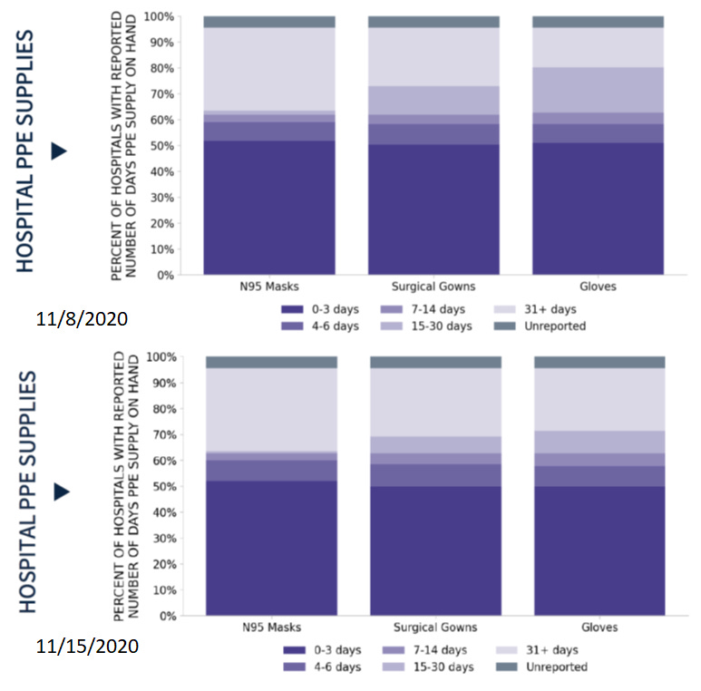
Next let’s consider the PPE inventory on hand for Georgia hospitals. Last week we saw the good news that the proportion of hospitals with only 0-3 days worth of PPE on hand had dropped from ~90% to 50%. Unfortunately, there was no real improvement this week for this and really nothing changed for the supply of N95 masks. But there are improvements in supply on hand for surgical gowns and gloves. But this still isn’t a good situation for Georgia as we see cases increase. Typically hospital admissions follow those surges in cases and we need to make sure our healthcare workers are well supplied.
Today in Georgia, there were 228 new hospital admissions for COVID-19, the highest single day recorded since 23Sep. There were 47 patients newly admitted to the ICU. We haven’t seen a number this high since 23Sep either. The number of patients currently hospitalized is 1755 and this is the highest we’ve seen since 03Sep. The graph below shows how the number of patients currently hospitalized has changed over time.

The number of ICU beds currently in use in Georgia is 82% (yellow zone), similar to where we were yesterday. This metric is not COVID-19 specific - it’s how many beds are in use for all reasons. The same is true for adult ventilator usage. Today, 28% of adult ventilators are in use, and this is similar to the baseline we observed prior to the start of the summer surge.
Deaths
Unfortunately, the most recent WHCTF report notes an increase in the weekly death rate for both Georgia and the US. For the US, the death rate increased 15%, but for Georgia, it rose 25%. We briefly matched the national death rate on 08Nov, but have otherwise been above the national average since early August.

Today there was a net increase of 40 confirmed COVID-19 deaths compared to yesterday’s total. The updated statewide total is 8536. Of today’s newly reported deaths, 40% came from nonrural counties outside of the Atlanta metro and 38% came from rural counties. In other words, 78% of the deaths came from outside the Atlanta metro.
I’ll close by making a brief point about Thanksgiving preparations. For those who minimize the importance of the pandemic and its effects, it seems like the perception is that the disease doesn’t kill “that many” people and the people it does kill are old people anyway…(we can talk about the morality of that attitude another time). But these same people, who acknowledge that the disease kills older populations, want to have big Thanksgiving gatherings *with* elderly relatives. I mean, does that make sense when you say it out loud? Because it seems contradictory or inhumane from this vantage point.
References
The WHCTF report was obtained through open record request to the Georgia Department of Public Health (MANY THANKS to their office!) and uploaded to the Center for Public Integrity’s collection of these reports: https://beta.documentcloud.org/documents/20407545-georgia-11_15_20
https://dph.georgia.gov/covid-19-daily-status-report
https://covid-gagio.hub.arcgis.com/
Georgia COVID-19 Updates is a free newsletter that depends on reader support. If you wish to subscribe please click the link below. There are free and paid options available.
My Ph.D. is in Medical Microbiology and Immunology. I've worked at places like Creighton University, the Centers for Disease Control & Prevention and Mercer University School of Medicine. All thoughts are my professional opinion and should not be considered medical advice.