The Daily Digest, 17Feb2021
Georgia COVID-19 Updates
Vaccine Update
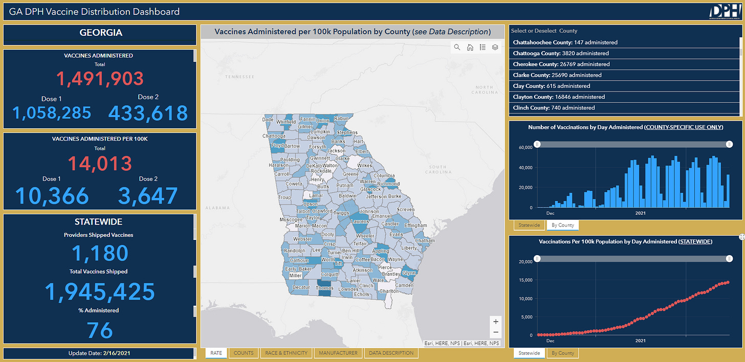
Maybe the biggest piece of news for Georgia and the vaccine effort is the release of a new dashboard to show expanded data. If you haven’t worked with an ESRI dashboard before, I have a couple tips:
You can hover over any of the boxes to bring up an “expand” icon in the upper right of that box. If you click on it, that will expand that box to full screen.
If you click on the counties over in the top right box of the vaccine dashboard, that will update the data in the boxes elsewhere on the dashboard to county-specific data. To get back to statewide data, just click on that county of interest again.
There’s a lot of additional data in the tabs so be sure to look through all of them.
The vaccine is a big expansion from the data we had before. For example, we now have a breakdown of total doses administered, how many were first and how many were second doses. We also have state-level data on race and ethnicity of those who have received the vaccines.
However, the dashboard isn’t perfect and there’s still a lot to be desired. Some things that I think would be really helpful include:
The dashboard is almost unusable on a mobile device or tablet. That means the data are inaccessible for a broad swath of the state’s population.
The map in the center screen has no hover/click capability to tell you the count or vaccine rate for a given county. Some of the counties are labeled but not all. And we’ve learned throughout this pandemic that a lot of people can’t find their own county on a map.
The county level data is based on county of administration - not county of residence, despite the fact that the GRITS system *does* record the vaccine recipient’s county of residence. We have people driving hours to get their vaccines. It’s hard to tell how we’re doing at access without this information. It also makes doses administered per 100,000 in a given county kind of meaningless. It would be great to see a toggle function or additional tab to see the doses and rates by county of residence.
The race and ethnicity data are only available at a state level, not a county level. So far, there are >104,000 people for whom race is “unknown.” That’s about 10% of the people who have received 1+ dose. In addition, race and ethnicity are not the only demographic data that are important. We should also be able to see a breakdown by age group and sex.
I would LOVE to see the data that support the dashboard available for download as is the case for the daily situation report from Georgia DPH. I understand that they may be limited for the data visualizations they can pay for or include in their dashboard. But people like me and others can make up for that, donating our time and expertise as we have since the start of the pandemic. Not to mention that people might just want to be able to look at the data for themselves.
All in all, I think this dashboard is great progress. And in my experience, DPH has been open to suggestions for improvement and willing to try new things as budgets and politics will allow. Perhaps we can look forward to additional improvements to the dashboard in the future.
The most recent state report from the White House is out today. On page 9 of that report, they offer this helpful map that shows how the states are doing at vaccinating their populations for COVID-19. Georgia is one of 8 states plus Puerto Rico that are in the 8.1 - 10% color tier, the group of states that are bringing up the rear. I was talking to a reporter today and it’s possible that Georgia is just going to be in the bottom for the months to come. For whatever reason, other states had the planning and commitment to aggressively deploy the vaccine as soon as it was made available to them whereas Georgia evidently did not. The more successful states have a sizeable head start compared to Georgia that may be insurmountable.
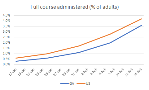
I think what we may need to focus on more going forward is how well Georgia is using the supply it does have. The Georgia dashboard says that 76% of the vaccine doses have been administered (#44 in the nation based on CDC data). The most successful states are 95 - 98%. So I don’t think it’s correct to say that the holdup for Georgia is limited the supply on hand. Because it turns out we have doses in the freezer. The question is whether we are matching the doses to people efficiently and this is where I think improvements can be made while we wait for additional supply. In the meantime, the graph below shows how Georgia is tracking compared to the US for adults who have completed the vaccine series. Georgia’s trend mirrors that of the US, but remains about 14% less than the national average.
Schools
The CDC came out with new guidance for safe school reopening last week. There are two pieces to the guidance that have to do with safety culture - what’s going on inside the building (i.e. mitigation strategies) and what’s going on outside the building (community transmission levels). The mitigation strategies are listed in the table below, under the color blocks where it says “all schools.” The community transmission levels are determined by 7-day case rate per 100,000 and 7-day test positivity and correspond to the color boxes. There are different tables for whether a school is doing screening testing onsite or if they depend on students, faculty and staff to get their testing offsite. For the vast majority of schools in Georgia, table 2 makes the most sense. But if, for example, you’re at a school that does do its own testing, then you’ll need to look at table 3. The table then goes on to explain how schools should be modifying their instructional model and the impacts on sports and extracurricular activities.
So you need to be in the blue or yellow category for community transmission levels. If we apply these thresholds to Georgia county data, then the map below shows how many counties are in the blue or yellow categories for test positivity, where schools could potentially safely reopen *IF* those schools are successfully implementing all 5 key mitigation strategies and are conducting routine testing of teachers and staff once per week. This map looks hopeful. There are 13 counties in the low category and 22 in the yellow category. Click on the map to click/hover over your county to see its rating and number.
However, there are two community metrics that determine a county’s status. If a county has differing ratings for test positivity and case rate per 100,000, say they have high case rate but moderate test positivity, then they should make decisions based on the higher of the two. So in our example, the county is considered to be in the high category.
If we look at 7-day case rate per 100,000 then the map looks like this: There is just one county (Stewart) that meets the case rate criteria. There is just one county that is in the low or moderate categories - Stewart county. You can get to the “live” version of the map below by clicking on it.
What this tells us is that based on the CDC’s guidance, there’s only one county in the state where community transmission levels are compatible with reopening schools safely for in person instruction for all students. For the counties in red, the guidance is that middle and high schools should be virtual only unless they can strictly implement five mitigation strategies (universal and correct mask wear, physical distancing, handwashing and respiratory etiquette, cleaning and maintaining health facilities, contact tracing with isolation and quarantine). In addition, all sports and extracurricular activities should be virtual only. For elementary students, they should be in hybrid learning or reduced attendance modes.
I know this guidance and how it applies to Georgia will feel like getting hit with a hammer. But I hope that we can see this as motivation for all of us in the community. The more we can limit disease transmission through our collective actions, the more students can go back to school. We are on the downhill of a case surge and cases and test positivity might get under these thresholds before long. Many counties are already there for test positivity. But we still remain at a very high level for case rate in all but one county and many counties for test positivity.
A reminder, just because something is open does not mean that it is safe. At least we now have a solid framework for what community metrics are considered “safe” and we can do something about that. We need to also ask ourselves whether our schools can successfully implement the mitigation strategies. And if they can’t, what is the bottleneck? Not enough space? Not enough teachers? Not enough masks? No mask mandate? Those are things that you should take to your school superintendent, the state legislature and the Governor. These are not things that individuals can correct - they require coordinated community effort and funding.
Testing
There were 19,391 newly reported PCR test results today, 9.6% of which were positive. Antigen testing identified 38% of today’s newly reported cases.
Test output in Georgia has decreased in a big way. The state has always been below the national average at testing our population. However, the disparity widened further this week and now the Georgia test rate is 52.2% less than the national rate. It’s hard to find cases when you aren’t looking for them.
So far, we aren’t seeing the expected outcome of decreased test output - that percent positivity would increase. Rather, positivity is on the decline - a good thing!
The state is ranked #8 for test positivity and #44 in the nation for tests performed per 100,000.
Cases
Today Georgia reported a net increase of 3545 newly reported cases (2198 by PCR, 1347 by antigen test). Thirty-eight percent of today’s newly reported cases came from nonrural counties outside of the Atlanta metro. Another 27.8% came from the Atlanta suburbs.
The state’s 7-day case rate per 100,000 is now 70% below the winter surge peak but 169% above our starting point prior to the surge. So we have come a long way but still have a ways to go. So far in this pandemic, the state has never returned to pre-surge baseline after any of its surges. This sets us up for bigger peaks with future surges because there is more disease circulating in the community. Hopefully we can do better this time around.
The state’s case rate has decreased 22% in the past week and the case rate is now just 20% higher than the national rate. It’s good to see this going down. Georgia is ranked #12 for new case rate per 100,000 according to the White House state report.
I find it interesting that the cases remain most intense in the northern half of the state since that’s where the winter surge began for the state. One might think that area might be where we would expect the disease to go away first, as we’ve seen happen elsewhere in the country.
Hospitalizations
Today Georgia reported 222 new confirmed COVID-19 hospital admissions and 37 new ICU admissions. There are 2654 currently hospitalized according to the state. According to the HHS, which also tracks suspected COVID-19 admissions and pediatric patients, the state has 3165 people currently in the hospital. The graph below shows the trend over time, with the HHS data making up the line after 07Feb, when there was an interruption in the hospital dashboards for the state.
There is additional improvement when it comes to hospital burden. The graphic below shows the GEMA hospital regions on the left (map). The table on the right shows the percent of adult ICUs that are in use and the proportion of all inpatients who are being treated for COVID-19 for each hospital region (patient census).
There are five hospital regions using >90% of their ICU beds and region A is completely full. This is far better than a month ago. When we look at patient census, only one region (N) remains in the darkest red category and we have several regions in the orange category, including region D (Atlanta and some of the suburbs). Statewide, about 85% of the ICU beds are full and the HHS tells us that 33% of the ICU beds are being used by COVID-19 patients. During the height of the winter surge, more than half of the ICU beds in use were held by COVID-19 patients. So, again, lots to celebrate here, even as we continue to work to limit disease transmission. Keep up the good work!
Georgia is ranked #5 in the US for confirmed and suspected COVID-19 admission rate per 100 beds.
Deaths
Today the state reported a net increase of 78 newly reported confirmed COVID-19 deaths and 21 probable deaths. Of the 78 confirmed deaths, 32% came from rural counties, 24% came from nonrural counties outside of the Atlanta metro and 23% came from Atlanta suburb counties.
Georgia is ranked #6 in the US when it comes to new deaths per 100,000. You can see how the death rate has trended weekly over time and how it has compared to the national trend in the graph below. We went above the national rate during the week of 17Jan and have remained above since then.
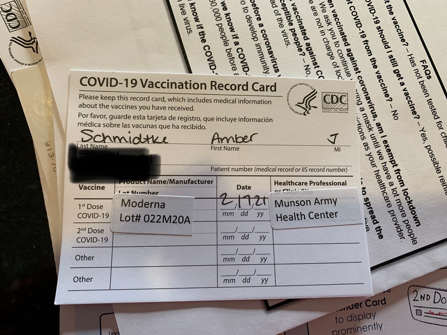
Today’s newsletter is going out a little later than usual and for good reason. I was able to get vaccinated for COVID-19 today with a short-notice notification that a scheduled vaccine clinic had doses but not people to take them at the end of the day. And they were looking for people to take them. I was there in less than five minutes. I was seated and waiting with a group of 7 other people and we weren’t sure how many of us would get the remaining doses. Then the coordinator came in and said they had just enough doses for us and we would all receive the first dose today. I was surrounded by my military family - servicemembers, military dependents, civilian contractors, etc who happened to stop in close to closing time - and I tried hard to keep it together. But I will tell you that I cried tears of relief when that announcement was made and I wasn’t the only one doing so in that room. It was like we finally had a moment to exhale in this pandemic. I have an underlying condition that puts me at a higher risk of hospitalization and death from COVID-19 and I can tell you that my family has experienced a lot of anxiety over the past year.
I’ll also tell you that the burnout for this pandemic is high - not just for you but for me also. So this shot in the arm was not just a boost for my immune system, but for my morale also. This vaccine is hope that I haven’t felt in months. Let’s get to the other side of this pandemic, with as many of us to celebrate as we possibly can manage. I very much hope that you will be able to access a vaccine as soon as possible.
I look forward to answering more vaccine Q&A on Friday and will be happy to share my post-vaccine symptoms (if any) as well.
In the meantime, my family is celebrating this exciting development by ordering carryout and eating it in our truck while parked in the restaurant parking lot, as we have since mid-March.
References
https://beta.healthdata.gov/browse?tags=covid-19-spr
https://experience.arcgis.com/experience/3d8eea39f5c1443db1743a4cb8948a9c/
https://www.cdc.gov/coronavirus/2019-ncov/community/schools-childcare/operation-strategy.html
Georgia COVID-19 Updates is a free newsletter that depends on reader support. If you wish to subscribe please click the link below. There are free and paid options available.
My Ph.D. is in Medical Microbiology and Immunology. I've worked at places like Creighton University, the Centers for Disease Control & Prevention and Mercer University School of Medicine. All thoughts are my professional opinion and should not be considered medical advice.


